- Syllabus
- 1 Introduction
- 2 Data in Biology
- 3 Preliminaries
- 4 R Programming
- 4.1 Before you begin
- 4.2 Introduction
- 4.3 R Syntax Basics
- 4.4 Basic Types of Values
- 4.5 Data Structures
- 4.6 Logical Tests and Comparators
- 4.7 Functions
- 4.8 Iteration
- 4.9 Installing Packages
- 4.10 Saving and Loading R Data
- 4.11 Troubleshooting and Debugging
- 4.12 Coding Style and Conventions
- 4.12.1 Is my code correct?
- 4.12.2 Does my code follow the DRY principle?
- 4.12.3 Did I choose concise but descriptive variable and function names?
- 4.12.4 Did I use indentation and naming conventions consistently throughout my code?
- 4.12.5 Did I write comments, especially when what the code does is not obvious?
- 4.12.6 How easy would it be for someone else to understand my code?
- 4.12.7 Is my code easy to maintain/change?
- 4.12.8 The
stylerpackage
- 5 Data Wrangling
- 6 Data Science
- 7 Data Visualization
- 8 Biology & Bioinformatics
- 8.1 R in Biology
- 8.2 Biological Data Overview
- 8.3 Bioconductor
- 8.4 Microarrays
- 8.5 High Throughput Sequencing
- 8.6 Gene Identifiers
- 8.7 Gene Expression
- 8.7.1 Gene Expression Data in Bioconductor
- 8.7.2 Differential Expression Analysis
- 8.7.3 Microarray Gene Expression Data
- 8.7.4 Differential Expression: Microarrays (limma)
- 8.7.5 RNASeq
- 8.7.6 RNASeq Gene Expression Data
- 8.7.7 Filtering Counts
- 8.7.8 Count Distributions
- 8.7.9 Differential Expression: RNASeq
- 8.8 Gene Set Enrichment Analysis
- 8.9 Biological Networks .
- 9 EngineeRing
- 10 RShiny
- 11 Communicating with R
- 12 Contribution Guide
- Assignments
- Assignment Format
- Starting an Assignment
- Assignment 1
- Assignment 2
- Assignment 3
- Problem Statement
- Learning Objectives
- Skill List
- Background on Microarrays
- Background on Principal Component Analysis
- Marisa et al. Gene Expression Classification of Colon Cancer into Molecular Subtypes: Characterization, Validation, and Prognostic Value. PLoS Medicine, May 2013. PMID: 23700391
- Scaling data using R
scale() - Proportion of variance explained
- Plotting and visualization of PCA
- Hierarchical Clustering and Heatmaps
- References
- Assignment 4
- Assignment 5
- Problem Statement
- Learning Objectives
- Skill List
- DESeq2 Background
- Generating a counts matrix
- Prefiltering Counts matrix
- Median-of-ratios normalization
- DESeq2 preparation
- O’Meara et al. Transcriptional Reversion of Cardiac Myocyte Fate During Mammalian Cardiac Regeneration. Circ Res. Feb 2015. PMID: 25477501l
- 1. Reading and subsetting the data from verse_counts.tsv and sample_metadata.csv
- 2. Running DESeq2
- 3. Annotating results to construct a labeled volcano plot
- 4. Diagnostic plot of the raw p-values for all genes
- 5. Plotting the LogFoldChanges for differentially expressed genes
- The choice of FDR cutoff depends on cost
- 6. Plotting the normalized counts of differentially expressed genes
- 7. Volcano Plot to visualize differential expression results
- 8. Running fgsea vignette
- 9. Plotting the top ten positive NES and top ten negative NES pathways
- References
- Assignment 6
- Assignment 7
- Appendix
- A Class Outlines
7.1 Responsible Plotting
“Good plots empower us to ask good questions.” - Alberto Cairo, How Charts Lie
Plots are the primary vehicles of communicating scientific results. A very common and useful approach to writing scientific papers is to decide how many figures are needed to tell the story, and then create plots as necessary to convey that story. The text plays a supporting role for the figures. Effective data visualization has immense power to communicate the ideas (and beliefs) of the chart creator. Consider the famous “hockey stick graph” depicting average global temperatures created by Jerry Mahlman to describe the pattern of global warming shown by Mann, Bradkely & Hughes in 1999:
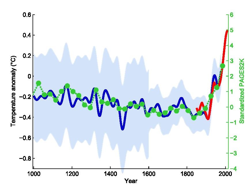
“Hockey stick graph” by Jerry Mahlman, showing the trend of temperature rise over the past 1000 years in the northern hemisphere
The data and models underlying the graph are very complex, but the story is clear: the past 100 years has seen a dramatic increase in average temperature in the northern hemisphere. This chart was one of the main drivers behind renewed main stream awareness of climate change, in no small part because it is easy to understand.
Given the power visualization has, and the increasing amount of data created by and required for daily life, it is ever more important that data visualization designers understand the principles and pitfalls of effective plotting. There is no easy solution to accomplishing this, but Alberto Cairo and Enrico Bertini, two journalists who specialize in data visualization and infographics, lay out five qualities of an effective visualization, in Cairo’s book the truthful art:
- It is truthful - the message conveyed by the visualization expresses some truth of the underlying data (to the extent that anything is “true”)
- It is functional - the visualization is accurate, and allows the reader to do something useful with the insights they gain
- It is insightful - the visualization should reveal patterns in the data that would otherwise be difficult or impossible to see and understand
- It is enlightening - the reader should leave the experience of engaging with the visualization convinced of something, ideally what the designer intends
- It is beautiful - it is visually appealing to its target audience, which helps the user more easily spend time and engage with the visualization
A full treatment of these ideas are included in, among others, three excellent books by Alberto Cairo, linked at the end of this section. The sections that follow describe some of the ideas and concepts that make visualization challenging and offer some guidance from the books mentioned on how to produce effective visualizations.
All three of these books were written by Alberto Cairo:
7.1.1 Visualization Principles
The purpose of data visualization is to illustrate (from the latin illustrare, meaning to light up or illuminate) relationships between quantities. Effective data visualization takes advantage of our highly evolved visual perception system to communicate these relationships to our cognitive and decision making systems. Therefore, our visualization strategies should take knowledge of our perceptual biases into account when deciding how to present data. Poor data visualization choices may make interpretation difficult, or worse lead us to incorrect inferences and conclusions.
7.1.2 Human Visual Perception
The human visual perceptual system is intrinsically integrated with our cognitive system. This makes it a predictive or interpretive system, where patterns of light received by the eye are pre-processed before the relatively slower executive function parts of our brains can make judgements. If we compare our perception of the world around us to a cinematic film, this makes our visual perception less raw video footage and more like a director’s commentary, where we add our interpretations, motivations, experiences, and anecdotal annotations to the images before we cognitively interpret them. Said differently, our visuo-cognitive system performs pattern recognition on the information we receive, and annotates the information with the patterns it thinks it sees. Very often, our cognition predicts patterns that are accurate, which therefore may be useful for us in making decisions, e.g. how to move out of the trajectory of a falling tree branch. However, sometimes our pattern recognition system, which is always trying to match patterns, sees patterns that don’t exist. Some of the most well known and well studied examples of these perceptual errors are optical illusions.
Optical illusions are images or animations that reveal the errors and bias of our perceptual system. Some illusions that are static images appear to move. Others distort the true relations between lines or shapes, or lead to incorrect or inconsistent perception of color. Consider the famous checkerboard shadow illusion created by Edward H. Adelson in 1995:
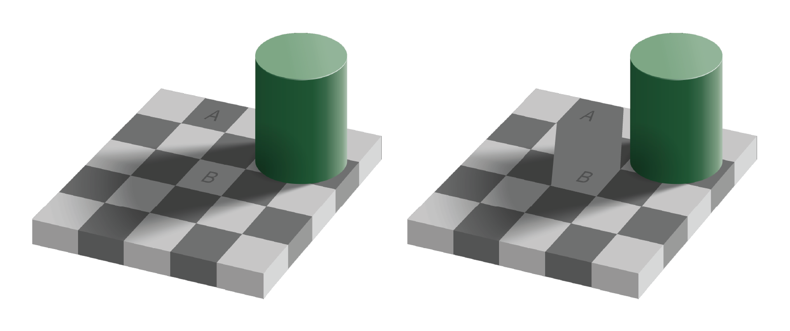
Checkerboard shadow illusion, the squares marked A and B are the same color
The image on the right clearly shows the two squares A and B are the same shade of grey, though A appears darker than B in the left image. This is because our perceptual system identifies color by contrasting adjacent colors. Since the colors adjacent to the A and B squares differ, our perception of the colors also differ. This example illustrates the contrast bias according to the value, or lightness, of the color, but the principle also applies to different hues:

The three squares are drawn on top of and below the image and are the same color
An illusion that shows how our perceptual system distorts relationships between geometry is as follows:
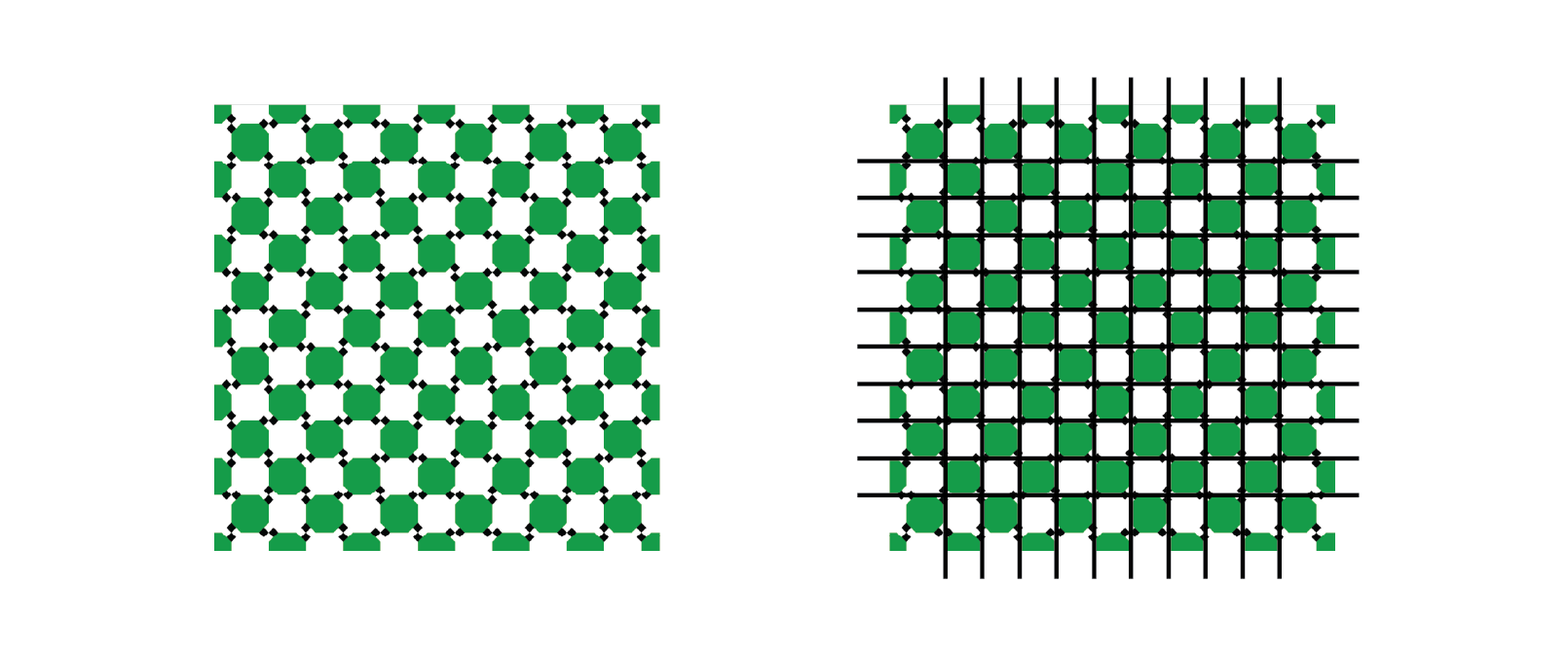
The horizontal and vertical pattern appears to be “wavy” but in fact form straight lines
The pattern of light and dark squares intersecting with the grid makes the lines appear “wavy” when all the horizontal and vertical lines are in fact straight, parallel, and perpendicular.
A final example illusion that is relevant for data visualization demonstrates a similar contextual bias of relative area:
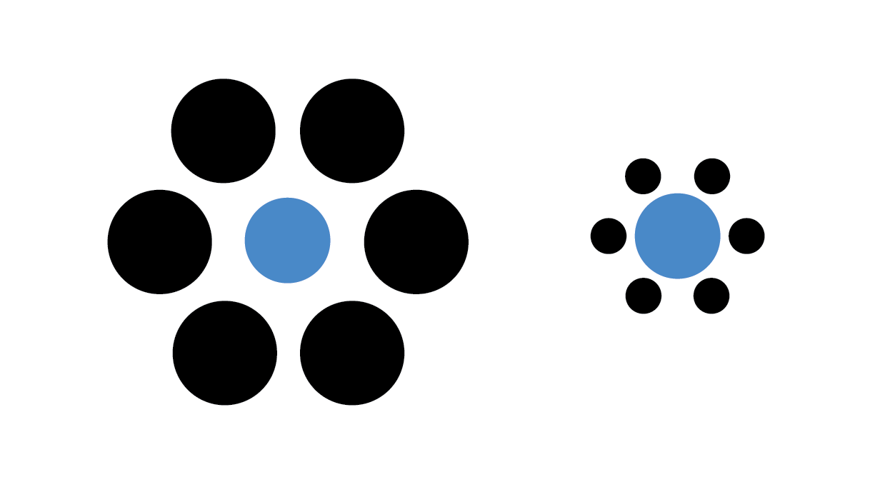
The blue dots have the same diameter
The two blue dots in the image have the same radius, although the dot within the large black circles appears smaller.
Not only are there illusions that distort our perception of shapes that are there, but there are also illusions that convince us of the existence of shapes that are not there. The following illusion illustrates the point:

The shapes are drawn to suggest a triangle in the middle, though no triangle is actually drawn
Seeing shapes when they aren’t there is nothing new to humans, of course.

Clouds that resemble shapes - this author sees a running dog
Each of these perceptual biases relate to how we interpret many common data visualization strategies. We cannot avoid making these interpretive errors via our cognition alone, but we can use this knowledge in the design of our plots to mitigate their effects. To quickly summarize the perceptual biases we have demonstrated:
- We perceive the value and hue of colors in contrast to adjacent colors
- Certain types of geometry interfere with our ability to assess accurate relationships between geometric shapes
- We perceive the size (area) of shapes relative to nearby shapes
- We may perceive shapes where there are none drawn, based on nearby shapes
- We may perceive shapes that are similar to other familiar shapes, but have no true relationship
Each of these biases influence how we perceive and interpret plots, as we will see in the rest of this chapter.
7.1.3 Visual Encodings
Data visualization is the process of encoding numbers as positions, shapes, and colors in a two- or sometimes three-dimensional space. There are many different geometric properties we can use to create an encoding, including:
- Length, width, or height
- Position
- Area
- Angle/proportional area
- Shape
- Hue and value of colors
Examples of each of these encodings is depicted for a fictitious dataset of values between zero and one in the following figure:
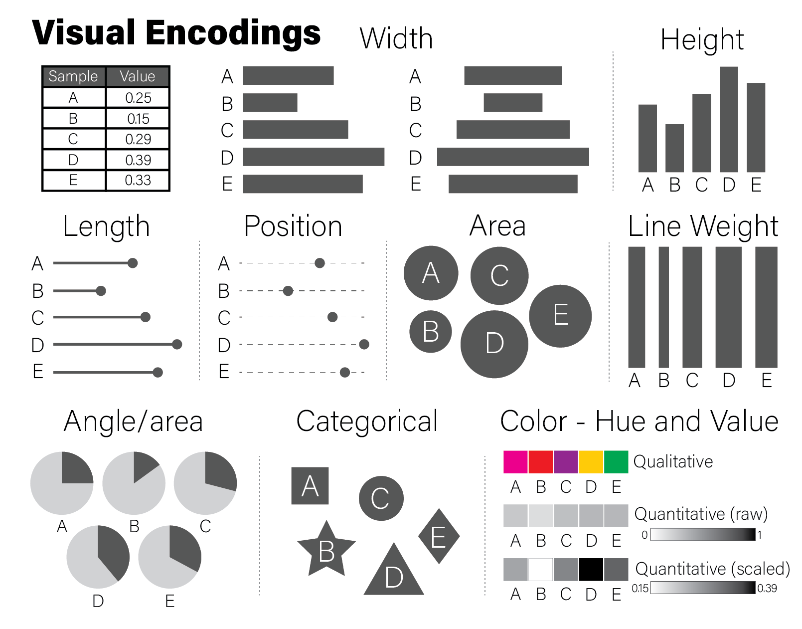
Different encodings for the same data. This figure was inspired by Alberto Cairo in his book the truthful art.
The example encodings in the figure are among the most common and recognizable elements used in scientific plotting. Every time a reader examines a plot, they must decode it to a (hopefully) accurate mental model of the quantities that underlie it. Using familiar encodings that a reader will already know how to interpret makes this decoding cognitively easier, thereby enabling the plot to be more quickly understood.
Every quantity we wish to plot must be mapped to a visualization using one or more of these geometric encodings. By combining different variables with different encodings, we construct more complex plots. Consider the scatter plot, which contains two continuous values per datum, each of which is mapped to a visualization with a position encoding:
tibble(
  x=rnorm(100),
  y=rnorm(100,0,5)
) %>%
  ggplot(aes(x=x,y=y)) +
  geom_point()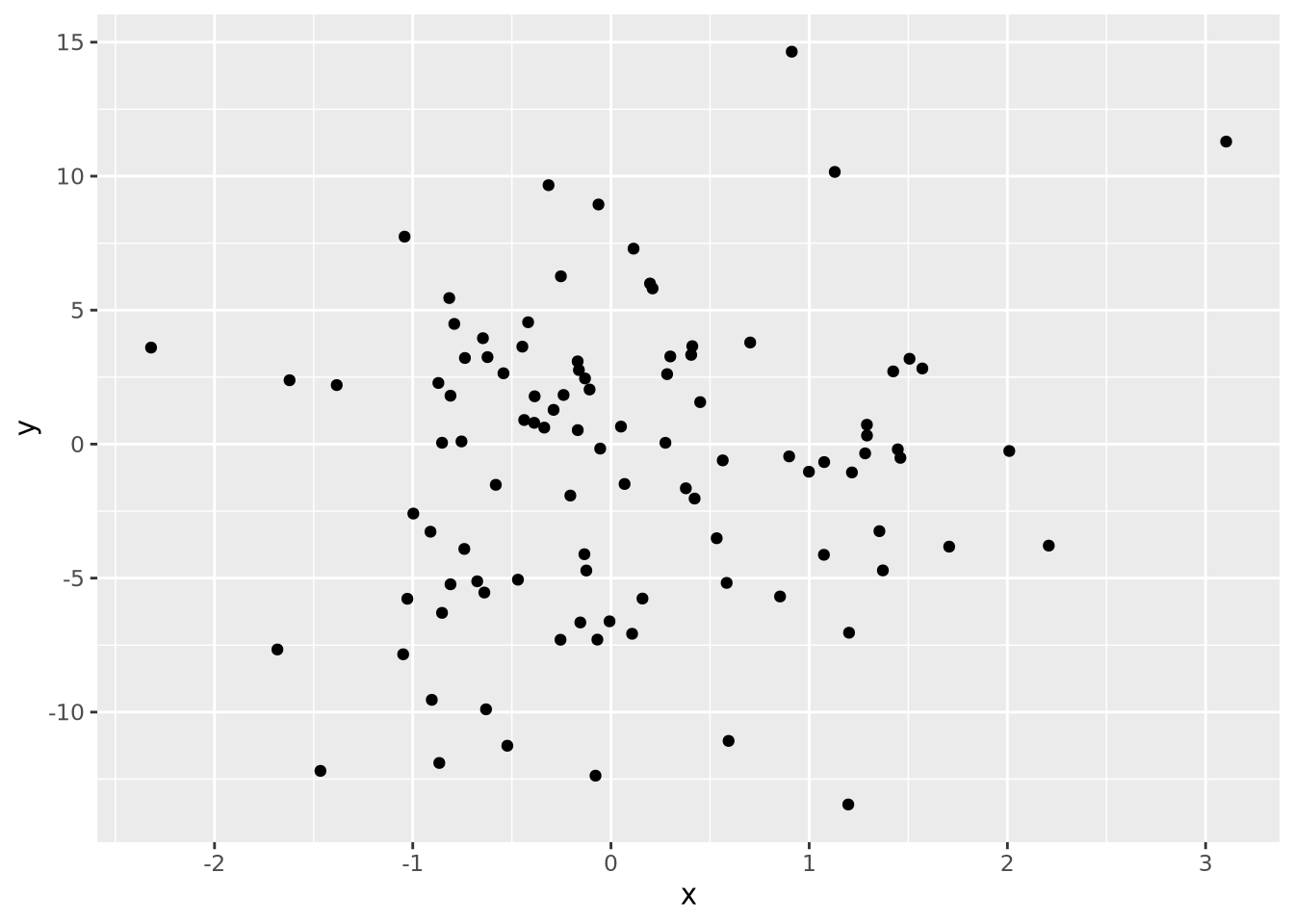
We might layer on another encoding by introducing a new variable that is the absolute value of the product of \(x\) and \(y\) and make the area of each datum proportional to that value:
data <-  tibble(
  x=rnorm(100),
  y=rnorm(100,0,5),
  `x times y`=abs(x*y)
)
data %>%
  ggplot(aes(x=x,y=y,size=`x times y`)) +
  geom_point()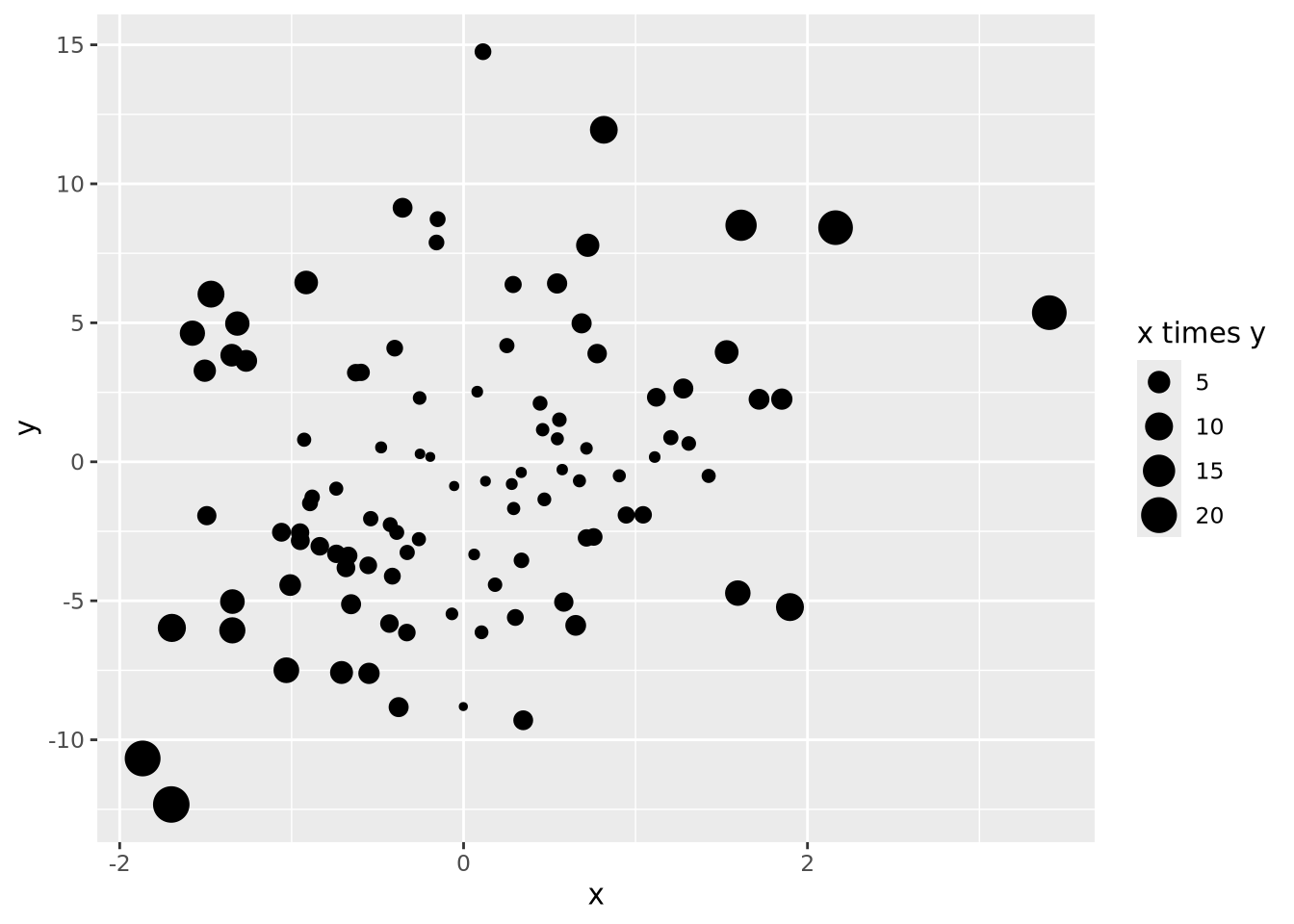
We could layer yet more encodings to color each marker proportional to a value between 0 and 1, and also change the shape based on a category:
data <- mutate(data,
    z=runif(100),
    category=sample(c('A','B','C'), 100, replace=TRUE)
  )
data %>%
  ggplot(aes(x=x, y=y, size=`x times y`, color=z, shape=category)) +
  geom_point()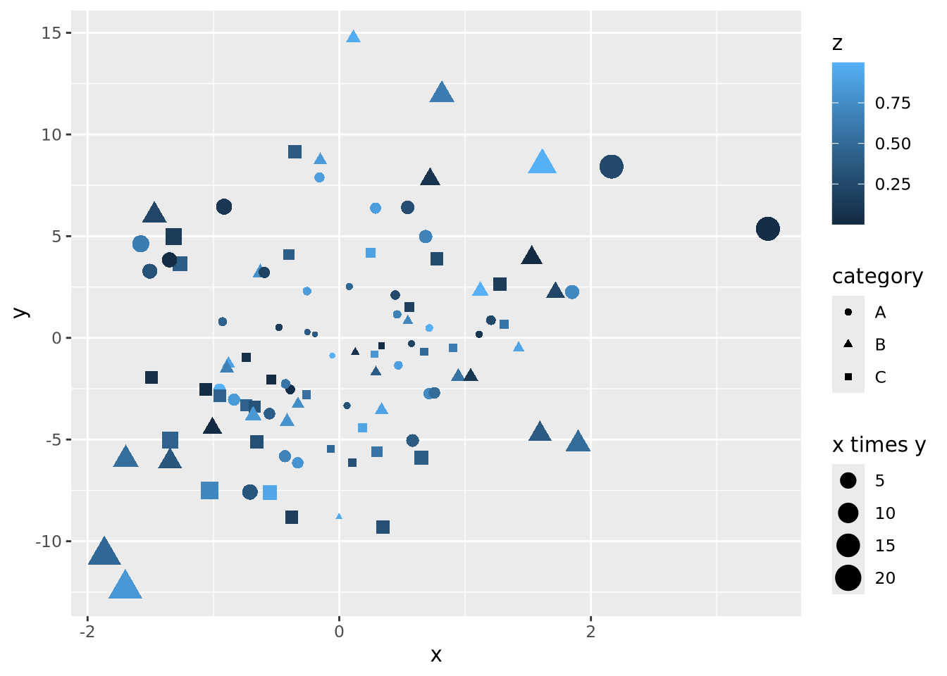
Let’s say the sum of \(x\) and \(y\) is meaningful as well, and we are interested in the order of the data along this axis. We can connect all the points with lines by using a length encoding between adjacent data points after sorting by \(x+y\):
data <- mutate(data,
  `x + y`=x+y,
) %>%
  arrange(`x + y`) %>%
  mutate(
    xend=lag(x,1),
    yend=lag(y,1)
  )
data %>%
  ggplot() +
  geom_segment(aes(x=x,xend=xend,y=y,yend=yend,alpha=0.5)) +
  geom_point(aes(x=x, y=y, size=`x times y`, color=z, shape=category))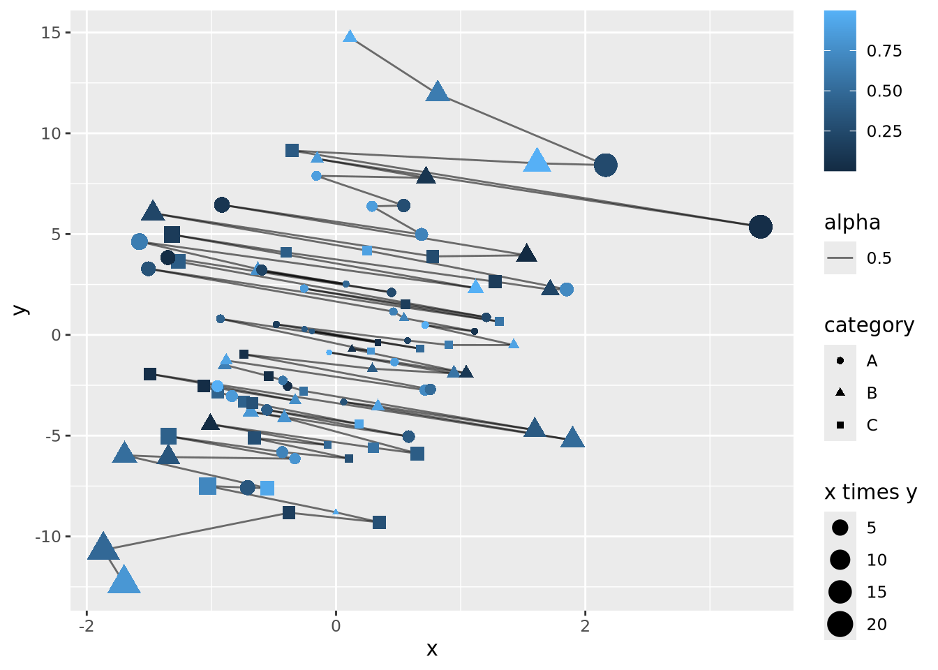
The plot is becoming very busy and difficult to interpret because we have encoded six different dimensions in the same plot:
- \(x\) value has a positional encoding
- \(y\) value has another positional encoding
- The product \(xy\) has an area encoding
- \(z\) has a quantitative color value encoding
- category has a categorical encoding to shape
- The adjacency of coordinates along the \(x + y\) axis with a length encoding
Very complex plots may be built by thinking explicitly about how each dimension of the data are encoded, but the designer (i.e. you) must carefully consider whether the chosen encodings faithfully depict the relationships in the data.
These common encodings depicted in the earlier figure are not the only possibilities for mapping visual properties to a set of values. Consider the violin plot below:
set.seed(1337)
tibble(
  value=rnorm(100),
  category='A'
) %>%
  ggplot(aes(x=category,y=value,fill=category)) +
  geom_violin()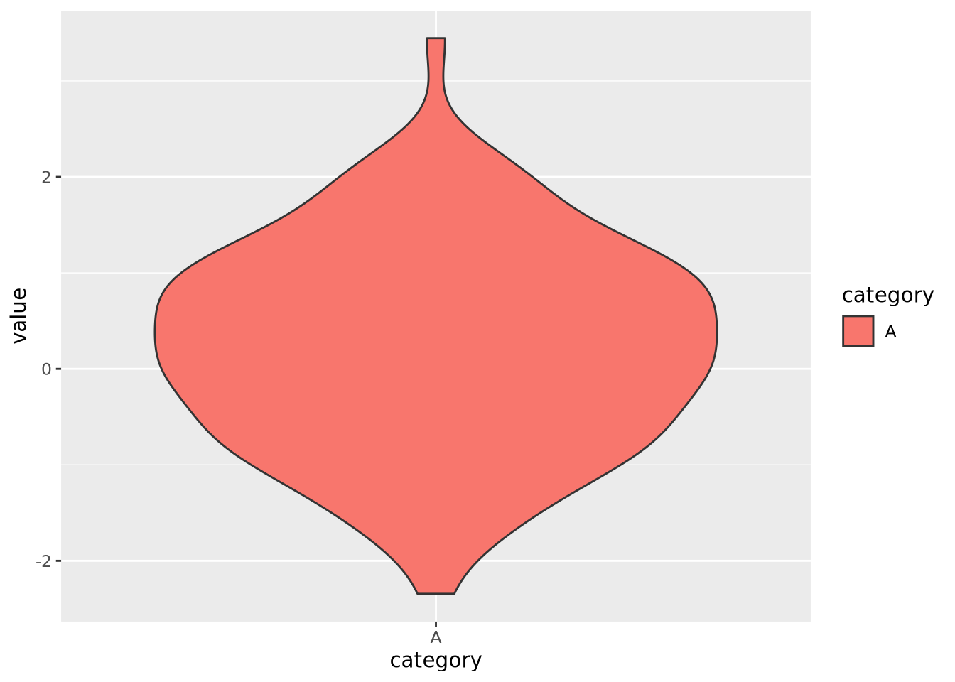
Here, geom_violin() has preprocessed the data to map the number of values
across the full range of values into a density. The density is then encoded with
a width encoding, where the width of the violin across the range of values,
which is encoded with a position encoding.
Most common chart types are simply combinations of variables with different encodings. The following table contains the encodings employed for different types of plots:
| Plot | \(x\) encoding | \(y\) encoding | note |
|---|---|---|---|
| scatter | position | position | |
| vertical bar | position | height | |
| horizontal bar | width | position | |
| lollipop | position | height for line + position for “head” | |
| violin | position | width | \(x\) transformed to range, \(y\) transformed to densities |
7.1.3.1 Elementary Perceptual Tasks
The purpose of visualizations is to enable the reader to construct an accurate mental model of the relationships or ideas contained within the data. As discussed in the Human Visual Perception section, not all visualizations allow for easy and accurate judgments of this kind due to the biases of our biological visuo-cognitive biases. However, some encodings of data allow more accurate judgments than others. William Cleveland and Robert McGill, two statisticians, proposed a hierarchy of visual encodings that span the spectrum of precision of our ability to accurately interpret visual information (Cleveland and McGill 1984). They defined the act of mapping a specific type of encoding to a cognitive model an elementary perceptual task. The hierarchy is depicted in the following figure:
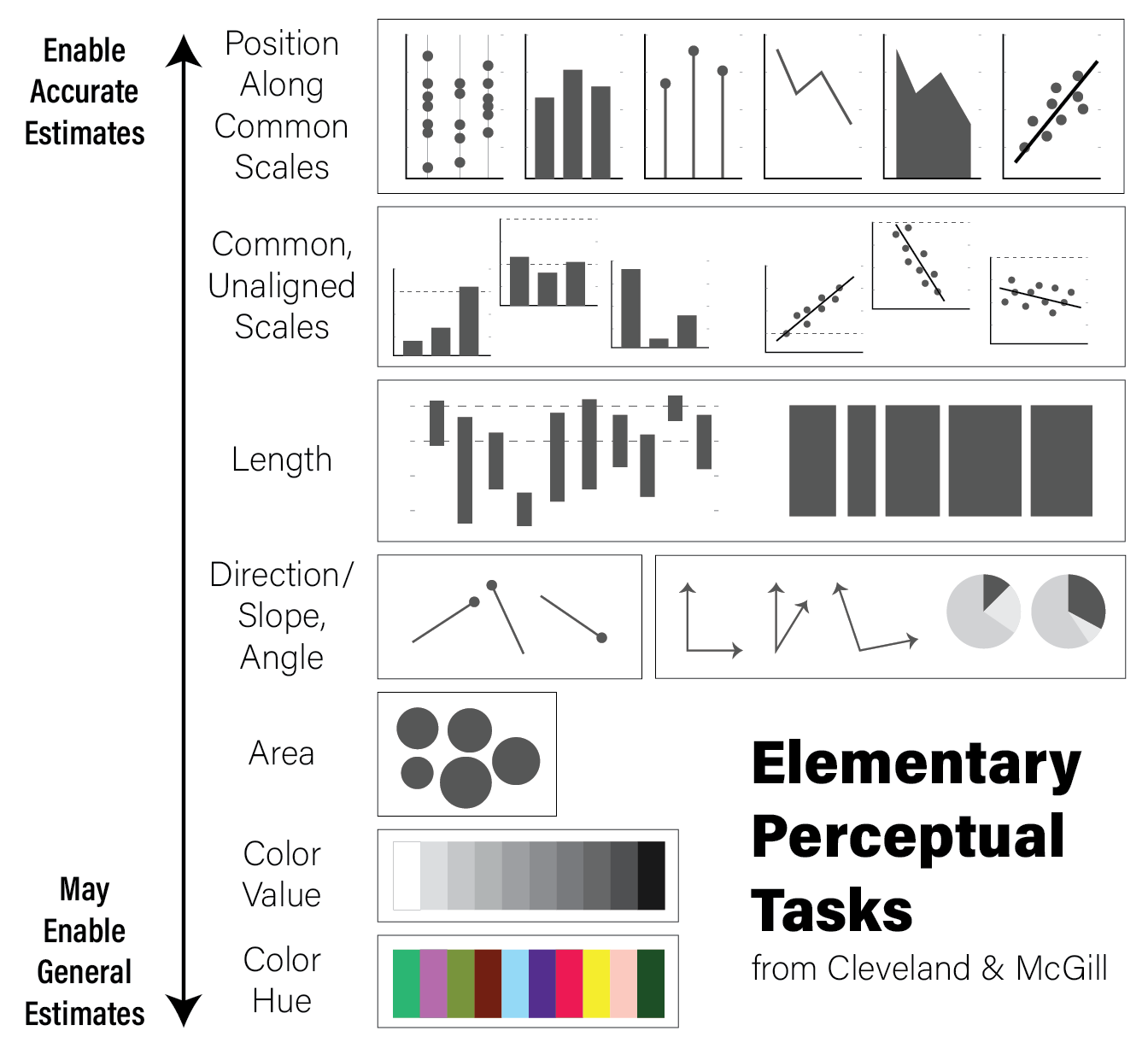
Elementary Perceptual Task Hierarchy - inspired by Alberto Cairo in the truthful art, which was inspired by Willian Cleveland and Robert McGill
The hierarchy is oriented from least to most cognitively difficult decoding tasks, where the easier tasks lend themselves to easier comparisons and judgements. For example, the easiest perceptual task is to compare visual elements with a position encoding that are all aligned across all charts; the positional decoding is the same for each chart, even if they use different stylistic elements. Further down the hierarchy, more cognitive effort is required to assess the precise relationships between elements of the plot, therefore possibly reducing the accuracy of our judgements.
This is not to say that it is always better for the reader to make highly accurate estimates. General trends and patterns may be more readily (and beautifully) apparent with less accurate encodings. Consider the following clustered heatmap:
# these data have two groups of samples with similar random data profiles
data <- as.matrix(
  tibble(
    A=c(rnorm(10),rnorm(10,2)),
    B=c(rnorm(10),rnorm(10,2)),
    C=c(rnorm(10),rnorm(10,2)),
    D=c(rnorm(10,4),rnorm(10,-1)),
    E=c(rnorm(10,4),rnorm(10,-1)),
    F=c(rnorm(10,4),rnorm(10,-1))
  )
)
rownames(data) <- paste0('G',seq(nrow(data)))
heatmap(data)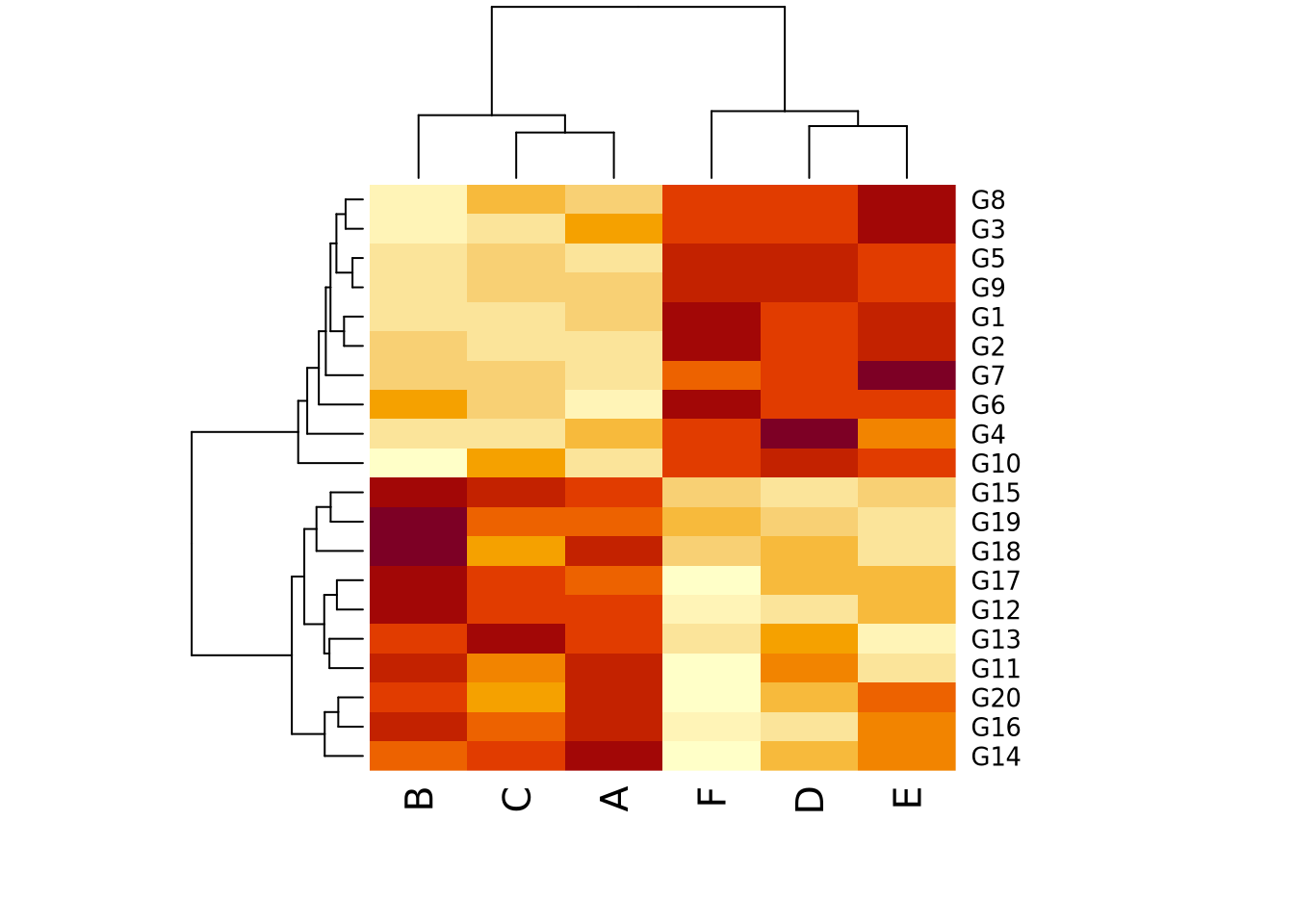
In this toy example, it may be sufficient for the reader’s comprehension to show that samples A, B, and C cluster together, as do D, E, and F, without requiring them to know precisely how different they are. In this case, the clustering suggested by the visualization should be presented in some other way that is more precise as well, for example a statistical comparison with results reported in a table, to confirm what our eyes tell us.
It is usually a good idea to plot data multiple ways, to ensure the patterns we see with one encoding are also seen with another. We might consider plotting the data again using a parallel coordinates plot:
library(GGally)

as_tibble(data) %>% mutate(
  group=c(rep('Group 1',10),rep('Group 2',10))
) %>%
  ggparcoord(columns=1:6,groupColumn=7)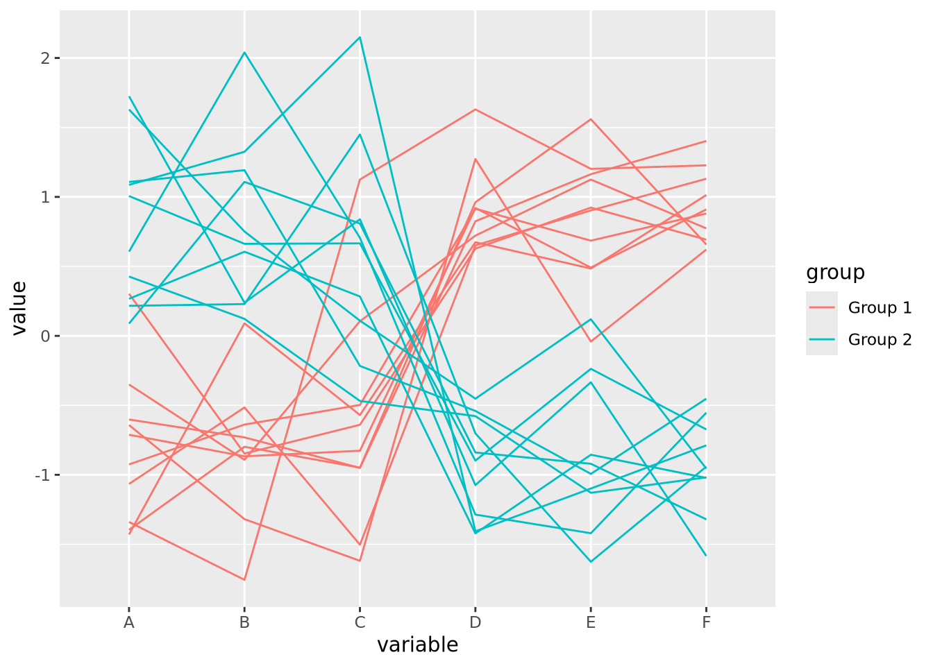
For simplicity, we added a new variable group that is consistent with the
clustering we observed in the heatmap, which we might have extracted
computationally by cutting the row dendrogram into two flat clusters. The
parallel coordinate plot also visually confirms our interpretation of two
distinct clusters. We may now feel more comfortable including one or the other
plot in a figure, though this author finds the parallel coordinate plot more
accurate and enlightening. Recall the elementary perceptual task hierarchy:
aligned position encodings enable more accurate estimates of data. Heatmaps,
which use color value and hue, enable the least accurate estimates.
7.1.4 Some Opinionated Rules of Thumb
Effective data visualization is challenging, and there are no simple solutions or single approaches to doing it well. In this sense, data visualization is as much an art as a science. This author has some rules of thumb he applies when visualizing data:
- Visualize the same data in multiple ways. This will help ensure you aren’t being unduly influenced by the quirks of certain encodings or inherent visuo-cognitive biases.
- Perform precise statistical analysis to confirm findings identified when inspecting plots. Examine the underlying data and devise statistical tests or procedures to verify and quantify patterns you see.
- Informative is better than beautiful. Although it may be tempting to make plots beautiful, this should not be at the expense of clarity. Make them clear first, then make them beautiful.
- No plot is better than a useless plot. Some plots, while pretty, are useless in a literal sense; the information contained within the plot is of no use in either devising followup experiments or gaining insight into the data.
- Sometimes a table is the right way to present data. Tables may be considered boring, but they are the most accurate representation of the data (i.e. they ARE the data). Especially for relatively small datasets, a table may do the job of communicating results better than any plot.
- If there is text on the plot, you should be able to read it. Many results in biological data analysis have hundreds or thousands of individual points, each of which has a label of some sort. If the font size for labels is too small to read, or they substantially overlap each other making them illegible, either the plot needs to change or the labels should not be drawn. Same goes for axis labels.
- (Almost) every plot should have axis labels, tick marks and labels, a legend, and a title. There are a few exceptions to this, but a plot should be mostly understandable without any help from the text or caption. If it isn’t, it’s probably a poor visualization strategy and can be improved.
- When using colors, be aware of color blindness. There are several known forms of colorblindness in humans. Most default color schemes are “colorblind friendly” but sometimes these color combinations can be counterinutitive. Check sites like ColorBrewer to find color schemes that are likely to be colorblind friendly.
- Make differences visually appear as big as they mean. Scales on plots can distort the meaning of the underlying data. For example, consider the following two plots with identical data:
library(patchwork)
data <- tibble(
  percent=c(86,88,87,90,93,89),
  ID=c('A','B','C','D','E','F')
)
g <- ggplot(data, aes(x=ID,y=percent)) +
  geom_bar(stat="identity")

g + coord_cartesian(ylim=c(85,95)) | g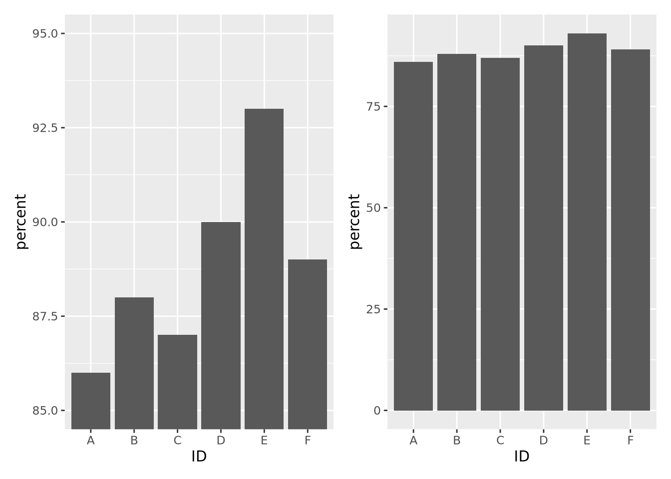
The left plot, which had its y axis limited to the values of the data, make the differences between samples seem visually much larger than they actually are. If a difference between 87 and 93 percent is in fact meaningful, then this might be ok, but the context matters.
You will identify your own strategies over time as you practice data visualization, and these rules of thumb might not work for you. There is no one right way to do data visualization, and as long as you are dedicated to representing your data accurately, there is no wrong way.