- Syllabus
- 1 Introduction
- 2 Data in Biology
- 3 Preliminaries
- 4 R Programming
- 4.1 Before you begin
- 4.2 Introduction
- 4.3 R Syntax Basics
- 4.4 Basic Types of Values
- 4.5 Data Structures
- 4.6 Logical Tests and Comparators
- 4.7 Functions
- 4.8 Iteration
- 4.9 Installing Packages
- 4.10 Saving and Loading R Data
- 4.11 Troubleshooting and Debugging
- 4.12 Coding Style and Conventions
- 4.12.1 Is my code correct?
- 4.12.2 Does my code follow the DRY principle?
- 4.12.3 Did I choose concise but descriptive variable and function names?
- 4.12.4 Did I use indentation and naming conventions consistently throughout my code?
- 4.12.5 Did I write comments, especially when what the code does is not obvious?
- 4.12.6 How easy would it be for someone else to understand my code?
- 4.12.7 Is my code easy to maintain/change?
- 4.12.8 The
stylerpackage
- 5 Data Wrangling
- 6 Data Science
- 7 Data Visualization
- 8 Biology & Bioinformatics
- 8.1 R in Biology
- 8.2 Biological Data Overview
- 8.3 Bioconductor
- 8.4 Microarrays
- 8.5 High Throughput Sequencing
- 8.6 Gene Identifiers
- 8.7 Gene Expression
- 8.7.1 Gene Expression Data in Bioconductor
- 8.7.2 Differential Expression Analysis
- 8.7.3 Microarray Gene Expression Data
- 8.7.4 Differential Expression: Microarrays (limma)
- 8.7.5 RNASeq
- 8.7.6 RNASeq Gene Expression Data
- 8.7.7 Filtering Counts
- 8.7.8 Count Distributions
- 8.7.9 Differential Expression: RNASeq
- 8.8 Gene Set Enrichment Analysis
- 8.9 Biological Networks .
- 9 EngineeRing
- 10 RShiny
- 11 Communicating with R
- 12 Contribution Guide
- Assignments
- Assignment Format
- Starting an Assignment
- Assignment 1
- Assignment 2
- Assignment 3
- Problem Statement
- Learning Objectives
- Skill List
- Background on Microarrays
- Background on Principal Component Analysis
- Marisa et al. Gene Expression Classification of Colon Cancer into Molecular Subtypes: Characterization, Validation, and Prognostic Value. PLoS Medicine, May 2013. PMID: 23700391
- Scaling data using R
scale() - Proportion of variance explained
- Plotting and visualization of PCA
- Hierarchical Clustering and Heatmaps
- References
- Assignment 4
- Assignment 5
- Problem Statement
- Learning Objectives
- Skill List
- DESeq2 Background
- Generating a counts matrix
- Prefiltering Counts matrix
- Median-of-ratios normalization
- DESeq2 preparation
- O’Meara et al. Transcriptional Reversion of Cardiac Myocyte Fate During Mammalian Cardiac Regeneration. Circ Res. Feb 2015. PMID: 25477501l
- 1. Reading and subsetting the data from verse_counts.tsv and sample_metadata.csv
- 2. Running DESeq2
- 3. Annotating results to construct a labeled volcano plot
- 4. Diagnostic plot of the raw p-values for all genes
- 5. Plotting the LogFoldChanges for differentially expressed genes
- The choice of FDR cutoff depends on cost
- 6. Plotting the normalized counts of differentially expressed genes
- 7. Volcano Plot to visualize differential expression results
- 8. Running fgsea vignette
- 9. Plotting the top ten positive NES and top ten negative NES pathways
- References
- Assignment 6
- Assignment 7
- Appendix
- A Class Outlines
6.4 Exploratory Data Analysis
So far, we have discussed methods where we chose an explicit model to summarize our data. However, sometimes we don’t have enough information about our data to propose reasonable models, as we did earlier when exploring the distribution of our imaginary gene expression dataset. There may be patterns in the data that emerge when we compute different summaries and ask whether there is a non-random structure to how the individual samples or features compare with one another. The types of methods we use to take a dataset and examine it for structure without a prefigured hypothesis is called exploratory analysis and is a key approach to working with biological data.
6.4.1 Principal Component Analysis
A very common method of exploratory analysis is principal component analysis or PCA. PCA is a statistical procedure that identifies so called directions of orthogonal variance that capture covariance between different dimensions in a dataset. Because the approach captures this covariance between features of arbitrary dimension, it is often used for so-called dimensionality reduction, where a large amount of variance in a dataset with a potentially large number of dimensions may be expressed in terms of a set of basis vectors of smaller dimension. The mathematical details of this approach are beyond the scope of this book, but below we explain in general terms the intuition behind what PCA does, and present an example of how it is used in a biological context.
PCA decomposes a dataset into a set of orthonormal basis vectors that collectively capture all the variance in the dataset, where the first basis vector, called the first principal component explains the largest fraction of the variance, the second principal component explains the second largest fraction, and so on. There are always an equal number of principal components as there are dimensions in the dataset or the number of samples, whichever is smaller. Typically only a small number of these components are needed to explain most of the variance.
Each principal component is a \(p\)-dimensional unit vector (i.e. a vector of magnitude 1), where \(p\) is the number of features in the dataset, and the values are weights that describe the component’s direction of variance. By multiplying this component with the values in each sample, we obtain the projection of each sample with respect to the basis of the component. The projections of each sample made with each principal component produces a rotation of the dataset in \(p\) dimensional space. The figure below presents a geometric intuition of PCA.
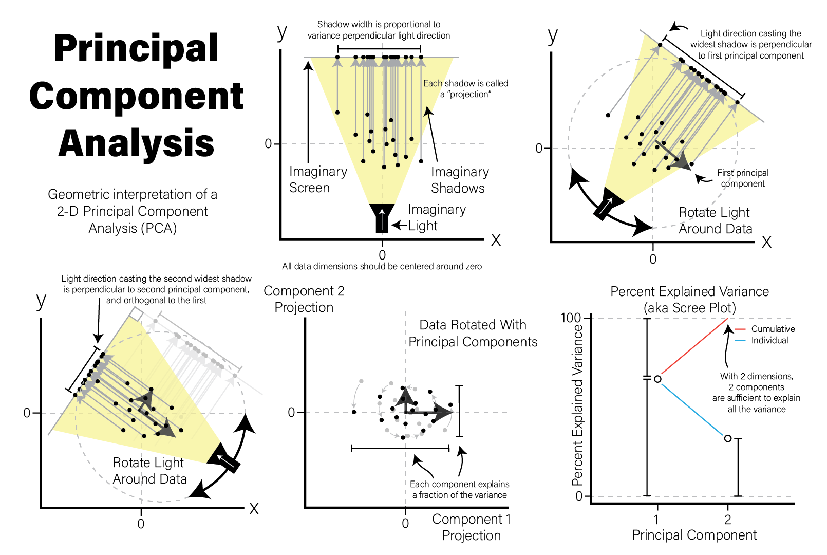
Principal Component Analysis - Geometric Intuition Illustration
Many biological datasets, especially those that make genome-wide measurements
like with gene expression assays, have many thousands of features (e.g. genes)
and comparatively few samples. Since PCA can only determine a maximum number of
principal components as the smaller of the number of features or samples, we
will almost always only have as many components as samples. To demonstrate this,
we perform PCA using the
stats::prcomp()
function on an example microarray gene expression intensity dataset:
# intensities contains microarray expression data for ~54k probesets x 20 samples

# transpose expression values so samples are rows
expr_mat <- intensities %>%
  pivot_longer(-c(probeset_id),names_to="sample") %>%
  pivot_wider(names_from=probeset_id)

# PCA expects all features (i.e. probesets) to be mean-centered,
# convert to dataframe so we can use rownames
expr_mat_centered <-  as.data.frame(
  lapply(dplyr::select(expr_mat,-c(sample)),function(x) x-mean(x))
)
rownames(expr_mat_centered) <- expr_mat$sample

# prcomp performs PCA
pca <- prcomp(
  expr_mat_centered,
  center=FALSE, # prcomp centers features to have mean zero by default, but we already did it
  scale=TRUE # prcomp scales each feature to have unit variance
)

# the str() function prints the structure of its argument
str(pca)
## List of 5
## $ sdev : num [1:20] 101.5 81 71.2 61.9 57.9 ...
## $ rotation: num [1:54675, 1:20] 0.00219 0.00173 -0.00313 0.00465 0.0034 ...
## ..- attr(*, "dimnames")=List of 2
## .. ..$ : chr [1:54675] "X1007_s_at" "X1053_at" "X117_at" "X121_at" ...
## .. ..$ : chr [1:20] "PC1" "PC2" "PC3" "PC4" ...
## $ center : logi FALSE
## $ scale : Named num [1:54675] 0.379 0.46 0.628 0.272 0.196 ...
## ..- attr(*, "names")= chr [1:54675] "X1007_s_at" "X1053_at" "X117_at" "X121_at" ...
## $ x : num [1:20, 1:20] -67.94 186.14 6.07 -70.72 9.58 ...
## ..- attr(*, "dimnames")=List of 2
## .. ..$ : chr [1:20] "A1" "A2" "A3" "A4" ...
## .. ..$ : chr [1:20] "PC1" "PC2" "PC3" "PC4" ...
## - attr(*, "class")= chr "prcomp"The result of prcomp() is a list with five members:
sdev- the standard deviation (i.e. the square root of the variance) for each componentrotation- a matrix where the principal components are in columnsx- the projections of the original data, aka the rotated data matrixcenter- ifcenter=TRUEwas passed, a vector of feature meansscale- ifscale=TRUEwas passed, a vector of the feature variances
Recall that each principal component explains a fraction of the overall variance
in the dataset. The sdev variable returned by prcomp() may be used to first
calculate the variance explained by each component by squaring it, then dividing
by the sum:
library(patchwork)
pca_var <- tibble(
  PC=factor(str_c("PC",1:20),str_c("PC",1:20)),
  Variance=pca$sdev**2,
  `% Explained Variance`=Variance/sum(Variance)*100,
  `Cumulative % Explained Variance`=cumsum(`% Explained Variance`)
)

exp_g <- pca_var %>%
  ggplot(aes(x=PC,y=`% Explained Variance`,group=1)) +
  geom_point() +
  geom_line() +
  theme(axis.text.x=element_text(angle=90,hjust=0,vjust=0.5)) # make x labels rotate 90 degrees

cum_g <- pca_var %>%
  ggplot(aes(x=PC,y=`Cumulative % Explained Variance`,group=1)) +
  geom_point() +
  geom_line() +
  ylim(0,100) + # set y limits to [0,100]
  theme(axis.text.x=element_text(angle=90,hjust=0,vjust=0.5))

exp_g | cum_g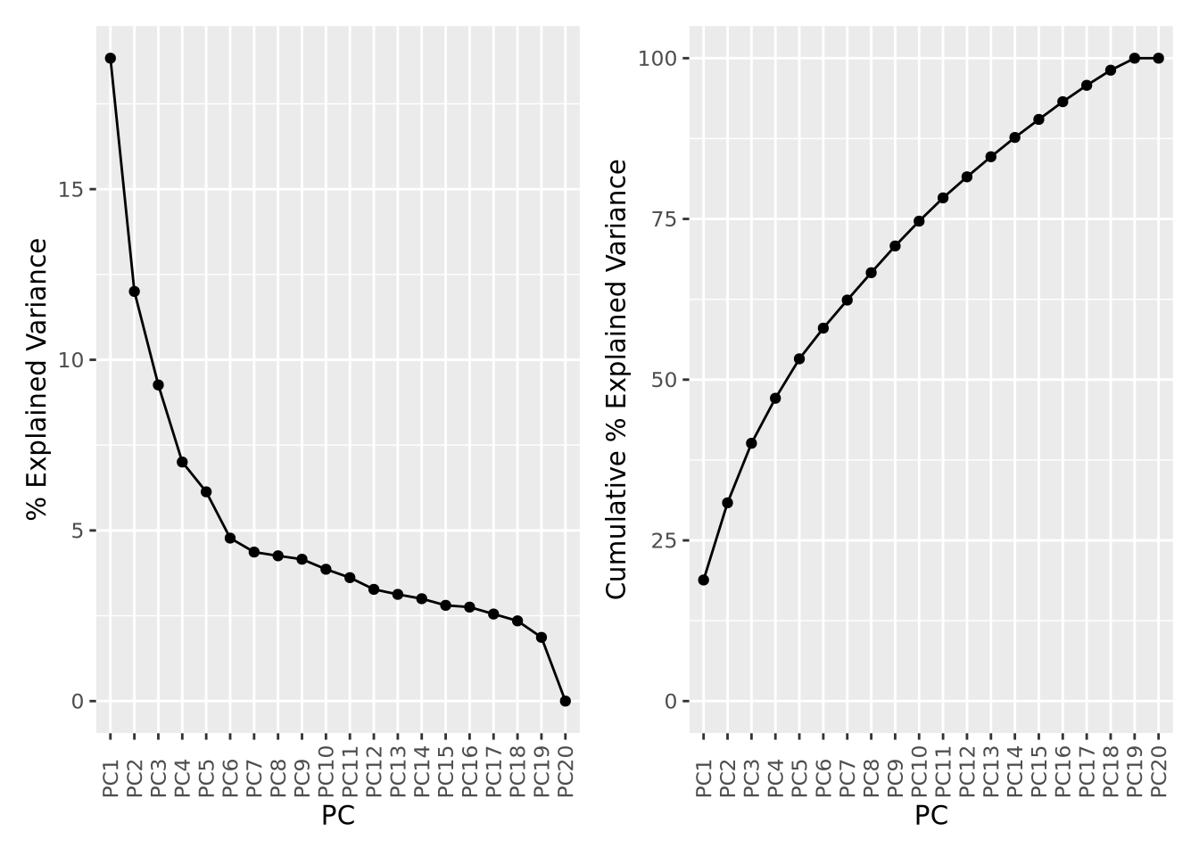
The first component explains nearly 20% of all variance in the dataset, followed by the second component with about 12%, the third component 9%, and so on. The cumulative variance plot on the right shows that the top 15 components are required to capture 90% of the variance in the dataset. This suggests that each sample contributes a significant amount of variance to the overall dataset, but that there are still some features that covary among them.
An important use of PCA results is the identification of outlier samples. This is accomplished by plotting the projections of each sample and examining the result by eye to identify samples that are “far away” from the other samples. This is usually done by inspection and outlier samples chosen subjectively; there are no general rules to decide when a sample is an outlier by this method. Below the projections for components 1 and 2 are plotted against each other as a scatter plot:
as_tibble(pca$x) %>%
  ggplot(aes(x=PC1,y=PC2)) +
  geom_point()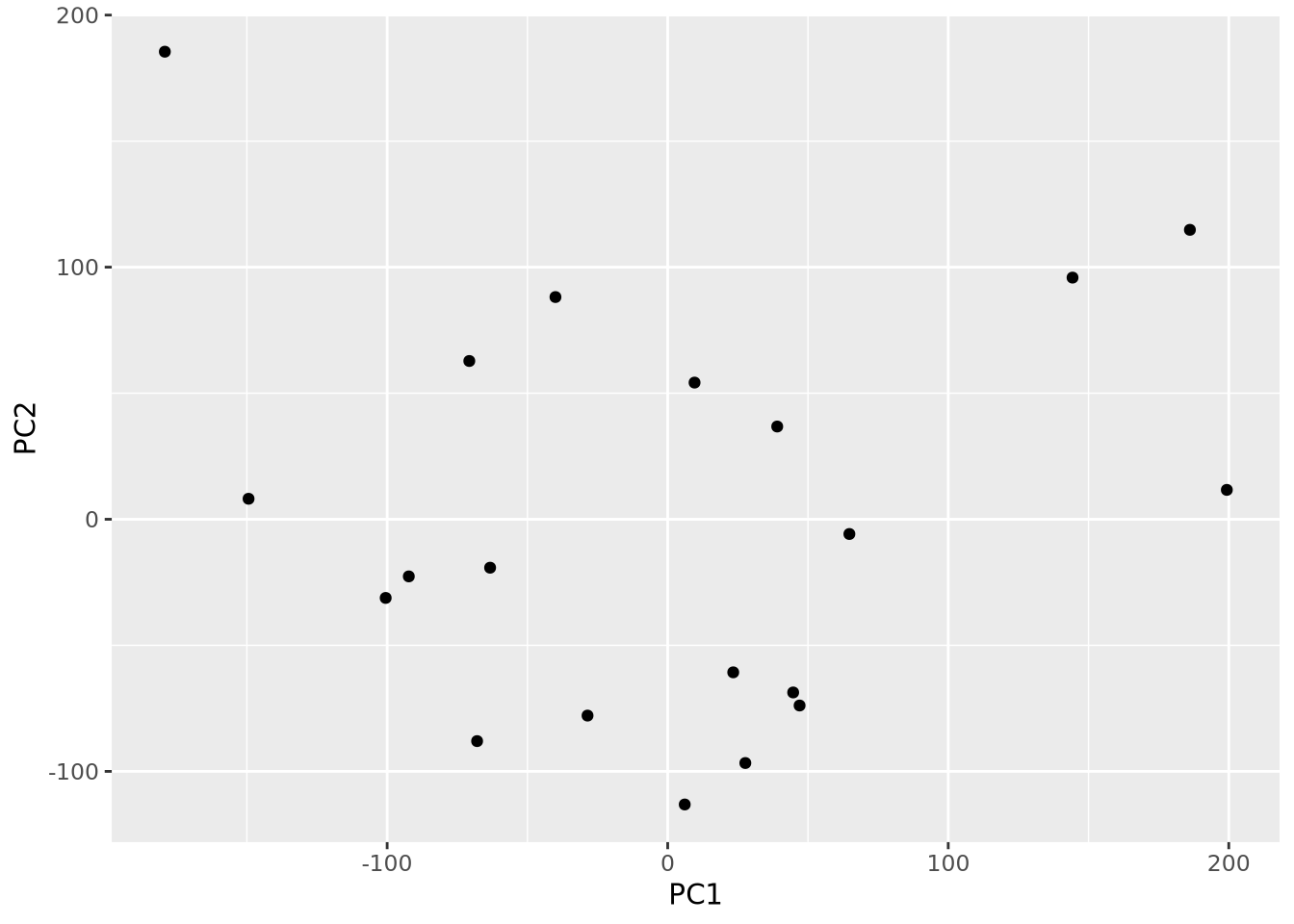
By eye, no samples appear to be obvious outliers. However, this plot is just one
of many pairs of projections. We could plot all pairs of the first six
components using the ggpairs() function in the
GGally package:
library(GGally)
as_tibble(pca$x) %>%
  dplyr::select(PC1:PC6) %>%
  ggpairs()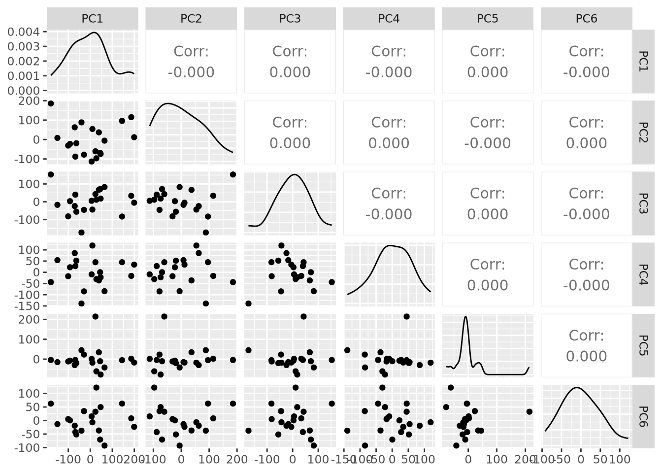
This is already nearly unintelligible and mostly uninformative. While it is very common for projections for pairs of components to be plotted, an alternative way to visualize projections across all samples is by plotting the distribution of projections for each component using a beeswarm plot:
as_tibble(pca$x) %>%
  pivot_longer(everything(),names_to="PC",values_to="projection") %>%
  mutate(PC=fct_relevel(PC,str_c("PC",1:20))) %>%
  ggplot(aes(x=PC,y=projection)) +
  geom_beeswarm() + labs(title="PCA Projection Plot") +
  theme(axis.text.x=element_text(angle=90,hjust=0,vjust=0.5))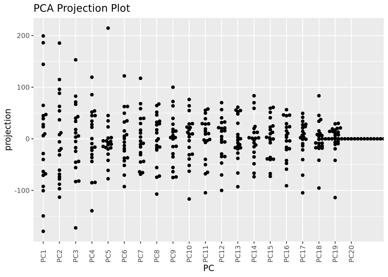
Now we can see all the projections for all components in the same plot, although we cannot see how they relate to one another.
These projection plots may become more useful if we layer on additional
information about our samples. There are two types of samples in our dataset (
labelled A and C. We can color our pairwise scatter plot by type like so:
as_tibble(pca$x) %>%
  mutate(type=stringr::str_sub(rownames(pca$x),1,1)) %>%
  ggplot(aes(x=PC1,y=PC2,color=type)) +
  geom_point()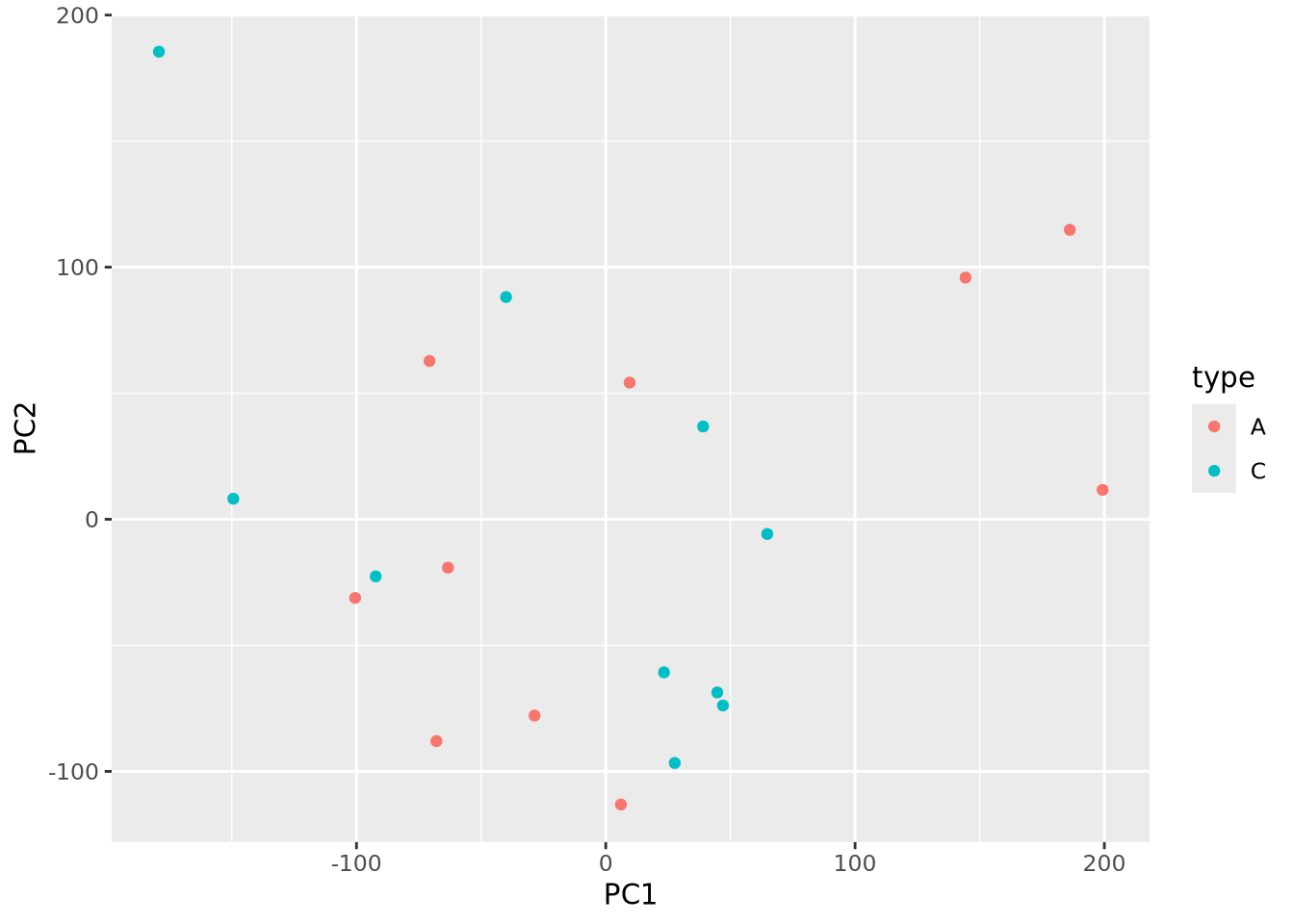
Little pattern is obvious from the plot, but we can plot pairs of components as before but now with type information:
library(GGally)
as_tibble(pca$x) %>%
  mutate(type=stringr::str_sub(rownames(pca$x),1,1)) %>%
  dplyr::select(c(type,PC1:PC6)) %>%
  ggpairs(columns=1:6,mapping=aes(fill=type))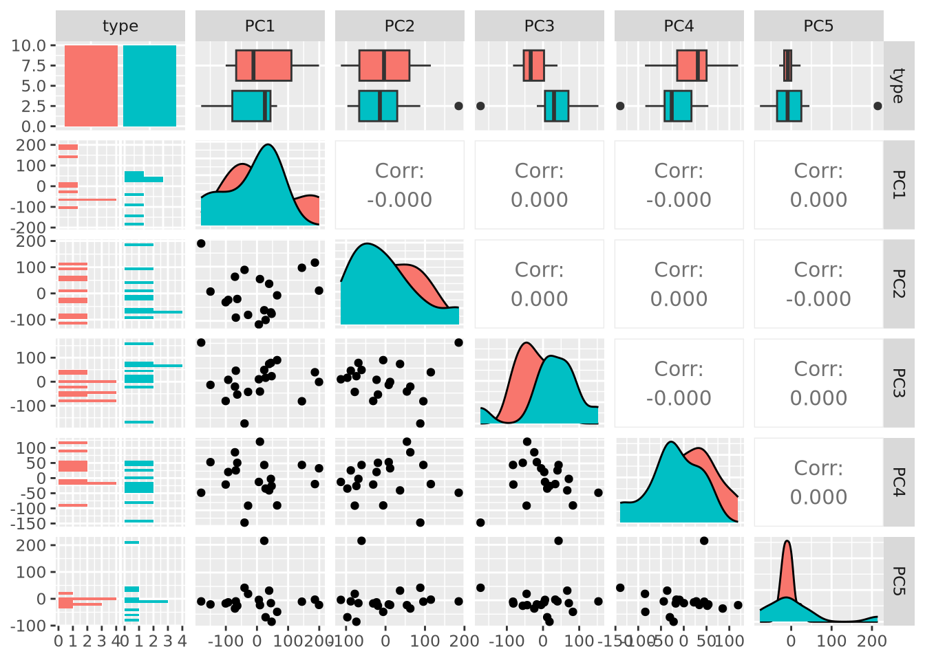
Examining PC3 and PC4, we now observe that there may indeed be some genes that distinguish between types based on the separation of projection scores for the two types. Finally, we can also color our beeswarm plot by type:
as_tibble(pca$x) %>%
  mutate(
    sample=rownames(pca$x),
    type=stringr::str_sub(sample,1,1)
  ) %>%
  pivot_longer(PC1:PC20,names_to="PC",values_to="projection") %>%
  mutate(PC=fct_relevel(PC,str_c("PC",1:20))) %>%
  ggplot(aes(x=PC,y=projection,color=type)) +
  geom_beeswarm() + labs(title="PCA Projection Plot") +
  theme(axis.text.x=element_text(angle=90,hjust=0,vjust=0.5))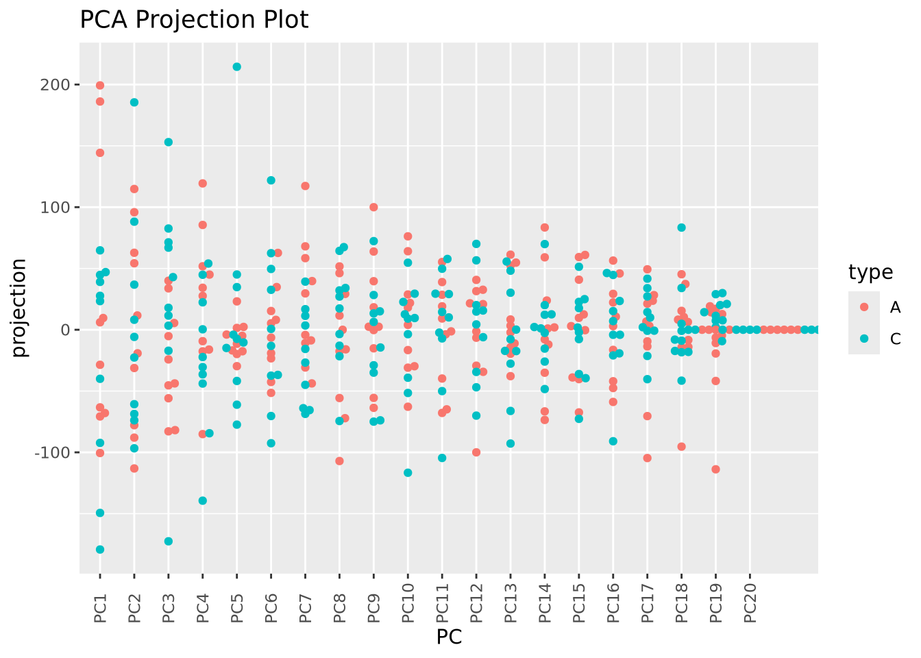
These approaches to plotting the results of a PCA are complementary, and all may be useful in understanding the structure of a dataset.
6.4.2 Cluster Analysis
Cluster analysis or simple clustering is the task of grouping objects together such that objects within the same group, or cluster, are more similar to each other than to objects in other clusters. It is a type of exploratory data analysis that seeks to identify structure or organization in a dataset without making strong assumptions about the data or testing a specific hypothesis. Many different clustering algorithms have been developed that employ different computational strategies and are designed for data with different types and properties. The choice of algorithm is often dependent upon not only the type of data being clustered but also the comparative performance of different clustering algorithms applied to the same data. Different algorithms may identify different types of patterns, and so no one clustering method is better than any other in general.
The goal of clustering may be easily illustrated with the following plot:
unclustered <- ggplot(well_clustered_data, aes(x=f1,y=f2)) +
  geom_point() +
  labs(title="Unclustered")
clustered <- ggplot(well_clustered_data, aes(x=f1,y=f2,color=cluster,shape=cluster)) +
  geom_point() +
  labs(title="Clustered")

unclustered | clustered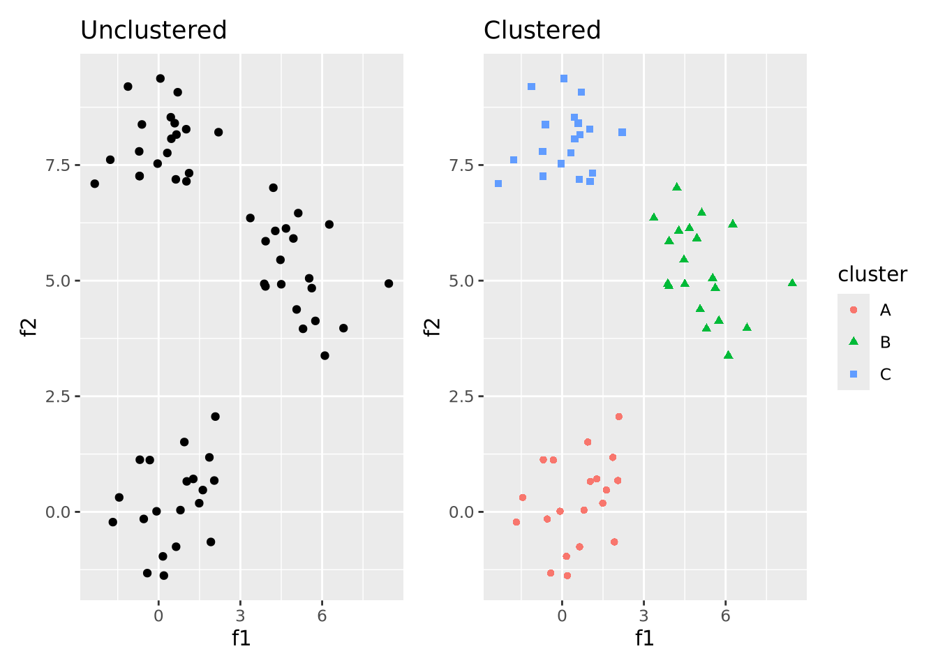
That is, the goal of clustering is to take unlabeled data that has some structure like on the left and label data points that are similar to one another to be in the same cluster. A full treatment of cluster analysis is beyond the scope of this book, but below we discuss a few of the most common and general clustering algorithms used in biology and bioinformatics.
6.4.2.1 Hierarchical Clustering
Hierarchical clustering is a form of clustering that clusters data points together in nested, or hierarchical, groups based on their dissimilarity from one another. There are two broad strategies to accomplish this:
- Agglomerative: all data points start in their own groups, and groups are iteratively merged hierarchically into larger groups based on their similarity until all data points have been added to a group
- Divisive: all data points start in the same group, and are recursively split into smaller groups based on their dissimilarity
Whichever approach is used, the critical step in clustering is choosing the distance function that quantifies how dissimilar two data points are. Distance functions, or metrics are non-negative real numbers whose magnitude is proportional to some notion of distance between a pair of points. There are many different distance functions to choose from, and the choice is made based on the type of data being clustered. For numeric data, euclidean distance, which corresponds to the length of a line segment drawn between two points in any \(n\)-dimensional Euclidean space is often a reasonable choice.
Because the divisive strategy is conceptually the inverse of agglomerative clustering, we will limit our description to agglomerative clustering. Once the distance function has been chosen, distances between all pairs of points are computed and the two nearest points are merged into a group. The new group of points is used for computing distances to all other points as a set using a linkage function which defines how the group is summarized into a single point for the purposes of distance calculation. The linkage function is what distinguishes different clustering algorithms, which include:
- Single-linkage - distance between two groups is computed as the distance between the two nearest members of the groups
- Complete-linkage - distance between two groups is computed as the distance between the two farthest members of the groups
- Unweighted Pair Group Method with Arithmetic mean (UPGMA) - distance between two groups is the average distance of all pairs of points between groups
- Weighted Pair Group Method with Arithmetic mean (WPGMA) - similar to UPGMA, but weights distances from pairs of groups evenly when merging
The choice of linkage function (and therefore clustering algorithm) should be determined based on knowledge of the dataset and assessment of clustering performance. In general, there is no one linkage function that will always perform well.
The following figure illustrates a simple example of clustering a 1 dimensional set of points using WPGMA:
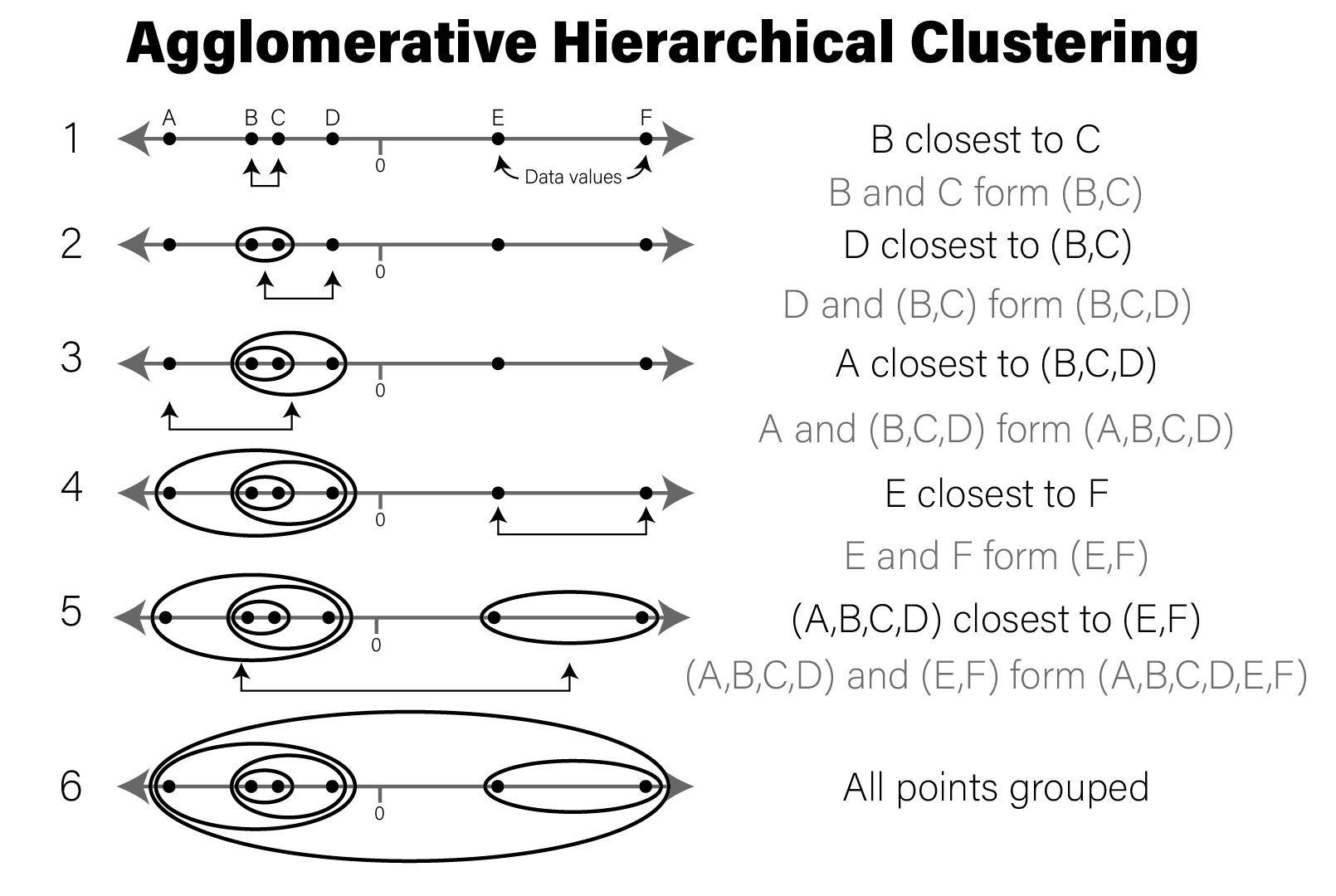
Conceptual illustration of agglomerative hierarchical clustering
Below we will cluster the synthetic dataset introduced above in R:
ggplot(well_clustered_data, aes(x=f1,y=f2)) +
  geom_point() +
  labs(title="Unclustered")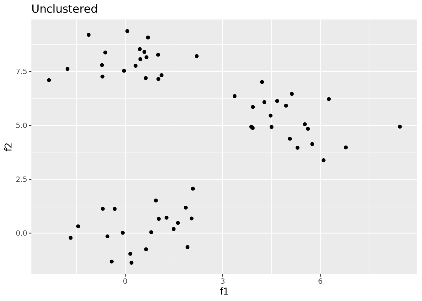
This synthetic dataset has two distinct groups of samples drawn from
multivariate normal samples. To hierarchically cluster these samples, we use the
dist()
and hclust()
functions:
# compute all pairwise distances using euclidean distance as the distance metric
euc_dist <- dist(dplyr::select(well_clustered_data,-ID))

# produce a clustering of the data using the hclust for hierarchical clustering
hc <- hclust(euc_dist, method="ave")

# add ID as labels to the clustering object
hc$labels <- well_clustered_data$ID


str(hc)
## List of 7
## $ merge : int [1:59, 1:2] -50 -33 -48 -46 -44 -21 -11 -4 -36 -3 ...
## $ height : num [1:59] 0.00429 0.08695 0.23536 0.24789 0.25588 ...
## $ order : int [1:60] 8 9 7 6 19 18 11 16 4 14 ...
## $ labels : chr [1:60] "A1" "A2" "A3" "A4" ...
## $ method : chr "average"
## $ call : language hclust(d = euc_dist, method = "ave")
## $ dist.method: chr "euclidean"
## - attr(*, "class")= chr "hclust"The hclust() return object describes the clustering as a tree that can be
visualized using a dendrogram:
library(ggdendro)
ggdendrogram(hc)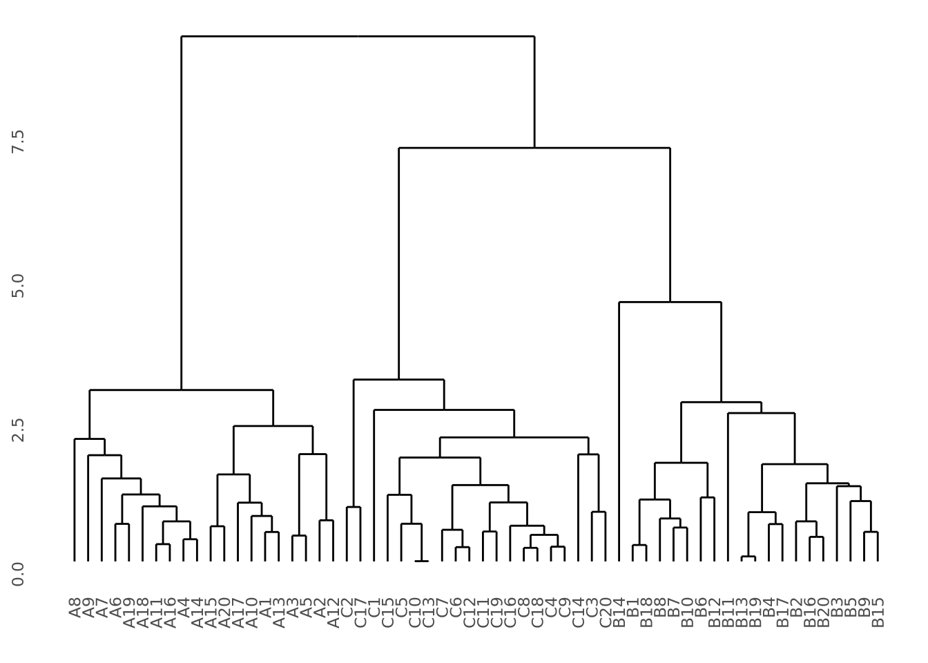 Our data do indeed cluster well, where all samples from the same group cluster
together perfectly. See the dendrogram section in the data
vizualization chapter for more detail on how to plot clustering
results.
Our data do indeed cluster well, where all samples from the same group cluster
together perfectly. See the dendrogram section in the data
vizualization chapter for more detail on how to plot clustering
results.
It is sometimes desirable to use split hierarchical clustering into groups based
on their pattern. In the above clustering, three discrete clusters corresponding
sample groups are clearly visible. If we wished to separate these three groups,
we can use the
cutree
to divide the tree into three groups using k=3:
labels <- cutree(hc,k=3)
labels
## A1 A2 A3 A4 A5 A6 A7 A8 A9 A10 A11 A12 A13 A14 A15 A16 A17 A18 A19 A20
## 1 1 1 1 1 1 1 1 1 1 1 1 1 1 1 1 1 1 1 1
## B1 B2 B3 B4 B5 B6 B7 B8 B9 B10 B11 B12 B13 B14 B15 B16 B17 B18 B19 B20
## 2 2 2 2 2 2 2 2 2 2 2 2 2 2 2 2 2 2 2 2
## C1 C2 C3 C4 C5 C6 C7 C8 C9 C10 C11 C12 C13 C14 C15 C16 C17 C18 C19 C20
## 3 3 3 3 3 3 3 3 3 3 3 3 3 3 3 3 3 3 3 3We can then use these samples and labels to color our original plot as desired:
# we turn our labels into a tibble so we can join them with the original tibble
well_clustered_data %>%
  left_join(
    tibble(
      ID=names(labels),
      label=as.factor(labels)
    )
  ) %>%
  ggplot(aes(x=f1,y=f2,color=label)) +
  geom_point() +
  labs(title="Clustered")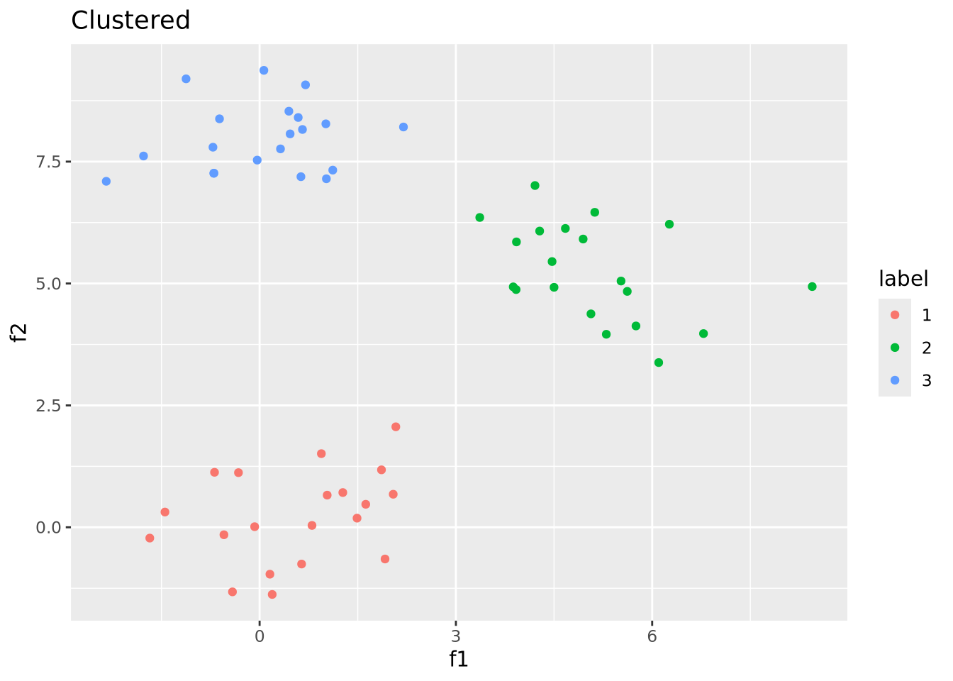
We were able to recover the correct clustering because this dataset was easy to cluster by construction. Real data are seldom so well behaved.