9 Biology & Bioinformatics
9.1 R in Biology
R became popular in biological data analysis in the early to mid 2000s, when microarray technology came into widespread use enabling researchers to look for statistical differences in gene expression for thousands of genes across large numbers of samples. As a result of this popularity, a community of biological researchers and data analysts created a collection of software packages called Bioconductor, which made a vast array of cutting edge statistical and bioinformatic methodologies widely available.
Due to its ease of use, widespread community support, rich ecosystem of biological data analysis packages, and to it being free, R remains one of the primary languages of biological data analysis. The language’s early focus on statistical analysis, and later transition to data science in general, makes it very useful and accessible to perform the kinds of analyses the new data science of biology required. It is also a bridge between biologists without a computational background and statisticians and bioinformaticians, who invent new methods and implement them as R packages that are easily accessible by all. The language and the package ecosystems and communities it supports continue to be a major source of biological discovery and innovation.
As a data science, biology benefits from the main strengths of R and the tidyverse when combined with the powerful analytical techniques available in Bioconductor packages, namely to manipulate, visualize, analyze, and communicate biological data.
9.2 Biological Data Overview
9.2.1 Types of Biological Data
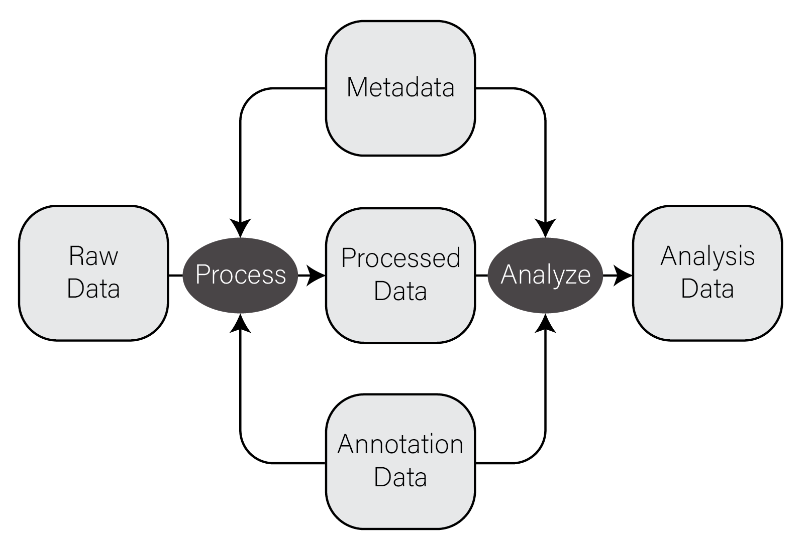
In very general terms, there are five types of data used in biological data analysis: raw/primary data, processed data, analysis results, metadata, and annotation data.
Raw/primary data. These data are the primary observations made by whatever instruments/techniques we are using for our experiment. These may include high-throughput sequencing data, mass/charge ratio data from mass spectrometry, 16S rRNA sequencing data from metagenomic studies, SNPs from genotyping assays, etc. These data can be very large and are often not efficiently processed using R. Instead, specialized tools built outside of R are used to first process the primary data into a form that is amenable to analysis. The most common primary biological data types include Microarrays, High Throughput Sequencing data, and mass spectrometry data.
Processed data. Processed data is the result of any analysis or transformation of primary data into an intermediate, more interpretable form. For example, when performing gene expression analysis with RNASeq, short reads that form the primary data are typically aligned against a genome and then counted against annotated genes, resulting in a count for each gene in the genome. Typically, these counts are then combined for many samples into a single matrix and subject to downstream analyses like differential expression.
Analysis results. Analysis results aren’t data per se, but are the results of analysis of primary data or processed results. For example, in gene expression studies, a first analysis is often differential expression, where each gene in the genome is tested for expression associated with some outcome of interest across many samples. Each gene then has a number of statistics and related values, like log2 fold change, nominal and adjusted p-value, etc. These forms of data are usually what we use to form interpretations of our datasets and therefore we must manipulate them in much the same way as any other dataset.
Metadata. In most experimental settings, multiple samples have been processed and had the same primary data type collected. These samples also have information associated with them, which is here termed metadata, or “data about data”. In our gene expression of post mortem brain experiments mentioned above, the information about the individuals themselves, including age at death, whether the person had a disease, the measurements of tissue quality, etc. is the metadata. The primary and processed data and metadata are usually stored in different files, where the metadata (or sample information or sample data, etc) will have one column indicating the unique identifier (ID) of each sample. The processed data will typically have columns named for each of the sample IDs.
Annotation data. A tremendous amount of knowledge has been generated about biological entities, e.g. genes, especially since the publication of the human genome. Annotation data is publicly available information about the features we measure in our experiments. This may come in the form of the coordinates in a genome where genes exist, any known functions of those genes, the domains found in proteins and their relative sequence, gene identifier cross references across different gene naming systems (e.g. symbol vs Ensembl ID), single nucleotide polymorphism genomic locations and associations with traits or diseases, etc. This is information that we use to aid in interpretation of our experimental data but generally do not generate ourselves. Annotation data comes in many forms, some of which are in CSV format.
The figure below contains a simple diagram of how these different types of data work together for a typical biological data analysis.
9.2.2 CSV Files
The most common, convenient, and flexible data file format in biology and
bioinformatics is the character-delimited or character-separated text file.
These files are plain text files (i.e. not the native file format of any
specific program, like Excel) that generally contain rectangles of data. When
formatted correctly, you can think of these files as containing a grid or matrix
of data values with some number of columns, each of which has the same number of
values. Each line of these files has some number of data values separated by a
consistent character, most commonly the comma which are called comma-separated
value, or “CSV”, files
and filenames typically end with the extension .csv. Note that
other characters, especially the
id,somevalue,category,genes
1,2.123,A,APOE
4,5.123,B,"HOXA1,HOXB1"
7,8.123,,SNCA
Some properties and principles of CSV files:
- The first line often but not always contains the column names of each column
- Each value is delimited by the same character, in this case
, - Values can be any value, including numbers and characters
- When a value contains the delimiting character (e.g. HOXA1,HOXB1 contains a
,), the value is wrapped in double quotes - Values can be missing, indicated by sequential delimiters (i.e.
,,or one,at the end of the line, if the last column value is missing) - There is no delimiter at the end of the lines
- To be well-formatted every line must have the same number of delimited values
These same properties and principles apply to all character-separated files, regardless of the specific delimiter used. If a file follows these principles, they can be loaded very easily into R or any other data analysis setting. ### Common Biological Data Matrices
Typically the first data set you will work with in R is processed data as described in the previous section. This data has been transformed from primary data in some way such that it (usually) forms a numeric matrix with features as rows and samples as columns. The first column of these files usually contains a feature identifier, e.g. gene identifier, genomic locus, probe set ID, etc and the remaining columns have numerical values, one per sample. The first row is usually column names for all the columns in the file. Below is an example of one of these files from a microarray gene expression dataset loaded into R:
intensities <- read_csv("example_intensity_data.csv")
intensities
# A tibble: 54,675 x 36
   probe     GSM972389 GSM972390 GSM972396 GSM972401 GSM972409 GSM972412 GSM972413 GSM972422 GSM972429
   <chr>         <dbl>     <dbl>     <dbl>     <dbl>     <dbl>     <dbl>     <dbl>     <dbl>     <dbl>
 1 1007_s_at      9.54     10.2       9.72      9.68      9.35      9.89      9.70      9.67      9.87
 2 1053_at        7.62      7.92      7.17      7.24      8.20      6.87      6.62      7.23      7.45
 3 117_at         5.50      5.56      5.06      7.44      5.19      5.72      5.87      6.15      5.46
 4 121_at         7.27      7.96      7.42      7.34      7.49      7.76      7.44      7.66      8.02
 5 1255_g_at      2.79      3.10      2.78      2.91      3.02      2.73      2.78      3.56      2.83
 6 1294_at        7.51      7.28      7.00      7.18      7.38      6.98      6.90      7.54      7.66
 7 1316_at        3.89      4.36      4.24      3.94      4.20      4.34      4.06      4.24      4.11
 8 1320_at        4.65      4.91      4.70      4.78      5.06      4.71      4.55      4.58      5.10
 9 1405_i_at      8.03      7.47      5.42      7.21      9.48      6.79      6.57      8.50      6.36
10 1431_at        3.09      3.78      3.33      3.12      3.21      3.27      3.37      3.84      3.32
# ... with 54,665 more rows, and 26 more variables: GSM972433 <dbl>, GSM972438 <dbl>, GSM972440 <dbl>,
#   GSM972443 <dbl>, GSM972444 <dbl>, GSM972446 <dbl>, GSM972453 <dbl>, GSM972457 <dbl>,
#   GSM972459 <dbl>, GSM972463 <dbl>, GSM972467 <dbl>, GSM972472 <dbl>, GSM972473 <dbl>,
#   GSM972475 <dbl>, GSM972476 <dbl>, GSM972477 <dbl>, GSM972479 <dbl>, GSM972480 <dbl>,
#   GSM972487 <dbl>, GSM972488 <dbl>, GSM972489 <dbl>, GSM972496 <dbl>, GSM972502 <dbl>,
#   GSM972510 <dbl>, GSM972512 <dbl>, GSM972521 <dbl>
The file has 54,676 rows, consisting of one header row which R loads in as the
column names, and the remaining are probe sets, one per row. There are 36
columns, where the first contains the probe set ID (e.g. 1007_s_at) and the
remaining 35 columns correspond to samples.
9.2.3 Biological data is NOT Tidy!
As mentioned in the tidy data section, the tidyverse packages assume data to be in so-called “tidy format”, with variables as columns and observations as rows. Unfortunately, certain forms of biological data are typically available in the opposite orientation - variables are in rows and observations are in columns. This is primarily true in feature data matrices, e.g. gene expression counts matrices, where the number of variables (e.g. genes) is much larger than the number of samples, which tend to be small very small compared with the number of features. This format is convenient for humans to interact with using, e.g. spreadsheet programs like Microsoft Excel, but can unfortunately make performing certain operations on them challenging in tidyverse.
For example, consider the microarray expression dataset in the previous section. Each of the 54,676 rows is a probeset, and each of the 35 numeric columns is a sample. This is a very large number of probesets to consider, especially if we plan to conduct a statistical test on each, which would impose a substantial multiple hypothesis testing burden on our results. We may therefore wish to eliminate probesets that have very low variance from the overall dataset, since these probesets are not likely to have a detectable statistical difference in our tests. However, computing the variance for each probeset is a computation across all columns, not on columns themselves, and this is not what tidyverse is designed to do well. Said differently, R and tidyverse do not operate by default on the rows of a data frame, tibble, or matrix.
Both base R and tidyverse are optimized to perform computations on columns, not rows. The reasons for this are buried in the details of how the R program itself was written to organize data internally and are beyond the scope of this book. The consequence of this design choice is that, while we can perform operations on the rows rather than the columns of a data structure, our code may perform very poorly (i.e. take a very long time to run).
When working with these datasets, we have a couple options to deal with this issue:
Pivot into long format. As described in the Rearranging Data section, we can rearrange our tibble to be more amenable to certain computations. In our earlier example, we wish to group all of our measurements by probeset and compute the variance of each, then possibly filter out probesets based on low variance. We can therefore combine
pivot_longer(),group_by(),summarize(), and finallyleft_join()to perform this operation. Exactly how to do this is left as an exercise in [Assignment 1].-
Compute row-wise statistics using
apply(). As described in Iteration, R is a functional programming language and implements iteration in a functional style using theapply()function. Theapply() functionaccepts aMARGINargument of 1 or 2 if the provided function is to be applied to the columns or rows, respectively. This method can be used to compute a summary statistic on each row of a tibble and the result saved back into the tibble using the column set operator:intensity_variance <- apply(intensities, 2, var) intensities$variance <- intensity_variance
9.3 Bioconductor
Bioconductor is an organized collection of strictly biological analysis methods packages for R. These packages are hosted and maintained outside of CRAN because the maintainers enforce a more rigorous set of coding quality, testing, and documentation standards than is required by normal R packages. These stricter requirements arose from a recognition that software packages are generally only as usable as their documentation allows them to be, and also that many if not most of the users of these packages are not statisticians or experienced computer programmers. Rather, they are people like us: biological analysis practitioners who may or may not have substantial coding experience but must analyze our data nonetheless. The excellent documentation and community support of the bioconductor ecosystem is a primary reason why R is such a popular language in biological analysis.
Bioconductor is divided into roughly two sets of packages: core maintainer packages and user contributed packages. The core maintainer packages are among the most critical, because they define a set of common objects and classes (e.g. the ExpressionSet class in the Biobase package) that all Bioconductor packages know how to work with. This common base provides consistency among all Bioconductor packages thereby streamlining the learning process. User contributed and maintained packages provide specialized functionality for specific types of analysis.
Bioconductor itself must be installed prior to installing other Bioconductor packages. To [install bioconductor], you can run the following:
if (!require("BiocManager", quietly = TRUE))
    install.packages("BiocManager")
BiocManager::install(version = "3.14")
Bioconductor undergoes regular releases indicated by a version, e.g. version = "3.14" at the time of writing. Every bioconductor package also has a version,
and each of those versions may or may not be compatible with a specific version
of Bioconductor. To make matters worse, Bioconductor versions are only
compatible with certain versions of R. Bioconductor version 3.14 requires R
version 4.1.0, and will not work with older R versions. These versions can cause
major version compatibility issues when you are forced to use older versions of
R, as may sometimes be the case on managed compute clusters. There is not a good
general solution for ensuring all your packages work together, but the general
best rule of thumb is to use the most current version of R and all packages at
the time when you write your code.
The BiocManager package is the only Bioconductor package installable using
install.packages(). After installing the BiocManager package, you may then
install bioconductor packages:
# installs the affy bioconductor package for microarray analysis
BiocManager::install("affy")
One key aspect of Bioconductor packages is consistent and helpful documentation; every package page on the Bioconductor.org site lists a block of code that will install the package, e.g. for the affy package. In addition, Biconductor provides three types of documentation:
- Workflow tutorials on how to perform specific analysis use cases
- Package vignettes for every package, which provide a worked example of how to use the package that can be adapted by the user to their specific case
- Detailed, consistently formatted reference documentation that gives precise information on functionality and use of each package
The thorough and useful documentation of packages in Bioconductor is one of the reasons why the package ecosystem, and R, is so widely used in biology and bioinformatics.
The base Bioconductor packages define convenient data structures for storing and analyzing many types of data. Recall earlier in the Types of Biological Data section, we described five types of biological data: primary, processed, analysis, metadata, and annotation data. Bioconductor provides a convenient class for storing many of these different data types together in one place, specifically the SummarizedExperiment class in the package of the same name package. An illustration of what a SummarizedExperiment object stores is below, from the Bioconductor maintainer’s paper in Nature:
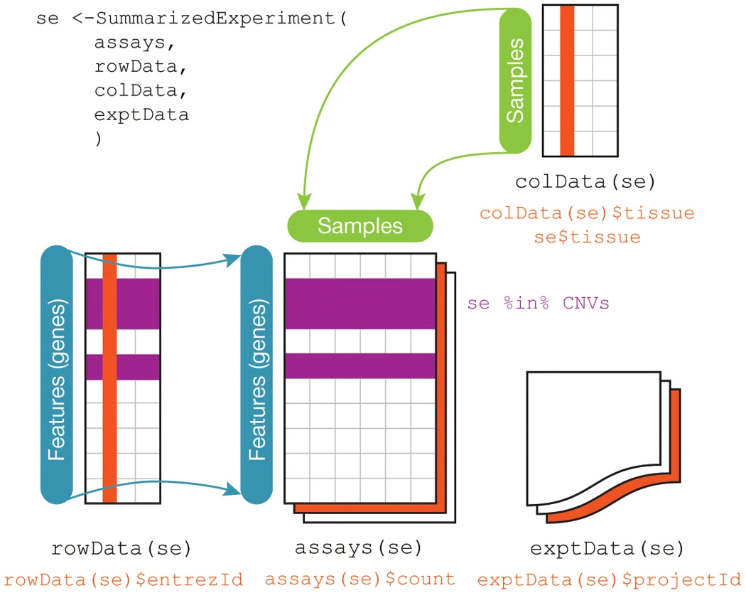
As you can see from the figure, this class stores processed data (assays),
metadata (colData and exptData), and annotation data (rowData). The
SummarizedExperiment class is used ubiquitously throughout the Bioconductor
package ecosystem, as are other core classes some of which we will cover later
in this chapter.
9.4 Microarrays
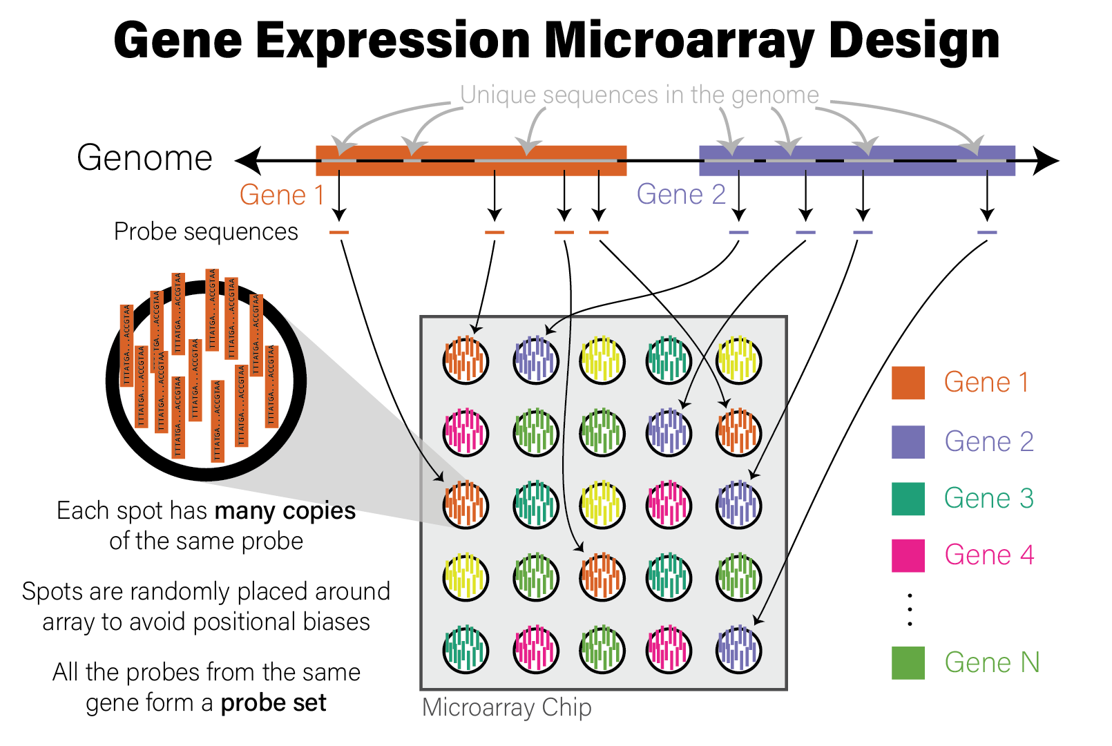
Microarrays are devices that measure the relative abundance of thousands of distinct DNA sequences simultaneously. Short (~25 nucleotide) single-stranded DNA molecules called probes are deposited on a small glass slide in a grid of spots, where each spot contains many copies of a probe with identical sequence. The probe sequences are selected a priori based on the purpose of the array. For example, gene expression microarrays have probes that correspond to the coding regions of the genome for a species of interest, while genotyping microarrays use sequences with known variants found in a population of genomes, most often the human population. Microarrays of the same type (e.g. human gene expression) all have the same set of probes. The choice of DNA sequence probes therefore determines what the microarray measures and how to interpret the data. The design of a microarray is illustrated in the following figure.
A microarray device generates data by applying a specially prepared DNA sample to it; the sample usually corresponds to a single biological specimen, e.g. an individual patient. The preparation method for the sample depends on what is being measured:
- When measuring DNA directly, e.g. genetic variants, the DNA itself is biochemically extracted
- When measuring gene expression via RNA abundance, RNA is first extracted and then reverse transcribed to complementary DNA (cDNA)
In either case, the molecules that will be applied to the microarray are DNA molecules. After extraction and preparation, the DNA molecules are then randomly cut up into shorter molecules (i.e. sheared) and each molecule has a molecular tag biochemically ligated to it that will emit fluorescence when excited by a specific wavelength of light. This tagged DNA sample is then washed over the microarray chip, where DNA molecules that share sequence complementarity with the probes on the array pair together. After this treatment, the microarray is washed to remove DNA molecules that did not have a match on the array, leaving only those molecules with a sequence match that remain bound to probes.
The microarray chip is then loaded into a scanning device, where a laser with a specific wavelength of light is then shone onto the array, causing the spots with tagged DNA molecules associated with probes to fluoresce, and other spots remain dark. A high resolution image is taken of the fluorescent array, and the image is analyzed to map the intensity of the light on each spot to a numeric value proportional to its intensity. The reason for this is that, since each spot has many individual probe molecules contained within it, the more copies of the corresponding DNA molecule were in the sample, the more light the spot emits. In this way, the relative abundance of all probes on the array are measured simultaneously. The process of generating microarray data from a sample is illustrated in the following figure.
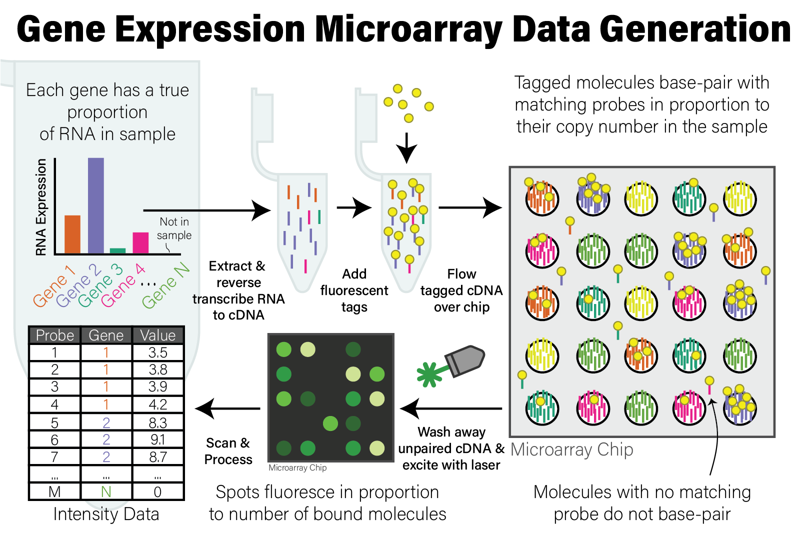
After the microarray has been scanned, the relative copy number of the DNA in the sample matching the probes on the microarray are expressed as the intensity of fluorescence of each probe. The raw intensity data from the scan has been processed and analyzed by the scanner software to account for technical biases and artefacts of the scanning instrument and data generation process. The data from a single scan is processed and stored in a file in CEL format, a proprietary data format that stores the raw probe intensity data that can be loaded for downstream analysis.
9.5 High Throughput Sequencing
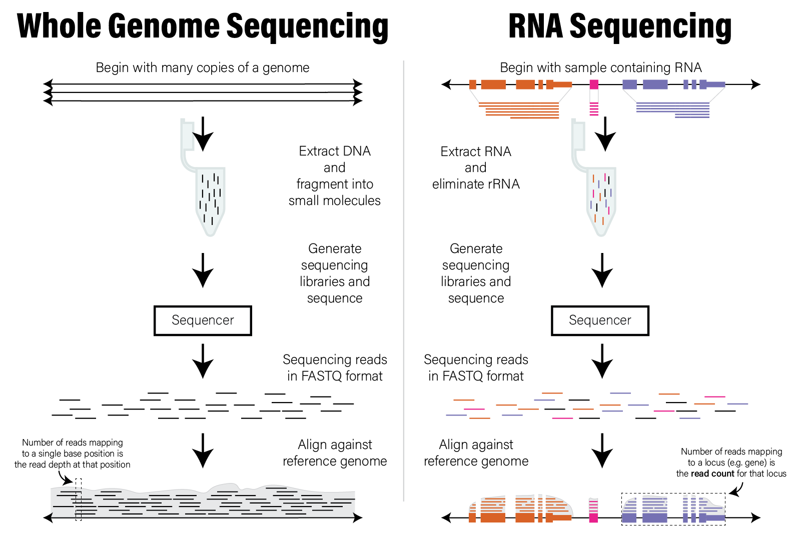
High throughput sequencing (HTS) technologies measure and digitize the nucleotide sequences of thousands to billions of DNA molecules simultaneously. In contrast to microarrays, which cannot identify new sequences due to their a priori probe based design, HTS instruments can in principle determine the sequence of any DNA molecule in a sample. For this reason, HTS datasets are sometimes called unbiased assays, because the sequences they identify are not predetermined.
The most popular HTS technology at the time of writing is provided by the Illumina biotechnology company. This technology was first developed and commercialized by the company Solexa during the late 1990s and was instrumental in the completion of the human genome. The cost of generating data with this technology has reduced by several orders of magnitude since then, resulting in an exponential growth of biological data and fundamentally changed our understanding of biology and health. Because of this, the analysis of these data, and not the time and cost of generation, has become the primary bottleneck in biological and biomedical research.
The Illumina HTS technology uses a biotechnological technique called sequencing by synthesis. Briefly, this technique entails biochemically ligating millions to billions of short (~300 nucleotide long) DNA molecules to a glass slide, denatured to become single stranded, and then used to synthesize the complementary strand by incorporating fluorescently tagged nucleotides. The tagged nucleotides that are incorporated on each nucleotide addition are excited with a laser and a high resolution photograph is taken of the flow cell. This process is repeated many times until the DNA molecules on the flow cell have been completely synthesized, and the collective images are computationally analyzed to build up the complete sequence of each molecule.
Other HTS methods have been developed that use different strategies, some of which do not utilize the sequencing by synthesis method. These alternative technologies differ in the length, number, confidence and per base cost of the DNA molecules they sequence. At the time of writing, the two most common technologies include:
- Pacific Biosciences (PacBio) Long Read Sequencing - this technology uses an engineered polymerase that performs run-on amplification of circularized DNA molecules and records a signature of each different base as it is incorporated into the amplification product. PacBio sequencing can generate reads that are thousands of nucleotides in length.
- Oxford Nanopore Sequencing (ONS) - this technology uses engineered proteins to form pores in an electrically conductive membrane, through which single stranded DNA molecules pass. As the individual nucleotides of a DNA molecule pass through the pore, the electrical current induced by the different nucleotide molecular structures is recorded and analyzed with signal processing algorithms to recover the original sequence of the molecule. No synthesis occurs in ONS technology.
Due to its widespread use, only Illumina sequencing data analysis is covered in this book, though additions in the future may be warranted.
Any DNA molecules may be subjected to sequencing via this method; the meaning of the resulting datasets and the goal of subsequent analysis are therefore dependent upon the material being studied. Below are some of the most common types of HTS experiments:
- Whole genome sequencing (WGS) - the input to sequencing is randomly sheared genomic DNA molecules, from single organisms or a collection of organisms, with the goal of reconstructing or further refining the genome sequence of the constituent organisms
- RNA Sequencing (RNASeq) - the input is complementary DNA (cDNA) that has been reverse transcribed from RNA extracted from a sample, with the goal of detecting which RNA transcripts (and therefore genes) are expressed in that sample
- Whole genome bisulfite sequencing (WGBS) - the input to sequencing is randomly sheared genomic DNA that has undergone bisulfite treatment, which converts methylated cytosines to thymines, thereby enabling detection of epigenetic methylation marks in the DNA
- Chromatin immunoprecipitation followed by sequencing (ChIPSeq) - the input is genomic DNA that was bound by specific DNA-binding proteins (e.g. transcription factors), that allows identification of locations in the genome where those proteins were bound
A complete coverage of the many different types of sequencing assays is beyond the scope of this book, but analysis techniques used for of some of these different types of experiments are covered later in this chapter.
9.5.1 Raw HTS Data
The raw data produced by the sequencing instrument, or sequencer, are the digitized DNA sequences for each of the billions of molecules that were captured by the flow cell. The digitized nucleotide sequence for each molecule is called a read, and therefore every run of a sequencing instrument produces millions to billions of reads. The data is stored in a standardized format called the FASTQ file format. Data for a single read in FASTQ format is shown below:
@SEQ_ID
GATTTGGGGTTCAAAGCAGTATCGATCAAATAGTAAATCCATTTGTTCAACTCACAGTTT
+
!''*((((***+))%%%++)(%%%%).1***-+*''))**55CCF>>>>>>CCCCCCC65
Each read has four lines in the FASTQ file. The first beginning with @ is the
sequencing header or name, which provides a unique identifier for the read in
the file. The second line is the nucleotide sequence as detected by the
sequencer. The third line is a secondary header line that starts with + and
may or may not include further information. The last line contains the phred
quality scores for the base
calls in the corresponding position of the read. Briefly, each character in the
phred quality score line has a corresponding integer is proportional to the
confidence that the base in the corresponding position of the read was called
correctly. This information is used to assess the quality of the data. See this
more in-depth explanation of phred
score for more information.
9.5.2 Preliminary HTS Data Analysis
Since all HTS experiments generate the same type of data (i.e. reads), all data analyses begin with processing of the sequences via bioinformatic algorithms; the choice of algorithm is determined by the experiment type and the biological question being asked. A full treatment of the variety of bioinformatic approaches to processing these data is beyond the scope of this book. We will focus on one analysis approach, alignment, that is commonly employed to produce derived data that is then further processed using R.
It is very common for HTS data, also called short read sequencing data, to be generated from organisms that have already had their genome sequenced, e.g. human or mouse. The reads in a dataset can therefore be compared with the appropriate genome sequence to aid in interpretation. This comparison amounts to searching in the organism’s genome, or the so-called reference genome, for the location or locations from which the molecule captured by each read originated. This search process is called alignment, where each short read sequence is aligned against the usually much larger reference genome to identify locations with identical or nearly identical sequence. Said differently, the alignment process attempts to assign each read to one or more locations in a reference genome, where only reads that have a match in the target genome will be assigned.
The alignment process is computationally intensive and requires specialized software to perform efficiently. While it may be technically capable of performing alignment, R is not optimized to process character data in the volume typical of these datasets. Therefore, it is not common to work with short read data (i.e. FASTQ files) directly in R, and other processing steps are required to transform the sequencing data into other forms that are then amenable to analysis in R.
The end result of aligning all the reads in a short read dataset is assignments of reads to positions across an entire reference genome. The distribution of those read alignment locations across the genome forms the basis of the data used to interpret the dataset. Specifically, each locus, or location spanning one or more bases, has zero or more reads aligned to it. The number of reads aligned to a locus, or the read count is commonly interpreted as being proportional to the number of those molecules found in the original sample. Therefore, the analysis and interpretation of HTS data commonly involves the analysis of count data, which we discuss in detail in the next section. The following figure illustrates the concepts described in this section.
9.5.3 Count Data
As mentioned above, the number of reads, or read counts that align to each locus of a genome form a distribution we can use to interpret the data. Count data have two important properties that require special attention:
- Count data are integers - the read counts assigned to a particular locus are whole numbers
- Counts are non-negative - counts can either be zero or positive; they cannot be negative
These two properties have the important consequence that count data are not normally distributed. Unlike with microarray data, common statistical techniques like linear regression are not directly applicable to count data. We must therefore account for this property of the data prior to statistical analysis in one of two ways:
- Use statistical methods that model counts data - generalized linear models that model data using Poisson and Negative Binomial distributions
- Transform the data to have be normally distributed - certain statistical transformations, such as regularized log or rank transformations can make counts data more closely follow a normal distribution
We will discuss these strategies in greater detail in the RNASeq Gene Expression Data section.
9.6 Gene Identifiers
9.6.1 Gene Identifier Systems
Since the first genetic sequence for a gene was determined in 1965 - an alanine tRNA in yeast(Holley et al. 1965) - scientists have been trying to give them names. In 1979, formal guidelines for the nomenclature used for human genes was proposed(Shows et al. 1979) along with the founding of the Human Gene Nomenclature Committee (Bruford et al. 2020), so that researchers would have a common vocabulary to refer to genes in a consistent way. In 1989, this committee was placed under the auspices of the Human Genome Organisation (HUGO), becoming the HUGO Gene Nomenclature Committee (HGNC). The HGNC has been the official body providing guidelines and gene naming authority since, and as such HGNC gene names are often called gene symbols.
As per Bruford et al. (2020), the official human gene symbol guidelines are as follows:
- Each gene is assigned a unique symbol, HGNC ID and descriptive name.
- Symbols contain only uppercase Latin letters and Arabic numerals.
- Symbols should not be the same as commonly used abbreviations
- Nomenclature should not contain reference to any species or “G” for gene.
- Nomenclature should not be offensive or pejorative.
Gene symbols are the most human-readable system for naming genes. The gene symbols BRCA1, APOE, and ACE2 may be familiar to you as they are involved in common diseases, namely breast cancer, Alzheimer’s Disease risk, and SARS-COV-2, respectively. Typically, the gene symbol is an acronym that roughly represents a label of what the gene is or does (or was originally found to be or do, as many genes are subsequently discovered to be involved in entirely separate processes as well), e.g. APOE represents the gene apolipoprotein E. This convention is convenient for humans when reading and identifying genes. However, standardized though the symbol conventions may be, they are not always easy for computers to work with, and ambiguities can cause mapping problems.
Other gene identifier systems developed along with other gene information databases. In 2000, the Ensembl genome browser was launched by the Wellcome Trust, a charitable foundation based in the United Kingdom, with the goal of providing automated annotation of the human genome. The Ensembl Project, which supports the genome browser, recognized even before the publication of the human genome that manual annotation and curation of genes is a slow and labor intensive process that would not provide researchers around the world timely access to information. The project therefore created a set of automated tools and pipelines to collect, process, and publish rapid and consistent annotation of genes in the human genome. Since its initial release, Ensembl now supports over 50,000 different genomes.
Ensembl assigns a automatic, systematic ID called the Ensembl Gene ID to every
gene in its database. Human Ensembl Gene IDs take the form ENSG plus an 11
digit number, optionally followed by a period delimited version number. For
example, at the time of writing the BRCA1 gene has an Ensembl Gene ID of
ENSG00000012048.23. The stable ID portion (i.e. ENSGNNNNNNNNNNN) will remain
associated with the gene forever (unless the gene annotation changes
“dramatically” in which case it is
retired). The .23 is the version
number of the gene annotation, meaning this gene has been updated 22 times (plus
its initial version) since addition to the database. The additional version
information is very important for reproducibility of biological analysis, since
conclusions drawn by results of these analyses are usually based on the most
current information about a gene which are continually updated over time.
Ensembl maintains annotations for many different organisms, and the gene identifiers for each genome contain codes that indicate which organism the gene is for. Here are the codes for orthologs of the body plan developmental gene HOXA1 in several different species:
| Gene ID Prefix | Organism | Symbol | Example |
|---|---|---|---|
ENSG |
Homo sapiens | HOXA1 | ENSG00000105991 |
ENSMUSG |
Mus musculus (mouse) | Hoxa1 | ENSMUSG00000029844 |
ENSDARG |
Danio rario (zebrafish) | hoxa1a | ENSDARG00000104307 |
ENSFCAG |
Felis catus (cat) | HOXA1 | ENSFCAG00000007937 |
ENSMMUG |
Macaca mulata (macaque) | HOXA1 | ENSMMUG00000012807 |
Ensembl Gene IDs and gene symbols are the most commonly used gene identifiers. The GENCODE project which provides consistent and stable genome annotation releases for human and mouse genomes, uses these two types of identifiers with its official annotations.
Ensembl provides stable identifiers for transcripts as well as genes. Transcript
identifiers correspond to distinct patterns of exons/introns that have been
identified for a gene, and each gene has one or more distinct transcripts.
Ensembl Transcript IDs have the form ENSTNNNNNNNNNNN.NN similar to Gene IDs.
Ensembl is not the only gene identifier system besides gene symbol. Several
other databases have devised and maintain their own identifiers, most notably
[Entrez Gene IDs](UCSC Gene IDs used by the NCBI Gene
database which assigns a unique integer to
each gene in each organism, and the Online Mendelian Inheritance in Man
(OMIM) database, which has identifiers that look like
OMIM:NNNNN, where each OMIM ID refers to a unique gene or human phenotype.
However, the primary identifiers used in modern human biological research remain
Ensembl IDs and official HGNC gene symbols.
9.6.2 Mapping Between Identifier Systems
A very common operation in biological analysis is to map between gene identifier systems, e.g. you are given Ensembl Gene ID and want to map to the more human-recognizable gene symbols. Ensembl provides a service called BioMart that allows you to download annotation information for genes, transcripts, and other information maintained in their databases. It also provides limited access to external sources of information on their genes, including cross references to HGNC gene symbols and some other gene identifier systems. The Ensembl website has helpful documentation on how to use BioMart to download annotation data using the web interface.
In addition to downloading annotations as a CSV file from the web interface, Ensembl also provides the biomaRt Bioconductor package to allow programmatic access to the same information directly from R. There is much more information in the Ensembl databases than gene annotation data that can be accessed via BioMart, but we will provide a brief example of how to extract gene information here:
# this assumes biomaRt is already installed through bioconductor
library(biomaRt)

# the human biomaRt database is named "hsapiens_gene_ensembl"
ensembl <- useEnsembl(biomart="ensembl", dataset="hsapiens_gene_ensembl")

# listAttributes() returns a data frame, turn into a tibble to help with formatting
as_tibble(listAttributes(ensembl))
# A tibble: 3,143 x 3
   name                          description                  page
   <chr>                         <chr>                        <chr>
 1 ensembl_gene_id               Gene stable ID               feature_page
 2 ensembl_gene_id_version       Gene stable ID version       feature_page
 3 ensembl_transcript_id         Transcript stable ID         feature_page
 4 ensembl_transcript_id_version Transcript stable ID version feature_page
 5 ensembl_peptide_id            Protein stable ID            feature_page
 6 ensembl_peptide_id_version    Protein stable ID version    feature_page
 7 ensembl_exon_id               Exon stable ID               feature_page
 8 description                   Gene description             feature_page
 9 chromosome_name               Chromosome/scaffold name     feature_page
10 start_position                Gene start (bp)              feature_page
# ... with 3,133 more rows
The name column provides the programmatic name associated with the attribute
that can be used to retrieve that annotation information using the getBM()
function:
# create a tibble with ensembl gene ID, HGNC gene symbol, and gene description
gene_map <- as_tibble(
  getBM(
    attributes=c("ensembl_gene_id", "hgnc_symbol", "description"),
    mart=ensembl
  )
)
gene_map
# A tibble: 68,012 x 3
   ensembl_gene_id hgnc_symbol description
   <chr>           <chr>       <chr>
 1 ENSG00000210049 MT-TF       mitochondrially encoded tRNA-Phe (UUU/C) [Source:HGNC Symbol;Acc:HGNC:748~
 2 ENSG00000211459 MT-RNR1     mitochondrially encoded 12S rRNA [Source:HGNC Symbol;Acc:HGNC:7470]
 3 ENSG00000210077 MT-TV       mitochondrially encoded tRNA-Val (GUN) [Source:HGNC Symbol;Acc:HGNC:7500]
 4 ENSG00000210082 MT-RNR2     mitochondrially encoded 16S rRNA [Source:HGNC Symbol;Acc:HGNC:7471]
 5 ENSG00000209082 MT-TL1      mitochondrially encoded tRNA-Leu (UUA/G) 1 [Source:HGNC Symbol;Acc:HGNC:7~
 6 ENSG00000198888 MT-ND1      mitochondrially encoded NADH:ubiquinone oxidoreductase core subunit 1 [So~
 7 ENSG00000210100 MT-TI       mitochondrially encoded tRNA-Ile (AUU/C) [Source:HGNC Symbol;Acc:HGNC:748~
 8 ENSG00000210107 MT-TQ       mitochondrially encoded tRNA-Gln (CAA/G) [Source:HGNC Symbol;Acc:HGNC:749~
 9 ENSG00000210112 MT-TM       mitochondrially encoded tRNA-Met (AUA/G) [Source:HGNC Symbol;Acc:HGNC:749~
10 ENSG00000198763 MT-ND2      mitochondrially encoded NADH:ubiquinone oxidoreductase core subunit 2 [So~
# ... with 68,002 more rows
With this Ensembl Gene ID to HGNC symbol mapping in hand, you can combine the tibble above with other tibbles containing gene information by joining them together.
BioMart/biomaRt is not the only ways to map different gene identifiers. The Bioconductor package AnnotateDbi also provides this functionality in a flexible format independent of the Ensembl databases. This package includes not only gene identifier mapping and information, but also identifiers from technology platforms, e.g. probe set IDs from microarrays, that can help when working with these types of data. The package also allows comprehensive and flexible homolog mapping. As with all Bioconductor packages, the AnnotationDbi documentation is well written and comprehensive, though knowledge of relational databases is helpful in understanding how the packages work.
9.6.3 Mapping Homologs
Sometimes it is necessary to link datasets from different organisms together by
orthology. For example, in an experiment performed in mice, we might be
interested in comparing gene expression patterns observed in the mouse samples
to a publicly available human dataset. In these contexts, we must link gene
identifiers from one organism to their corresponding homologs in the other.
BioMart enables us to extract these linked identifiers by explicitly connecting
different biomaRt
databases
with the getLDS() function:
human_db <- useEnsembl("ensembl", dataset = "hsapiens_gene_ensembl")
mouse_db <- useEnsembl("ensembl", dataset = "mmusculus_gene_ensembl")
orth_map <- as_tibble(
  getLDS(attributes = c("ensembl_gene_id", "hgnc_symbol"),
       mart = human_db,
       attributesL = c("ensembl_gene_id", "mgi_symbol"),
       martL = mouse_db
  )
)
orth_map
# A tibble: 26,390 x 4
   Gene.stable.ID  HGNC.symbol Gene.stable.ID.1   MGI.symbol
   <chr>           <chr>       <chr>              <chr>
 1 ENSG00000198695 MT-ND6      ENSMUSG00000064368 "mt-Nd6"
 2 ENSG00000212907 MT-ND4L     ENSMUSG00000065947 "mt-Nd4l"
 3 ENSG00000279169 PRAMEF13    ENSMUSG00000094303 ""
 4 ENSG00000279169 PRAMEF13    ENSMUSG00000094722 ""
 5 ENSG00000279169 PRAMEF13    ENSMUSG00000095666 ""
 6 ENSG00000279169 PRAMEF13    ENSMUSG00000094741 ""
 7 ENSG00000279169 PRAMEF13    ENSMUSG00000094836 ""
 8 ENSG00000279169 PRAMEF13    ENSMUSG00000074720 ""
 9 ENSG00000279169 PRAMEF13    ENSMUSG00000096236 ""
10 ENSG00000198763 MT-ND2      ENSMUSG00000064345 "mt-Nd2"
# ... with 26,380 more rows
The mgi_symbol field refers to the gene symbol assigned in the Mouse Genome
Informatics database
maintained by The Jackson Laboratory.
9.7 Gene Expression
Gene expression is the process by which information from a gene is used in the synthesis of functional gene products that affect a phenotype. While gene expression studies are often focused on protein coding genes, there are many other functional molecules, e.g. transfer RNAs, lncRNAs, etc, that are produced by this process. The gene expression process has many steps and intermediate products, as depicted in the following figure:
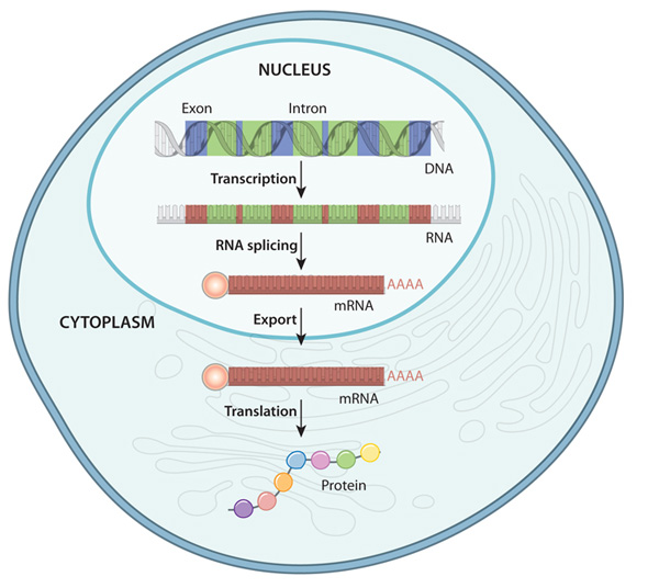
The specific parts of the genome that code for genes are copied, or transcribed into RNA molecules called transcripts. In lower organisms like bacteria, these RNA molecules are passed on directly to ribosomes, which translate them into proteins. In most higher organisms like eukaryotes, these initial transcripts, called pre-messenger RNA (pre-mRNA) transcripts are further processed such that certain parts of the transcript, called introns, are spliced out and the flanking sequences, called exons, are concatenated together. After this splicing process is complete, the pre-mRNA transcripts become mature messenger RNA (mRNA) transcripts which go on to be exported from the nucleus and loaded into ribosomes in the cytoplasm to undergo translation into proteins.
In gene expression studies, the relative abundance, or number of copies, of RNA or mRNA transcripts in a sample is measured. The measurements are non-negative numbers that are proportional to the relative abundance of a transcript with respect to some reference, either another gene, or in the case of high throughput assays like microarrays or high throughput sequencing, relative to measurements of all distinct transcripts examined in the experiment. Conceptually, the larger the magnitude of a transcript abundance measurement, the more copies of that transcript were in the original sample.
There are many ways to measure the abundance of RNA transcripts; the following are some of the common methods at the time of writing:
- Light absorbance - RNA absorbs ultraviolet light with wavelength 260 nm, which can be used to determine RNA concentration in a sample using specialized equipment
- Northern blot - measures relative abundance of an RNA with a specific sequence
- quantitative polymerase chain reaction (qPCR) - measures relative abundance of an RNA with a specific sequence using PCR amplification
- Oligonucleotide and microarrays - measures relative abundance of thousands of genes simultaneously using known DNA probe sequences and fluorescently tagged RNA molecules
- High throughput RNA sequencing (RNASeq) - measures thousands to millions of RNA fragments simultaneously in proportion to their relative abundance
While any of the measurement methods above may be analyzed in R, the high throughput methods (i.e. microarray, high throughput sequencing) are the primary concern of this chapter. These methods generate measurements for thousands of transcripts or genes simultaneously, requiring the power and flexibility of programmatic analysis to process in a practical amount of time. The remainder of this chapter is devoted to understanding the specific technologies, data types, and analytical strategies involved in working with these data.
Gene expression measurements are almost always inherently relative, either due to limitations of the measurement methods (e.g. microarrays, described below) or because measuring all molecules in a sample will almost always be prohibitively expensive, have diminishing returns, and it is very difficult if not impossible to determine if all the molecules have been measured. This means we cannot in general associate the numbers associated with the measurements with an absolute molecular copy number. An important implication of the inherent relativity of these measurements is: absence of evidence is not evidence of absence. In other words, if a transcript has an abundance measurement of zero, this does not necessarily imply that the gene is not expressed. It may be that the gene is indeed expressed, but the copy number is sufficiently small that it was not detected by the assay.
9.7.1 Gene Expression Data in Bioconductor
The SummarizedExperiment container is the standard way to load and work with gene expression data in Bioconductor. This container requires the following information:
-
assays- one or more measurement assays (e.g. gene expression) in the form of a feature by sample matrix -
colData- metadata associated with the samples (i.e. columns) of the assays -
rowData- metadata associated with the features (i.e. rows) of the assays -
exptData- additional metadata about the experiment itself, like protocol, project name, etc
The figure below illustrates how the SummarizedExperiment container is structured and how the different data elements are accessed:
Many Bioconductor packages for specific types of data, e.g. limma create these SummarizedExperiment objects for you, but you may also create your own by assembling each of these data into data frames manually:
# microarray expression dataset intensities
intensities <- readr::read_delim("example_intensity_data.csv",delim=" ")

# the first column of intensities tibble is the probesetId, extract to pass as rowData
rowData <- intensities["probeset_id"]

# remove probeset IDs from tibble and turn into a R dataframe so that we can assign rownames
# since tibbles don't support row names
intensities <- as.data.frame(
  select(intensities, -probeset_id)
)
rownames(intensities) <- rowData$probeset_id

# these column data are made up, but you would have a sample metadata file to use
colData <- tibble(
  sample_name=colnames(intensities),
  condition=sample(c("case","control"),ncol(intensities),replace=TRUE)
)

se <- SummarizedExperiment(
   assays=list(intensities=intensities),
   colData=colData,
   rowData=rowData
)
se
## class: SummarizedExperiment
## dim: 54675 35
## metadata(0):
## assays(1): intensities
## rownames(54675): 1007_s_at 1053_at ... AFFX-TrpnX-5_at AFFX-TrpnX-M_at
## rowData names(1): probeset_id
## colnames(35): GSM972389 GSM972390 ... GSM972512 GSM972521
## colData names(2): sample_name conditionDetailed documentation of how to create and use the SummarizedExperiment is available in the SummarizedExperiment vignette.
SummarizedExperiment is the successor to the older ExpressionSet container. Both are still used by Bioconductor packages, but SummarizedExperiment is more modern and flexible, so it is suggested for use whenever possible.
9.7.2 Differential Expression Analysis
Differential expression analysis seeks to identify to what extent gene expression is associated with one or more variables of interest. For example, we might be interested in genes that have higher expression in subjects with a disease, or which genes change in response to a treatment.
Typically, gene expression analysis requires two types of data to run: an
expression matrix and a design matrix. The expression matrix will generally
have features (e.g. genes) as rows and samples as columns. The design matrix is
a numeric matrix that contains the variables we wish to model and any covariates
or confounders we wish to adjust for. The variables in the design matrix then
must be encoded in a way that statistical procedures can understand. The full
details of how design matrices are constructed is beyond the scope of this book.
Fortunately, R makes it very easy to construct these matrices from a tibble with
the model.matrix()
function.
Consider for the following imaginary sample information tibble that has 10 AD
and 10 Control subjects with different clinical and protein histology
measurements assayed on their brain tissue:
ad_metadata## # A tibble: 20 × 8
## ID age_at_death condition tau abeta iba1 gfap braak_stage
## <chr> <dbl> <fct> <dbl> <dbl> <dbl> <dbl> <fct>
## 1 A1 73 AD 96548 176324 157501 78139 4
## 2 A2 82 AD 95251 0 147637 79348 4
## 3 A3 82 AD 40287 45365 17655 127131 2
## 4 A4 81 AD 82833 181513 225558 122615 4
## 5 A5 84 AD 73807 69332 47247 46968 3
## 6 A6 81 AD 69108 139420 57814 24885 3
## 7 A7 91 AD 138135 209045 101545 32704 6
## 8 A8 88 AD 63485 104154 80123 31620 3
## 9 A9 74 AD 59485 148125 27375 50549 3
## 10 A10 69 AD 48357 27260 47024 78507 2
## 11 C1 80 Control 62684 93739 131595 124075 3
## 12 C2 77 Control 63598 69838 7189 35597 3
## 13 C3 72 Control 52951 19444 54673 17221 2
## 14 C4 75 Control 12415 7451 16481 38510 0
## 15 C5 77 Control 62805 0 40419 108479 3
## 16 C6 77 Control 1615 3921 2439 35430 0
## 17 C7 73 Control 62233 77113 81887 96024 3
## 18 C8 77 Control 59123 94715 72350 76833 3
## 19 C9 80 Control 21705 3046 26768 113093 1
## 20 C10 73 Control 15781 16592 10271 100858 1We might be interested in identifying genes that are increased or decreased in people with AD compared with Controls. We can create a model matrix for this as follows:
model.matrix(~ condition, data=ad_metadata)## (Intercept) conditionAD
## 1 1 1
## 2 1 1
## 3 1 1
## 4 1 1
## 5 1 1
## 6 1 1
## 7 1 1
## 8 1 1
## 9 1 1
## 10 1 1
## 11 1 0
## 12 1 0
## 13 1 0
## 14 1 0
## 15 1 0
## 16 1 0
## 17 1 0
## 18 1 0
## 19 1 0
## 20 1 0
## attr(,"assign")
## [1] 0 1
## attr(,"contrasts")
## attr(,"contrasts")$condition
## [1] "contr.treatment"The ~ condition argument is an an R
forumla,
which is a concise description of how variable should be included in the model.
The general format of a formula is as follows:
# portions in [] are optional
[<outcome variable>] ~ <predictor variable 1> [+ <predictor variable 2>]...

# examples

# model Gene 3 expression as a function of disease status
`Gene 3` ~ condition

# model the amount of tau pathology as a function of abeta pathology,
# adjusting for age at death
tau ~ age_at_death + abeta

# create a model without an outcome variable that can be used to create the
# model matrix to test for differences with disease status adjusting for age at death
~ age_at_death + condition
For most models, the design matrix will have an intercept term of all ones and
additional colums for the other variables in the model. We might wish to adjust
out the effect of age by including age_at_death as a covariate in the model:
model.matrix(~ age_at_death + condition, data=ad_metadata)## (Intercept) age_at_death conditionAD
## 1 1 73 1
## 2 1 82 1
## 3 1 82 1
## 4 1 81 1
## 5 1 84 1
## 6 1 81 1
## 7 1 91 1
## 8 1 88 1
## 9 1 74 1
## 10 1 69 1
## 11 1 80 0
## 12 1 77 0
## 13 1 72 0
## 14 1 75 0
## 15 1 77 0
## 16 1 77 0
## 17 1 73 0
## 18 1 77 0
## 19 1 80 0
## 20 1 73 0
## attr(,"assign")
## [1] 0 1 2
## attr(,"contrasts")
## attr(,"contrasts")$condition
## [1] "contr.treatment"The model matrix now includes a column for age at death as well. This model model matrix is now suitable to pass to differential expression software packages to look for genes associated with disease status.
As mentioned above, modern gene expression assays measure thousands of genes simultaneously. This means each gene must be tested for differential expression individually. In general, each gene is tested using the same statistical model, so a differential expression analysis package will perform something equivalent to the following:
Gene 1 ~ age_at_death + condition
Gene 2 ~ age_at_death + condition
Gene 3 ~ age_at_death + condition
...
Gene N ~ age_at_death + condition
Each gene model will have its own statistics associated with it that we must process and interpret after the analysis is complete.
9.7.3 Microarray Gene Expression Data
On a high level, there are four steps involved in analyzing gene expression microarray data:
- Summarization of probes to probesets. Each gene is represented by multiple probes with different sequences. Summarization is a statistical procedure that computes a single value for each probeset from its corresponding probes.
- Normalization. This includes removing background signal from individual arrays as well as adjusting probeset intensities so that they are comparable across multiple sample arrays.
- Quality control. Compare all normalized samples within a sample set to identify, mitigate, or eliminate potential outlier samples.
- Analysis. Using the quality controlled expression data, Implement statistical analysis to answer research questions.
The full details of microarray analysis are beyond the scope of this book. However in the following sections we cover some of the basic entry points to performing these steps in R and Bioconductor.
The CEL data files from a set of microarrays can be loaded into R for analysis
using the affy Bioconductor
package.
This package provides all the functions necessary for loading the data and
performing key preprocessing operations. Typically, two or more samples were
processed in this way, resulting in a set of CEL files that should be processed
together. These CEL files will typically be all stored in the same directory,
and may be loaded using the affy::ReadAffy function:
# read all CEL files in a single directory
affy_batch <- affy::ReadAffy(celfile.path="directory/of/CELfiles")

# or individual files in different directories
cel_filenames <- c(
  list.files( path="CELfile_dir1", full.names=TRUE, pattern=".CEL$" ),
  list.files( path="CELfile_dir2", full.names=TRUE, pattern=".CEL$" )
)
affy_batch <- affy::ReadAffy(filenames=cel_filenames)
The affy_batch variable is a AffyBatch container, which stores information
on the probe definitions based on the type of microarray, probe-level intensity
for each sample, and other information about the experiment contained within the
CEL files.
The affy package provides functions to perform probe summarization and
normalization. The most popular method to accomplish this at the time of writing
is called Robust Multi-array Average or RMA (Irizarry et al. 2003), which performs
summarization and normalization of multiple arrays simultaneously. Below, the
RMA algorithm is used to normalize an example dataset provided by the
affydata
Bioconductor package.
Certain Bioconductor packages provide example datasets for use with companion
analysis packages. For example, the affydata package provides the Dilution
dataset, which was generated using two concentrations of cDNA from human liver
tissue and a central nervous system cell line. To load a data package into R,
first run library(<data package>) and then data(<dataset name>).
library(affy)
library(affydata)
data(Dilution)

# normalize the Dilution microarray expression values
# note Dilution is an AffyBatch object
eset_rma <- affy::rma(Dilution,verbose=FALSE)## Package LibPath Item
## [1,] "affydata" "/opt/conda/lib/R/library" "Dilution"
## Title
## [1,] "AffyBatch instance Dilution"
data(Dilution)

# normalize the Dilution microarray expression values
# note Dilution is an AffyBatch object
eset_rma <- affy::rma(Dilution,verbose=FALSE)

# plot distribution of non-normalized probes
# note rma normalization takes the log2 of the expression values,
# so we must do so on the raw data to compare
raw_intensity <- as_tibble(exprs(Dilution)) %>%
  mutate(probeset_id=rownames(exprs(Dilution))) %>%
  pivot_longer(-probeset_id, names_to="Sample", values_to = "Intensity") %>%
  mutate(
    `log2 Intensity`=log2(Intensity),
    Category="Before Normalization"
  )

# plot distribution of normalized probes
rma_intensity <- as_tibble(exprs(eset_rma)) %>%
  mutate(probesetid=featureNames(eset_rma)) %>%
  pivot_longer(-probesetid, names_to="Sample", values_to = "log2 Intensity") %>%
  mutate(Category="RMA Normalized")

dplyr::bind_rows(raw_intensity, rma_intensity) %>%
  ggplot(aes(x=Sample, y=`log2 Intensity`)) +
  geom_boxplot() +
  facet_wrap(vars(Category))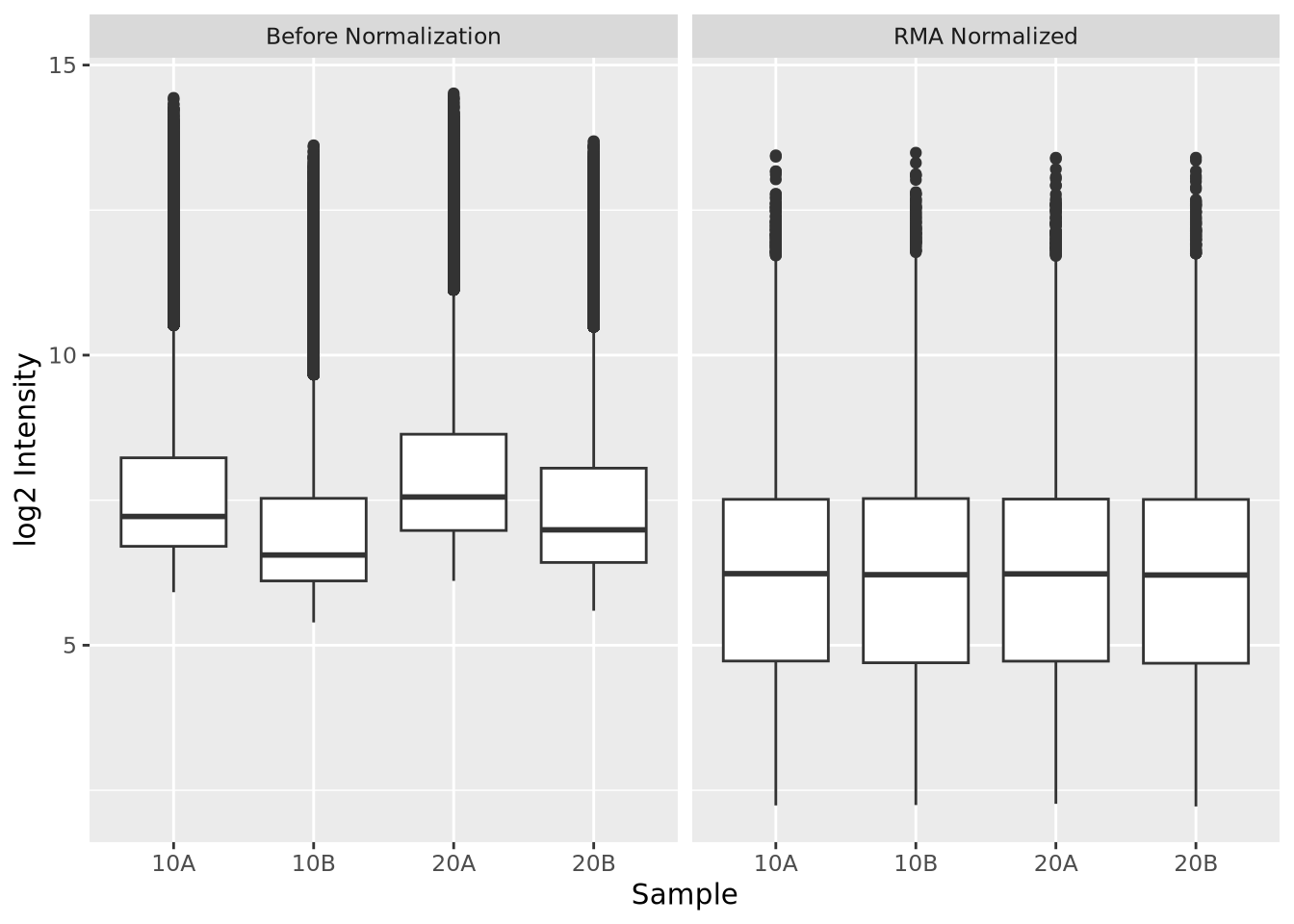
Above, we first apply RMA to the Dilution microarray dataset using the
affy::rma() function. Then we plot the log 2 intensities of the probes in each
array, first using the raw intensities and then afysis seeking to
identify how associated gene expression is with one or more variables of
interest. For example,
9.7.4 Differential Expression: Microarrays (limma)
limma, which
is short for linear models of microarrays, is one of the top most
downloaded Bioconductor packages.
limma is utilized for analyzing microarray gene expression data, with a focus on
analyses using linear models to integrate all of the data from an experiment.
limma was developed for microarray analysis prior to the development of
sequencing based gene expression methods (i.e. RNASeq) but has since added
functionality to analyze other types of gene expression data.
limma excels at analyzing these types of data as it can support arbitrarily complex experimental designs while maintaining strong statistical power. An experiment with a large number of conditions or predictors can still be analyze even with small sample sizes. The method accomplishes this by using an empirical Bayes approach that borrows information across all the genes in the dataset to better control error in individual gene models. See Ritchie et al. (2015) for more details on how limma works.
limma requres an expression matrix like that stored in an ExpressionSet or SummarizedExperiment container and a design matrix:
# intensities is an example gene expression matrix that corresponds to our
# AD sample metadata of 10 AD and 10 Control individuals
ad_se  <- SummarizedExperiment(
  assays=list(intensities=intensities),
  colData=ad_metadata,
  rowData=rownames(intensities)
)

# define our design matrix for AD vs control, adjusting for age at death
ad_vs_control_model <- model.matrix(~ age_at_death + condition, data=ad_metadata)

# now run limma
# first fit all genes with the model
fit <- limma::lmFit(
  assays(se)$intensities,
  ad_vs_control_model
)

# now better control fit errors with the empirical Bayes method
fit <- limma::eBayes(fit)
We have now conducted a differential expression analysis with limma. We can
extract out the results for our question of interest - which genes are
associated with AD - using the limma::topTable() function:
# the coefficient name conditionAD is the column name in the design matrix
# adjust="BH" means perform Benjamini-Hochberg multiple testing adjustment
# on the nominal p-values from each gene test
# topTable only returns the top 10 results sorted by ascending p-value by default
topTable(fit, coef="conditionAD", adjust="BH")
## logFC AveExpr t P.Value adj.P.Val B
## 206354_at -2.7507429 5.669691 -5.349105 3.436185e-05 0.9992944 -2.387433
## 234942_s_at 0.9906708 8.397425 5.206286 4.726372e-05 0.9992944 -2.447456
## 243618_s_at -0.6879431 7.148455 -4.864695 1.020980e-04 0.9992944 -2.598600
## 223703_at 0.8693657 6.154392 4.745033 1.340200e-04 0.9992944 -2.654092
## 244391_at -0.5251423 5.532712 -4.691482 1.514215e-04 0.9992944 -2.679354
## 1554308_s_at -0.8622761 3.404188 -4.428740 2.763033e-04 0.9992944 -2.807091
## 1557179_s_at -0.2814909 2.767313 -4.379307 3.095237e-04 0.9992944 -2.831821
## 215238_s_at 0.4403151 4.970336 4.324162 3.513569e-04 0.9992944 -2.859664
## 237269_at -1.4862155 6.027691 -4.312331 3.610482e-04 0.9992944 -2.865672
## 212595_s_at 0.6459786 9.941364 4.303300 3.686273e-04 0.9992944 -2.870267From the table, none of the probesets in this experiment are significant at FDR < 0.05.
9.7.5 RNASeq
RNA sequencing (RNASeq) is a HTS technology that measures the abundance of RNA molecules in a sample. Briefly, RNA molecules are extracted from a sample using a biochemical protocol that isolates RNA from other molecules (i.e. DNA, proteins, etc) in the sample. Ribosomal RNA is removed from the sample (see Note box below), and the remaining RNA molecules are size selected to retain only short molecules (~15-300 nucleotides in length, depending on the protocol). The size selected molecules are then reverse transcribed into cDNA and converted to double stranded molecules. Sequencing libraries are prepared with these cDNA using proprietary biochemical protocols to make them suitable for sequencing on the sequencing instrument. After sequencing, FASTQ files containing millions of reads for one or more samples is produced. Except for the initial RNA extraction, all of these steps are typically performed by specialized instrumentation facilities called sequencing cores who provide the data in FASTQ format to the investigators.
80%-90% of the RNA mass in a cell is ribosomal RNA (rRNA), the RNA that makes up ribosomes and is responsible for maintaining protein translation processes in the cell. If total RNA was sequenced, the large majority of reads would correspond to rRNAs and would therefore be of little or no use. For this reason, rRNA molecules are removed from the RNA material that goes on to sequencing using either a poly-A tail enrichment or ribo-depletion strategy. These two methods maintain different populations of RNA and therefore sequencing datasets generated with different strategies require different interpretations. The more detail on this topic is beyond the scope of this book, but (Zhao et al. 2018) provide a good introduction and comparison of both approaches.
The reads produced in an RNASeq experiment represent RNA fragments from transcripts. The number of reads that correspond to specific transcripts is assumed to be proportional to the copy number of that transcript in the original sample. The alignment process described in the Preliminary HTS Data Analysis section produces alignments of reads against the genome or transcriptome, and the number of reads that align against each gene or transcript is counted using a reference annotation that defines the locations of every known gene in the genome. The resulting counts are therefore estimates of the copy number of the molecules for each gene or transcript in the original sample. Conceptually, the more reads that map to a gene, the higher the abundance of transcripts for that gene, and therefore we infer higher the expression of that gene.
Gene expression for different genes can vary by orders of magnitude within a single cell, where highly expressed genes may have billions of transcripts and others comparatively few. Therefore, the likelihood of obtaining a read for a given transcript is proportional to the relative abundance of that transcript compared with all other transcripts. Relatively rare transcripts have a low probability of being sampled by the sequencing procedure, and extremely lowly expressed genes may not be sampled at all. The library size (i.e. the total number of reads) in the sequencing dataset for a sample determines the range of gene expression the dataset is likely to detect, where datasets with few reads are unlikely to sample lowly expressed transcripts even though they are truly expressed. For this reason absence of evidence is not evidence of absence in RNASeq data. If a read is not observed for any given gene, we cannot say that the gene is not expressed; we can only say that the relative expression of that gene is below the detection threshold of the dataset we generated, given the number of sequenced reads.
For a single sample, the output of this read counting procedure is a vector of read counts for each gene in the annotation. Genes with no reads mapping to them will have a count of zero, and all others will have a read count of one or more; as mentioned in the Count Data section, read counts are typically non-zero integers. This procedure is typically repeated separately for a set of samples that make up the experiment, and the counts for each sample are concatenated together into a counts matrix. This count matrix is the primary result of interest that is passed on to downstream analysis, most commonly differential expression analysis.
9.7.6 RNASeq Gene Expression Data
The read counts for each gene or transcript in the genome are estimates of the relative abundance of molecules in the original sample. The number of genes counted depends on the organism being studied and the maturity of the gene annotation used. Complex multicellular organisms have on the order of thousands to tens of thousands of genes; for example, humans and mice have 20k-30k genes in their respective genomes. Each RNASeq experiment thus may yield tens of thousands of measurements for each sample.
We shall consider an example RNASeq dataset generated by (O’Meara et al. 2015) generated to study how mouse cardiac cells can regenerate up until one week of age, after which they lose the ability to do so. The dataset has eight RNASeq samples, two for each of four time points across the developmental window until adulthood. We will load in the expression data as a tibble:
counts <- read_tsv("verse_counts.tsv")
counts
## # A tibble: 55,416 × 9
## gene P0_1 P0_2 P4_1 P4_2 P7_1 P7_2 Ad_1 Ad_2
## <chr> <dbl> <dbl> <dbl> <dbl> <dbl> <dbl> <dbl> <dbl>
## 1 ENSMUSG00000102693.2 0 0 0 0 0 0 0 0
## 2 ENSMUSG00000064842.3 0 0 0 0 0 0 0 0
## 3 ENSMUSG00000051951.6 19 24 17 17 17 12 7 5
## 4 ENSMUSG00000102851.2 0 0 0 0 1 0 0 0
## 5 ENSMUSG00000103377.2 1 0 0 1 0 1 1 0
## 6 ENSMUSG00000104017.2 0 3 0 0 0 1 0 0
## 7 ENSMUSG00000103025.2 0 0 0 0 0 0 0 0
## 8 ENSMUSG00000089699.2 0 0 0 0 0 0 0 0
## 9 ENSMUSG00000103201.2 0 0 0 0 0 0 0 1
## 10 ENSMUSG00000103147.2 0 0 0 0 0 0 0 0
## # ℹ 55,406 more rowsThe annotation counted reads for 55,416 annnotated Ensembl gene for the mouse genome, as described in the Gene Identifier Systems section.
There are typically three steps when analyzing a RNASeq count matrix:
- Filter genes that are unlikely to be differentially expressed.
- Normalize filtered counts to make samples comparable to one another.
- Differential expression analysis of filtered, normalized counts.
Each of these steps will be described in detail below.
9.7.7 Filtering Counts
Filtering genes that are not likely to be differentially expressed is an important step in differential expression analysis. The primary reason for this is to reduce the number of genes tested for differential expression, thereby reducing the multiple testing burden on the results. There are many approaches and rationales for picking filters, and the choice is generally subjective and highly dependent upon the specific dataset. In this section we discuss some of the rationale and considerations for different filtering strategies.
Genes that were not detected in any sample are the easiest to filter, and often eliminate many genes from consideration. Below we filter out all genes that have zero counts in all samples:
nonzero_genes <- rowSums(counts[-1])!=0
filtered_counts <- counts[nonzero_genes,]
filtered_counts
## # A tibble: 32,613 × 9
## gene P0_1 P0_2 P4_1 P4_2 P7_1 P7_2 Ad_1 Ad_2
## <chr> <dbl> <dbl> <dbl> <dbl> <dbl> <dbl> <dbl> <dbl>
## 1 ENSMUSG00000051951.6 19 24 17 17 17 12 7 5
## 2 ENSMUSG00000102851.2 0 0 0 0 1 0 0 0
## 3 ENSMUSG00000103377.2 1 0 0 1 0 1 1 0
## 4 ENSMUSG00000104017.2 0 3 0 0 0 1 0 0
## 5 ENSMUSG00000103201.2 0 0 0 0 0 0 0 1
## 6 ENSMUSG00000103161.2 0 0 1 0 0 0 0 0
## 7 ENSMUSG00000102331.2 5 8 2 6 6 11 4 3
## 8 ENSMUSG00000102343.2 0 0 0 1 0 0 0 0
## 9 ENSMUSG00000025900.14 4 3 6 7 7 3 36 35
## 10 ENSMUSG00000102948.2 1 0 0 0 0 0 0 1
## # ℹ 32,603 more rowsOnly 32,613 genes remain after filtering out genes with all zeros, eliminating nearly 23,000 genes, or more than 40% of the genes in the annotation. Filtering genes with zeros in all samples as we have done above is somewhat liberal, as there may be many genes with reads in only one sample. Genes with only a single sample with a non-zero count also cannot be differentially expressed, so we can easily decide to eliminate those as well:
nonzero_genes <- rowSums(counts[-1])>=2
filtered_counts <- counts[nonzero_genes,]
filtered_counts
## # A tibble: 28,979 × 9
## gene P0_1 P0_2 P4_1 P4_2 P7_1 P7_2 Ad_1 Ad_2
## <chr> <dbl> <dbl> <dbl> <dbl> <dbl> <dbl> <dbl> <dbl>
## 1 ENSMUSG00000051951.6 19 24 17 17 17 12 7 5
## 2 ENSMUSG00000103377.2 1 0 0 1 0 1 1 0
## 3 ENSMUSG00000104017.2 0 3 0 0 0 1 0 0
## 4 ENSMUSG00000102331.2 5 8 2 6 6 11 4 3
## 5 ENSMUSG00000025900.14 4 3 6 7 7 3 36 35
## 6 ENSMUSG00000102948.2 1 0 0 0 0 0 0 1
## 7 ENSMUSG00000025902.14 195 186 204 229 157 173 196 129
## 8 ENSMUSG00000104238.2 0 4 0 2 4 1 3 3
## 9 ENSMUSG00000102269.2 7 16 6 6 4 6 8 3
## 10 ENSMUSG00000118917.1 0 1 0 0 1 1 0 0
## # ℹ 28,969 more rowsWe have now reduced our number of genes to 28,979 by including only genes with at least two non-zero counts. We may now wonder how many genes we would include if we required at least \(n\) samples to have non-zero counts. Consider the following bar chart of the number of genes detected in at least \(n\) samples:
library(patchwork)

nonzero_counts <- mutate(counts,`Number of samples`=rowSums(counts[-1]!=0)) %>%
  group_by(`Number of samples`) %>%
  summarize(`Number of genes`=n() ) %>%
  mutate(`Cumulative number of genes`=sum(`Number of genes`)-lag(cumsum(`Number of genes`),1,default=0))

sum_g <- ggplot(nonzero_counts) +
  geom_bar(aes(x=`Number of samples`,y=`Cumulative number of genes`,fill="In at least n"),stat="identity") +
  geom_bar(aes(x=`Number of samples`,y=`Number of genes`,fill="In exactly n"),stat="identity") +
  labs(title="Number of genes detected in n samples") +
  scale_fill_discrete(name="Nonzero in:")

sum_g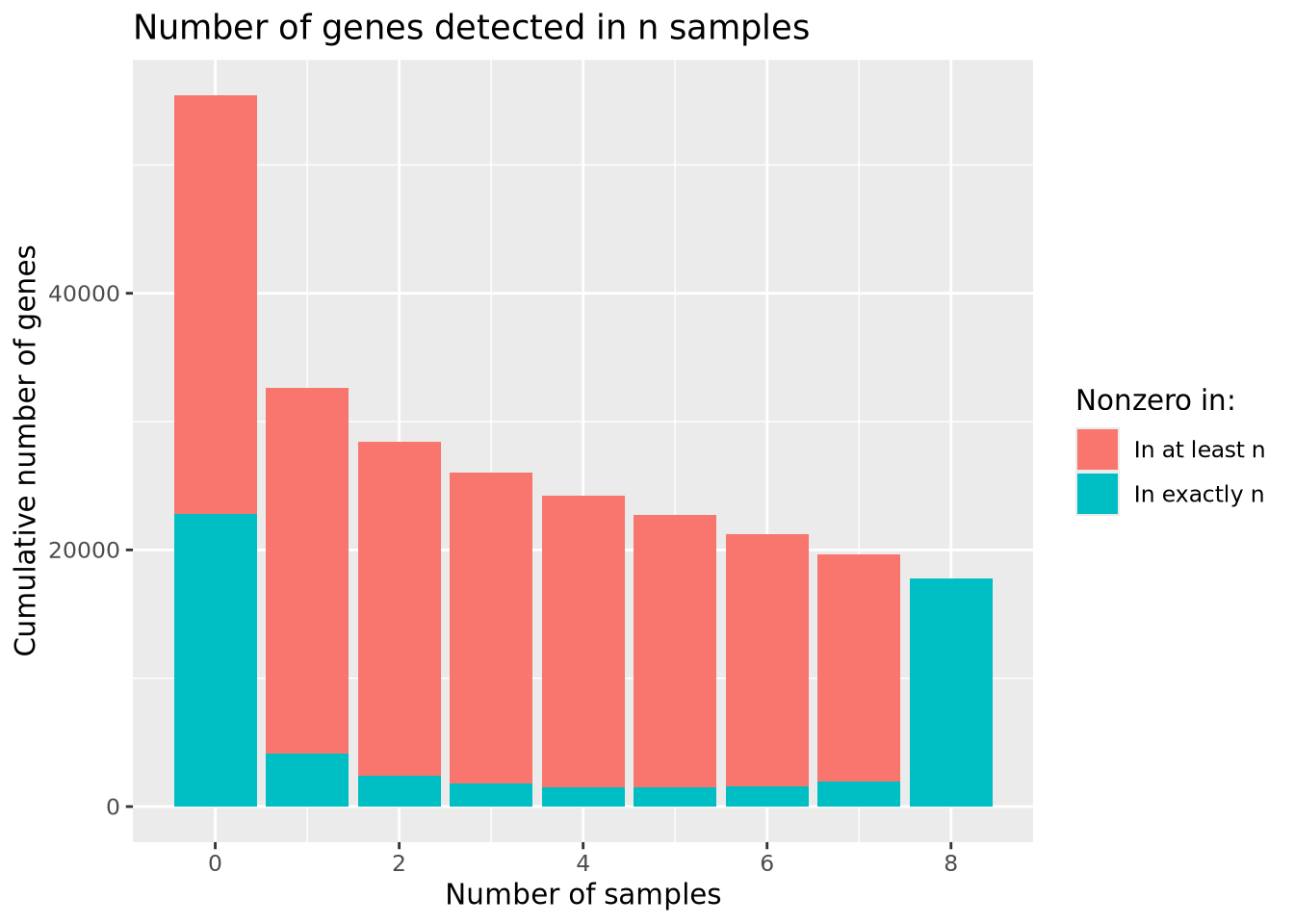
The largest number of genes is detected in none of the samples, followed by genes detected in all samples, with many fewer in between. Based on the plot, there is no obvious choice for how many nonzero samples are sufficient to use as a filter.
We may gain additional insight into this problem by considering the distribution of counts for genes present in at least \(n\) samples as above, rather than just the number of nonzero counts. Below is a plot similar to that above but, which plots the distribution of mean counts across samples within each number of nonzero samples:
# calculate the mean count for non-zero counts in genes with exactly n non-zero counts
mutate(counts,`Number of nonzero samples`=factor(rowSums(counts[-1]!=0))) %>%
  pivot_longer(-c(gene,`Number of nonzero samples`),names_to="Sample",values_to="Count") %>%
  group_by(`Number of nonzero samples`) %>%
  group_by(gene, .add=TRUE) %>% summarize(`Nonzero Count Mean`=mean(Count[Count!=0]),.groups="keep") %>%
  ungroup() %>%
  ggplot(aes(x=`Number of nonzero samples`,y=`Nonzero Count Mean`,fill=`Number of nonzero samples`)) +
  geom_violin(scale="width") +
  scale_y_log10() +
  labs(title="Nonzero count mean for genes with exactly n nonzero counts")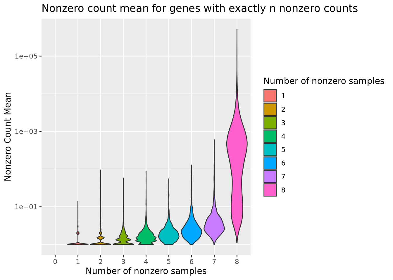
From this plot, we see that the mean count for genes with even a single sample with a zero is substantially lower than most genes without any zeros. We might therefore decide to filter out genes that have any zeros, with the rationale that most genes of appreciable abundance would still be included. However, there are some genes with a high average count for samples that are not zero that would be eliminated if we chose to use only genes expressed in all 8 samples. Again, there is no clear choice of filtering threshold, and a subjective decision is necessary.
One important property of RNASeq expression data is that genes with higher mean count also have higher variance. This mean-variance dependence means these count data are heteroskedastic, a term used to describe data that has inconstant variance across different values. We can visualize this dependence by calculating the mean and variance for each of our normalized count genes and plotting them against each other:
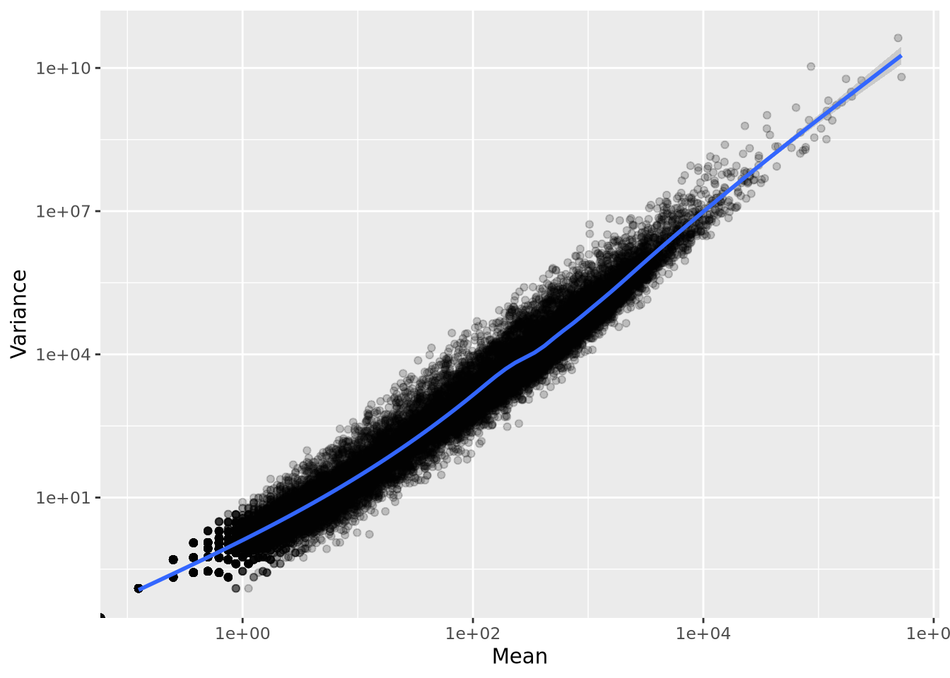
Unlike in microarray data, where probesets can be filtered based on variance, using low variance as a filter for count data would result in filtering out genes with low mean, which would lead to undesirable bias toward highly expressed genes.
Depending on the experiment, it may be meaningful if a gene is detected at all in any of the samples. In these cases, genes with only 1 read in a single sample might be kept, even though these genes would not result in confident statistical inference if subjected to differential expression. The scientific question asked by the experiment is an important consideration when deciding thresholds.
When the goal of the RNASeq experiment is differential expression analysis, a good rule of thumb when choosing a filtering threshold is to choose genes that have sufficiently many non-zero counts such that the statistical method has enough variance to perform reliable inference. For example, a reasonable filtering threshold might be to include genes that have non-zero counts in at least 50% of the samples. This threshold depends only upon the number of samples being considered. In an experimental design with two or more sample groups, a reasonable strategy might be to require at least 50% of samples within at least one group or within all groups to be included. Taking the experimental design into account when filtering can ensure the most interesting genes, e.g. those expressed only in one condition, are captured.
Regardless of the filtering strategy used, there is no biological meaning to any filtering threshold. The number of reads detected for each gene is dependent primarily upon the library size, where larger libraries are more likely to sample lowly abundant genes. Therefore, we cannot filter genes with the intent of “removing lowly expressed genes”; instead we can only filter out genes that are below the detection threshold afforded by the library size of the dataset.
9.7.8 Count Distributions
The range of gene expression in a cell varies by orders of magnitude. The following histogram plots the distribution of read count values for one of the adult samples:
dplyr::select(filtered_counts, Ad_1) %>%
  mutate(`log10(counts+1)`=log10(Ad_1+1)) %>%
  ggplot(aes(x=`log10(counts+1)`)) +
  geom_histogram(bins=50) +
  labs(title='log10(counts) distribution for Adult mouse')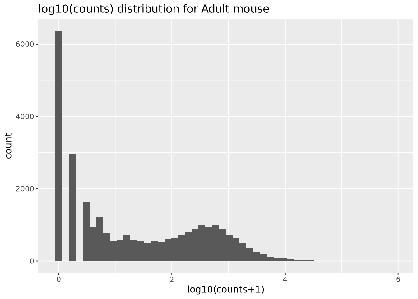
We add 1 count, called a pseudocount, to avoid taking the log of zero, therefore all the genes at \(x=0\) are genes that have no reads. From the plot, the largest count is nearly \(10^6\) while the smallest is 1, spanning nearly six orders of magnitude. There are relatively few of these highly abundant genes, however, and most genes are betwen the range of 100-10,000 reads. We see that this distribution is similar for all the samples, when displayed as a ridgeline plot:
library(ggridges)

pivot_longer(filtered_counts,-c(gene),names_to="Sample",values_to="Count") %>%
  mutate(`log10(Count+1)`=log10(Count+1)) %>%
  ggplot(aes(y=Sample,x=`log10(Count+1)`,fill=Sample)) +
  geom_density_ridges(bandwidth=0.132) +
  labs(title="log10(Count+1) Distributions")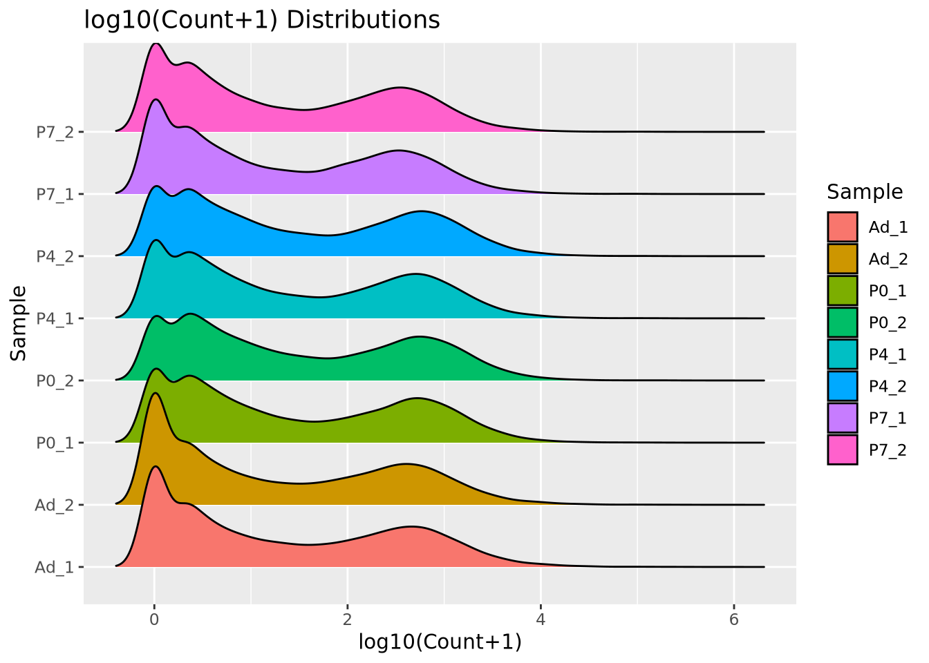
The general shape of the distributions is similar, with a large mode of counts at zero, representing genes that had zero counts in that sample, and a wider mode between 100 and 10,000 where most consistently expressed genes fall. However, we note that the peak count of these larger modes vary and also recall that though the difference appears small, the log scale of the x axis means the differences in counts may be substantial. We will discuss the implications of this in the next section.
9.7.8.1 Count Normalization
The number of reads generated for each sample in an RNASeq dataset varies from sample to sample due to randomness in the biochemical process that generates the data. The relationship between the number of reads that maps to any given gene and the relative abundance of the molecule in the sample is dependent upon the library size of each sample. The direct number of counts, or the raw counts, is therefore not directly comparable between samples. A simple example should suffice to make this clear:
Imagine two RNASeq datasets generated from the same RNA sample. One of the samples was sequenced to 1000 reads, and the other to 2000 reads. Now imagine that one gene makes up half of the RNA in the original sample. In the sample with 1000 reads, we find this gene has 500 reads. In the sample with 2000 reads, the gene has 1000 of those reads. In both cases the fraction of reads that map to the gene is 0.5, but the absolute number of reads differs greatly. This is why the raw counts for a gene are not directly comparable between samples with different numbers of reads. Since in general every sample will have a unique number of reads, these raw counts will never be directly comparable. The way we mitigate this problem is with a statistical procedure called count normalization.
Count normalization is the process by which the number of raw counts in each sample is scaled by a factor to make multiple samples comparable. Many strategies have been proposed to do this, but the simplest is a family of methods that divide by some factor of the library size. A common method in this family is to compute counts per million reads or CPM normalization, which scales each gene count by the number of millions of reads in the library:
\[ cpm_{s,i} = \frac{c_{s,i}}{l_s} * 10^6 \]
Here, \(c_{s,i}\) is the raw count of gene \(i\) in sample \(s\), and \(l_s\) is the number of reads in the dataset for sample \(s\). If each sample is scaled by their own library size, then in principle the proportion of read counts assigned to each gene out of all reads for that sample will be comparable across samples. When we have no additional knowledge of the distribution of genes in our system, library size normalization methods are the most general and make the fewest assumptions. Below is a ridgeline plot of the counts distribution after CPM normalization:
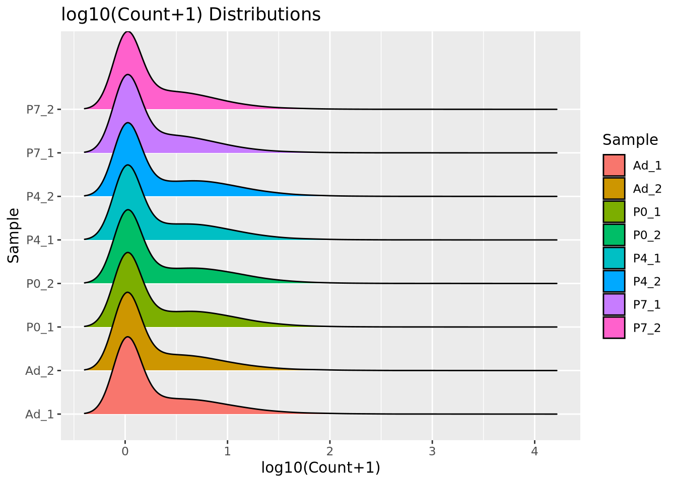
The distributions look quite different after CPM normalization, but the modes now look more consistent than with raw counts.
One drawback of library size normalization is it is sensitive to extreme values; individual genes with many more reads in one sample than in other samples. These outliers can lead to pathological effects when comparing gene count values across samples. However, if we are measuring gene expression in a single biological system like mouse or human, as is often the case, other methods have been developed to better use our understanding of the gene expression distribution to perform more robust and biologically meaningful normalization. A more robust approach is possible when we make the reasonable assumption that, for any set of biological conditions in an experiment, most genes are not differentially expressed. This is the assumption made by the DESeq2 normalization method.
The DESeq2 normalization method is a statistical procedure that uses the median geometric mean computed across all samples to determine the scale factor for each sample. The procedure is somewhat complicated and we encourage the reader to examine it in detail in the DESeq2 publication (Love, Huber, and Anders 2014). The method has proven to be consistent and reliable compared with other strategies (Dillies et al. 2013) and is the default normalization for the populare DESeq2 differential expression method, which will be described in a later section. The DESeq2 normalization method may be implemented using the DESeq2 Bioconductor package:
library(DESeq2)
# DESeq2 requires a counts matrix, column data (sample information), and a formula
# the counts matrix *must be raw counts*
count_mat <- as.matrix(filtered_counts[-1])

row.names(count_mat) <- filtered_counts$gene

dds <- DESeqDataSetFromMatrix(
  countData=count_mat,
  colData=tibble(sample_name=colnames(filtered_counts[-1])),
  design=~1 # no formula is needed for normalization, ~1 produces a trivial design matrix
)

# compute normalization factors
dds <- estimateSizeFactors(dds)

# extract the normalized counts
deseq_norm_counts <- as_tibble(counts(dds,normalized=TRUE)) %>%
  mutate(gene=filtered_counts$gene) %>%
  relocate(gene)
Using the DESeq2 package, we first construct a DESeq object using the raw counts
matrix, a sample information tibble with only a sample name column, and a
trivial design formula, which will be explained in more depth in the
DESeq2/edgeR section. The estimateSizeFactors() function performs the
normalization routine on the counts, and the counts(dds,normalized=TRUE) call
extracts the normalized counts matrix. When plotted as a ridgeline plot as
before, we see that the gene expression distribution modes are better behaved
compared to raw counts, and the shape of the distribution is preserved unlike
with CPM normalized counts:
pivot_longer(deseq_norm_counts,-c(gene),names_to="Sample",values_to="Count") %>%
  mutate(`log10(Count+1)`=log10(Count+1)) %>%
  ggplot(aes(y=Sample,x=`log10(Count+1)`,fill=Sample)) +
  geom_density_ridges(bandwidth=0.132) +
  labs(title="log10(Count+1) Distributions")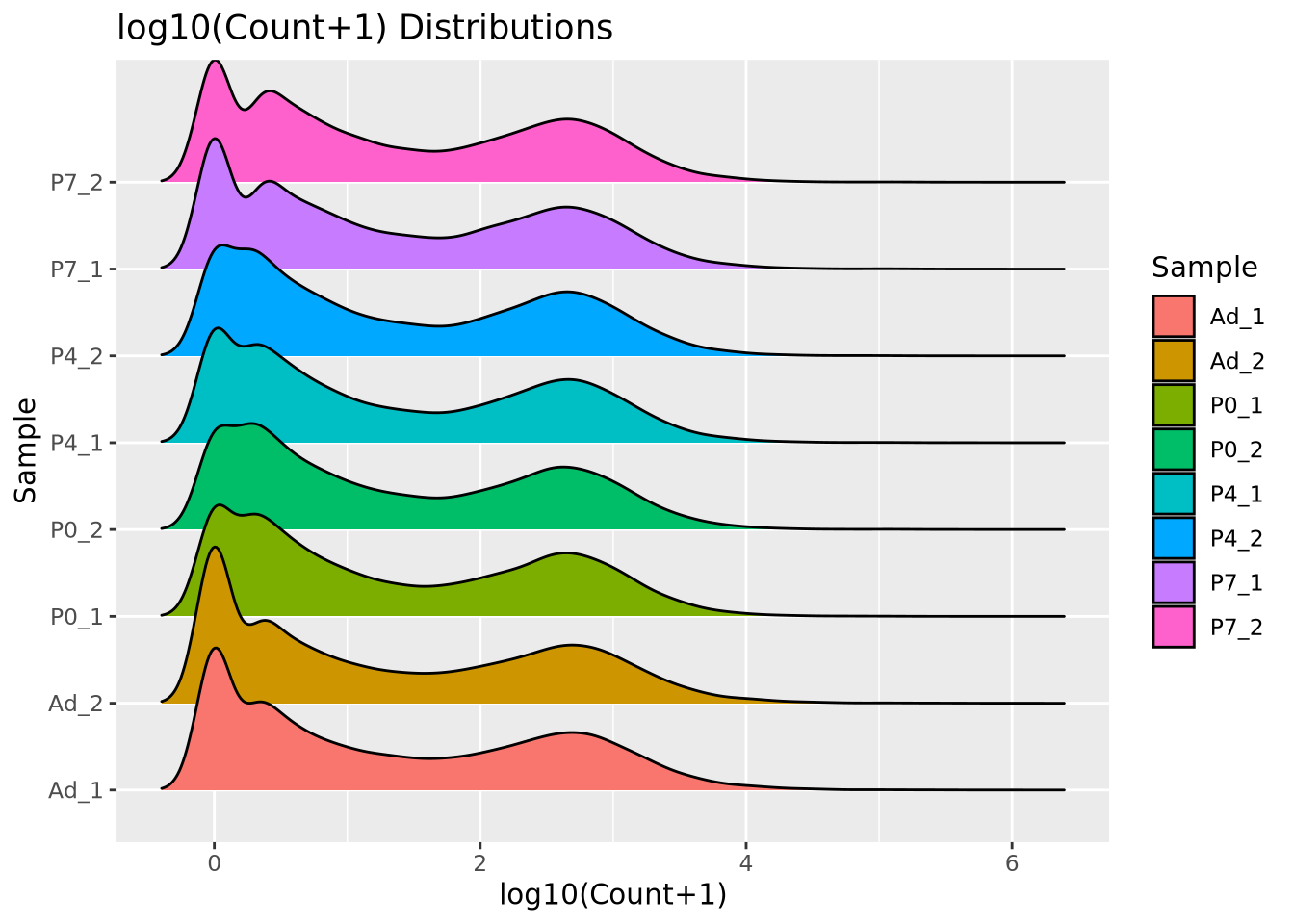
The DESeq2 normalization procedure has two important considerations to keep in mind:
- The procedure borrows information across all samples. The geometric mean of counts across all samples is computed as part of the normalization procedure. This means that the size factors computed depend on the samples in the dataset. The normalized counts for one sample will likely change if it is normalized with a different set of samples.
- The procedure does not use genes with any zero counts. The geometric mean calculation across all samples means that any sample with a zero count results in the entire geometric mean being zero. For this reason only genes with nonzero counts in every sample are used to calculate the normalization factors. If one of the samples has a large number of zeros, for example due to a small library size, this could dramatically influence the normalization factors for the entire experiment.
The CPM normalization procedure does not borrow information across all samples, and therefore is not subject to these considerations.
These are only two of many possible normalization methods, DESeq2 being the most popular at the time of writing. For a detailed explanation of many normalization methods, see (Dillies et al. 2013).
9.7.8.2 Count Transformation
As mentioned in the Count Data section, one way to deal with the non-normality
of count data is to perform a data transformation that makes the counts data
follow a normal distribution. Transformation to normality allows common and
powerful statistical methods like linear regression to be used. The most basic
count transformation is to take the logarithm of the counts. However, this can
be problematic for genes with low counts, causing the values to spread further
apart than genes with high counts, increasing the likelihood of false positive
results. To address this issue, the DESeq2 package provides the rlog()
function that performs a regularized logarithmic transformation that adjusts the
log transform based on the mean count of each gene.
The rlog transformation also has the desirable effect of making the count data homoskedastic, meaning the variance of a gene is not dependent on the mean. Some statistical methods assume that a dataset has this property. The relationship of mean count vs variance will be discussed in more detail in the next section.
We can clearlysee the effect of rlog on the counts distribution by plotting the rlog’ed counts using a ridgeline plot as before:
# the dds is the DESeq2 object from earlier
rld <- rlog(dds)

# extract rlog values as a tibble
rlog_counts <- as_tibble(assay(rld))
rlog_counts$gene <- filtered_counts$gene
pivot_longer(rlog_counts,-c(gene),names_to="Sample",values_to="rlog count") %>%
  ggplot(aes(y=Sample,x=`rlog count`,fill=Sample)) +
  geom_density_ridges(bandwidth=0.132) +
  labs(title="rlog Distributions")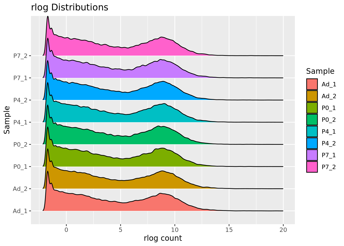
It is generally accepted that count transformations have significant drawbacks compared with statistical methods that model counts and errors explicitly, like generalized linear models (GLM) such as Poisson and Negative Binomial regressions (St-Pierre, Shikon, and Schneider 2018). Whenever possible, these GLM based methods should be used instead of transformations. However, the transformations may sometimes be necessary depending on the required analysis, so the rlog function in DESeq2 may be useful for these cases.
9.7.9 Differential Expression: RNASeq
The read counts for each gene or transcript form the primary data used to identify genes whose expression correlates with some condition of interest. The counts matrix created by concatenating read counts for all genes across a set of samples where rows are genes or transcripts and columns are samples is the most common form of expression data used for this purpose. As mentioned in the Count Data section, these counts are not normally distributed and therefore require a statistical approach that can accommodate the counts distribution.
The strong relationship between the mean and variance is characteristic of RNASeq expression data, and motivates the use of a generalized linear model called negative binomial regression. Negative binomial regression models count data using the negative binomial distribution, which allows the relationship of mean and variance of a counts distribution to vary. The statistical details of the negative binomial distribution and negative binomial regression are beyond the scope of this book, but below we will discuss the aspects necessary to implement differential expression analysis.
9.7.9.1 DESeq2/EdgeR
DESeq2 and edgeR are bioconductor packages that both implement negative binomial regression to perform differential expression on RNASeq data. Both perform raw counts normalization as part of their function, though they differ in the normalization method (DESeq2 method is described above, while edgeR uses trimmed mean of M-values (TMM), see (Robinson and Oshlack 2010)). The interface for using both packages is also similar, so we will focus on DESeq2 in this section.
As mentioned briefly above, DESeq2 requires three pieces of information to perform differential expression:
- A raw counts matrix with genes as rows and samples as columns
- A data frame with metadata associated with the columns
- A design formula for the differential expression model
DESeq2 requires raw counts due to its normalization procedure, which borrows information across samples when computing size factors, as described above in the Count Normalization section.
With these three pieces of information, we construct a DESeq object:
library(DESeq2)

# filter counts to retain genes with at least 6 out of 8 samples with nonzero counts
filtered_counts <- counts[rowSums(counts[-1]!=0)>=6,]

# DESeq2 requires a counts matrix, column data (sample information), and a formula
# the counts matrix *must be raw counts*
count_mat <- as.matrix(filtered_counts[-1])
row.names(count_mat) <- filtered_counts$gene

# create a sample matrix from sample names
sample_info <- tibble(
  sample_name=colnames(filtered_counts[-1])
) %>%
  separate(sample_name,c("timepoint","replicate"),sep="_",remove=FALSE) %>%
  mutate(
    timepoint=factor(timepoint,levels=c("Ad","P0","P4","P7"))
  )

design <- formula(~ timepoint)

sample_info
## # A tibble: 8 × 3
## sample_name timepoint replicate
## <chr> <fct> <chr>
## 1 P0_1 P0 1
## 2 P0_2 P0 2
## 3 P4_1 P4 1
## 4 P4_2 P4 2
## 5 P7_1 P7 1
## 6 P7_2 P7 2
## 7 Ad_1 Ad 1
## 8 Ad_2 Ad 2The design formula ~ timepoint is similar to that supplied to the
model.matrix() function as described in the Differential Expression Analysis
section, where DESeq2 implicitly creates the model matrix by combining the
column data with the formula. In this differential expression analysis, we wish
to identify genes that are different between the timepoints P0, P4, P7,
and Ad. With these three pieces of information prepared, we can create a DESeq
object and perform differential expression analysis:
dds <- DESeqDataSetFromMatrix(
  countData=count_mat,
  colData=sample_info,
  design=design
)
dds <- DESeq(dds)
resultsNames(dds)
## [1] "Intercept" "timepoint_P0_vs_Ad" "timepoint_P4_vs_Ad"
## [4] "timepoint_P7_vs_Ad"DESeq2 performed differential expression on each gene and estimated parameters
for three different comparisons - P0 vs Ad, P4 vs Ad, and P7 vs Ad. Here, Ad is
the reference group so that we may interpret the statistics as relative to the
adult animals. The choice of reference group does not change the magnitude of
the results, but may change the sign of the estimated coefficients, which are
log2 fold changes. To extract out the differential expression statistics for the
P0 vs Ad comparison, we can use the results() function:
res <- results(dds, name="timepoint_P0_vs_Ad")
p0_vs_Ad_de <- as_tibble(res) %>%
  mutate(gene=rownames(res)) %>%
  relocate(gene) %>%
  arrange(pvalue)
p0_vs_Ad_de
## # A tibble: 21,213 × 7
## gene baseMean log2FoldChange lfcSE stat pvalue padj
## <chr> <dbl> <dbl> <dbl> <dbl> <dbl> <dbl>
## 1 ENSMUSG00000000031.17 19624. 6.75 0.190 35.6 5.70e-278 1.07e-273
## 2 ENSMUSG00000026418.17 9671. 9.84 0.285 34.5 2.29e-261 2.15e-257
## 3 ENSMUSG00000051855.16 3462. 5.35 0.157 34.1 2.84e-255 1.77e-251
## 4 ENSMUSG00000027750.17 9482. 4.05 0.125 32.4 2.26e-230 1.06e-226
## 5 ENSMUSG00000042828.13 3906. -5.32 0.167 -31.8 1.67e-221 6.25e-218
## 6 ENSMUSG00000046598.16 1154. -6.08 0.197 -30.8 4.77e-208 1.49e-204
## 7 ENSMUSG00000019817.19 1952. 5.15 0.171 30.1 1.43e-198 3.83e-195
## 8 ENSMUSG00000021622.4 17146. -4.57 0.157 -29.0 4.41e-185 1.03e-181
## 9 ENSMUSG00000002500.16 2121. -6.20 0.217 -28.5 6.69e-179 1.39e-175
## 10 ENSMUSG00000024598.10 1885. 5.90 0.209 28.2 5.56e-175 1.04e-171
## # ℹ 21,203 more rowsThese are the results of the differential expression comparing P0 with Ad; the
other contrasts (P4 vs Ad and P7 vs Ad) may be extracted by specifying the
appropriate result names to the name argument to the results() function. The columns in the DESeq2 results are defined as follows:
- baseMean - the mean normalized count of all samples for the gene
- log2FoldChange - the estimated coefficient (i.e. log2FoldChange) for the comparison of interest
- lfcSE - the standard error for the log2FoldChange estimate
- stat - the Wald statistic associated with the log2FoldChange estimate
- pvalue - the nominal p-value of the Wald test (i.e. the signifiance of the association)
- padj - the multiple testing adjusted p-value (i.e. false discovery rate)
In the P0 vs Ad comparison, we can check the number of significant results easily:
# number of genes significant at FDR < 0.05
filter(p0_vs_Ad_de,padj<0.05)
## # A tibble: 7,557 × 7
## gene baseMean log2FoldChange lfcSE stat pvalue padj
## <chr> <dbl> <dbl> <dbl> <dbl> <dbl> <dbl>
## 1 ENSMUSG00000000031.17 19624. 6.75 0.190 35.6 5.70e-278 1.07e-273
## 2 ENSMUSG00000026418.17 9671. 9.84 0.285 34.5 2.29e-261 2.15e-257
## 3 ENSMUSG00000051855.16 3462. 5.35 0.157 34.1 2.84e-255 1.77e-251
## 4 ENSMUSG00000027750.17 9482. 4.05 0.125 32.4 2.26e-230 1.06e-226
## 5 ENSMUSG00000042828.13 3906. -5.32 0.167 -31.8 1.67e-221 6.25e-218
## 6 ENSMUSG00000046598.16 1154. -6.08 0.197 -30.8 4.77e-208 1.49e-204
## 7 ENSMUSG00000019817.19 1952. 5.15 0.171 30.1 1.43e-198 3.83e-195
## 8 ENSMUSG00000021622.4 17146. -4.57 0.157 -29.0 4.41e-185 1.03e-181
## 9 ENSMUSG00000002500.16 2121. -6.20 0.217 -28.5 6.69e-179 1.39e-175
## 10 ENSMUSG00000024598.10 1885. 5.90 0.209 28.2 5.56e-175 1.04e-171
## # ℹ 7,547 more rowsThere were 7,557 significantly differentially expressed genes associated with this comparison, which includes both up- and down-regulated genes (examine the signs of the log2FoldChange column). A common diagnostic plot of differenial expression results is the so-called volcano plot which plots the log2FoldChange on the x-axis against -log10 adjusted p-value on the y-axis:
mutate(
  p0_vs_Ad_de,
  `-log10(adjusted p)`=-log10(padj),
  `FDR<0.05`=padj<0.05
  ) %>%
  ggplot(aes(x=log2FoldChange,y=`-log10(adjusted p)`,color=`FDR<0.05`)) +
  geom_point()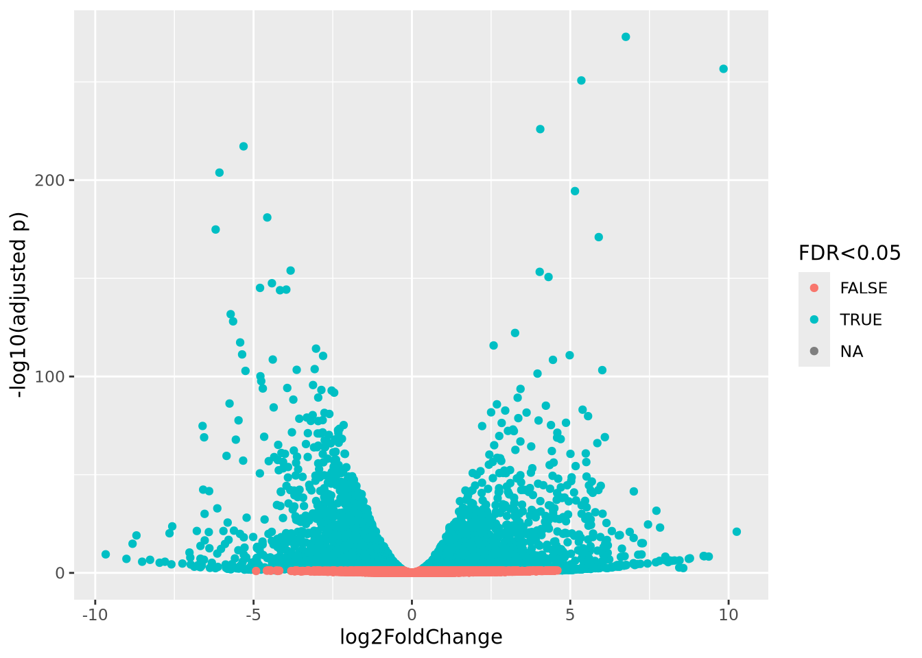
The plot shows that there are significant genes at FDR < 0.05 that are increased and decreased in the comparison.
DESeq2 has many capabilities beyond this basic differential expression functionality as described in its comprehensive documentation in its vignette.
As mentioned, edgeR implements a very similar model to DESeq2 and also has excellent documentation.
9.7.9.2 limma/voom
While the limma package was initially developed for microarray analysis, the authors added support for RNASeq soon after the HTS technique became available. limma accommodates count data by first performing a Count Transformation using its own voom transformation procedure. voom transforms counts by first performing a counts per million normalization, taking the logarithm of the CPM values, and finally estimates the mean-variance relationship across genes for use in its empirical Bayes statistical framework. The counts data being thus transformed, limma performs statistical inference using its usual linear model framework to produce differential expression results with arbitrarily complex statistical models.
This brief example is from the limma User Guide chapter 15, and covers loading and processing data from an RNA-seq experiment. We go into more depth while working with limma in assignment 6.
Without going into too much detail, the design variable is how we inform limma
of our experimental conditions, and where limma draws from to construct its
linear models correctly. This design is relatively simple, just four samples
belonging to two different conditions (the swirls here refer to the swirl of
zebra fish, you can just see them as a phenotypic difference)
design <- data.frame(swirl = c("swirl.1", "swirl.2", "swirl.3", "swirl.4"),
                     condition = c(1, -1, 1, -1))
dge <- DGEList(counts=counts)
keep <- filterByExpr(dge, design)
dge <- dge[keep,,keep.lib.sizes=FALSE]
DGEList() is a function from edgeR, of which limma borrows some loading and
filtering functions. This experiment filters by expression level, and uses
square bracket notation ([]) to reduce the number of rows.
Finally, the expression data is transformed into CPM, counts per million, and
a linear model is applied to the data with lmFit(). topTable() is used to view the most
differentially expressed data.
# limma trend
logCPM <- cpm(dge, log=TRUE, prior.count=3)
fit <- lmFit(logCPM, design)
fit <- eBayes(fit, trend=TRUE)
topTable(fit, coef=ncol(design))
9.8 Gene Set Enrichment Analysis
With the constant evolution of high-throughput sequencing (HTS) technologies, the size and dimensionality of data generated has been ever increasing. The question of interest has shifted from how do we generate the data to how do we make meaningful biological interpretations on a genome-wide level. The simplest and most common output of HTS experiments is a list of “interesting” genes. In the specific case of differential gene expression analysis, it is possible and quite common to obtain hundreds or even thousands of differentially expressed genes in a single experiment that may be directly or indirectly related to the phenotype of interest.
While it can be helpful and fruitful to research these genes individually, this form of personal inspection is limited by one’s domain knowledge and by the size of the results. On a biological level, it is complicated by the fact that most processes are often coordinated by the actions of many genes/gene products working in concert. Cellular signaling pathways, phenotypic differences or responses to various stimuli are typically associated with changes in the expression pattern of many genes that share common biological functions or regulation.
Gene set enrichment analysis is an umbrella term for methods designed to analyze expression data and capture changes in higher-level biological processes and pathways by organizing genes into biologically relevant groups or gene sets. We will discuss the background of two common gene set enrichment analyses (over-representation analysis and rank-based Gene Set Enrichment Analysis), their advantages and disadvantages, and walk-through an example of how they can each be implemented in R. Before this, we will briefly touch upon the definition of a gene set and describe how to construct or obtain gene sets.
9.8.1 Gene Sets
Gene sets are curated lists of genes that are grouped together by some logical association or pre-existing domain knowledge. Their primary use is to facilitate the biological interpretation of expression data by capturing high-level interactions between biologically relevant groups of genes. These sets are highly flexible and may be constructed based on any a priori knowledge or classification. For example, one could define a gene set that includes all genes that are members of the same biochemical pathway or a gene set that consists of all genes that are induced upon treatment with a particular pharmacological agent. While it is perfectly valid to construct new gene sets, there are many existing and curated collections of gene sets that are maintained and contributed to by communities of scientists throughout the world. Below, we will highlight some of the major collections that are commonly used and cited in published work:
The Kyoto Encyclopedia of Genes and Genomes (KEGG) is a repository for biological pathway information that the authors describe as a means to “computerize functional interpretations as part of the pathway reconstruction process based on the hierarchically structured knowledge about the genomic, chemical, and network spaces”. The KEGG Pathways database consists of maps displaying the functional and regulatory relationships of genes within various metabolic and cell signaling pathways. The KEGG offers a web service that allows for the extraction of the genes and other information belonging to specific pathways.
The Gene Ontology provides a network representation of biological systems from the molecular-level to the organismal level by defining a graph based representation of connected terms using a controlled vocabulary. At a high level, GO annotations consist of three broad ontologies termed molecular function, cellular component, and biological process. The molecular function is the specific activity a gene product performs on a molecular level (i.e. a protein kinase would be annotated with protein kinase activity). The biological process defines the higher-level programs and pathways that’s accomplished by the activities of the gene product (i.e. if we take our previous example of a protein kinase, it’s biological process might be assigned as signal transduction). The cellular component refers to the localization of the gene product within the cell (i.e. the cellular component of a protein kinase might be cytosol). A gene product can be annotated with zero or more terms from each ontology, and these annotations are based on multiple levels of evidence from published work. The GO annotations may be accessed or downloaded directly from their own website, and there exist a number of web services that use GO annotations in the background (DAVID, enrichR, etc.)
The Molecular Signatures Database (MSigDB) is a collection of gene sets curated, maintained and provided by the Broad Institute and UC San Diego. Although intended and designed for specific use with the Gene Set Enrichment Analysis Methodology, they are freely available and only require proper attribution for other uses. The MSigDB consists of 9 major collections of gene sets: H (hallmark gene sets), C1 (positional gene sets), C2 (curated gene sets), c3 (regulatory target gene sets), c4 (computational gene sets), c5 (ontology gene sets), c6 (oncogenic signature gene sets), c7 (immunologic signature gene sets), c8 (cell type signature gene sets). They are available in formats ready for use in the GSEA methodology and other formats that are easily imported into various settings for custom use. The gene sets as well as the GSEA methodology are available directly from their website. There are a number of R-specific packages that have been developed for working directly with these gene sets such as GSEABase or fgsea, which we will discuss later.
9.8.2 Working with gene sets in R
We will walk through two quick examples of how to read in an example collection of gene sets. We will utilize the Hallmarks gene set collection, downloaded directly from the MSigDB website, which consists of 50 gene sets representing well-defined biological processes and generated by aggregating together many pre-existing gene sets. The MSigDB provides these gene set collections in the GMT format. These files are tab-delimited and each row in the format represents one gene set with the first column being the name of the gene set, and the second column a short description. The remaining columns each represent a gene and unequal lengths of columns per row is allowed. As is, the GMT format is designed to work specifically with the GSEA methodology developed and provided by the Broad Institute. However, we will also show two ways to manually parse these gene collections for exploration and further use in R.
The first way to parse these gene sets would be to use various tidyverse
functions that you should be familiar with already to construct a tibble.
Essentially, we read the file, rename the first two columns for convenience, and
use a combination of pivot_longer() and group_by() to quickly access genes
by pathway. Below, we have the results of these operations and used them to
display a summary of the number of genes in all the pathways contained with the
hallmark pathways gene collection.
read_delim('h.all.v7.5.1.symbols.gmt', delim='\t', col_names=FALSE) %>%
  dplyr::rename(Pathway = X1, Desc=X2) %>%
  dplyr::select(-Desc) %>%
  pivot_longer(!Pathway, values_to='genes', values_drop_na=TRUE, names_to = NULL) %>%
  group_by(Pathway) %>%
  summarise(n=n())
## # A tibble: 50 × 2
## Pathway n
## <chr> <int>
## 1 HALLMARK_ADIPOGENESIS 200
## 2 HALLMARK_ALLOGRAFT_REJECTION 200
## 3 HALLMARK_ANDROGEN_RESPONSE 100
## 4 HALLMARK_ANGIOGENESIS 36
## 5 HALLMARK_APICAL_JUNCTION 200
## 6 HALLMARK_APICAL_SURFACE 44
## 7 HALLMARK_APOPTOSIS 161
## 8 HALLMARK_BILE_ACID_METABOLISM 112
## 9 HALLMARK_CHOLESTEROL_HOMEOSTASIS 74
## 10 HALLMARK_COAGULATION 138
## # ℹ 40 more rowsWe can see that there are 50 total pathways in the hallmarks gene collection
that contain varying numbers of genes. We discarded the description column and
if we were to save the results after using pivot_longer() instead of piping
them to group_by and summarise(), we would have a tibble in the “long”
format with each row representing a single pathway and single gene.
However, there do exist various packages that have been developed to specifically handle gene set data in R such as the previously mentioned GSEABase. This is a collection of functions and class-based objects that facilitate working with gene sets. The foundation of the GSEABase package is the GeneSet and GeneSetCollection classes which store gene sets and metadata or a collection of GeneSet objects, respectively. We will use the GSEABase package to read in the collection of gene sets we previously downloaded.
## GeneSetCollection
##   names: HALLMARK_TNFA_SIGNALING_VIA_NFKB, HALLMARK_HYPOXIA, ..., HALLMARK_PANCREAS_BETA_CELLS (50 total)
##   unique identifiers: JUNB, CXCL2, ..., SRP14 (4383 total)
##   types in collection:
##     geneIdType: NullIdentifier (1 total)
##     collectionType: NullCollection (1 total)
If we simply access the hallmarks_gmt variable, we can see that it is a GeneSetCollection object containing 0 total gene sets which encompass 4383 unique identifiers or HGNC symbols. Although this package supports a range of functions, we will focus on the basics. For a more thorough description of the classes and methods, please read their extended documentation available here.
The geneIds method will return a list with each pathway as a named vector of associated gene ids:
## $HALLMARK_TNFA_SIGNALING_VIA_NFKB
##   [1] "JUNB"     "CXCL2"    "ATF3"     "NFKBIA"   "TNFAIP3"  "PTGS2"
##   [7] "CXCL1"    "IER3"     "CD83"     "CCL20"    "CXCL3"    "MAFF"
##  [13] "NFKB2"    "TNFAIP2"  "HBEGF"    "KLF6"     "BIRC3"    "PLAUR"
##  [19] "ZFP36"    "ICAM1"    "JUN"      "EGR3"     "IL1B"     "BCL2A1"
##  [25] "PPP1R15A" "ZC3H12A"  "SOD2"     "NR4A2"    "IL1A"     "RELB"
##  [31] "TRAF1"    "BTG2"     "DUSP1"    "MAP3K8"   "ETS2"     "F3"
##  [37] "SDC4"     "EGR1"     "IL6"      "TNF"      "KDM6B"    "NFKB1"
##  [43] "LIF"      "PTX3"     "FOSL1"    "NR4A1"    "JAG1"     "CCL4"
##  [49] "GCH1"     "CCL2"     "RCAN1"    "DUSP2"    "EHD1"     "IER2"
##  [55] "REL"      "CFLAR"    "RIPK2"    "NFKBIE"   "NR4A3"    "PHLDA1"
##  [61] "IER5"     "TNFSF9"   "GEM"      "GADD45A"  "CXCL10"   "PLK2"
##  [67] "BHLHE40"  "EGR2"     "SOCS3"    "SLC2A6"   "PTGER4"   "DUSP5"
##  [73] "SERPINB2" "NFIL3"    "SERPINE1" "TRIB1"    "TIPARP"   "RELA"
##  [79] "BIRC2"    "CXCL6"    "LITAF"    "TNFAIP6"  "CD44"     "INHBA"
##  [85] "PLAU"     "MYC"      "TNFRSF9"  "SGK1"     "TNIP1"    "NAMPT"
##  [91] "FOSL2"    "PNRC1"    "ID2"      "CD69"     "IL7R"     "EFNA1"
##  [97] "PHLDA2"   "PFKFB3"   "CCL5"     "YRDC"     "IFNGR2"   "SQSTM1"
## [103] "BTG3"     "GADD45B"  "KYNU"     "G0S2"     "BTG1"     "MCL1"
## [109] "VEGFA"    "MAP2K3"   "CDKN1A"   "CCN1"     "TANK"     "IFIT2"
## [115] "IL18"     "TUBB2A"   "IRF1"     "FOS"      "OLR1"     "RHOB"
## [121] "AREG"     "NINJ1"    "ZBTB10"   "PLPP3"    "KLF4"     "CXCL11"
## [127] "SAT1"     "CSF1"     "GPR183"   "PMEPA1"   "PTPRE"    "TLR2"
## [133] "ACKR3"    "KLF10"    "MARCKS"   "LAMB3"    "CEBPB"    "TRIP10"
## [139] "F2RL1"    "KLF9"     "LDLR"     "TGIF1"    "RNF19B"   "DRAM1"
## [145] "B4GALT1"  "DNAJB4"   "CSF2"     "PDE4B"    "SNN"      "PLEK"
## [151] "STAT5A"   "DENND5A"  "CCND1"    "DDX58"    "SPHK1"    "CD80"
## [157] "TNFAIP8"  "CCNL1"    "FUT4"     "CCRL2"    "SPSB1"    "TSC22D1"
## [163] "B4GALT5"  "SIK1"     "CLCF1"    "NFE2L2"   "FOSB"     "PER1"
## [169] "NFAT5"    "ATP2B1"   "IL12B"    "IL6ST"    "SLC16A6"  "ABCA1"
## [175] "HES1"     "BCL6"     "IRS2"     "SLC2A3"   "CEBPD"    "IL23A"
## [181] "SMAD3"    "TAP1"     "MSC"      "IFIH1"    "IL15RA"   "TNIP2"
## [187] "BCL3"     "PANX1"    "FJX1"     "EDN1"     "EIF1"     "BMP2"
## [193] "DUSP4"    "PDLIM5"   "ICOSLG"   "GFPT2"    "KLF2"     "TNC"
## [199] "SERPINB8" "MXD1"
##
## $HALLMARK_HYPOXIA
##   [1] "PGK1"     "PDK1"     "GBE1"     "PFKL"     "ALDOA"    "ENO2"
##   [7] "PGM1"     "NDRG1"    "HK2"      "ALDOC"    "GPI"      "MXI1"
##  [13] "SLC2A1"   "P4HA1"    "ADM"      "P4HA2"    "ENO1"     "PFKP"
##  [19] "AK4"      "FAM162A"  "PFKFB3"   "VEGFA"    "BNIP3L"   "TPI1"
##  [25] "ERO1A"    "KDM3A"    "CCNG2"    "LDHA"     "GYS1"     "GAPDH"
##  [31] "BHLHE40"  "ANGPTL4"  "JUN"      "SERPINE1" "LOX"      "GCK"
##  [37] "PPFIA4"   "MAFF"     "DDIT4"    "SLC2A3"   "IGFBP3"   "NFIL3"
##  [43] "FOS"      "RBPJ"     "HK1"      "CITED2"   "ISG20"    "GALK1"
##  [49] "WSB1"     "PYGM"     "STC1"     "ZNF292"   "BTG1"     "PLIN2"
##  [55] "CSRP2"    "VLDLR"    "JMJD6"    "EXT1"     "F3"       "PDK3"
##  [61] "ANKZF1"   "UGP2"     "ALDOB"    "STC2"     "ERRFI1"   "ENO3"
##  [67] "PNRC1"    "HMOX1"    "PGF"      "GAPDHS"   "CHST2"    "TMEM45A"
##  [73] "BCAN"     "ATF3"     "CAV1"     "AMPD3"    "GPC3"     "NDST1"
##  [79] "IRS2"     "SAP30"    "GAA"      "SDC4"     "STBD1"    "IER3"
##  [85] "PKLR"     "IGFBP1"   "PLAUR"    "CAVIN3"   "CCN5"     "LARGE1"
##  [91] "NOCT"     "S100A4"   "RRAGD"    "ZFP36"    "EGFR"     "EDN2"
##  [97] "IDS"      "CDKN1A"   "RORA"     "DUSP1"    "MIF"      "PPP1R3C"
## [103] "DPYSL4"   "KDELR3"   "DTNA"     "ADORA2B"  "HS3ST1"   "CAVIN1"
## [109] "NR3C1"    "KLF6"     "GPC4"     "CCN1"     "TNFAIP3"  "CA12"
## [115] "HEXA"     "BGN"      "PPP1R15A" "PGM2"     "PIM1"     "PRDX5"
## [121] "NAGK"     "CDKN1B"   "BRS3"     "TKTL1"    "MT1E"     "ATP7A"
## [127] "MT2A"     "SDC3"     "TIPARP"   "PKP1"     "ANXA2"    "PGAM2"
## [133] "DDIT3"    "PRKCA"    "SLC37A4"  "CXCR4"    "EFNA3"    "CP"
## [139] "KLF7"     "CCN2"     "CHST3"    "TPD52"    "LXN"      "B4GALNT2"
## [145] "PPARGC1A" "BCL2"     "GCNT2"    "HAS1"     "KLHL24"   "SCARB1"
## [151] "SLC25A1"  "SDC2"     "CASP6"    "VHL"      "FOXO3"    "PDGFB"
## [157] "B3GALT6"  "SLC2A5"   "SRPX"     "EFNA1"    "GLRX"     "ACKR3"
## [163] "PAM"      "TGFBI"    "DCN"      "SIAH2"    "PLAC8"    "FBP1"
## [169] "TPST2"    "PHKG1"    "MYH9"     "CDKN1C"   "GRHPR"    "PCK1"
## [175] "INHA"     "HSPA5"    "NDST2"    "NEDD4L"   "TPBG"     "XPNPEP1"
## [181] "IL6"      "SLC6A6"   "MAP3K1"   "LDHC"     "AKAP12"   "TES"
## [187] "KIF5A"    "LALBA"    "COL5A1"   "GPC1"     "HDLBP"    "ILVBL"
## [193] "NCAN"     "TGM2"     "ETS1"     "HOXB9"    "SELENBP1" "FOSL2"
## [199] "SULT2B1"  "TGFB3"
The names method will return all of the gene set names contained within a specific collection:
## [1] "HALLMARK_TNFA_SIGNALING_VIA_NFKB" "HALLMARK_HYPOXIA"We can access a specific gene set contained within this collection by referring to its name and using the following notation:
hallmarks_gmt[['HALLMARK_ANGIOGENESIS']]## setName: HALLMARK_ANGIOGENESIS
## geneIds: VCAN, POSTN, ..., CXCL6 (total: 36)
## geneIdType: Null
## collectionType: Null
## details: use 'details(object)'Simply accessing the object will provide a high-level summary of the information
contained within. To access a specific value of this GeneSet object, we would
call one of the slots (a core concept in object-oriented programming). In our
particular case, we could extract the gene names contained assigned to this
GeneSet by calling the geneIds slot as shown below to return a vector of the
gene names. We can see the first five below and also the length of the returned
vector by using the base R length() function:
head(hallmarks_gmt[['HALLMARK_ANGIOGENESIS']]@geneIds)## [1] "VCAN" "POSTN" "FSTL1" "LRPAP1" "STC1" "LPL"
length(hallmarks_gmt[['HALLMARK_ANGIOGENESIS']]@geneIds)## [1] 36GSEABase includes a number of built-in functions for reading gene sets in from various sources and performing common operations such as set intersections, set differences, and ID conversions. We will demonstrate the usage of some of these in the next section covering Over-representation analysis.
9.8.3 Over-representation Analysis
One of the most common ways to utilize gene sets to evaluate gene expression results is to perform Over-representation Analysis (ORA). Let us assume that we have obtained a list of differentially expressed genes from an experiment. We are curious to know if within this list of differentially expressed genes, do we see an over-representation or enrichment of genes belonging to gene sets of interest? In more general terms, the goal of ORA is to determine how likely it is that there is a non-random association between a gene being differentially expressed and having membership in a chosen (and ideally relevant) gene set. In R, we can do a simple ORA by utilizing a Fisher’s exact test and a contingency table.
For a purely hypothetical example, let us assume that we have performed differential gene expression analysis between two different cell lines. We obtain a list of 10,000 total genes (our background) discovered in the experiment and find that at our chosen statistical threshold, 1,000 of these are differentially expressed. To keep things simple, we will perform a single ORA test against the Hallmarks Angiogenesis gene set using a sample list of 1000 differentially expressed genes selected from data generated by Marisa et al. 2013. The Hallmarks Angiogenesis gene set consists of 36 genes and we find that 13 of these are also present in our list of differentially expressed genes.
Please note that we are removing this list of genes from its original meaning and context found in the publication and simply using it to demonstrate the basic steps occurring during ORA. All of these numbers and lists were arbitrarily chosen and this experimental setup is purely hypothetical.
Another issue to note is that typically the “background” list should represent the entire pool of genes from which any differentially expressed genes could have been selected. For expression experiments, it is typical to choose all of the detected genes (regardless of significance) as the background. The number of genes in the organism’s genome could potentially also be an appropriate “background”
Also, it is important to keep in mind that in reality, ORA is nearly always performed on a larger scale against a variety of different gene sets. This allows for the unbiased discovery of potentially novel and unexpected enrichment in other biological areas of interest. It also necessitates the need for multiple-testing correction, which we have discussed in multiple hypothesis testing.
To begin, we would want to prepare a contingency table which describes the various overlaps between our sets of interest. For a 2x2 contingency table, these four values will be:
- Genes present in our list of differentially expressed genes and present in our gene set
- Genes present in our list of differentially expressed genes and not present in our gene set
- Genes not present in our list of differentially expressed genes and present in our gene set
- Genes not present in our list of differentially expressed genes and not present in our gene set
To demonstrate what this would look like, we have manually constructed a contingency table with labels and totals added below. If you look at the margins of the table and recall the previously given values above, you can reconstruct the logic used to generate each of the values in all the cells.
| Differentially Expressed | Not Differentially Expressed | Total | |
|---|---|---|---|
| In Gene Set | 13 | 23 | 36 |
| Not in Gene Set | 987 | 8977 | 9964 |
| Total | 1000 | 9000 | 10000 |
For the purposes of this example, we are reading in our differentially expressed genes from an external file, but this vector could be generated in any number of ways depending upon where and how your results are stored. Following good coding practices, we will write a small function that takes this list of DE genes and a GeneSet object to programmatically generate a contingency table:
There are many ways to construct a contingency table. This is just one way that was chosen to make calculations of the values contained within the table transparent and easy to understand.
#load and read our list of DE genes contained within a newline delimited txt file
de_genes <- scan('example_de_list.txt', what=character(), sep='\n')

#define a function that takes a list of DE genes, and a specific GeneSet from a GeneSetCollection to generate a contingency table
#using set operations in GSEABase
make_contingency <- function(de_list, GeneSetobj) {


  #make our de list into a simple GeneSet object using GSEABase
  de_geneset <- GeneSet(de_list, setName='1000 DE genes')

  #If we had the full results, we could determine this value without manually setting it
  background_len <- 10000

  #Calculate the values inside the contingency table using set operations
  de_in <- length((de_geneset & GeneSetobj)@geneIds)
  de_notin <- length(setdiff(de_geneset, GeneSetobj)@geneIds)
  set_notde <- length(setdiff(GeneSetobj, de_geneset)@geneIds)
  notin_notde <- background_len - (de_in + de_notin + set_notde)


  #return a matrix of the contingency values
  return(matrix(c(de_in, de_notin, set_notde, notin_notde), nrow=2))


}

contingency_table <- make_contingency(de_genes, hallmarks_gmt[['HALLMARK_ANGIOGENESIS']])
contingency_table
## [,1] [,2]
## [1,] 13 23
## [2,] 987 8977We perform the Fisher’s Exact test using the built-in R function fisher.test()
and view the summarized output by simply calling the variable where we stored
the test results:
fisher_results <- fisher.test(contingency_table, alternative='greater')
fisher_results
##
## Fisher's Exact Test for Count Data
##
## data: contingency_table
## p-value = 2.382e-05
## alternative hypothesis: true odds ratio is greater than 1
## 95 percent confidence interval:
## 2.685749 Inf
## sample estimates:
## odds ratio
## 5.139308Specific values of the results can be accessed by the $notation (i.e.
fisher_results$p.value). The full list of returned values may be found in the R
documentation for fisher.test()
Back to our hypothetical example and focusing on the p-value returned of r fisher_results$p.value, we can interpret this as the probability of randomly
obtaining results as or more extreme than what we observed assuming the null
hypothesis that there is no association between differential expression and gene
set membership is true. Based on these results and if this p-value was below our
pre-determined statistical threshold, we could make the conclusion that there is
an enrichment or over-representation of our differentially expressed genes
from this experiment in the Hallmark Angiogenesis gene set. Relating this back
to the experiment, we might hypothesize that the differences between our two
cell lines might be driving gene expression changes that result in alterations
in genes involved in angiogenesis. This might motivate potential further in
vitro experiments on these cell lines, including migration and proliferation
assays, that could reveal if this enrichment of angiogenesis genes is reflected
at a phenotypic or functional level.
ORA is a quick and useful way to generate further hypotheses to investigate specific mechanisms of action or regulation. For example, after identifying a gene set as being enriched or over-represented, one could further test the specific genes in the set by examining their directionality of change or asking if dependent pathways/networks are also perturbed.
One major limitation of ORA is that it relies on the choice of arbitrary statistical thresholds to define “interesting” or “differentially expressed” genes. To reiterate again, p-value thresholds hold no inherent biological meaning and are subjectively determined. Changing the p-value threshold may result in dramatic differences in the outcome of ORA. Additionally, expression datasets may measure tens of thousands of genes in a single experiment, and filtering by a p-value threshold may discard potentially useful information.
ORA (though often modified with slightly different statistical methodologies) is implemented in a number of different R packages such as topGO or various web services including DAVID and enrichR
9.8.4 Rank-based Analysis
We will refer to the specific method developed by the Broad Institute and UC San Diego as Gene Set Enrichment Analysis (note the capitalization). This specific methodology should not be confused with gene set enrichment analysis, which we use as an umbrella term covering the many statistical methodologies used to analyze gene sets.
Gene Set Enrichment Analysis (https://www.gsea-msigdb.org/gsea/index.jsp) was a method developed to facilitate the biological analysis of genome-wide expression experiments. It is a rank-based method which utilizes all of the information from an expression dataset instead of relying on pre-determined statistical thresholds. In the simplest case, GSEA organizes expression data into two classes, and ranks all discovered genes by a chosen metric correlating their expression to these classes. Then, for a pre-defined set of genes, GSEA tests whether the members of this particular gene set occur more frequently at the top or bottom of the ranked list or are randomly distributed throughout. This ranking can be done by a number of different measures, but common ones include signal-to-noise ratio, signed log p-value or log fold change estimates. These pre-defined gene sets are flexible and may be manually constructed or drawn from the many curated databases of gene sets.
Behind the scenes, GSEA functions by descending through the ranked list and increasing a cumulative score when a gene is encountered that’s contained within the chosen gene set and decreasing that score when it encounters a gene that is not within that gene set. This incrementing is weighted to put more emphasis on genes that are found at the extremes of the ranked list and the final score taken as the enrichment score (ES) is the maximum of the deviation from zero. From this score, a p-value is determined by permuting the phenotype labels to generate a null distribution to compare against. To account for multiple hypothesis correction, the ES is normalized by the size of the gene set to create a normalized enrichment score (NES) and the p-values are subjected to Benjamini-Hochberg correction to generate FDR values for each NES.
To make this explanation more transparent, let us assume that we have performed a RNAseq experiment to determine which genes are changed when we knock out our gene of interest in a model cell line. We have obtained our results, which consists of a list of all genes discovered in the experiment and associated statistical measures such as p-value and log fold change estimates. To perform a basic GSEA, we would sort this list of genes, without respect to significance, by descending fold change to generate a ranked list where genes that are upregulated (positive fold change) are at the “top” of our list and genes that are downregulated (negative fold change) are at the “bottom” of our list. We would use this ranked list and any number or combination of gene sets to perform GSEA using one of the available means.
GSEA is available as a java application with a graphical user interface as well as a command-line utility for use in HPC cluster environments. There also exist several packages in R that also implement the core GSEA algorithm along with various changes and refinements to the underlying statistical methodology. In the following section, we will refer to the usage of one such package, fgsea. Under most circumstances, GSEA can be run with default parameters but please see the official documentation for a list of customizable parameters and situations in which to adjust them.
GSEA will return a list of results for gene sets tested consisting of their associated enrichment scores, and various statistical measures for a given ranked input With GSEA results, it is typical to set a permissive FDR threshold to consider which gene sets are significant. Further inspection of individual gene sets may be performed by analyzing the leading edge subset for each gene set. This is the group of genes that occur before and contribute to the maximum deviation from zero score for a given gene set during the analysis. These genes are typically interpreted as being the more relevant subset of genes that likely contribute the most to the enrichment signal, and are typically used in further investigations comparing leading edge subsets from other gene sets or applying domain knowledge to predict their regulatory effects and functions with respect to their annotated biological pathway or gene set.
GSEA is a highly flexible method that incorporates information from all of the data generated in HTS experiments. The choice of ranking methods and gene sets can all be tailored to the specific experiment or question at hand, and it is a simple yet fast method that can detect more subtle changes in gene networks than ORA.
The interpretation of a GSEA result needs to be made with care. Let’s assume that we have performed GSEA using fold Change as our ranking metric and we find that the “KEGG Glycolysis” pathway is found to be enriched with a positive normalized enrichment score and is statistically significant. Alone, this does not necessarily imply that glycolysis is more active between the conditions of interest. It simply allows for the conclusion that there is an enrichment of genes belonging to this gene set among the genes with a positive log fold change in the experiment. This might imply that your experimental conditions are affecting some underlying transcriptional regulation that results in these genes being up-regulated. However, it could also be explained by feedback mechanisms, direct or indirect, from related biological pathways or gene networks. It does not allow you to directly conclude that the glycolysis pathway itself is more active at a functional level. To make that assertion, you would need to perform further in vitro or in vivo functional assays that directly measure the activity and outputs of glycolysis given your experimental conditions.
It is important to remember that unless specified, gene sets will often contain a mix of genes with different regulatory activities including both activators and inhibitors of that pathway. In addition, for many biological pathways, there are other factors that influence its regulation that may not be apparent at a gene expression level. In the specific example of metabolic pathways, it is common for the enzymatic products of subsequent reactions to feedback and regulate the activity and flux through the pathway or connected pathways. This regulation is not easily discerned at the gene expression level alone. All of this is to say that the results from GSEA must be interpreted with care and integrated with other analyses and knowledge to gain a holistic understanding of its meaning.
9.8.5 fgsea
To perform GSEA analysis in R, we will be using the fgsea (http://bioconductor.org/packages/release/bioc/html/fgsea.html) package. fgsea uses the core algorithm behind rank-based GSEA but with additional statistical methodologies meant to provide better estimations of small p-values. For this example, we have generated simulated and completely artificial data for the ranked list. We have chosen 1000 genes to represent all of the genes discovered in our experiment, annotated them with random values for their fold change and sorted the list in descending order. The top of our list corresponds to genes with a positive fold change and the bottom those with a negative fold change. For this hypothetical experiment, let us assume that genes that have a positive fold change are upregulated in our condition of interest vs. the reference and genes that have a negative fold change are downregulated in our condition of interest vs. the reference.
The genes that served as our ranked list input were taken from an experiment looking at differences in cancer subtypes. Although our fold change values associated with them were generated randomly, there is likely a strong residual signal / bias towards various cancer pathways as we will see in our results below
fgsea takes as input, a named vector of gene-level statistics (a ranked list)
and a named list of gene sets. The gene names in the ranked list must exactly
match how they appear in the gene sets (see the note below for additional
considerations to keep in mind). By default, the fgsea() function will run a
pre-ranked GSEA meaning that you must generate the ranked list manually
beforehand. Importantly, it will not check your ranked list input and will
assume it is sorted numerically in descending order of your ranking metric.
Gene sets downloaded from the MSigDB are sets of human genes and are represented by either NCBI Entrez IDs or HGNC symbols. For convenience, we have been working with gene sets containing HGNC symbols. It is important to remember to check what identifier system and what species the gene set is provided as. This also becomes relevant when performing rank-based GSEA on data generated in non-human species. In these situations, you will need to convert the gene IDs between species and assuming you’re using a pre-defined gene set, match the identifiers from your ranked list to the format found in the gene set.
This issue typically becomes relevant when trying to use the MSigDB gene sets to
compare against a ranked list of genes generated from HTS experiments in Mus
musculus. MGI symbols typically begin with an uppercase letter and are followed
by all lowercase letters or numbers. While there are examples of exact
concordance where true orthologous mouse and human genes have matching MGI and
HGNC symbols only differing in case (i.e. Gzmb and GZMB), you should not
simply convert MGI symbols to all uppercase. This will work for the subset of
genes where the orthologs have the same symbol but will misidentify many genes
where they do not share the same base name. One way to properly perform this
kind of ‘orthology’ mapping is to use biomaRt, which we have discussed
previously.
For this example, we have already made simulated vectors containing the gene
names and their associated fold change values. We will generate the appropriate
format using the setNames function on our two vectors and we can use both
head and tail to quickly check the sorting. For non-simulated data, you
could generate these vectors in a number of ways depending upon the format
of your results data.
These are the top 5 genes in our ranked list:
##  RBMS1P1    RBMS1     GAS1    SFRP2   CCDC80      MGP
## 9.965527 9.907958 9.888917 9.828172 9.826594 9.802787
And these are the bottom 5 genes in the list:
tail(rnk_list)## KLF7 ANKDD1A RIMKLB RGS19 PLPPR4 TENM4
## -9.865186 -9.922858 -9.930453 -9.931198 -9.959923 -9.984908For our gene sets, we will use the same Hallmarks gene set provided by MSigDB.
There are two ways we can load these gene sets in the appropriate format
expected. The first is to use one of the built-in functions in fgsea,
gmtPathways, which will read directly from the GMT file. We have displayed
the contents of a randomly selected gene set below:
hallmark_pathways_fgsea <- fgsea::gmtPathways('h.all.v7.5.1.symbols.gmt')
hallmark_pathways_fgsea$HALLMARK_TGF_BETA_SIGNALING
## [1] "TGFBR1" "SMAD7" "TGFB1" "SMURF2" "SMURF1" "BMPR2"
## [7] "SKIL" "SKI" "ACVR1" "PMEPA1" "NCOR2" "SERPINE1"
## [13] "JUNB" "SMAD1" "SMAD6" "PPP1R15A" "TGIF1" "FURIN"
## [19] "SMAD3" "FKBP1A" "MAP3K7" "BMPR1A" "CTNNB1" "HIPK2"
## [25] "KLF10" "BMP2" "ENG" "APC" "PPM1A" "XIAP"
## [31] "CDH1" "ID1" "LEFTY2" "CDKN1C" "TRIM33" "RAB31"
## [37] "TJP1" "SLC20A1" "CDK9" "ID3" "NOG" "ARID4B"
## [43] "IFNGR2" "ID2" "PPP1CA" "SPTBN1" "WWTR1" "BCAR3"
## [49] "THBS1" "FNTA" "HDAC1" "UBE2D3" "LTBP2" "RHOA"If we had previously loaded these gene sets in using GSEABase, we could also simply do the following:
hallmark_pathways_GSEABase <- geneIds(hallmarks_gmt)
hallmark_pathways_GSEABase$HALLMARK_TGF_BETA_SIGNALING
## [1] "TGFBR1" "SMAD7" "TGFB1" "SMURF2" "SMURF1" "BMPR2"
## [7] "SKIL" "SKI" "ACVR1" "PMEPA1" "NCOR2" "SERPINE1"
## [13] "JUNB" "SMAD1" "SMAD6" "PPP1R15A" "TGIF1" "FURIN"
## [19] "SMAD3" "FKBP1A" "MAP3K7" "BMPR1A" "CTNNB1" "HIPK2"
## [25] "KLF10" "BMP2" "ENG" "APC" "PPM1A" "XIAP"
## [31] "CDH1" "ID1" "LEFTY2" "CDKN1C" "TRIM33" "RAB31"
## [37] "TJP1" "SLC20A1" "CDK9" "ID3" "NOG" "ARID4B"
## [43] "IFNGR2" "ID2" "PPP1CA" "SPTBN1" "WWTR1" "BCAR3"
## [49] "THBS1" "FNTA" "HDAC1" "UBE2D3" "LTBP2" "RHOA"Now to run fgsea, we will use default parameters besides manually setting thresholds to ignore gene sets in the analysis based on minimum and maximum values for their size:
fgsea_results <- fgsea(hallmark_pathways_GSEABase, rnk_list, minSize = 15, maxSize=500)
fgsea_results <- fgsea_results %>% as_tibble()
As noted in the official documentation for the original GSEA, very small gene sets or very large gene sets may lead to issues with artificially high scores or poor normalization, respectively. These values can be adjusted as needed, but we have used the range suggested by the official documentation.
We will convert the fgsea results into a tibble, and perform some basic
exploration of our results. We can see below the results sorted by ascending
padj and the pathways with the lowest adjusted p-values are largely associated
with cancer pathways including Epithelial Mesenchymal Transition, and Apical
Junctions.
## # A tibble: 15 × 8
##    pathway                 pval     padj log2err     ES    NES  size leadingEdge
##    <chr>                  <dbl>    <dbl>   <dbl>  <dbl>  <dbl> <int> <list>
##  1 HALLMARK_EPITHELIA… 4.86e-11 7.28e-10  0.851   0.509  2.60    107 <chr [56]>
##  2 HALLMARK_APICAL_JU… 1.50e- 3 1.12e- 2  0.455   0.479  1.87     32 <chr [16]>
##  3 HALLMARK_MYOGENESIS 3.61e- 3 1.81e- 2  0.432   0.428  1.76     40 <chr [24]>
##  4 HALLMARK_COAGULATI… 5.16e- 2 1.55e- 1  0.277   0.383  1.46     30 <chr [13]>
##  5 HALLMARK_COMPLEMENT 5.15e- 2 1.55e- 1  0.277   0.380  1.49     33 <chr [11]>
##  6 HALLMARK_KRAS_SIGN… 1.08e- 1 2.37e- 1  0.188   0.329  1.30     35 <chr [13]>
##  7 HALLMARK_UV_RESPON… 1.11e- 1 2.37e- 1  0.186   0.325  1.31     37 <chr [17]>
##  8 HALLMARK_APOPTOSIS  1.28e- 1 2.39e- 1  0.171   0.378  1.31     21 <chr [10]>
##  9 HALLMARK_HYPOXIA    2.24e- 1 3.74e- 1  0.124   0.298  1.16     31 <chr [12]>
## 10 HALLMARK_ADIPOGENE… 2.73e- 1 4.09e- 1  0.111   0.329  1.13     20 <chr [11]>
## 11 HALLMARK_IL2_STAT5… 5.71e- 1 7.14e- 1  0.0747 -0.253 -0.925    24 <chr [6]>
## 12 HALLMARK_INTERFERO… 5.63e- 1 7.14e- 1  0.0749 -0.254 -0.924    23 <chr [7]>
## 13 HALLMARK_ALLOGRAFT… 6.92e- 1 7.99e- 1  0.0646 -0.236 -0.857    23 <chr [4]>
## 14 HALLMARK_INFLAMMAT… 9.10e- 1 9.72e- 1  0.0479  0.184  0.683    26 <chr [7]>
## 15 HALLMARK_TNFA_SIGN… 9.72e- 1 9.72e- 1  0.0501 -0.171 -0.591    20 <chr [4]>
To begin to explore these results, we could filter by our FDR threshold and subset significant gene sets by the direction of their NES (positive indicating an enrichment at the “top” of our list and negative indicating an enrichment at the “bottom”).
top_positive_nes <- fgsea_results %>%
  filter(padj < .25 & NES > 0) %>%
  slice_max(NES, n=5)

top_positive_nes
## # A tibble: 5 × 8
## pathway pval padj log2err ES NES size leadingEdge
## <chr> <dbl> <dbl> <dbl> <dbl> <dbl> <int> <list>
## 1 HALLMARK_EPITHELIAL_M… 4.86e-11 7.28e-10 0.851 0.509 2.60 107 <chr [56]>
## 2 HALLMARK_APICAL_JUNCT… 1.50e- 3 1.12e- 2 0.455 0.479 1.87 32 <chr [16]>
## 3 HALLMARK_MYOGENESIS 3.61e- 3 1.81e- 2 0.432 0.428 1.76 40 <chr [24]>
## 4 HALLMARK_COMPLEMENT 5.15e- 2 1.55e- 1 0.277 0.380 1.49 33 <chr [11]>
## 5 HALLMARK_COAGULATION 5.16e- 2 1.55e- 1 0.277 0.383 1.46 30 <chr [13]>To provide a basic visualization of these results, we can display the normalized
enrichment scores for all of our pathways in a bar chart and fill the bars by
whether or not they meet our padj threshold.
Rank-based GSEA is often used as a hypothesis-generating experiment as it can quickly capture potentially interesting global patterns of regulation among many biological pathways and processes while considering all the information generated in a HTS experiment. It is typical to set a permissive FDR for considering “significant” gene sets. The results of rank-based GSEA need to be further inspected and most often confirmed through complementary or follow-up experiments. Thus, we will choose to use a relaxed FDR threshold of < .25.
fgsea_results %>%
  mutate(pathway = forcats::fct_reorder(pathway, NES)) %>%
  ggplot() +
  geom_bar(aes(x=pathway, y=NES, fill = padj < .25), stat='identity') +
  scale_fill_manual(values = c('TRUE' = 'red', 'FALSE' = 'blue')) +
  theme_minimal() +
  ggtitle('fgsea results for Hallmark MSigDB gene sets') +
  ylab('Normalized Enrichment Score (NES)') +
  xlab('') +
  coord_flip()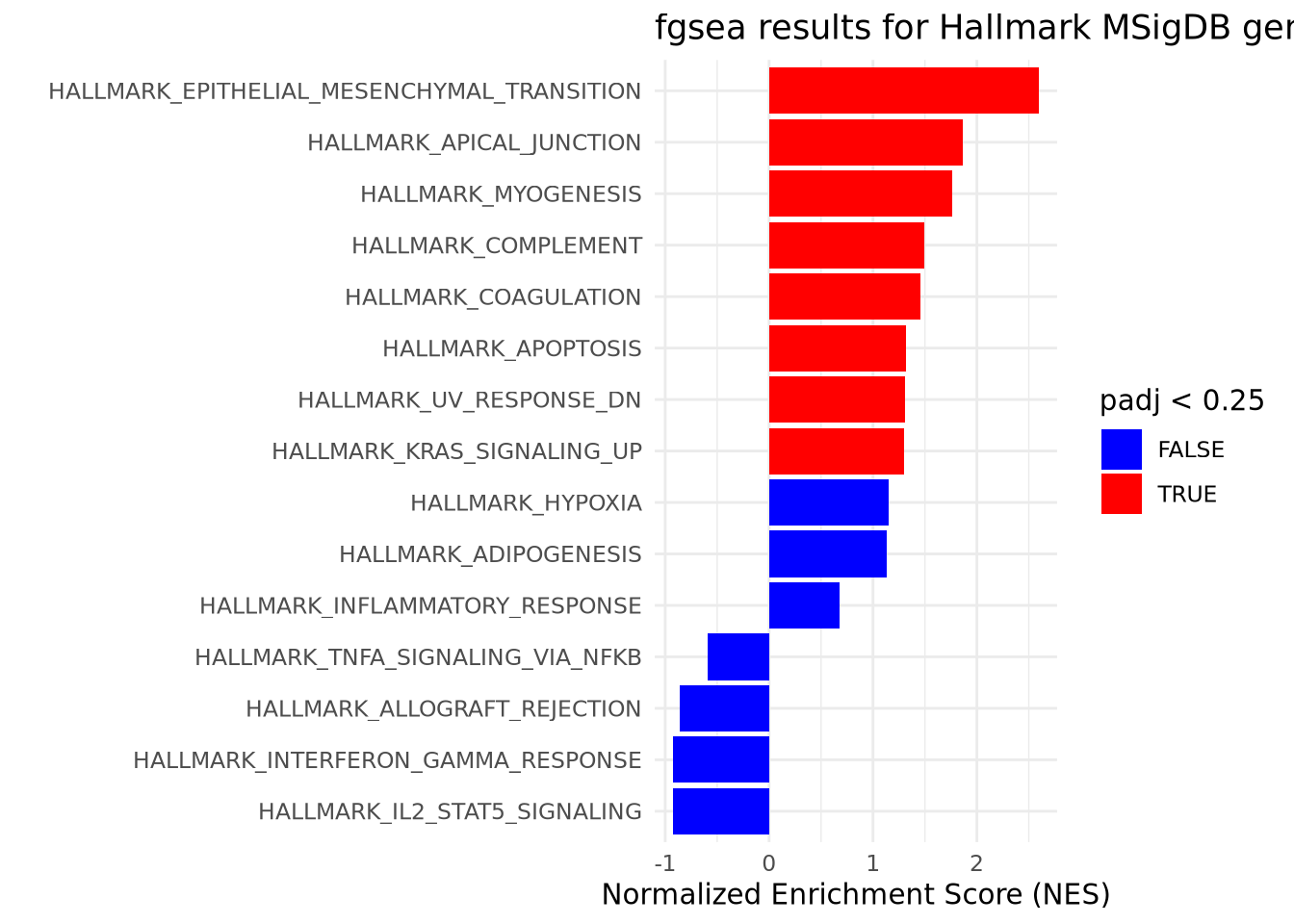
(#fig:top level results plot)GSEA results suggest an enrichment of cancer-related pathways amongst upregulated genes. GSEA was performed using a list of genes generated through RNAseq and ranked by descending fold change. GSEA was run using default parameters with minSize = 15 and maxSize = 500. Gene sets with a Benjamini-Hochberg adjusted p-value < .25 are considered significant.
Given the artificial nature of our data and our choice of a small gene set collection, we have very few results and are able to display all of them intelligibly on one plot. In real experiments, there may be several hundred significant gene sets of interest. In cases like this, you may need to restrict the number of gene sets by taking the top ten ranked by NES (both positive and negative) and plotting those in a figure like the one above. This is only a suggestion and there are many ways to choose ‘interesting’ gene sets to plot together depending upon the experimental context and future questions of interest.
If we wished to investigate a single gene set from this list of results, we
could create an enrichment plot displaying the Enrichment Score as it’s
calculated through the ranked list. For convenience, we have wrapped the
pre-built function, plotEnrichment from fgsea, in a user-defined function that
allows us to specify a specific pathway. The plotEnrichment function expects
at minimum the list of genes contained within the pathway to plot and the input
ranked list of gene-level statistics. We have displayed the enrichment plot for
one of the significantly enriched gene sets below:
make_gsea_plot <- function(pathway_name, rnks) {
plotEnrichment(hallmark_pathways_fgsea[[pathway_name]], rnks) +
    labs(title=pathway_name)
}
make_gsea_plot('HALLMARK_EPITHELIAL_MESENCHYMAL_TRANSITION', rnk_list)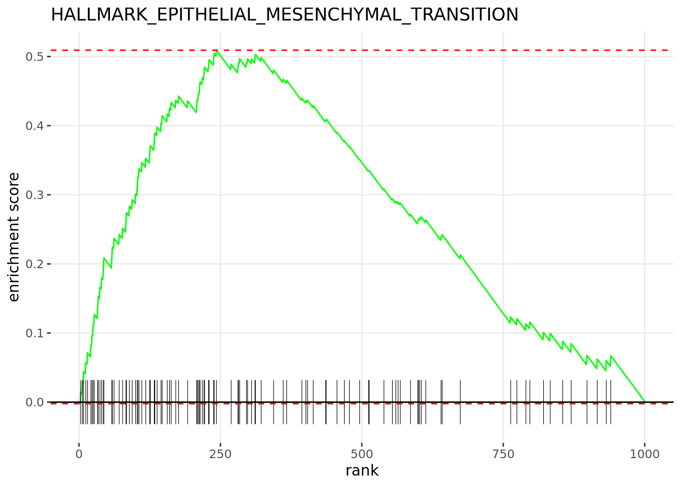
(#fig:enrichment plot)The Hallmarks EPITHELIAL_MESENCHYMAL_TRANSITION Pathway is significantly enriched amongst the upregulated genes. There are 56 genes in the leading edge subset including GAS1, POSTN, and LOX. The Normalized Enrichment Score calculated for this gene set was 2.59 and it has an adjusted p-value of 7.28e-10
As mentioned in the prior section, it is often useful for further investigation
to inspect the leading edge subset of genes contained within ‘interesting’ gene
sets. fgsea stores these genes in the form of a list associated with each
pathway in the returned table. We could convert and save these values in a named
list for convenience. This can be accomplished by making use of the deframe()
function. Below we have saved all of the genes contained within the leading edge
subset of significant gene sets, and displayed those belonging to the
HALLMARK_EPITHELIAL_MESENCHYMAL_TRANSITION gene set as determined in this
experiment:
gather_leadingedge <- function(results, threshold) {

  genes <- results %>%
  filter(padj < threshold) %>%
  dplyr::select(pathway, leadingEdge) %>%
  deframe()
  return(genes)
}

leading_edge_genes <- gather_leadingedge(fgsea_results, .25)
leading_edge_genes$HALLMARK_EPITHELIAL_MESENCHYMAL_TRANSITION
## [1] "GAS1" "MGP" "SPOCK1" "EFEMP2" "FERMT2" "FBN1" "TAGLN" "FSTL1"
## [9] "TIMP3" "VIM" "VCAN" "THBS2" "ACTA2" "DCN" "BGN" "NNMT"
## [17] "CALD1" "NTM" "FBLN1" "SPARC" "COL5A2" "MYL9" "SLIT2" "DPYSL3"
## [25] "VEGFC" "COL3A1" "LGALS1" "THY1" "PCOLCE" "ADAM12" "SFRP4" "WIPF1"
## [33] "COL6A3" "CTHRC1" "TIMP1" "TPM2" "FN1" "COL5A1" "PMP22" "MMP2"
## [41] "HTRA1" "COL1A2" "POSTN" "PDGFRB" "EMP3" "MXRA5" "FLNA" "PRRX1"
## [49] "FAP" "LOX" "BASP1" "GREM1" "CCN2" "CDH11" "LUM" "LAMC1"This named list contains all of the leading edge genes for gene sets meeting a
certain padj threshold. We could import these as a GSEABase GeneSetCollection
object for further analyses in R or write them to a file to pass on to
collaborators.
These examples are just some of the ways you can utilize and explore the GSEA
results returned by fgsea. There are also other methods such as the one found in
the built-in function, fgsea::plotGseaTable, that provide other ways to
visualize these results for groups of different gene sets. You can also perform
any number of different filtering and sorting options on the table of results
depending upon your interests.
9.9 Biological Networks
Biological systems are made up of many components that work together in spatial, temporal, and chemical ways to maintain biological fidelity. These components may be molecular components like metabolites, transcripts, or proteins, entire organisms as in the case of microbial ecologies, or even abstract concepts like genes and metabolic reactions. While studying individual components is a necessary part of biological research, understanding how those components interact and influence each other can help gain a greater understanding of biological systems as a whole. In biology, mathematics, and other fields, we can conceptualize a set of these components and their relationships as network.
In general terms, a network is defined as a set of components (or entities) and the relationships between them. Some networks are physical, like computer networks where different hardware devices are connected together with wires. However, most networks are more abstract, like social networks of friendships between people, and ecological networks like forests or soil where different organisms influence each other by predation, synergistic interactions, etc.
Biological networks in molecular biology are similarly abstract, where an interaction between entities can represent many different types of relationships. The primary entities of molecular networks are genes, macromolecules (DNA, RNA transcripts, proteins, etc), metabolites and other small molecules, cellular organelles and components, and entire cells themselves. Relationships between these entities may include spatial colocality, direct physical association, shared molecular functions, genetic and evolutionary relationships, chemical interactions like biochemical and structural modifications, modulation of the anabolic or catabolic rates (e.g. rate of transcription, translation, etc), and many more. In reality, entities may have all of these types of relationships with other entities, all potentially occuring simultaneously at any moment in time.
It is a substantial challenge to incorporate all possible types of interactions between all entities in mind at the same time, so we will typically express only subsets of any holistic network. These subnetworks reflect different aspects of the system, e.g. which genes control the transcription of which other genes, or which proteins physically complex with one another. Fortunately, the concept of the network is generic, so we may generally use the same tools and techniques to express and analyze networks for any network type.
This section first describes some of the different types of biological networks found in molecular biology, and then covers some of the basics of the mathematical and computational expressions, properties, and algorithms used to analyze networks.
9.9.1 Biological Pathways
Biological pathways, or just pathways, are groups of genes that work together to create some product or cause a change in a cell. Most of the coordinated activites of a cell are performed by pathways that are induced or repressed based on conditions within and without the cell. Hundreds of biological pathways have been characterized and organized into publicly available databases.
9.9.2 Protein-Protein Interaction Network .
What are protein-protein interaction (PPI) networks? What information do they represent (direct association, functional association, etc)? Where does PPI information come from (datasets, databases, etc)? What are some ways we can use PPI information when interpreting other biological data (like differential expression? not sure)?
9.9.3 Gene Regulatory Networks .
What are gene regulatory networks? Why are they important? How do we identify them (data driven correlation, wetlab experiments, others?)? How are they useful?
9.9.4 WGCNA .
Weighted correlation network analysis (WGCNA) identifies genes (or other biology features) that are highly correlated with each other, and group them into clusters / modules.
Typical inputs of WGCNA is the expression matrix of genes, proteins or other biology features. Then, WGCNA will construct a undirected and weighted co-expression network. The nodes will be genes (or other features), and the edges connecting them will be the pairwise correlation value of their expression level. Modules are simply the clusters of highly connected genes. After the modules are detected, down stream analyses may include summarizing the module by its “eigengenes”, inferring the functionality of a gene from genes in the same module, or compare different modules.
For more information, you may refer to this article or the manual of WGCNA R package.
9.9.4.1 How to run WGCNA in R
First, install package WGCNA.
BiocManager::install("WGCNA")
library(WGCNA)
note: if you receive error message saying some dependencies are not available, it’s probably because you used to try to install it using standard method install.package("WGCNA"). If that’s the case, try the following to re-install WGCNA:
BiocManager::install("WGCNA",force = T)Let’s load a toy gene expression matrix. We have 15 samples and 7 genes.
##            CRAB     Whale     Lobst      Octop    Coral BabyShark     Orca
## samp1  6.867731  8.796212  7.820130  6.6081601 15.37307 14.047536 32.96333
## samp2 10.918217  6.775947 16.545788  7.5685123 28.59193  8.923224 19.13865
## samp3  5.821857  8.682239  5.089099  2.8030264 17.99007 14.643098 36.93207
## samp4 17.976404  5.741274 27.596721  8.8660342 34.62918  9.473205 18.68929
## samp5 11.647539 10.866047 14.852970  2.2034360 14.15414 15.949892 42.21472
## samp6  5.897658 11.960800 15.915636 -0.1724085 21.78596 16.336686 44.93125
An optional choice in WGCNA to allow multithreads
allowWGCNAThreads(4)## Allowing multi-threading with up to 4 threads.Now we will choose a “soft-thresholding power” to construct the network. There is no single answer in the power to choose.
If you refer to WGCNA faq, there are more details for power choosing.
# A set of soft-thresholding powers to choose from:
powers <- seq(1, 10)

# Call the network topology analysis function
sft <- pickSoftThreshold(
  data = dat,
  powerVector = powers,
  verbose = 5
)
## pickSoftThreshold: will use block size 7.
## pickSoftThreshold: calculating connectivity for given powers...
## ..working on genes 1 through 7 of 7
## Power SFT.R.sq slope truncated.R.sq mean.k. median.k. max.k.
## 1 1 0.026500 -12.800 0.38900 1.920 1.820 2.350
## 2 2 0.007510 2.420 -0.18500 1.240 1.180 1.730
## 3 3 0.001090 0.582 0.00340 0.931 0.908 1.430
## 4 4 0.001300 -0.460 -0.14200 0.733 0.708 1.220
## 5 5 0.003130 0.526 -0.03820 0.592 0.556 1.060
## 6 6 0.018100 -1.150 0.04810 0.486 0.440 0.922
## 7 7 0.087400 -2.130 -0.15900 0.404 0.349 0.807
## 8 8 0.063500 -1.570 -0.11100 0.338 0.279 0.708
## 9 9 0.000378 -0.206 0.00319 0.285 0.224 0.621
## 10 10 0.003650 -0.600 -0.00478 0.241 0.181 0.545
par(mfrow = c(1, 2))
cex1 <- 0.9
plot(sft$fitIndices[, 1],
  -sign(sft$fitIndices[, 3]) * sft$fitIndices[, 2],
  xlab = "Soft Threshold (power)",
  ylab = "Scale Free Topology Model Fit, signed R^2",
  main = paste("Scale independence")
)
text(sft$fitIndices[, 1],
  -sign(sft$fitIndices[, 3]) * sft$fitIndices[, 2],
  labels = powers, cex = cex1, col = "red"
)
abline(h = 0.90, col = "red")
plot(sft$fitIndices[, 1],
  sft$fitIndices[, 5],
  xlab = "Soft Threshold (power)",
  ylab = "Mean Connectivity",
  type = "n",
  main = paste("Mean connectivity")
)
text(sft$fitIndices[, 1],
  sft$fitIndices[, 5],
  labels = powers,
  cex = cex1, col = "red"
)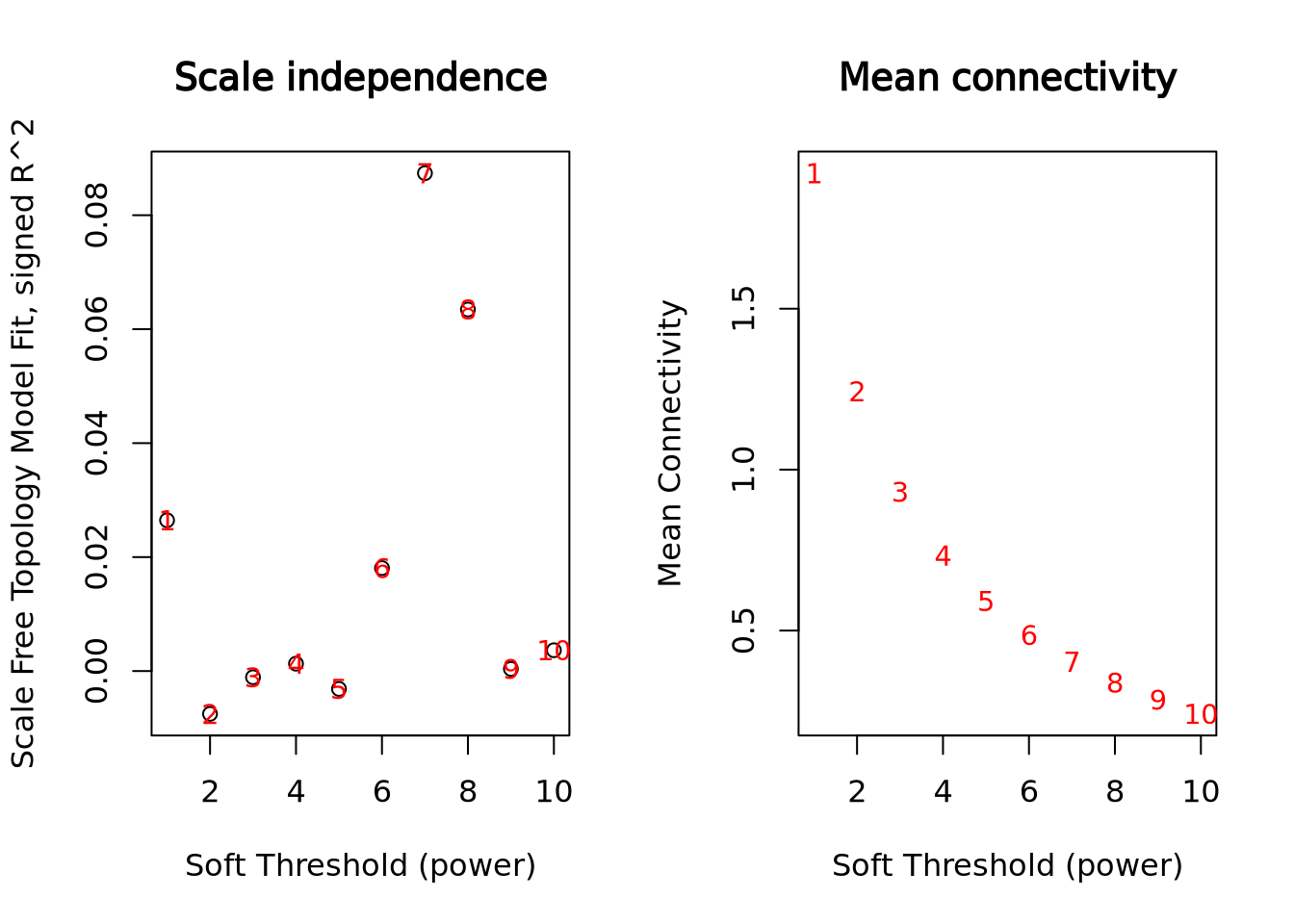
Generally, we want to choose a power that give us the “Scale Free Topology Model Fit, signed R^2” around 0.8. This toy dataset is too small and can’t show it properly.
For illustration, we will pick power 4 in this example.
picked_power <- 4

# fix a namespace conflict issue, force R to use the cor() function in WGCNA:
temp_cor <- cor
cor <- WGCNA::cor
Construct network.
There are a lot of parameters. In most cases, you don’t need to modify them. But, make sure you choose the proper power, networkType (“signed” or “unsigned”), and minModuleSize in your analysis.
- networkType Using “signed” option, the direction of the correlation will be considered, e.g. two genes won’t be clustered together if their correlation value is a perfect -1. On the other hand, use “unsigned” option to consider the absolute value of correlation.
- minModuleSize The minimum umber of features, e.g. genes, in a module. In this example with only 7 genes, so I set this argument to be 2. In real analysis, a typical choice may be 20 or 30 for a matrix with several hundreds or thousands of genes.
netwk <- blockwiseModules(
  datExpr = dat,
  power = picked_power,
  networkType = "signed",
  deepSplit = 2,
  pamRespectsDendro = F,
  minModuleSize = 2,
  maxBlockSize = 4000,
  reassignThreshold = 0,
  mergeCutHeight = 0.25,
  saveTOMs = T, # Archive the run results in TOM file (saves time)
  saveTOMFileBase = "ER",
  numericLabels = T,
  verbose = 3
)
## Calculating module eigengenes block-wise from all genes
## Flagging genes and samples with too many missing values...
## ..step 1
## ..Working on block 1 .
## TOM calculation: adjacency..
## ..will not use multithreading.
## Fraction of slow calculations: 0.000000
## ..connectivity..
## ..matrix multiplication (system BLAS)..
## ..normalization..
## ..done.
## ..saving TOM for block 1 into file ER-block.1.RData
## ....clustering..
## ....detecting modules..
## ....calculating module eigengenes..
## ....checking kME in modules..
## ..merging modules that are too close..
## mergeCloseModules: Merging modules whose distance is less than 0.25
## Calculating new MEs...Now we can see the module membership assignment:
netwk$colors## CRAB Whale Lobst Octop Coral BabyShark Orca
## 1 2 1 1 1 2 2CRAB, Lobst, Octop and Coral are assigned to module 1. Whale, BabyShark and Orca are assigned to module 2.
We can use function labels2colors() to conveniently convert the module membership to color labels.
mergedColors <- labels2colors(netwk$colors)Plot the dendrogram and the module colors:
plotDendroAndColors(
  netwk$dendrograms[[1]],
  mergedColors[netwk$blockGenes[[1]]],
  "Module colors",
  dendroLabels = FALSE,
  hang = 0.03,
  addGuide = TRUE,
  guideHang = 0.05
)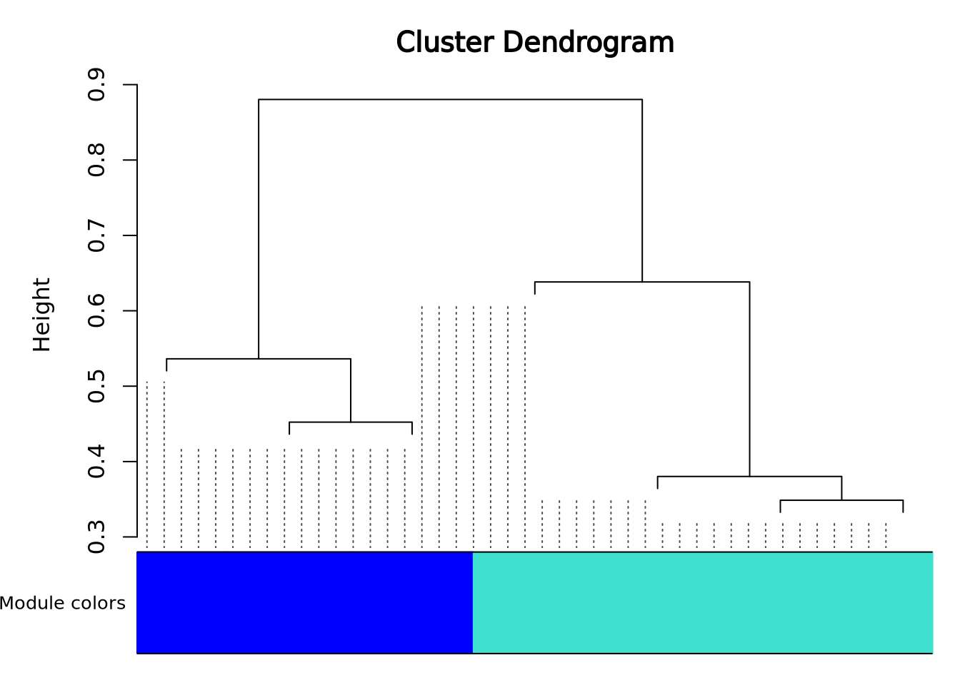
In a real analysis with a lot of genes, you will see much more modules and colors.
In this dendrogram, you will be able to roughly see the size of each module by looking at the area of different colors.
At this point, the WGCNA analysis is finished.
We can summarize the module information in a data frame:
module_df <- data.frame(
  gene_id = names(netwk$colors),
  modules = labels2colors(netwk$colors)
)
module_df
## gene_id modules
## 1 CRAB turquoise
## 2 Whale blue
## 3 Lobst turquoise
## 4 Octop turquoise
## 5 Coral turquoise
## 6 BabyShark blue
## 7 Orca blue