7 Data Science
Data science is an enormous and rapidly growing field that incorporates elements of statistics, computer science, software engineering, high performance and cloud computing, and big data management, as well as syntheses with knowledge from other social and physical science fields to model and predict phenomena captured by data collected from the “real world”. Many books have and will be written on this subject, and this one does not pretend to even attempt to give this area an adequate treatment. Like the rest of this book, the topics covered here are opinionated and presented through the lens of a biological analyst practitioner with enough high level conceptual details and a few general principles to hopefully be useful in that context.
7.1 Data Modeling
The goal of data modeling is to describe a dataset using a relatively small number of mathematical relationships. Said differently, a model uses some parts of a dataset to try to accurately predict other parts of the dataset in a way that is useful to us.
Models are human inventions; they reflect our beliefs about the way the universe works. The successful model identifies patterns within a dataset that are the result of causal relationships in the universe that led to the phenomena that were measured while accounting for noise in the data. However, the model itself does not identify or even accurately reflect those causal effects. The model merely summarizes patterns and we as scientists are left to interpret those patterns and design follow up experiments to investigate the nature of those causal relationships using our prior knowledge of the world.
There are several principles to keep in mind when modeling data:
Data are never wrong. All data are collected using processes and devices designed and implemented by humans, who always have biases and make assumptions. All data measure something about the universe, and so are “true” in some sense of the word. If what we intended to measure and what we actually measured were not the same thing, that is due to our errors in collection or interpretation, not due to the data being wrong. If we approach our dataset with a particular set of hypotheses and the data don’t support those hypotheses, it is our beliefs of the world and our understanding of the dataset that are wrong, not the data itself.
Not all data are useful. Just because data isn’t wrong, it doesn’t mean it is useful. There may have been systematic errors in the collection of the data that makes interpreting them difficult. Data collected for one purpose may not be useful for any other purposes. And sometimes, a dataset collected for a particular purpose may simply not have the information needed to answer our questions; if what we measure has no relationship to what we wish to predict, the data itself is not useful - though the knowledge that what we measured has no detectable effect on the thing we wish to predict may be very useful!
“All models are wrong, but some are useful.” George Box, the renowned British statistician, famously asserted this in a 1976 paper to the Journal of the American Statistical Association. (Box 1976). By this he meant that every model we create is a simplification of the system we are seeking to model, which is by definition not identical to that system. To perfectly model a system, our model would need to be precisely the system we are modeling, which is no longer a model but the system itself. Fortunately, even though we know our models are always wrong to some degree, they may nonetheless be useful because they are not too wrong. Some models may indeed be too wrong, though.
Data do not contain causal information. “Correlation does not mean causation.” Data are measurements of the results of a process in the universe that we wish to understand; the data are possibly reflective of that process, but do not contain any information about the process itself. We cannot infer causal relationships from a dataset alone. We must construct possible causal models using our knowledge of the world first, then apply our data to our model and other alternative models to compare their relative plausibility.
All data have noise. The usefulness of a model to describe a dataset is related to the relative strength of the patterns and noise in the dataset when viewed through the lens of the model; conceptually, the so-called “signal to noise ratio” of the data. The fundamental concern of statistics is quantifying uncertainty (i.e. noise), and separating it from real signal, though different statistical approaches (e.g. frequentist vs Bayesian) reason about uncertainty in different ways.
Modeling begins (or should begin) with posing one or more scientific models of the process or phenomenon we wish to understand. The scientific model is conceptual; it reflects our belief of the universe and proposes a causal explanation for the phenomenon. We then decide how to map that scientific model onto a statistical model, which is a mechanical procedure that quantifies how well our scientific model explains a dataset. The scientific model and statistical model are related but independent choices we make. There may be many valid statistical models that represent a given scientific model. However, sometimes in practice we lack sufficient knowledge about the process to propose scientific models first, requiring data exploration and summarization first to suggest reasonable starting points.
This section pertains primarily to models specified explicitly by humans. There is another class of models, namely those created by certain machine learning algorithms like neural networks and deep learning, that discover models from data. These models are fundamentally different than those designed by human minds, in that they are often accurate and therefore useful, but it can be very difficult if not impossible to understand how they work. While these are important types of models that fall under the umbrella of data science, we limit the content of this chapter to human designed statistical models.
7.1.1 A Worked Modeling Example
As an example, let’s consider a scenario where we wish to assess whether any of three genes can help us distinguish between patients who have Parkinson’s Disease and those who don’t by measuring the relative activity of those genes in blood samples. We have the following made-up dataset:
gene_exp## # A tibble: 200 × 5
## sample_name `Disease Status` `Gene 1` `Gene 2` `Gene 3`
## <chr> <fct> <dbl> <dbl> <dbl>
## 1 P1 Parkinson's 257. 636. 504.
## 2 P2 Parkinson's 241. 556. 484.
## 3 P3 Parkinson's 252. 426. 476.
## 4 P4 Parkinson's 271. 405. 458.
## 5 P5 Parkinson's 248. 482. 520.
## 6 P6 Parkinson's 275. 521. 460.
## 7 P7 Parkinson's 264. 415. 568.
## 8 P8 Parkinson's 276. 450. 495.
## 9 P9 Parkinson's 274. 490. 496.
## 10 P10 Parkinson's 251. 584. 573.
## # ℹ 190 more rowsOur imaginary dataset has 100 Parkinson’s and 100 control subjects. For each of
our samples, we have a sample ID, Disease Status of Parkinson's or Control,
and numeric measurements of each of three genes. Below are violin
plots of our (made-up) data set for these three genes:
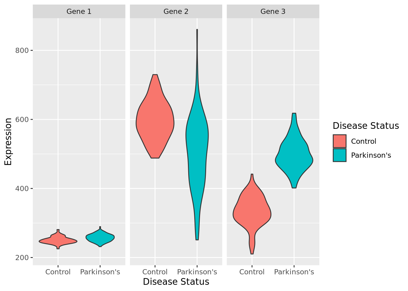
By inspection, it appears that Gene 1 has no relationship with disease; we may safely eliminate this gene from further consideration. Gene 2 appears to have a different profile depending on disease status, where control individuals have a higher average expression and a lower variance. Unfortunately, despite this qualitative difference, this gene may not be useful for telling whether someone has disease or not - the ranges completely overlap. Gene 3 appears to discriminate between disease and control. There is some overlap in the two expression distributions, but above a certain expression value these data suggest a high degree of predictive accuracy may be obtained with this gene. Measuring this gene may therefore be useful, if the results from this dataset generalize to all people with Parkinson’s Disease.
So far, we have not done any modeling, but instead relied on plotting and our eyes. A more quantitative question might be: how much higher is Gene 3 expression in Parkinson’s Disease than control? Another way of posing this question is: if I know a patient has Parkinson’s Disease, what Gene 3 expression value do I expect them to have? Written this way, we have turned our question into a prediction problem: if we only had information that a patient had Parkinson’s Disease, what is the predicted expression value of their Gene 3?
Another way to pose this prediction question is in the opposite (and arguably more useful) direction: if all we knew about a person was their Gene 3 gene expression, how likely is it that the person has Parkinson’s Disease? If this gene expression is predictive enough of a person’s disease status, it may be a viable biomarker of disease and thus might be useful in a clinical setting, for example when identifying presymptomatic individuals or assessing the efficacy of a pharmacological treatment.
Although it may seems obvious, before beginning to model a dataset, we must start by posing the scientific question as concisely as possible, as we have done above. These questions will help us identify which modeling techniques are appropriate and help us ensure we interpret our results correctly.
We will use this example dataset throughout this chapter to illustrate some key concepts.
7.1.2 Data Summarization
Broadly speaking, data summarization is the process of finding a lower-dimensional representation of a larger dataset. There are many ways to summarize a set of data; each approach will emphasize different aspects of the dataset, and have varying degrees of accuracy. Consider the gene expression of Gene 1 for all individuals in our example above, plotted as a distribution with a histogram:
ggplot(gene_exp, aes(x=`Gene 1`)) +
  geom_histogram(bins=30,fill="#a93c13")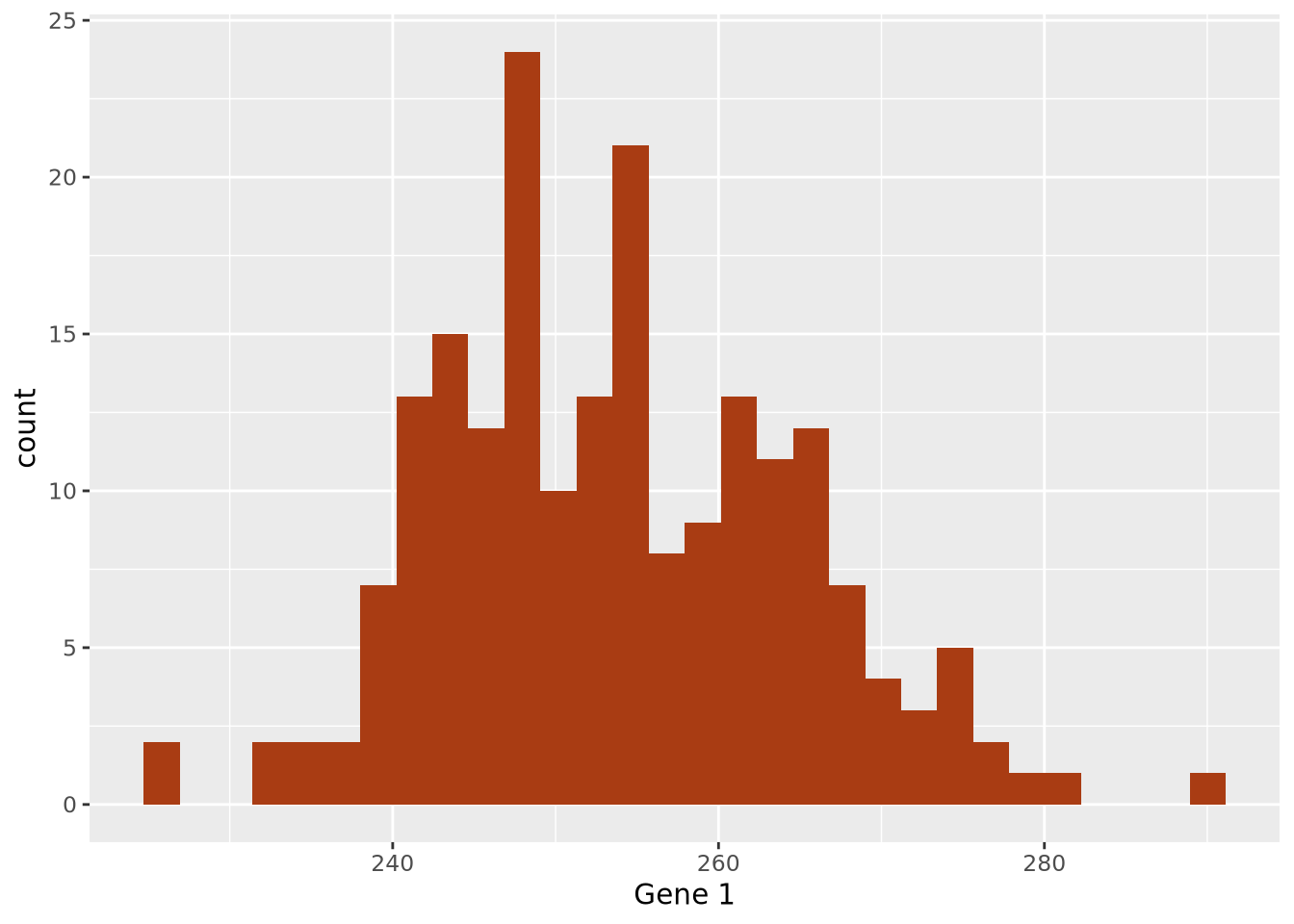
7.1.2.1 Point Estimates
The data are concentrated around the value 250, and become less common for larger and smaller values. Since the extents to the left and right of the middle of the distribution appear to be equally distant, perhaps the arithmetic mean is a good way to identify the middle of the distribution:
ggplot(gene_exp, aes(x=`Gene 1`)) +
  geom_histogram(bins=30,fill="#a93c13") +
  geom_vline(xintercept=mean(gene_exp$`Gene 1`))
By eye, the mean does seem to correspond well to the value that is among the most frequent, and successfully captures an important aspect of the data: its central tendency. Summaries that compute a single number are called point estimates. Point estimates collapse the data into one singular point, one value.
The arithmetic mean is just one measure of central tendency, computed by taking the sum of all the values and dividing by the number of values. The mean may be a good point estimate of the central tendency of a dataset, but it is sensitive to outlier samples. Consider the following examples:
library(patchwork)
well_behaved_data <- tibble(data = rnorm(1000))
data_w_outliers <- tibble(data = c(rnorm(800), rep(5, 200))) # oops I add some outliers :^)

g_no_outlier <- ggplot(well_behaved_data, aes(x = data)) +
  geom_histogram(fill = "#56CBF9", color = "grey", bins = 30) +
  geom_vline(xintercept = mean(well_behaved_data$data)) +
  ggtitle("Mean example, no outliers")

g_outlier <- ggplot(data_w_outliers, aes(x = data)) +
  geom_histogram(fill = "#7FBEEB", color = "grey", bins = 30) +
  geom_vline(xintercept = mean(data_w_outliers$data)) +
  ggtitle("Mean example, big outliers")

g_no_outlier | g_outlier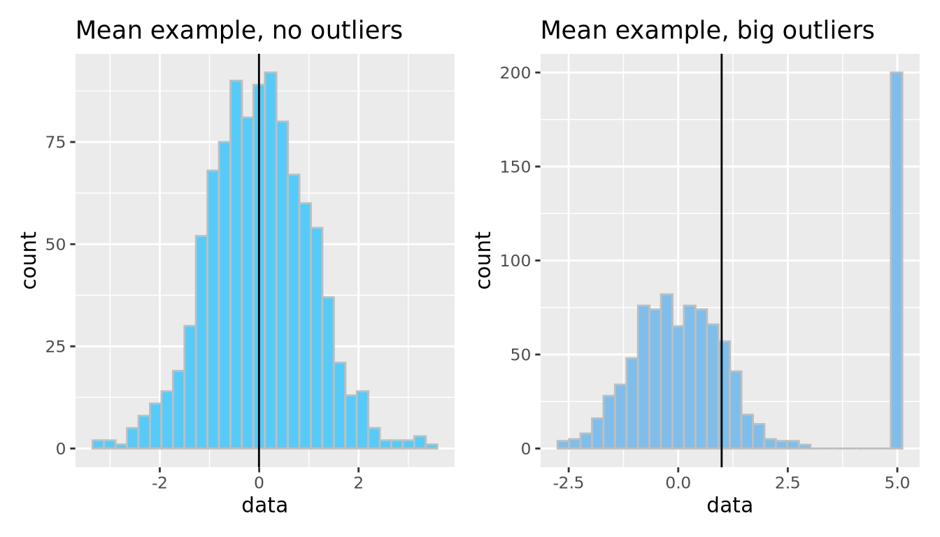
The median is another measure of central tendency, which is found by identifying the value that divides the samples into equal halves when sorted from smallest to largest. The median is more robust in the presence of outliers.
g_no_outlier <- ggplot(well_behaved_data, aes(x = data)) +
  geom_histogram(fill = "#AFBED1", color = "grey", bins = 30) +
  geom_vline(xintercept = median(well_behaved_data$data)) +
  ggtitle("Median example")

g_outlier <- ggplot(data_w_outliers, aes(x = data)) +
  geom_histogram(fill = "#7FBEEB", color = "grey", bins = 30) +
  geom_vline(xintercept = median(data_w_outliers$data)) +
  ggtitle("Median example, big outliers")

g_no_outlier | g_outlier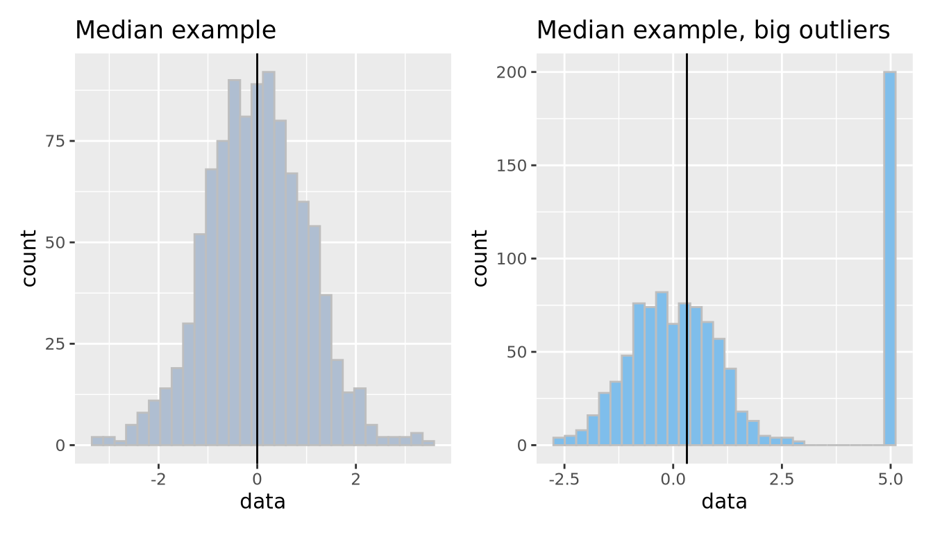
7.1.2.2 Dispersion
Central tendencies are important aspects of the data but don’t describe what the data do for values outside this point estimate of central tendency; in other words, we have not expressed the spread, or dispersion of the data.
We decide that perhaps computing the standard deviation of the data may characterize the spread well, since it appears to be symmetric around the mean. We can layer this information on the plot as well to inspect it:
g1_mean <- mean(gene_exp$`Gene 1`)
g1_sd <- sd(gene_exp$`Gene 1`)
ggplot(gene_exp, aes(x=`Gene 1`)) +
  geom_histogram(bins=30,fill="#a93c13") +
  geom_vline(xintercept=g1_mean) +
  geom_segment(x=g1_mean-g1_sd, y=10, xend=g1_mean+g1_sd, yend=10)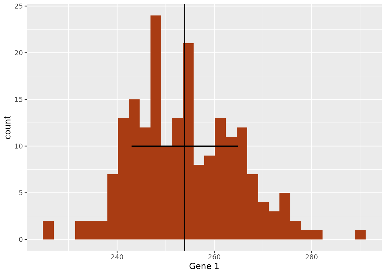
The width of the horizontal line is proportional to the mean +/- one standard
deviation around the mean, and has been placed arbitrarily on the y axis at y = 10 to show how this range covers the data in the histogram. The +/- 1 standard
deviation around the mean visually describes the spread of the data reasonably
well.
Measures the spread of the data, typically around its perceived center (a mean). Often related to the distribution of the data.
Standard deviation: A measure of how close values are to the mean. Bigger standard deviations mean data is more spread out.
data <- tibble(data = c(rnorm(1000, sd=1.75)))
ggplot(data, aes(x = data)) +
  geom_histogram(fill = "#EAC5D8", color = "white", bins = 30) +
  geom_vline(xintercept = c(-2, -1, 0, 1, 2) * sd(data$data)) +
  xlim(c(-6, 6)) +
  ggtitle("Standard deviations aplenty", paste("SD:", sd(data$data)))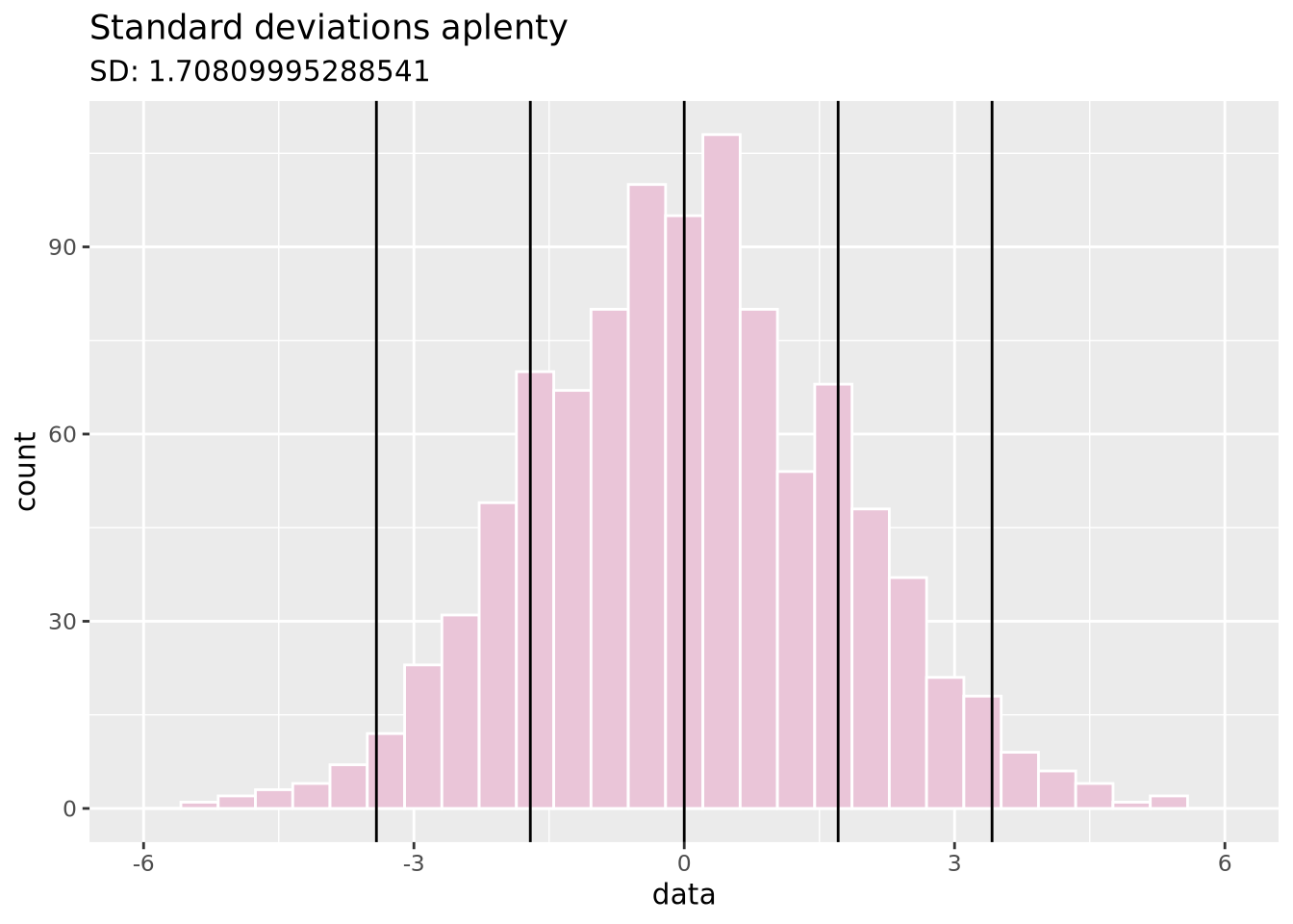
Variance: Similar to SD (it’s the square of SD), variance measures how far a random value is from the mean.
data <- tibble(data = c(rnorm(1000, sd=0.5)))
ggplot(data, aes(x = data)) +
  geom_histogram(fill = "#DBD8F0", color = "white", bins = 30) +
  geom_vline(xintercept = mean(data$data)) +
  xlim(c(-6, 6)) +
  ggtitle("Same mean as SD plot, but different variance",
          paste("Variance:", sd(data$data)))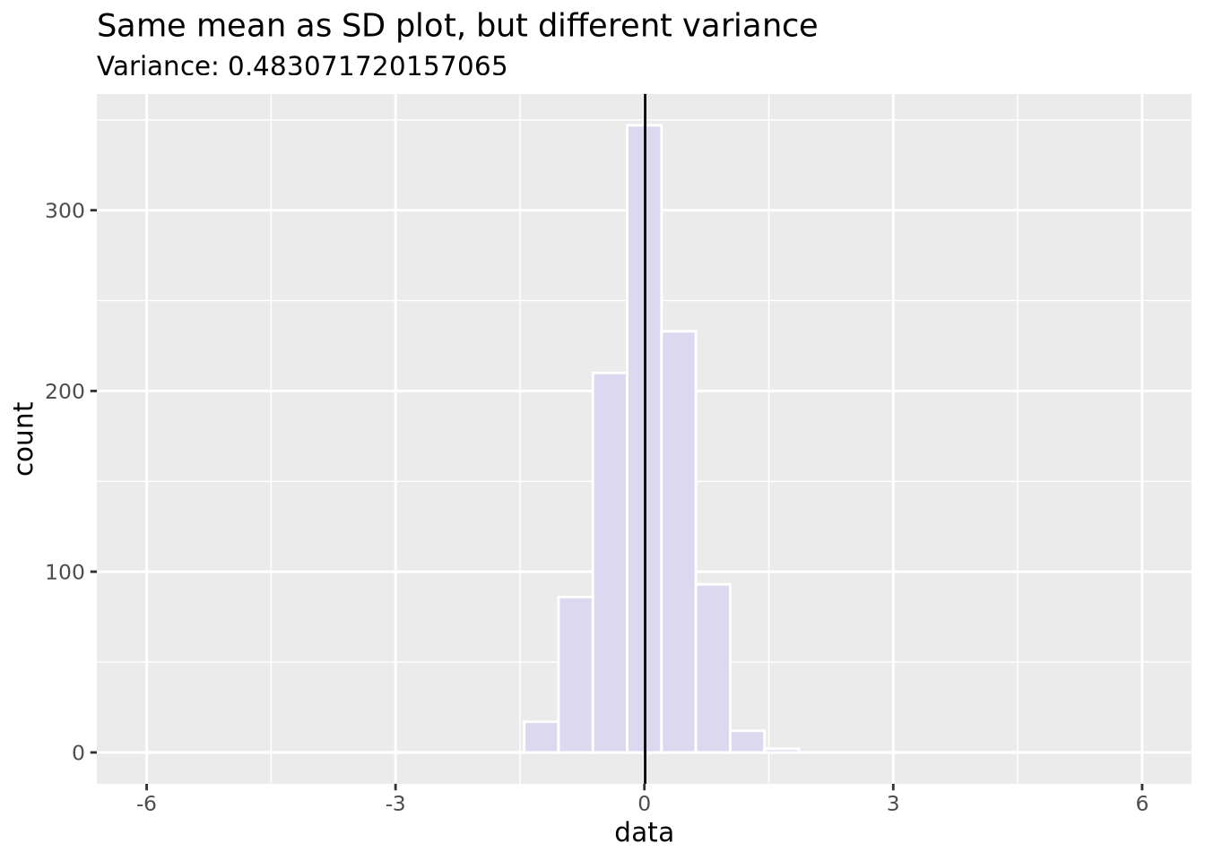
7.1.2.3 Distributions
With these two pieces of knowledge - the mean accurately describes the center of
the data and the standard deviation describes the spread - we now recognize that
these data may be normally distributed, and therefore
we can potentially describe the dataset mathematically. We decide to visually
inspect this possibility by layering a normal distribution on top of our data
using
stat_function:
g1_mean <- mean(gene_exp$`Gene 1`)
g1_sd <- sd(gene_exp$`Gene 1`)
ggplot(gene_exp, aes(x=`Gene 1`)) +
  geom_histogram(
    aes(y=after_stat(density)),
    bins=30,
    fill="#a93c13"
  ) +
  stat_function(fun=dnorm, args = list(mean=g1_mean, sd=g1_sd), size=2)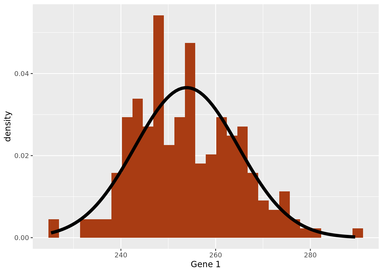
Note the histogram bars are scaled with
aes(y=[after_stat](https://ggplot2.tidyverse.org/reference/aes_eval.html)(density))
to the density of values in each bin to make all the bar heights sum to 1 so
that the y scale matches that of a normal distribution.
We have now created our first model: we chose to express the dataset as a normal distribution parameterized by the mean and standard deviation and standard deviation of the data. Using the values of 254 and 11 as our mean and standard deviation, respectively, we can express our model mathematically as follows:
\[ Gene\;1 \sim \mathcal{N}(254, 11) \]
Here the \(\sim\) symbol means “distributed as” and the \(\mathcal{N}(\mu,\sigma)\) represents a normal distribution with mean of \(\mu\) and standard deviation of \(\sigma\). This is mathematical formulation means the same thing as saying we are modeling Gene 1 expression as a normal distribution with mean of 254 and standard deviation of 11. Without any additional information about a new sample, we would expect the expression of that gene to be 254, although it may vary from this value.
The normal distribution is the most common distribution observed in nature, but it is hardly the only one. We could have proposed other distributions to instead summarize our data:
g_norm <- ggplot(tibble(data = rnorm(5000)), aes(x = data)) +
geom_histogram(fill = "#D0FCB3", bins = 50, color = "gray") +
ggtitle("Normal distribution", "rnorm(n = 1000)")
g_unif <- ggplot(tibble(data = runif(5000)), aes(x = data)) +
geom_histogram(fill = "#271F30", bins = 50, color = "white") +
ggtitle("Uniform distribution", "runif(n = 1000)")
g_logistic <- ggplot(tibble(data = rlogis(5000)), aes(x = data)) +
geom_histogram(fill = "#9BC59D", bins = 50, color = "black") +
ggtitle("Logistic distribution", "rlogis(n = 1000)")
g_exp <- ggplot(tibble(data = rexp(5000, rate = 1)), aes(x = data)) +
geom_histogram(fill = "#6C5A49", bins = 50, color = "white") +
ggtitle("Exponential distribution", "rexp(n = 1000, rate = 1)")
(g_norm | g_unif) / (g_logistic | g_exp)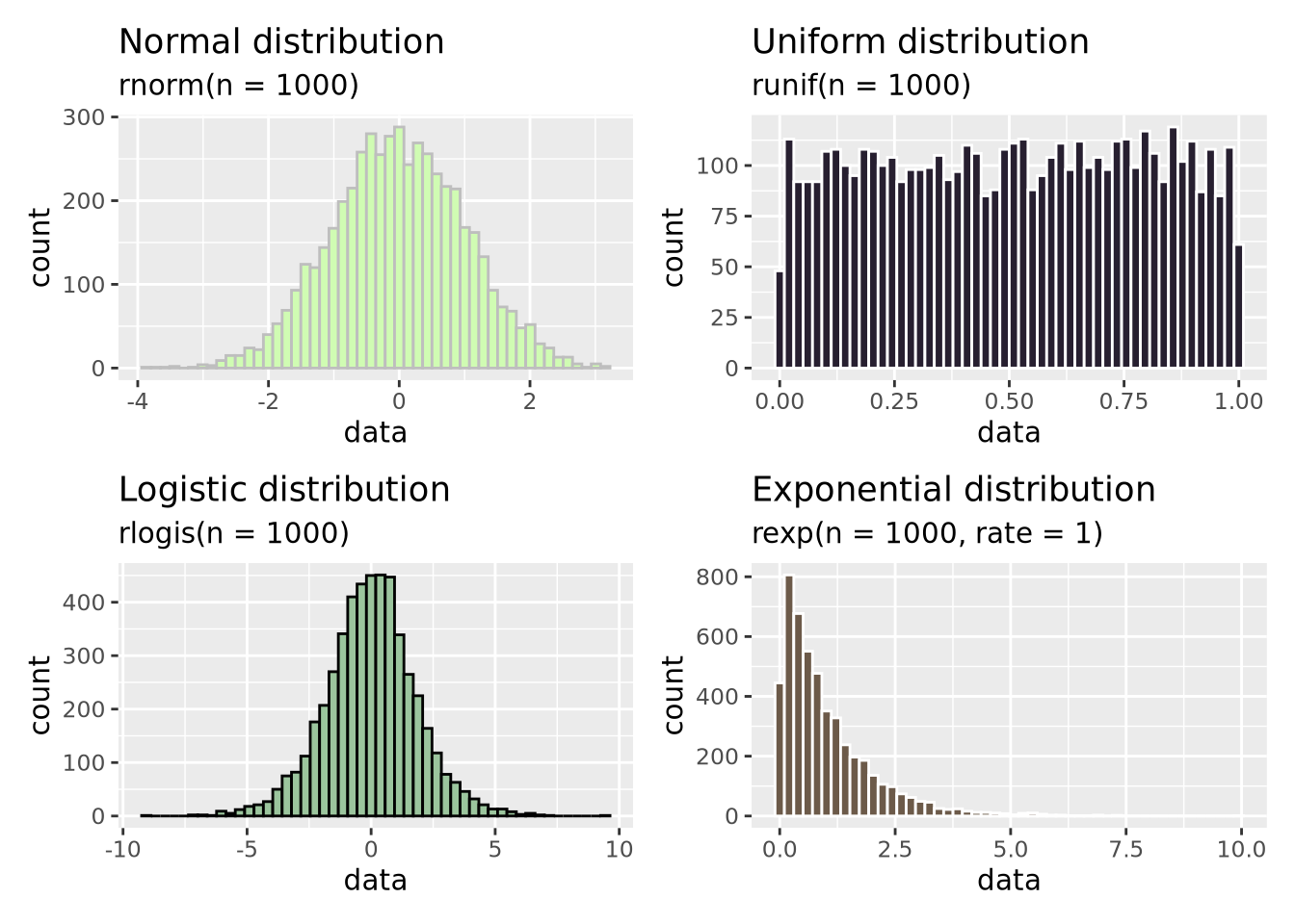 In addition to the normal distribution, we have also plotted samples drawn from
a continuous uniform
distribution
between 0 and 1, a logistic
distribution which is
similar to the normal distribution but has heavier “tails”, and an exponential
distribution.
There are many more distributions than these, and many of them were discovered
to arise in nature and encode different types of processes and relationships.
In addition to the normal distribution, we have also plotted samples drawn from
a continuous uniform
distribution
between 0 and 1, a logistic
distribution which is
similar to the normal distribution but has heavier “tails”, and an exponential
distribution.
There are many more distributions than these, and many of them were discovered
to arise in nature and encode different types of processes and relationships.
A few notes on our data modeling example before we move on:
Our model choice was totally subjective. We looked at the data and decided that a normal distribution was a reasonable choice. There were many other choices we could have made, and all of them would be equally valid, though they may not all describe the data equally well.
We can’t know if this is the “correct” model for the data. By eye, it appears to be a reasonably accurate summary. However, there is no such thing as a correct model; some models are simply better at describing the data than others. Recall that all models are wrong, and some models are useful. Our model may be useful, but it is definitely wrong to some extent.
We don’t know how well our model describes the data yet. So far we’ve only used our eyes to choose our model which might be a good starting point considering our data are so simple, but we have not yet quantified how well our model describes the data, or compared it to alternative models to see which is better. This will be discussed briefly in a later section.
7.1.3 Linear Models
Our choice of a normal distribution to model our Gene 1 gene expression was only descriptive; it was a low-dimensional summary of our dataset. However, it was not very informative; it doesn’t tell us anything useful about Gene 1 expression with respect to our scientific question of distinguishing between Parkinson’s Disease and Control individuals. To do that, we will need to find a model that can make predictions that we may find useful if we receive new data. To do that, we will introduce a new type of model: the linear model.
A linear model is any statistical model that relates one outcome variable as a linear combination (i.e. sum) of one or more explanatory variables. This may be expressed mathematically as follows:
\[ Y_i = \beta_0 + \beta_1 \phi_1 ( X_{i1} ) + \beta_2 \phi_2 ( X_{i2} ) + \ldots + \beta_p \phi_p ( X_{ip} ) + \epsilon_i \]
Above, \(Y_i\) is some outcome or response variable we wish to model, \(X_{ij}\) is our explanatory or predictor variable \(j\) for observatoin \(i\), and \(\beta_j\) are coefficients estimated to minimize the difference between the predicted outcome \(\hat{Y_i}\) and the observed \(Y_i\) over all observations. \(\phi_j\) is a possibly non-linear transformation of the explanatory variable \(X_ij\); note these functions may be non-linear so long as the predicted outcome is modeled as a linear combination of the transformed variables. The rest of this section is dedicated to a worked example of a linear model for gene expression data.
Let us begin with a beeswarm plot plot of Gene 3:
library(ggbeeswarm)
ggplot(gene_exp, aes(x=`Disease Status`, y=`Gene 3`, color=`Disease Status`)) +
  geom_beeswarm()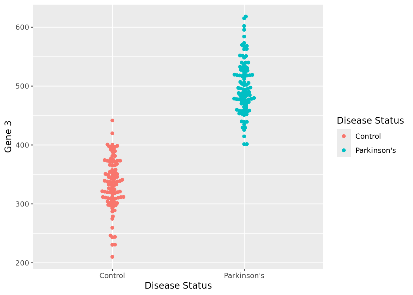
The expression values within each disease status look like they might be normally distributed just like Gene 1, so let’s summarize each group with the arithmetic mean and standard deviation as before, and instead plot both distributions as histograms:
exp_summ <- pivot_longer(
  gene_exp,
  c(`Gene 3`)
) %>%
  group_by(`Disease Status`) %>%
  summarize(mean=mean(value),sd=sd(value))

pd_mean <- filter(exp_summ, `Disease Status` == "Parkinson's")$mean
c_mean <- filter(exp_summ, `Disease Status` == "Control")$mean

ggplot(gene_exp, aes(x=`Gene 3`, fill=`Disease Status`)) +
  geom_histogram(bins=20, alpha=0.6,position="identity") +
  annotate("segment", x=c_mean, xend=pd_mean, y=20, yend=20, arrow=arrow(ends="both", angle=90)) +
  annotate("text", x=mean(c(c_mean,pd_mean)), y=21, hjust=0.5, label="How different?")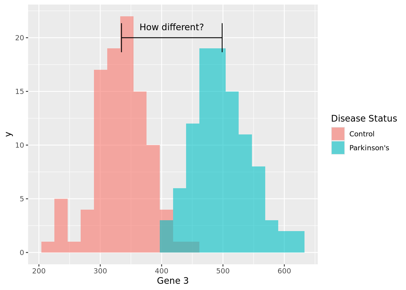
We can make a point estimate of this difference by simply subtracting the means:
pd_mean - c_mean## [1] 164.0942In other words, this point estimate suggests that on average Parkinson’s patients have 164.1 greater expression than Controls. We can plot this relationship relatively simply:
ggplot(gene_exp, aes(x=`Disease Status`, y=`Gene 3`, color=`Disease Status`)) +
  geom_beeswarm() +
  annotate("segment", x=0, xend=3, y=2*c_mean-pd_mean, yend=2*pd_mean-c_mean)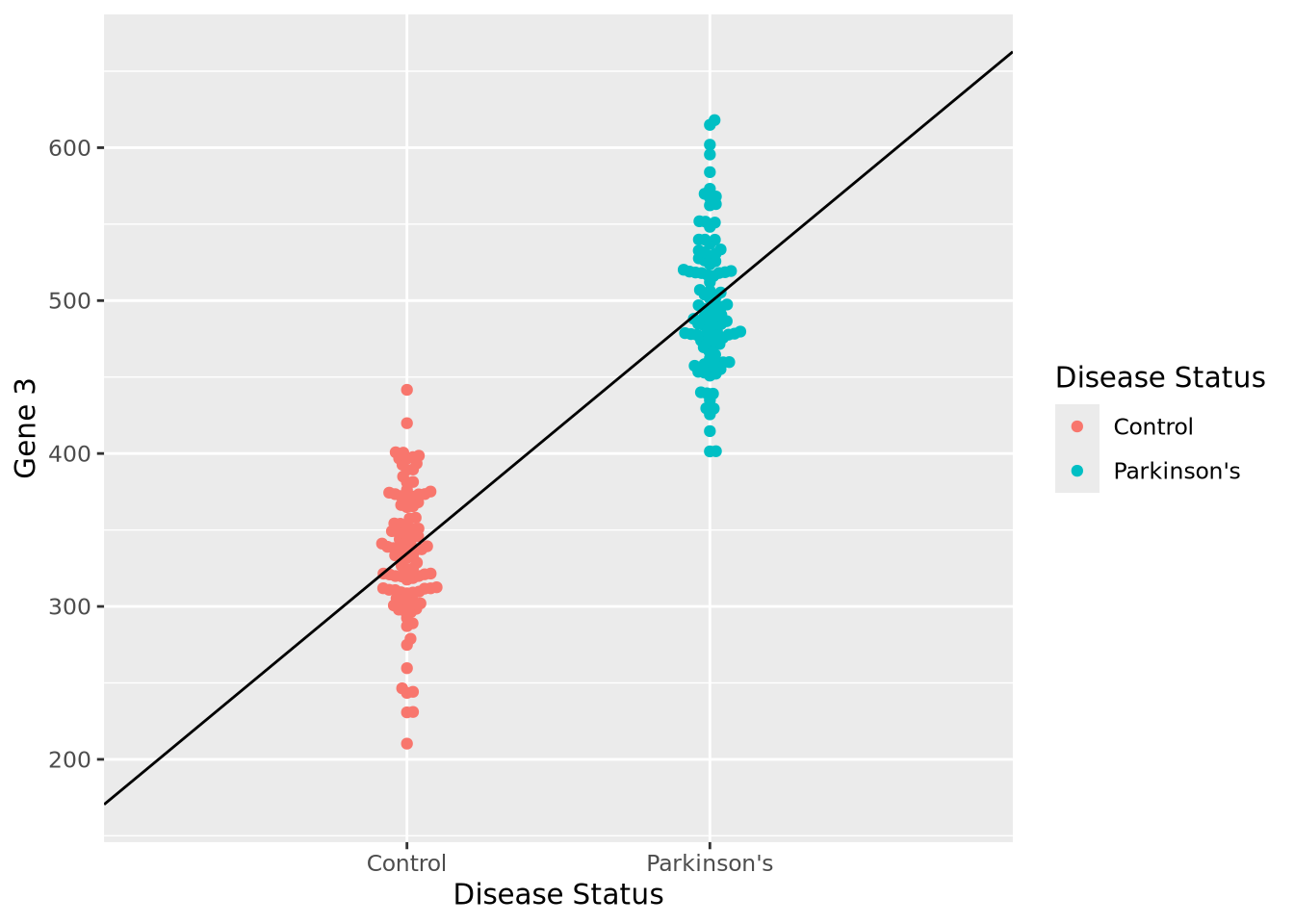
However, this point estimate tells us nothing about how confident we are about the difference. We can do this by using an linear regression by modeling Gene 3 as a function of disease status:
fit <- lm(`Gene 3` ~ `Disease Status`, data=gene_exp)
fit
##
## Call:
## lm(formula = `Gene 3` ~ `Disease Status`, data = gene_exp)
##
## Coefficients:
## (Intercept) `Disease Status`Parkinson's
## 334.6 164.1The coefficient associated with having the disease status of Parkinson’s disease
is almost exactly equal to our difference in means. We also note that the
coefficient labeled (Intercept) is nearly equal to the mean of our control
samples (334.6). Under the hood, this simple linear model did the
same calculation we did by subtracting the means of each group but estimated the
means using all the data at once, instead of point estimates. Another advantage
of using lm() over the point estimate method is the model can estimate how
confident the model was that the difference in mean between Parkinson’s and
controls subjects. Let’s print some more information about the model than
before:
summary(fit)##
## Call:
## lm(formula = `Gene 3` ~ `Disease Status`, data = gene_exp)
##
## Residuals:
## Min 1Q Median 3Q Max
## -124.303 -25.758 -2.434 30.518 119.348
##
## Coefficients:
## Estimate Std. Error t value Pr(>|t|)
## (Intercept) 334.578 4.414 75.80 <2e-16 ***
## `Disease Status`Parkinson's 164.094 6.243 26.29 <2e-16 ***
## ---
## Signif. codes: 0 '***' 0.001 '**' 0.01 '*' 0.05 '.' 0.1 ' ' 1
##
## Residual standard error: 44.14 on 198 degrees of freedom
## Multiple R-squared: 0.7773, Adjusted R-squared: 0.7761
## F-statistic: 691 on 1 and 198 DF, p-value: < 2.2e-16We again see our coefficient estimates for the intercept (i.e. mean control
expression) and our increase in Parkinson’s, but also a number of other terms,
in particular Pr(>|t|) and Multiple R-squared. The former is the
p-value associated with each of the coefficient estimates, both of
which are very small, indicating to us that the model was very confident of the
estimated values. The latter, multiple R-squared or \(R^2\), describes how much of
the variance in the data was explained by the model it found as a fraction
between 0 and 1. This model explains 77.7% of the variance of the data, which is
substantial. The \(R^2\) value also has an associated p-value, which is also very
small. Overall, these statistics suggest this model fits the data very well.
We can plot the results of a linear model for each of our genes relatively easily:
pd_mean <- mean(filter(gene_exp,`Disease Status`=="Parkinson's")$`Gene 1`)
c_mean <- mean(filter(gene_exp,`Disease Status`=="Control")$`Gene 1`)
g1 <- ggplot(gene_exp, aes(x=`Disease Status`, y=`Gene 1`, color=`Disease Status`)) +
  geom_beeswarm() +
  annotate("segment", x=0, xend=3, y=2*c_mean-pd_mean, yend=2*pd_mean-c_mean) +
  theme(legend.position="none")

pd_mean <- mean(filter(gene_exp,`Disease Status`=="Parkinson's")$`Gene 2`)
c_mean <- mean(filter(gene_exp,`Disease Status`=="Control")$`Gene 2`)
g2 <- ggplot(gene_exp, aes(x=`Disease Status`, y=`Gene 2`, color=`Disease Status`)) +
  geom_beeswarm() +
  annotate("segment", x=0, xend=3, y=2*c_mean-pd_mean, yend=2*pd_mean-c_mean) +
  theme(legend.position="none")

pd_mean <- mean(filter(gene_exp,`Disease Status`=="Parkinson's")$`Gene 3`)
c_mean <- mean(filter(gene_exp,`Disease Status`=="Control")$`Gene 3`)
g3 <- ggplot(gene_exp, aes(x=`Disease Status`, y=`Gene 3`, color=`Disease Status`)) +
  geom_beeswarm() +
  annotate("segment", x=0, xend=3, y=2*c_mean-pd_mean, yend=2*pd_mean-c_mean) +
  theme(legend.position="none")
g1 | g2 | g3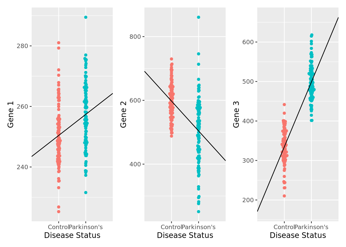
We can also compute the corresponding linear model fits, and confirm that the coefficients agree with the directions observed in the plot, as well as that all the associations are significant FDR < 0.05:
fit1 <- lm(`Gene 1` ~ `Disease Status`, data=gene_exp)
fit2 <- lm(`Gene 2` ~ `Disease Status`, data=gene_exp)
fit3 <- lm(`Gene 3` ~ `Disease Status`, data=gene_exp)

gene_stats <- bind_rows(
  c("Gene 1",coefficients(fit1),summary(fit1)$coefficients[2,4]),
  c("Gene 2",coefficients(fit2),summary(fit2)$coefficients[2,4]),
  c("Gene 3",coefficients(fit3),summary(fit3)$coefficients[2,4])
)
colnames(gene_stats) <- c("Gene","Intercept","Parkinson's","pvalue")
gene_stats$padj <- p.adjust(gene_stats$pvalue,method="fdr")
gene_stats
## # A tibble: 3 x 5
## Gene Intercept `Parkinson's` pvalue padj
## <chr> <chr> <chr> <chr> <dbl>
## 1 Gene 1 250.410735540151 6.95982194659045 3.92131170913765e-06 3.92e- 6
## 2 Gene 2 597.763814010886 -93.6291659250254 2.37368730897756e-13 3.56e-13
## 3 Gene 3 334.57788193953 164.094204856583 1.72774902843408e-66 5.18e-66We have just performed our first elementary differential expression analysis using a linear model. Specifically, we examined each of our genes for a statistical relationship with having Parkinson’s disease. The mechanics of this analysis are beyond the scope of this book, but later when we consider differential expression analysis packages in chapter 7 this pattern should be familiar after this example.
If you are familiar with logistic
regression, you might have
wondered why we didn’t model disease status, which is a binary variable, as a
function of gene expression like Disease Status ~ Gene 3. There are several
reasons for this, complete
separation principally
among them. In logistic regression, complete separation occurs when all the
predictor values (e.g. gene expression) for one outcome group are greater or
smaller than the other; i.e. there is no overlap in the values between groups.
This causes logistic regression to fail to converge, leaving these genes with no
statistics even though these genes are potentially the most interesting! There
are methods (e.g. Firth’s Logistic
Regression) that
overcome this problem, but methods that model gene expression as a function of
other outcome variables were developed first and remain the most popular.
7.1.4 Flavors of Linear Models
The linear model implemented above is termed linear regression due to the way it models the relationship between the predictor variables and the outcome. Specifically, linear regression makes some strong assumptions about that relationship that may not always hold for all datasets. To address this limitation, a more flexible class of linear models called generalized linear models that allow these assumptions to be relaxed by changing the mathematical relationship between the predictors and outcome using a link function, and/or by mathematically transforming the predictors themselves. Some of the more common generalized linear models are listed below:
- Logistic regression - models a binary outcome (e.g. disease vs control) as a linear combination of predictor variables by using the logistic function as the link function.
- Multinomial regression - models a multinomial (i.e. categorical variable with more than two categories) using a multinomial logit function link function
- Poisson regression - models an outcome variable that are count data as a linear combination of predictors using the logarithm as the link function; this model is commonly used when modeling certain types of high throughput sequencing data
- Negative binomial regression - also models an outcome variable that are count data but relaxes some of the assumptions of Poisson regression, namely the mean-variance equality constraint; negative binomial regression is commonly used to model gene expression estimated from RNASeq data.
Generalized linear models are very flexible, and there are many other types of these models used in biology and data science. It is important to be aware of the characteristics of the outcome you wish to model and choose the modeling method that is most suitable.
7.2 Statistical Distributions
Biological data, like all data, is uncertain. Measurements always contain noise, but a collection of measurements do not always contain signal. The field of statistics grew from the recognition that mathematics can be used to quantify uncertainty and help us reason about whether a signal exists within a dataset, and how certain we are of that signal. At its core, statistics is about separating the signal from the noise of a dataset in a rigorous and precise way.
One of the fundamental statistical tools used when estimating uncertainty is the statistical distribution, or probability distribution, or simply distribution. There are two broad classes of distributions: statistical, or theoretical, distributions and empirical distributions. In this section we will discuss some general properties of distributions, briefly describe some common probability distributions, and explain how to specify and use these distributions in R.
7.2.1 Random Variables
A random variable is an object or quantity which depends upon random events and that can have samples drawn from it. For example, a six-sided die is a random variable with six possible outcomes, and a single roll of the die will yield one of those outcomes with some probability (equal probability, if the die is fair). A coin is also a random variable, with heads or tails as the outcome. A gene’s expression in a RNASeq experiment is a random variable, where the possible outcomes are any non-negative integer corresponding to the number of reads that map to it. In these examples, the outcome is a simple category or real number, but random variables can be associated with more complex outcomes as well, including trees, sets, shapes, sequences, etc. The probability of each outcome is specified by the distribution associated with the random variable.
Random variables are usually notated as capital letters, like \(X,Y,Z,\) etc. A sample drawn from a random variable is usually notated as a lowercase of the same letter, e.g. \(x\) is a sample drawn from the random variable \(X\). The distribution of a random variable is usually described like “\(X\) follows a binomial distribution” or “\(Y\) is a normally distributed random variable”.
The probability of a random variable taking one of its possible values is usually written \(P(X = x)\). The value of \(P(X = x)\) is defined by the distribution of \(X\). As we will see later in the p-values section, sometimes we are also interested in the probability of observing a value of \(x\) or larger (or smaller). These probabilities are written \(P(X > x)\) (or \(P(X < x)\)). How these probabilities are computed is described in the next section.
7.2.2 Statistical Distribution Basics
By definition, a statistical distribution is a function that maps the possible values for a variable to how often they occur. Said differently, a statistical distribution is used to compute the probability of seeing a single value, or a range of values, relative to all other possible values, assuming the random variable in question follows the statistical distribution. The following is a visualization of the theoretical distribution of a normally distributed random variable:
tibble(
  x = seq(-4,4,by=0.1),
  `Probability Density`=dnorm(x,0,1)
) %>%
  ggplot(aes(x=x,y=`Probability Density`)) +
  geom_line() +
  labs(title="Probability Density Function for a Normal Distribution")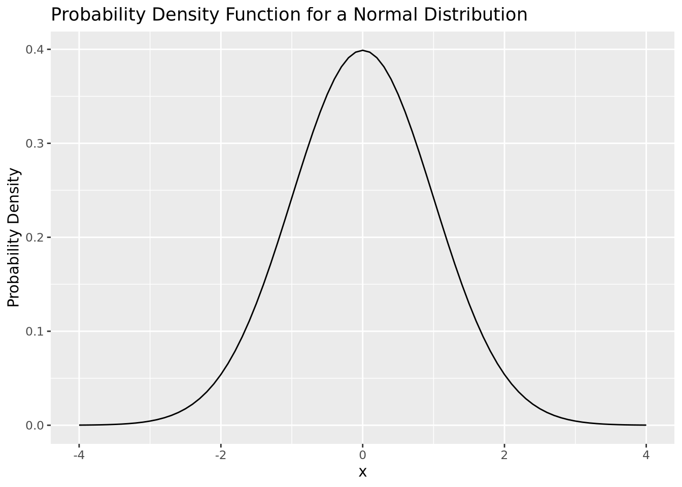
The plot above depicts to the probability density function (PDF) of a normal distribution with mean of zero and a standard deviation of one. The PDF defines the probability associated with every possible value of \(x\), which for the normal distribution is all real numbers. All PDFs have a closed mathematical form. The PDF for the normal distribution is:
\[ P(X = x|\mu,\sigma) = \frac{1}{\sigma\sqrt{2\pi}}e^{\frac{-(x-\mu)^2}{2\sigma}} \]
The notation \(P(X = x|\mu,\sigma)\) is read like “the probability that the random variable \(X\) takes the value \(x\), given mean \(\mu\) and standard deviation \(\sigma\)”. The normal distribution is an example of a parametric distribution because its PDF requires two parameters - mean and standard deviation - to compute probabilities. The choice of parameter values \(\mu\) and \(\sigma\) in the normal distribution determine the probability of the value of \(x\).
Probability density functions are defined for continuous distributions only, as described later in this section. Discrete distributions have a probability mass function (PMF) instead of a PDF, since the probability distribution is subdivided into a set of different categories. PMFs have different mathematical characteristics than PDFs (e.g. they are not continuous and therefore are not differentiable), but serve the same purpose.
In probability theory, if a plausible event has a probability of zero, this does not mean that event can never occur. In fact, every specific value in a distribution that supports all real numbers has a probability of zero (i.e. one specific value out of an infinite number of values). Instead, the probability distribution function allows us to reason about the relative likelihood of observing values in one range of the distribution compared with the others. While most values have extremely small relative probabilities, they never are equal to zero. This is due to the asymptotic properties of probability distributions, where every supported value of the distribution has a non-zero value by definition, though many values may be very close to zero.
The PDF provides the probability density of specific values within the distribution, but sometimes we are interested in the probability of a value being less than or equal to a particular value. We compute this using the cumulative distribution function (CDF) or sometimes just distribution function. In the plot below, both the PDF and CDF are plotted for a normal distribution with mean zero and standard deviation of 1:
tibble(
  x = seq(-4,4,by=0.1),
  PDF=dnorm(x,0,1),
  CDF=pnorm(x,0,1)
) %>%
  ggplot() +
  geom_line(aes(x=x,y=PDF,color="PDF")) +
  geom_line(aes(x=x,y=CDF,color="CDF"),linetype="dashed")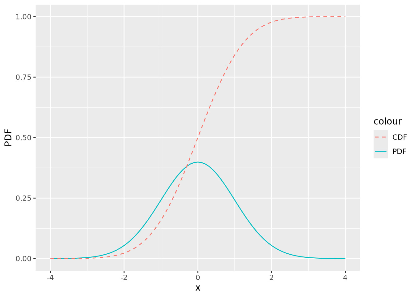
The value of the CDF corresponds to the area under the density curve up to the corresponding value of \(x\); 1 minus that value is the area under the curve greater than that value. The following figures illustrate this:
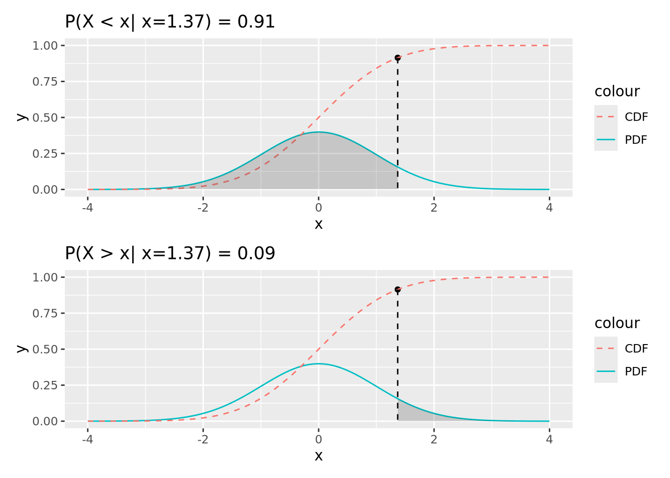
91% of the probability density is less than the (arbitrary) value of \(x=1.37\), and likewise 9% is greater. This is how p-values are calculated, as described later.
The CDF is also useful for generating samples from the distribution. In the following plot, 1000 random samples were drawn from a uniform distribution in the interval \((0,1)\) and plotted using the inverse CDF function:
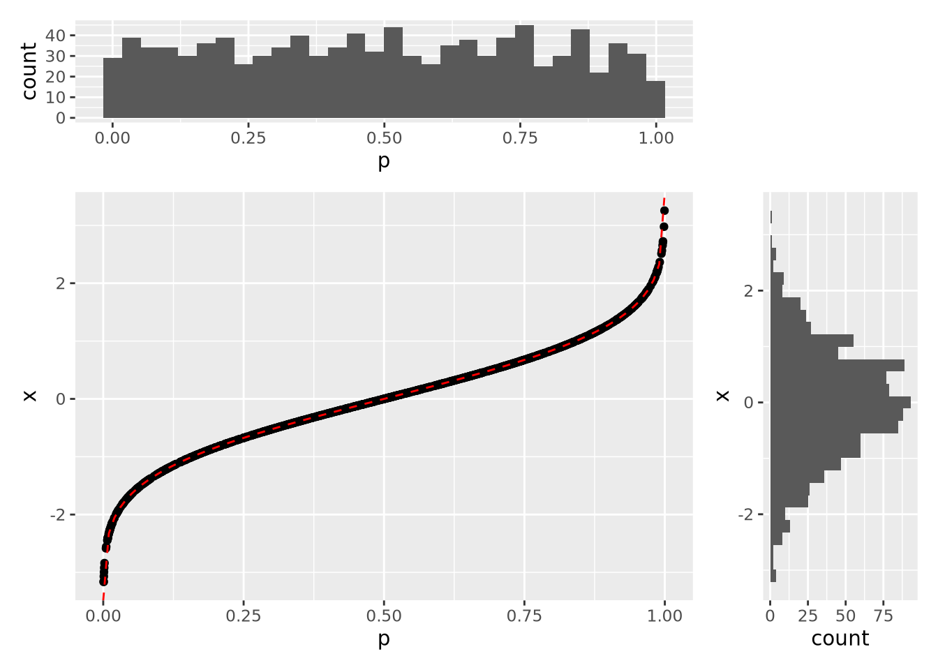
The histograms on the margins show the distributions of the \(p\) and \(x\) values for the scatter points. The \(p\) coordinates are uniform, while the \(x\) distribution is normal with mean of zero and standard deviation of one. In this way, we can draw samples from a normal distribution, or any other distribution that has an invertible CDF.
7.2.3 Distributions in R
There are four key operations we performed with the normal distribution in the previous section:
- Calculate probabilities using the PDF
- Calculate cumulative probabilities using the CDF
- Calculate the value associated with a cumulative probability
- Sample values from a parameterized distribution
In R, each of these operations has a dedicated function for each different
distribution, prefixed by d, p, q, and r. For the normal distribution,
these functions are dnorm, pnorm, qnorm, and rnorm:
-
dnorm(x, mean=0, sd=1)- PDF of the normal distribution -
pnorm(q, mean=0, sd=1)- CDF of the normal distribution -
qnorm(p, mean=0, sd=1)- inverse CDF; accepts quantiles between 0 and 1 and returns the value of the distribution for those quantiles -
rnorm(n, mean=0, sd=1)- generatensamples from a normal distribution
R uses this scheme for all of its base distributions, which include:
| Distribution | Probability Density Function |
|---|---|
| Normal | dnorm(x,mean,sd) |
| t Distribution | dt(x,df) |
| Poisson | dpois(n,lambda) |
| Binomial | dbinom(x, size, prob) |
| Negative Binomial | dnbinom(x, size, prob, mu) |
| Exponential | dexp(x, rate) |
| \(\chi^2\) | dchisq(x, df) |
There are many more distributions implemented in R beyond these, and they all follow the same scheme.
The next two sections will cover examples of some of these distributions. Generally, statistical distributions are divided into two categories: discrete distributions and continuous distributions.
7.2.4 Discrete Distributions
Discrete distributions are defined over countable, possibly infinite sets. Common discrete distributions include binomial (e.g. coin flips), multinomial (e.g. dice rolls), Poisson (e.g. number of WGS sequencing reads that map to a specific locus), etc. Below we describe a few of these in detail.
7.2.4.1 Bernoulli random trail and more
One of the examples for discrete random variable distribution is the Bernoulli function. A Bernoulli trail has only 2 outcomes with probability \(p\) and \((1-p)\). Consider flipping a fair coin, and the random variable X can take value 0 or 1 indicating you get a head or a tail. If it’s a fair coin, we would expect the \(Pr(X = 0) = Pr(X = 1) = 0.5\). Or, if we throw a die and we record X = 1 when we get a six, and X = 0 otherwise, then \(Pr(X = 0) = 5/6\) and \(Pr(X = 1) = 1/6\).
Now consider a slightly complicated situation: what if we are throwing the die \(n\) times and we would like to analyze the total number of six, say \(x\), we get during those \(n\) throws? Now, this leads us to the binomial distribution. If it’s a fair die, we would say our proportion parameter \(p = 1/6\), which means the probability we are getting a six is 1/6 for each throw.
\[ \begin{equation} f(x) = \frac {n!} {x!(n-x)!}p^x (1-p) ^{(n-x)} \end{equation} \]
The geometric random variable, similar to the binomial, is also from a sequence of random Bernoulli trials with a constant probability parameter \(p\). But this time, we define the random variable \(X\) as the number of consecutive failures before the first success. In this case, the probability of \(x\) consecutive failures followed by success on trial \(x+1\) is:
\[ \begin{equation} f(x) = p * (1-p)^x \end{equation} \]
The negative binomial distribution goes one step forward. This time, we are still performing a sequence of independent Bernoulli random trials with a constant probability of success equal to \(p\). But now we would like to record the random variable \(Z\) to be the total number of failures before we finally get to the \(r^{th}\) success. In other words, when we get to the \(r^{th}\) success, we had \(x+r\) Bernoulli random trails, in which \(x\) times failed and \(r\) times succeeded.
\[ \begin{equation} f(x) = \frac {x+r-1} {r-1} p^r {(1-p)}^x \end{equation} \]
7.2.4.2 Poisson
The Poisson distribution is used to express the probability of a given number
of events occurring in a fixed interval of time or space, and these events
occur with a known constant mean rate and independently of the time since
the last event. But no one understands this definition.
The formula for Poisson distribution is:
\[ \begin{equation} f(k; \lambda) = Pr(X=k) = \frac {\lambda^k e^{-\lambda}} {k!} \end{equation} \]
- lambda is the expected value of the random variable X
- k is the number of occurrences
- e is Euler’s number (e=2.71828)
okay, the formula makes it even more confusing.
Imagine you are working at a mail reception center, and your responsibility is to receive incoming letters. Assume the number of incoming letters is not affected by the day of the week or season of the year. You are expected to get 20 letters on average in a day. But, the actual number of letters you receive each day will not be perfectly 20.
You recorded the number of letters you receive each day in a month (30 days). In the following plot, each dot represents a day. The x-axis is calender day, and y-axis is the number of letters you receive on that day. Although on average you are receiving 20 letters each day, the actual number of letters each day vary a lot.
set.seed(2)
my_letter <- rpois(n = 30, lambda = 20)
plot(my_letter,
  main = "Letters received each day",
  xlab = "day of the month", ylab = "number of letters",
  pch = 19, col = "royalblue"
)
abline(a = 20, b = 0, lwd = 2, lty = 3, col = "salmon")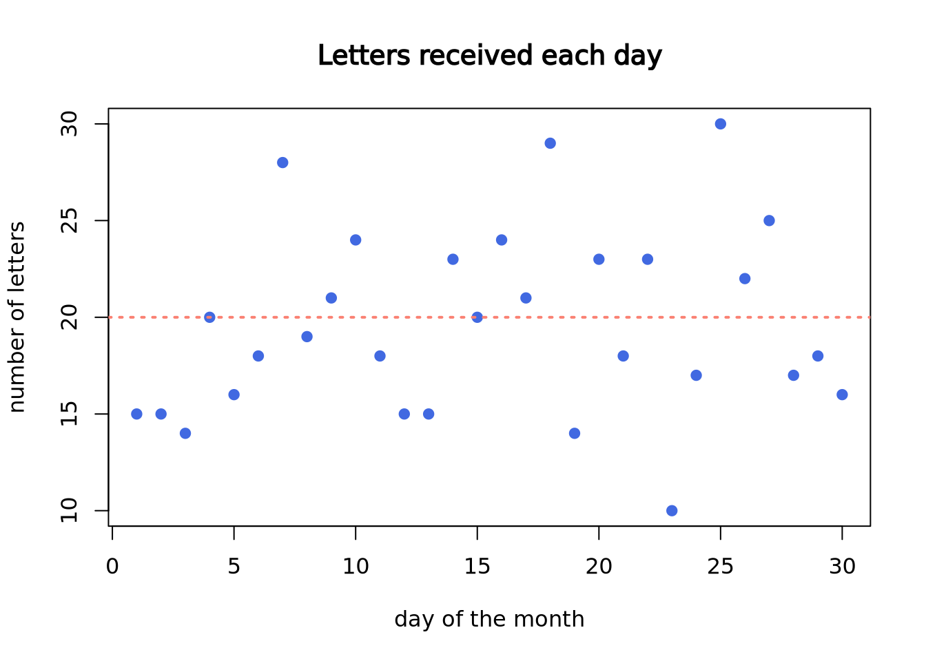
Now, let’s plot the density plot of our data. The \(x\)-axis is the number of letters on a single day, and the \(y\)-axis is the probability.
plot(density(my_letter),
  lwd = 2, col = "royalblue",
  main = "Probability of number of letters each day",
  xlab = "number of letters"
)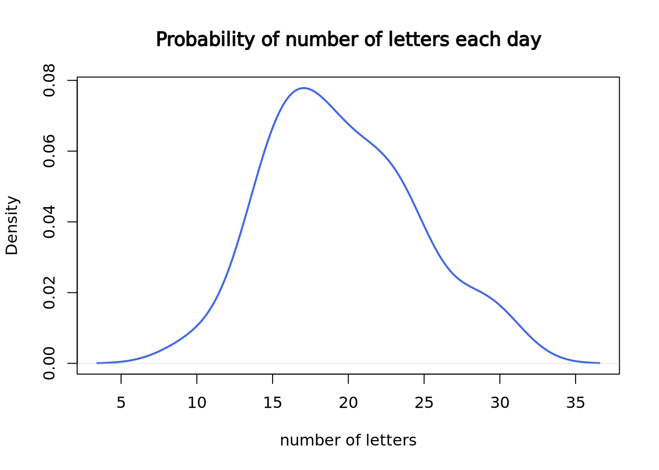
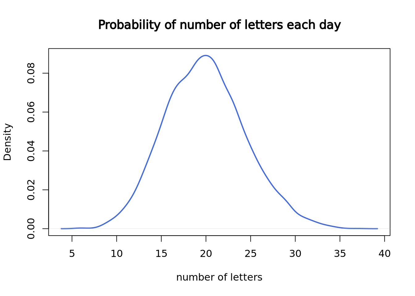
Since we only have 30 data points, it doesn’t look like a good curve. But, after we worked at the mail reception for 5000 days, it becomes much closer to the theoretical Poisson distribution with lambda = 20.
set.seed(3)
plot(density(rpois(n = 5000, lambda = 20)),
  lwd = 2, col = "royalblue",
  main = "Probability of number of letters each day",
  xlab = "number of letters"
)
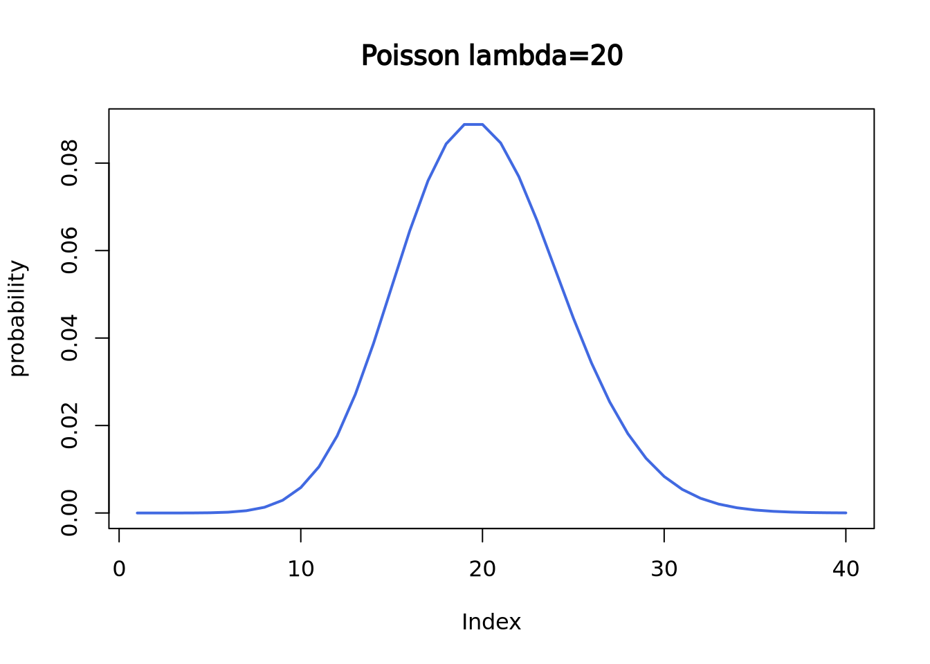
Here is the theoretical Poisson distribution with lambda = 20:
plot(dpois(c(1:40), lambda = 20),
  lwd = 2, type = "l", col = "royalblue",
  ylab = "probability", main = "Poisson lambda=20"
)
If we want to know what’s the probability to receive, for example, 18 letters,
we can use dpois() function.
dpois(x = 18, lambda = 20)## [1] 0.08439355If we want to know the probability of receiving 18 or less letters,
use ppois() function.
ppois(q = 18, lambda = 20, lower.tail = T)## [1] 0.3814219It is the cumulative area colored in the following plot:
plot(dpois(c(1:40), lambda = 20),
  lwd = 2, type = "l", col = "royalblue",
  ylab = "probability", main = "Poisson lambda=20"
)
polygon(
  x = c(1:18, 18),
  y = c(dpois(c(1:18), lambda = 20), 0),
  border = "royalblue", col = "lightblue1"
)
segments(x0 = 18, y0 = 0, y1 = 0.08439355, lwd = 2, lty = 2, col = "salmon")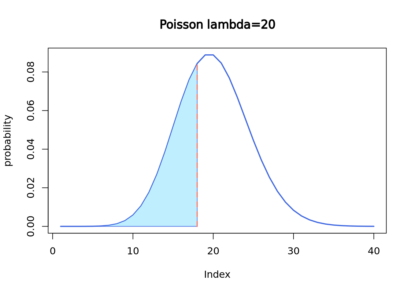
qpois() is like the “reverse” of ppois().
qpois(p = 0.3814219, lambda = 20)## [1] 18Let’s review the definition of Poisson distribution.
- “these events occur in a fixed interval of time or space”, which is a day;
- “these events occur with a known constant mean rate”, which is 20 letters;
- “independently of the time since the last event”, which means the number of
letters you receive today is independent of the letter you receive tomorrow.
more work today don’t guarantee less work tomorrow, just like in real life
Now let’s re-visit the formula.
\[ \begin{equation} f(k; \lambda) = Pr(X=k) = \frac {\lambda^k e^{-\lambda}} {k!} \end{equation} \]
- lambda is the expected value of \(X\), which is 20 letters in this example.
- \(k\) is the number of occurrences, which is the number of letters you get on a specific day.
- e is Euler’s number (e=2.71828)
7.2.5 Continuous Distributions
In contrast with discrete distributions, continuous distributions are defined over infinite, possibly bounded domains, e.g. all real numbers. There are a number of different continuous distributions. Here we will focus on the Normal distribution (Gaussian distribution). A lot of variables in real life are normally distributed, common examples include people’s height, blood pressure, and students’ exam score.
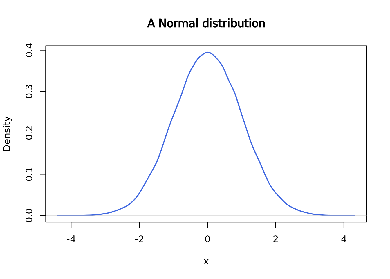
This is what a normal distribution with mean = 0 and standard deviation = 1 looks like:
set.seed(2)
norm <- rnorm(n = 50000, mean = 0, sd = 1)
plot(density(norm),
  main = "A Normal distribution", xlab = "x",
  lwd = 2, col = "royalblue"
)
Similar as the Poisson distribution above, there are several functions to work
with normal distribution, including rnorm(), dnorm(), pnorm(), and
qnorm().
rnorm() is used to draw random data points from a normal distribution with
a given mean and standard deviation.
set.seed(2)
rnorm(
  n = 6, # number of data points to draw
  mean = 0, # mean
  sd = 1 # standard deviation
)
## [1] -0.89691455 0.18484918 1.58784533 -1.13037567 -0.08025176 0.13242028dnorm() is the density at a given quantile. For instance, in the normal
distribution (mean=0, standard deviation=1) above, the probability density at
0.5 is roughly 0.35.
dnorm(x = 0.5, mean = 0, sd = 1)## [1] 0.3520653
plot(density(norm),
  main = "A Normal distribution", xlab = "x",
  lwd = 2, col = "royalblue"
)
segments(x0 = 0.5, y0 = 0, y1 = 0.3520653, lwd = 2, lty = 3, col = "salmon")
segments(x0 = -5, y0 = 0.3520653, x1 = 0.5, lwd = 2, lty = 3, col = "salmon")
points(x = 0.5, y = 0.3520653, cex = 1.5, lwd = 2, col = "red")
text(x = 1.1, y = 0.36, labels = "0.3521", col = "red2")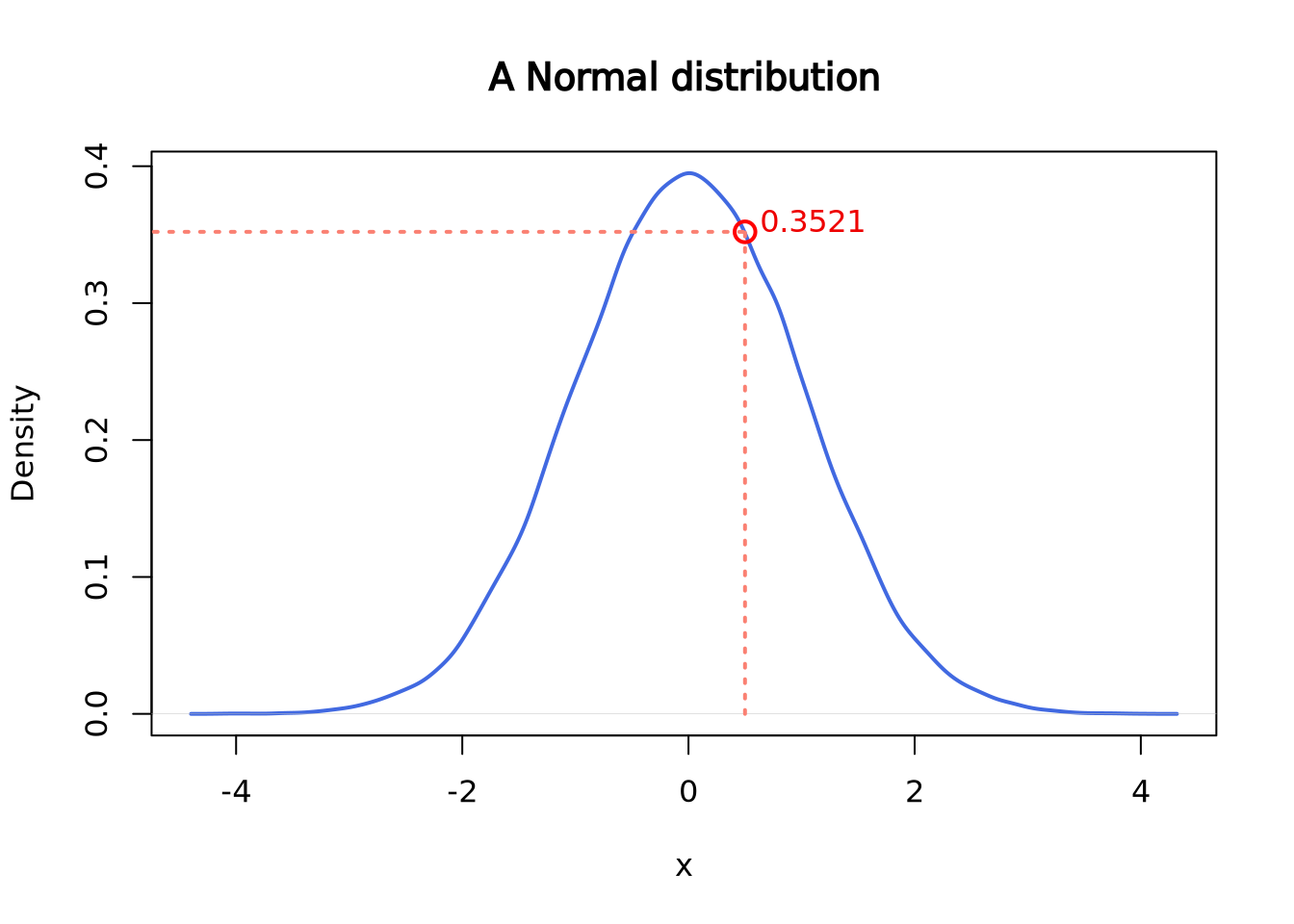
pnorm() gives the distribution function. Or, you can think of it as the
cumulative of the left side of the density function until a given value,
which is the area colored in light blue in the following plot.
pnorm(q = 0.5, mean = 0, sd = 1)## [1] 0.6914625
plot(density(norm),
  main = "A Normal distribution", xlab = "x",
  lwd = 2, col = "royalblue"
)
polygon(
  x = c(density(norm)$x[density(norm)$x <= 0.5], 0.5),
  y = c(density(norm)$y[density(norm)$x <= 0.5], 0),
  border = "royalblue", col = "lightblue1"
)
segments(x0 = 0.5, y0 = 0, y1 = 0.3520653, lwd = 2, lty = 2, col = "salmon")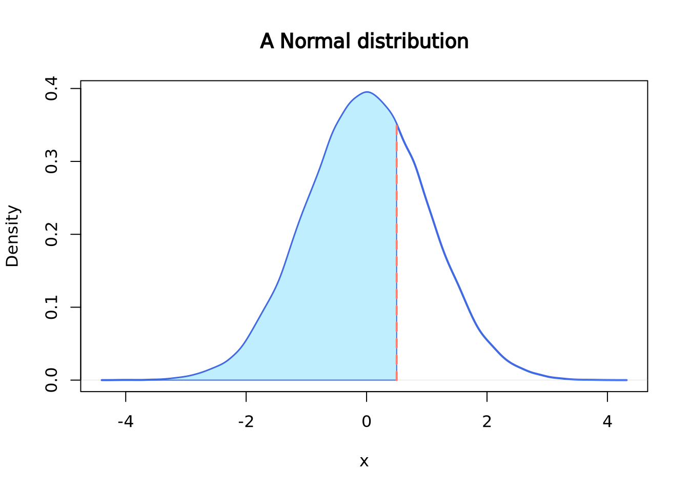
qnorm() gives the quantile function. You can think of it as the “reverse” of
pnorm(). For instance:
pnorm(q = 0.5, mean = 0, sd = 1)## [1] 0.6914625
qnorm(p = 0.6914625, mean = 0, sd = 1)## [1] 0.5000001Similarly, other distributions such as chi-square distribution, they all have
the same set of functions: rchisq(), dchisq(), pchisq() and qchisq() etc.
7.2.6 Empirical Distributions
Empirical distributions describe the relative frequency of observed values in a dataset. Empirical distributions may have any shape, and may be visualized using any of the methods described in the Visualizing Distributions section, e.g. a density plot. The following beeswarm and density plot both visualize the same made-up dataset:
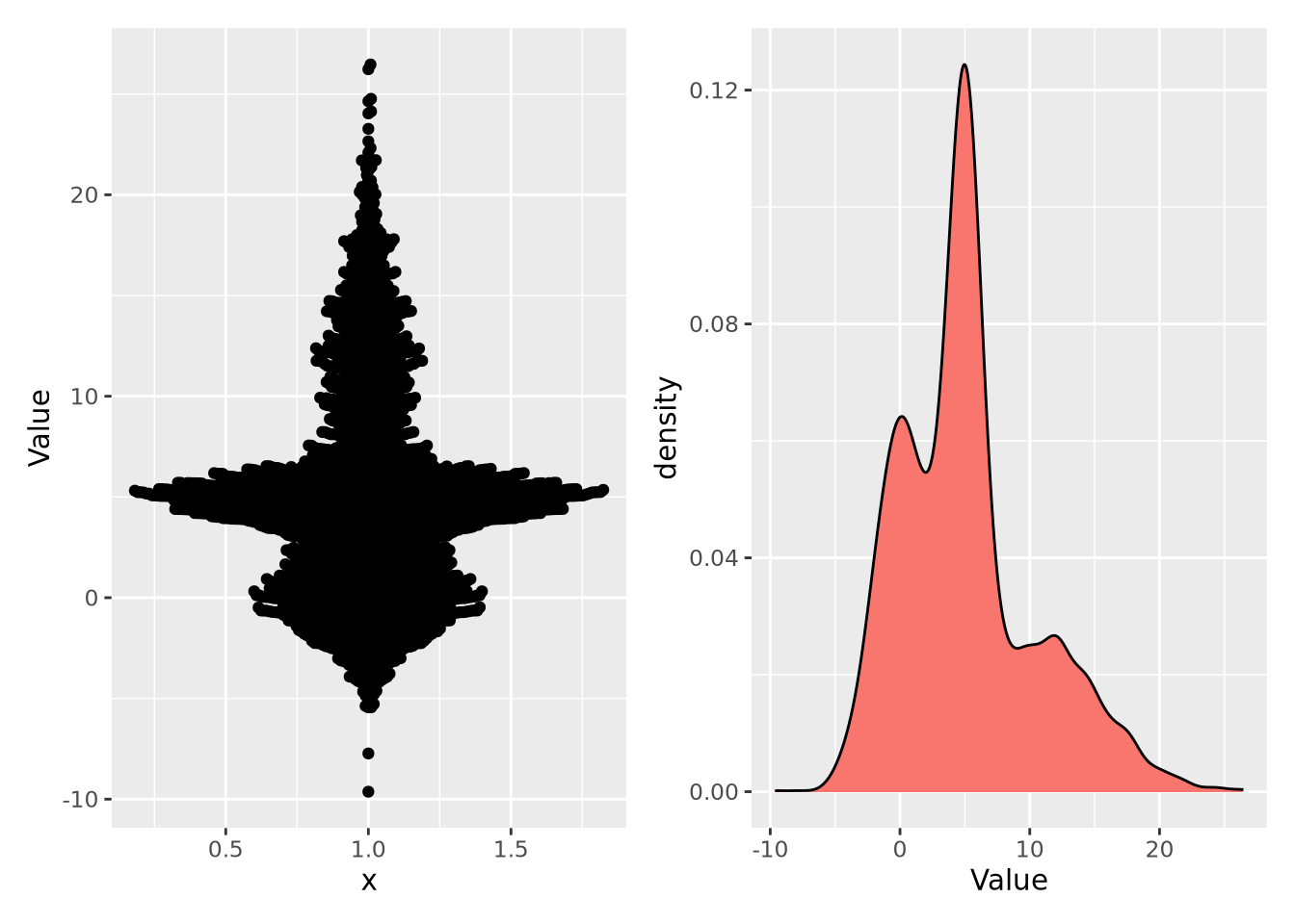
Note the \(y\) axis in the plot on the right is scaled as a density, rather than a count. A distribution plotted as a density ensures the values sum to 1, thus making a probability distribution. This empirical distribution looks quite complicated, and cannot be easily captured with a single mean and confidence interval.
7.3 Statistical Tests
7.3.1 What is a statistical test
A statistical test is an application of mathematics that we used to analyze quantitative data. They can be described as a way to understand how the independent variable(s) of the study affect the outcome of the dependent variable. The kind of statistical test appropriate for a study depends on a number of factors including variables characteristics, study design, and data distribution. The independent variable is (are) the variable(s) being controlled in the study to determine its effects on the dependent variable(s). Not all studies have independent variable(s).
Study design
The number of conditions a study has corresponds to the number of levels the independent variable has, for example 1 condition = 1 level, 2 conditions = 2 levels, and so on. This is different from the number of independent variables a study has. If a study has multiple independent variables, each will have its own number of levels. Statistical tests can be categorized as to whether they can handle 1, 2, or 2+ levels.
If you have 2 or more levels, then the type of grouping will need to be considered: are they between-subjects* or repeated-measures**. A between-subject design means that each participant undergoes one condition whereas a repeated-measures design has each participant undergo all conditions. A third type exists called matched groups, where different subjects undergo different conditions but are matched to each other in some important way, and may be treated as a repeated-measure design when selecting for a statistical test
*Independent design = between-subjects = between-groups; not to be confused with the variable. **Dependent design = repeated-measures = within-subjects = within-groups; also not to be confused with the variable.
Variables
The characteristics of your variables, both independent (predictor) and dependent (descriptor), will help you choose which statistical test to use. Specifically, the number of each, their type, and the level of measurement, will help you narrow your choices to select the appropriate test.
Number of Variables
The number of both independent and dependent variables will affect which test you select. Test selection will differ whether you have 1 or 2+ dependent variables and 0, 1, or 2+ independent variables.
Types of Data (Continuous and Categorical)
Typically in bioinformatics, data is subdivided into 3 categories: Continuous, Categorical, and Binary. Continuous data is data that can take real number values within either a finite or infinite range. For example, height is a continuous variable: 152.853288cm (60.1783 in), 182.9704cm (72.0356 in), 172.7cm(68in), 163cm(64.2in) and 145.647cm (57.3413 in) are all technically valid heights. Categorical data is data that can be divided to categories or groups such as (high, medium, and low) or (under10, 10-29, and 30+). Binary data, data that can either be one thing or another (T/D, Y/N, 0/1, etc) falls under the Categorical data umbrella though may get mentioned separately elsewhere. Data that exists in sequential, positive integer form- such as number of siblings- is called Discrete data (bonus 4th category!) but typically ends up being treated as categorical data.
Levels of Measurement
The main levels of measurement in we use in statistics are Ratio, Interval, Nominal, and Ordinal. Both Ratio and Interval levels have distance between measurements defined; the biggest difference between the two is that Ratio measurements have a meaningful zero value (and no negative numbers). Height in inches or cm, Kelvin, and number of students in a class are all Ratio measurements. Interval measurements do not have a meaningful zero. Celsius and Fahrenheit both have arbitrary 0s- the freezing point of pure and (a specific kind of) ocean water- making most standard temperature measurements type Interval. Ordinal measurements have a meaningful order to their values but have variable/imprecise distances between measurements, like socioeconomic status (upper, middle, and lower) and days since diagnosis (under 10, 10-39, 40-99, 100+). Nominal measurements do not have meaningful order to their values, like country of origin and yes/no. Ratio and Interval measurements are continuous variables while Nominal and Ordinal measurements are categorical variables.
Data Distribution (Parametric vs Nonparametric)
This is the third factor to keep in mind for test selection and only applicable for NON-nominal dependent variables. Parametric tests make the assumption that the population the data is sourced from has a normal or Gaussian distribution. These are powerful tests because of their data distribution assumption, with the downside of only being able to be used in select cases. Nonparametric tests do not assume a normal distribution and therefore can be used in a wide range of cases, thought they are less likely to find significance in the results.
7.3.2 Common Statistical Tests
Here are some common statistical tests and a quick overview as to how to run them in R. If you would like more information about a specific test, links are included in the descriptions
These are only some statistical tests. Here’s a link to where you can find a few more
One-Sample T-Test
Dependent Variables: 1, continuous [ratio and interval]
Independent Variables: 0 variables
Design: 1 group, 1 level
Parametric: Yes
More t-test information shamelessly linked from SPH Null and Alternate (Research) Hypotheses Z-values(not mentioned but are in texts that fully explain t-tests) One-Sample t-tests come in 3 flavors: two-tailed test, one-tailed test (upper tail), and one-tailed test (lower tail).
# One-sample t-test
t.test(x, #numeric vector of data
       mu = 0, #True value of the mean. Defaults to 0
       alternative = "two.sided", # ("two.sided", "less", "greater") depending on which you want to use. Defaults to "two.sided
       conf.level = 0.95 #1-alpha. Defaults to 0.95
)
The t.test() function allows for multiple kinds of t-tests. To use this
function to perform a one sample t-test, you will need a numeric vector of the
data you want to run the data on, the mean you want to compare it to, your
confidence level (1 - alpha), and your alternative hypothesis. The t-test, like
other kinds of t-tests, will compare the means by calculating the t-statistic,
p-value and confidence intervals of your data’s mean.
t: The calculated t-statistic, uses formula : (mean(x) - mu)/(sd(x)*sqrt(n_samples))
df: Degrees of Freedom. Calculated by: n_samples-1
p: The p-value of the t-test as determined by the t-statistic and df on the t-distribution table
(conf.level) percent confidence interval: calculated interval where the true mean(x) is with conf.level % certainty.
sample estimates, mean of x: The calculated mean of x
Accepting or rejecting the null hypothesis is a matter of determining if mean(x) is outside the percent confidence interval range, if it is then the p-value will determine the significance of the results.
#Example
set.seed(10)
x0 <- rnorm(100, 0, 1) #rnorm(n_samples, true_mean, standard_deviation)

ttestx0 <- t.test(x0, mu = 0, alternative = "two.sided", conf.level = 0.95) #actual running of the t-test
#t.test(x0) yeilds the same results bc I used default values for mu, alternative, and conf.level

tlessx0 <- t.test(x0, mu = 0, alternative = "less", conf.level = 0.90)

knitr::knit_print(ttestx0) #display t-test output via knitr
##
## One Sample t-test
##
## data: x0
## t = -1.4507, df = 99, p-value = 0.15
## alternative hypothesis: true mean is not equal to 0
## 95 percent confidence interval:
## -0.32331056 0.05021268
## sample estimates:
## mean of x
## -0.1365489In t.test_x0, we are running a two-tailed t-test on a vector of 100 doubles
generated with rnorm() where the intended mean is 0. Since this is a
two-tailed test, the alternate hypothesis is mean(x0) != 0 while the null
hypothesis is mean(x0) = 0
Since mu=0 and 0 is within the range (-.323, 0.050), we have failed to reject the null hypothesis with this set of data
Unpaired T-Test
Dependent Variables: 1, continuous [ratio and interval]
Independent Variables: 1
Design: 2 groups, 2 levels
Parametric: Yes
# One-sample t-test
t.test(x, #numeric vector of data 1
       y, #numeric vector of data 2
       alternative = "two.sided", # ("two.sided", "less", "greater") depending on which you want to use. Defaults to "two.sided
       conf.level = 0.95 #1-alpha. Defaults to 0.95
)
The unpaired t-test functions similarly to the one-sample t-test except instead of mu, it uses dataset y. Variance is assumed to be about equal between dataset x and y.
#Unpaired t-test example
set.seed(10)
x <- rnorm(100, 0, 1)
y <- rnorm(100, 3, 1)

unpaired <- t.test(x, y)

knitr::knit_print(unpaired)
##
## Welch Two Sample t-test
##
## data: x and y
## t = -22.51, df = 197.83, p-value < 2.2e-16
## alternative hypothesis: true difference in means is not equal to 0
## 95 percent confidence interval:
## -3.308051 -2.775122
## sample estimates:
## mean of x mean of y
## -0.1365489 2.9050374Output for an unpaired two sample t-test is similar to the output for the one-sample. Mu is typically 0 (though one could change it with ‘mu = n’ in the function call) and the test uses the confidence interval for (mean(x)-mean(y)), which is (-3.308, -2.775). Since mu does not exist within the confidence interval, the null hypothesis can be rejected.
Paired T-Test
Dependent Variables: 1, continuous [ratio and interval]
Independent Variables: 1
Design: 1 group, 2 levels
Parametric: Yes
# One-sample t-test
t.test(x, #numeric vector of data 1
       y, #numeric vector of data 2
       paired = TRUE, #defaults to FALSE
       alternative = "two.sided", # ("two.sided", "less", "greater") depending on which you want to use. Defaults to "two.sided
       conf.level = 0.95 #1-alpha. Defaults to 0.95
)
The paired t-test works for matched and repeated-measures designs. Like the
unpaired t-test, it has a second data vector and does not need ‘mu’. When
running a paired t-test make sure that you specify that paired = TRUE when
calling the function and that x and y have the same length.
More information about paired t-tests here
#Unpaired t-test example
set.seed(10)
x <- rnorm(100, 0, 13)
y <- rnorm(100, 3, 1)

unpaired <- t.test(x, y, paired = TRUE)

knitr::knit_print(unpaired)
##
## Paired t-test
##
## data: x and y
## t = -3.7956, df = 99, p-value = 0.0002539
## alternative hypothesis: true mean difference is not equal to 0
## 95 percent confidence interval:
## -7.126787 -2.233560
## sample estimates:
## mean difference
## -4.680174Similar to the unpaired t-test, the paired t-test looks at the differences
between x and y. Unlike the unpaired t-test, the statistic creates and runs its
test on a third set of data created from the differences of x and y. For an x
and y of length n, r would create a third data set of new = ((x1-y1), (x2-y2),...(xn-1-yn-1), (xn-yn)) and run its testing with mean(new) and sd(new)
Chi-Squared test
Dependent Variables: 1, categorical
Independent Variables: 1
Design: 2 groups, 2 + levels
Parametric: No
More Information on Chi-Squared tests
#How to Run a chi-squared test
chisq.test(x, # numeric vector, matrix, or factor
           y # numeric vector; ignored if x is a matrix; factor of the same length as x if x is a factor
)
7.3.2.1 __Chi-Square Goodness-Of-Fit_ _{-}
Dependent Variables: 1, categorical
Independent Variables: 0
Design: 1 group
Parametric: No
More Information on Chi-Squared test on one sample
#How to Run a chi-square goodness of fit
chisq.test(x, # numeric vector
           p = #list of probabilities, like c(10, 10, 10, 70)/100), same length as x
)
The chi-squared goodness-of-fit can compare one set of outcomes to a given set of probabilities to determine the likelihood of the test probabilities differing from the given. The set of given probabilities constitutes the null hypothesis. In the below example, the dataset is the tested outcome frequencies: the number of times x[1], x[2], x[3], and x[4] were observed. If my null hypothesis says that each of the 4 should be observed an equal number of times, then the resulting chi-square test should will have a p-value of p<0.001
x <- c(10,25, 18, 92)

chisq.test(x, p=c(25, 25, 25, 25)/100)
##
## Chi-squared test for given probabilities
##
## data: x
## X-squared = 117.43, df = 3, p-value < 2.2e-16Wilcoxon-Mann Whitney test
Dependent Variables: 1, (ordinal, interval, or ratio)
Independent Variables: 1
Design: 2 groups, 2 levels
Parametric: No
Wilcoxon Signed Ranks test
Dependent Variables: 1, (ordinal, interval, or ratio)
Independent Variables: 1
Design: 1 groups, 2 levels
Parametric: No
``{reval=FALSE}
wilcox.test(x,#Numeric vector of data y, #numeric vector of data from 2nd level- same length paired = TRUE)
#### __One-Way ANOVA__ {-}


_Dependent Variables_: 1, continuous

_Independent Variables_: 1

_Design_: 2+ groups, 2+ levels

_Parametric_: Yes

[More information here](https://sphweb.bumc.bu.edu/otlt/MPH-Modules/BS/BS704_HypothesisTesting-ANOVA/BS704_HypothesisTesting-ANOVA4.html#headingtaglink_3)

``` r
summary(aov(formula, #formula specifying the model
data #data frame containing the variables in the formula))7.3.3 Choosing a Test
- Look for your Dependent Variable(s). How many do you have? (1 or 2+)
- Which ones exist on a continuum, where any fraction within the valid range is technically possible, though the actual data might have rounded? (Continuous vs Categorical)
- For Categorical: If values do not have a definite order then it’s Nominal. Else it’s probably Ordinal
- Look for your Independent Variable(s). How many do you have? (0, 1, or 2+)
- Define their types and level of measurement as described in 1a and then do 2b and 2c if you have 1 or more independent variables
- How many conditions does each independent variable have? (= # of levels)
- Does the same subject or (equivalent subjects) undergo each condition/level? (‘Yes’ -> repeated-measures; ‘No’ -> between-groups
- If you do not have nominal data, can you assume your data would have a normal distribution if you measured the general population? (‘Yes’-> parametric; ‘No’ -> non-parametric)
7.3.4 P-values
In statistics, the p-value is the probability of obtaining the observed results assuming that the null hypothesis is correct. In other words, the p-value is the probability of the same results happening by chance selection from the normal population rather than the test condition.
For instance, imagine there is a game that randomly picks one out of four colors. The game developer decides to add a 5th color, yellow, so that each color now has 1/5 chance of winning and a 4/5 chance of losing. How many of its first games would yellow have to lose in a row before you suspect the dev forgot to code in the ability for yellow to win? If you want to wait to until there is a < 5% chance of yellow losing every single game in a row under normal circumstances before pointing this out to the dev, then yellow would have to lose 14/14 games (a 4.4% likelihood).
To visualize how 14 losses in a row in a game of chance with 1/5 success rate would occur in less than 5% of all instances, we can run a simulation of 1000 instances of 14 games with 1/5 chance success and displaying the results with their frequencies of success:
roll <- function(nrolls, noptions){
outcomes <- sample(1:noptions, nrolls, TRUE)
return(length(outcomes[outcomes == 1]))
}
dataset <- function(sample, nrolls, noptions){
simulations <- c()
for(i in 1:sample){simulations[i] <- roll(nrolls, noptions)}
return(simulations)
}
set.seed(18)
Yellow_Wins <- dataset(1000, 14, 5)
hist(Yellow_Wins, freq=FALSE, right=FALSE)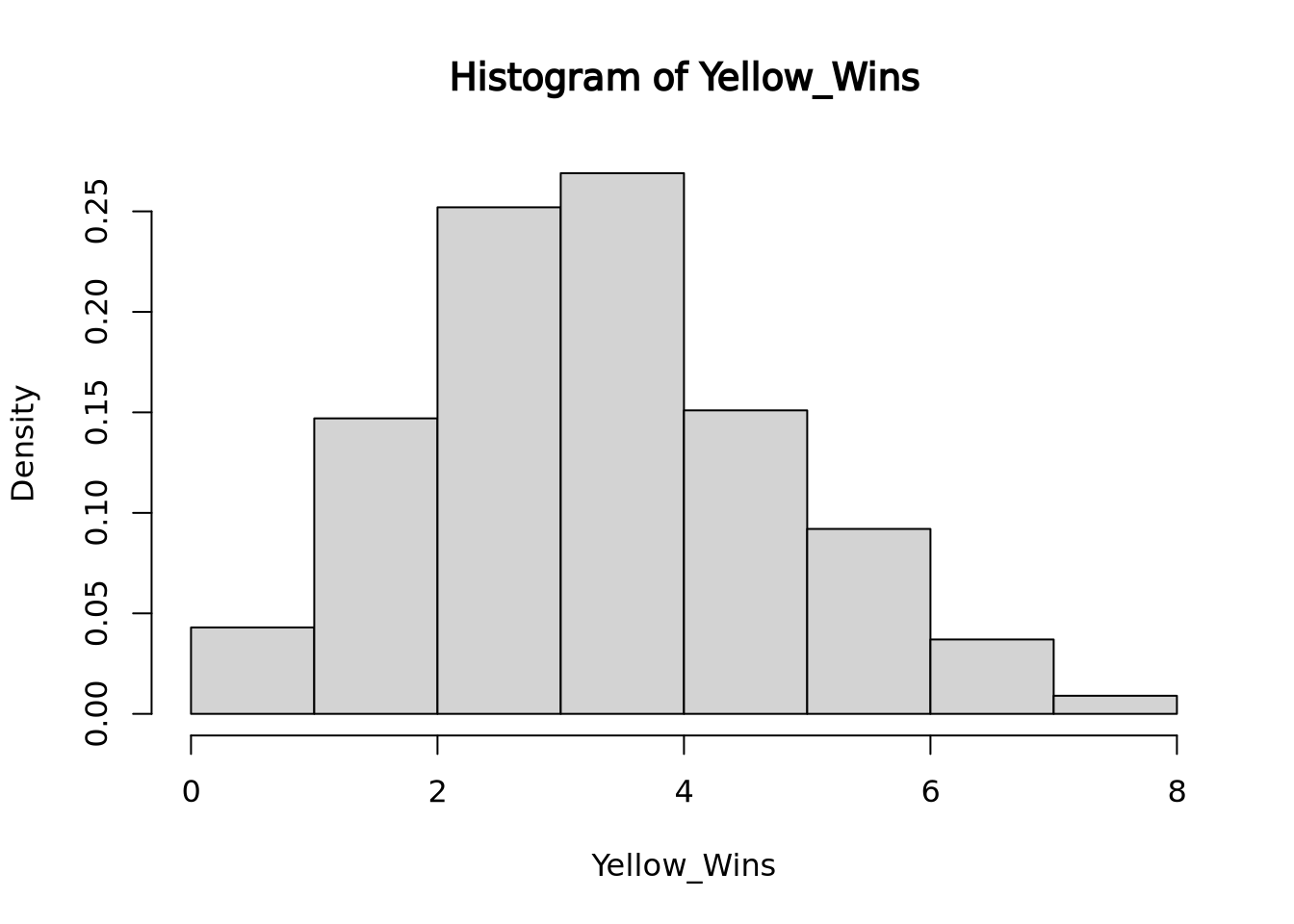 Here you see that slightly less than 5% of all run instances had 0 wins.
In this situation, we are comparing if yellow’s win rate is significantly lower than if yellow had an equal chance at winning. The research hypothesis or alternative hypothesis in this case is that yellow’s chance of winning is significantly lower than the rest of the colors while the null hypothesis would be that yellow’s chance of winning is the same as the rest of the colors. The p-value of this test would be 0.043 because 43 out of 1000 instances of 14 rolls with a 1/5 chance of success totaled 0 successes, the number of successes we saw. If we instead were looking for 1 success or less out of 14 rolls, the p-value would be 0.19, because our simulation ran 147 instances of 1 success and 42 instances of 0 success.
Since p-values are calculated by the percentage of outcomes that are higher than the one observed, on a normal distribution they may look something like this:
set.seed(2)
norm <- rnorm(n = 50000, mean = 4, sd = 1)
plot(density(norm),
     main = "P-Values on a Normal Distribution", xlab = "X-Values",
     lwd = 2, col = "royalblue"
)
polygon(
  x = c(density(norm)$x[density(norm)$x >= 6], 6),
  y = c(density(norm)$y[density(norm)$x >= 6], 0),
  border = "royalblue", col = "lightblue1"
)
segments(x0 = 6, y0 = 0, y1 = 0.4, lwd = 2, lty = 2, col = "salmon")
text(7, 0.2, "Observed Value (@ 2sd)")
text(3.9, 0.01, "Instances higher than crit. val ->")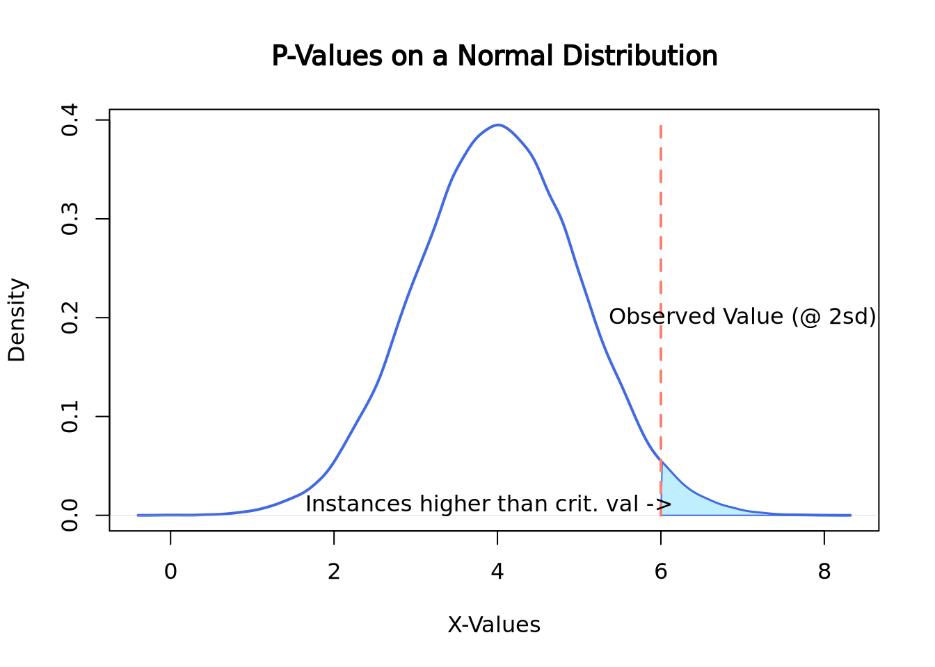
Here the observed value is 6, which happens to be exactly 2 standard deviations above the mean. To compute the p-value of this instance, the area under the curve would need to be calculated which can be easily done by looking up the appropriate values on a z-table. Here is a link about finding the area under the normal curve
7.3.5 Multiple Hypothesis Testing .
What is multiply hypothesis testing adjustment? Why is it important? What are some common adjustment methods (Bonferroni (FWER) and Benjamini-Hochberg (FDR))? How do we interpret adjusted p-values (depends on the adjustment method)? How do we compute adjusted p-values in R?
7.3.6 Statistical power
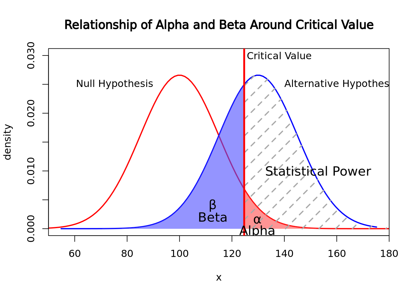
Statistical Power is the probability that the null hypothesis was actually false but the data did not have enough evidence to reject it. In short, it is the failure to reject the null hypothesis in the presence of a significant effect. This is a Type II error, also known as a false negative. Its counterpart, the Type I error, is the probability that a null hypothesis was rejected when there was no significant effect.
The chance of a Type I error is represented by alpha, the same alpha that we use to calculate significance level (1-alpha). Type II errors are represented by beta. The relationship between statistical power and beta are similar to the relationship between significance level and alpha: statistical power is calculated as 1-beta.
Read more about the relationship between Type II and Type I errors
To calculate beta, find the area under the curve of the research hypothesis distribution on the opposite side of the critical value line where alpha is calculated. To find the area in the tail of the distribution, you would need to reference a Z-score chart, which will not be expected of you in this course. If you wish to read more about it here is a link about finding the area under the normal curve with z-scores, same one as linked above
 Code sourced from:
caracal, “How do I find the probability of a type II error”, stats.stackexchange.com, Feb 19, 2011, link, Date Accessed: Feb 28, 2022
Code sourced from:
caracal, “How do I find the probability of a type II error”, stats.stackexchange.com, Feb 19, 2011, link, Date Accessed: Feb 28, 2022
The above graph shows the relationship of alpha and beta. Since the alternative hypothesis is looking for a higher mean, alpha is calculated by the area under the null hypothesis curve on right side of the critical value while beta is calculated by the area under the alternative hypothesis on the left of the critical value line. Should an experiment get a higher p-value than the critical value, then the Beta will increase in relationship to Alpha decreasing.
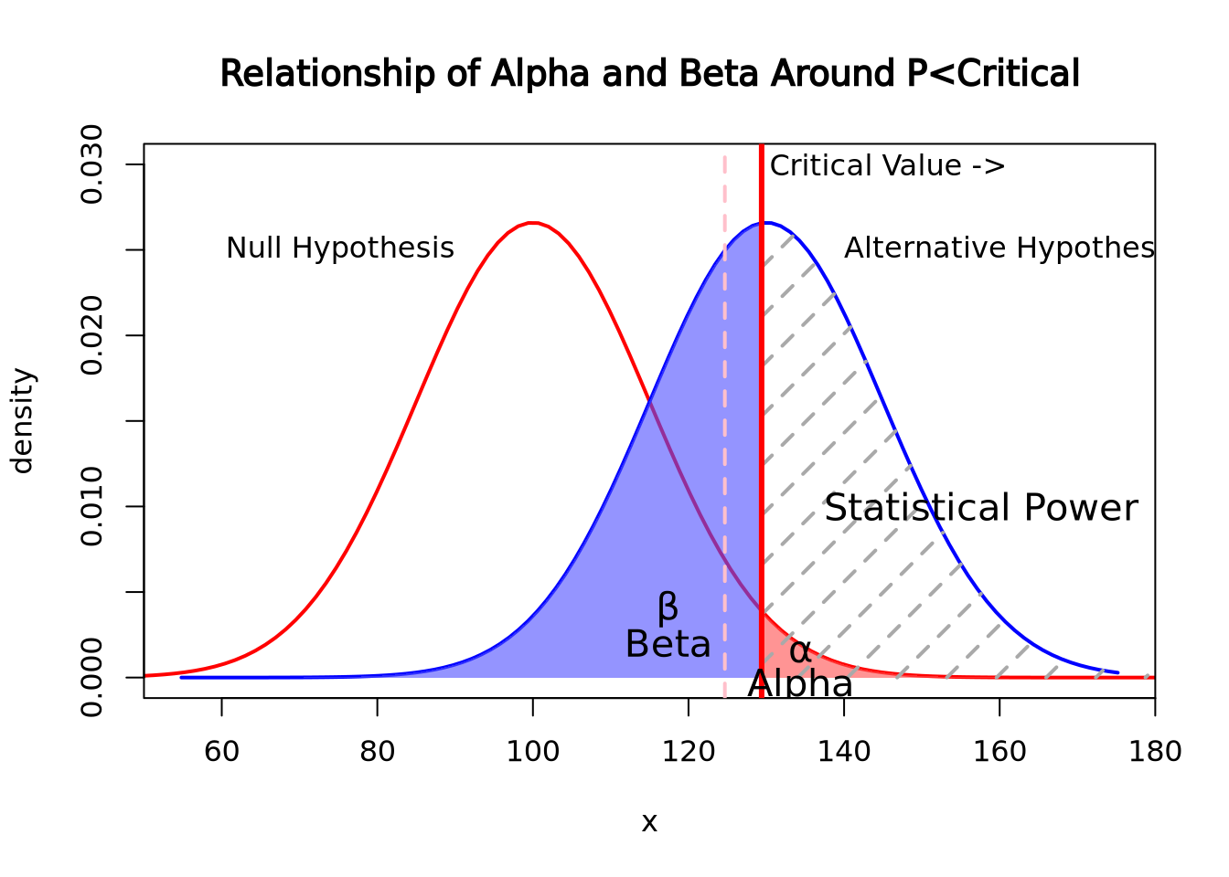 In this graph, the critical value was moved to 0.025 while the null and alternative hypotheses stayed the same. As the chance of alpha decreased, the chances of beta increased. The opposite is also true, as alpha increases, beta decreases
Applications of Statistical Power
One of the applications of statistical power, besides as a measure of Type II error probability, is to allow you to run a power analysis. A power analysis involves using the relationship between Effect Size, Sample Size, Significance, and Statistical Power when you have three of the four parts in order to find the value of the fourth. This is typically used to find the effect size of a study, as that is often the hardest to estimate, or to find a sample size that corresponds with a desired effect size when designing a study. Further reading on statistical power and power analysis
Effect Size
The effect size is a measurement of the magnitude of experimental effects. There are a number of ways to calculate effect size including but not limited to Cohen’s D, Pearson’s R, and Odds Ratio. If you would like to read about what BU’s SPH has to say about it, here is the SPH module link
Citations: Dorey FJ. Statistics in brief: Statistical power: what is it and when should it be used?. Clin Orthop Relat Res. 2011;469(2):619-620. doi:10.1007/s11999-010-1435-0
Parab S, Bhalerao S. Choosing statistical test. Int J Ayurveda Res. 2010;1(3):187-191. doi:10.4103/0974-7788.72494 Introduction to SAS. UCLA: Statistical Consulting Group. from https://stats.idre.ucla.edu/sas/modules/sas-learning-moduleintroduction-to-the-features-of-sas/ (accessed February 24, 2022)
Ranganathan P, Gogtay NJ. An Introduction to Statistics - Data Types, Distributions and Summarizing Data. Indian J Crit Care Med. 2019 Jun;23(Suppl 2):S169-S170. doi: 10.5005/jp-journals-10071-23198. PMID: 31485129; PMCID: PMC6707495.
7.4 Exploratory Data Analysis
So far, we have discussed methods where we chose an explicit model to summarize our data. However, sometimes we don’t have enough information about our data to propose reasonable models, as we did earlier when exploring the distribution of our imaginary gene expression dataset. There may be patterns in the data that emerge when we compute different summaries and ask whether there is a non-random structure to how the individual samples or features compare with one another. The types of methods we use to take a dataset and examine it for structure without a prefigured hypothesis is called exploratory analysis and is a key approach to working with biological data.
7.4.1 Principal Component Analysis
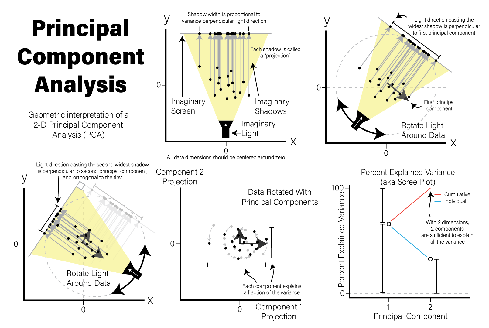
A very common method of exploratory analysis is principal component analysis or PCA. PCA is a statistical procedure that identifies so called directions of orthogonal variance that capture covariance between different dimensions in a dataset. Because the approach captures this covariance between features of arbitrary dimension, it is often used for so-called dimensionality reduction, where a large amount of variance in a dataset with a potentially large number of dimensions may be expressed in terms of a set of basis vectors of smaller dimension. The mathematical details of this approach are beyond the scope of this book, but below we explain in general terms the intuition behind what PCA does, and present an example of how it is used in a biological context.
PCA decomposes a dataset into a set of orthonormal basis vectors that collectively capture all the variance in the dataset, where the first basis vector, called the first principal component explains the largest fraction of the variance, the second principal component explains the second largest fraction, and so on. There are always an equal number of principal components as there are dimensions in the dataset or the number of samples, whichever is smaller. Typically only a small number of these components are needed to explain most of the variance.
Each principal component is a \(p\)-dimensional unit vector (i.e. a vector of magnitude 1), where \(p\) is the number of features in the dataset, and the values are weights that describe the component’s direction of variance. By multiplying this component with the values in each sample, we obtain the projection of each sample with respect to the basis of the component. The projections of each sample made with each principal component produces a rotation of the dataset in \(p\) dimensional space. The figure below presents a geometric intuition of PCA.
Many biological datasets, especially those that make genome-wide measurements
like with gene expression assays, have many thousands of features (e.g. genes)
and comparatively few samples. Since PCA can only determine a maximum number of
principal components as the smaller of the number of features or samples, we
will almost always only have as many components as samples. To demonstrate this,
we perform PCA using the
stats::prcomp()
function on an example microarray gene expression intensity dataset:
# intensities contains microarray expression data for ~54k probesets x 20 samples

# transpose expression values so samples are rows
expr_mat <- intensities %>%
  pivot_longer(-c(probeset_id),names_to="sample") %>%
  pivot_wider(names_from=probeset_id)

# PCA expects all features (i.e. probesets) to be mean-centered,
# convert to dataframe so we can use rownames
expr_mat_centered <-  as.data.frame(
  lapply(dplyr::select(expr_mat,-c(sample)),function(x) x-mean(x))
)
rownames(expr_mat_centered) <- expr_mat$sample

# prcomp performs PCA
pca <- prcomp(
  expr_mat_centered,
  center=FALSE, # prcomp centers features to have mean zero by default, but we already did it
  scale=TRUE # prcomp scales each feature to have unit variance
)

# the str() function prints the structure of its argument
str(pca)
## List of 5
## $ sdev : num [1:20] 101.5 81 71.2 61.9 57.9 ...
## $ rotation: num [1:54675, 1:20] 0.00219 0.00173 -0.00313 0.00465 0.0034 ...
## ..- attr(*, "dimnames")=List of 2
## .. ..$ : chr [1:54675] "X1007_s_at" "X1053_at" "X117_at" "X121_at" ...
## .. ..$ : chr [1:20] "PC1" "PC2" "PC3" "PC4" ...
## $ center : logi FALSE
## $ scale : Named num [1:54675] 0.379 0.46 0.628 0.272 0.196 ...
## ..- attr(*, "names")= chr [1:54675] "X1007_s_at" "X1053_at" "X117_at" "X121_at" ...
## $ x : num [1:20, 1:20] -67.94 186.14 6.07 -70.72 9.58 ...
## ..- attr(*, "dimnames")=List of 2
## .. ..$ : chr [1:20] "A1" "A2" "A3" "A4" ...
## .. ..$ : chr [1:20] "PC1" "PC2" "PC3" "PC4" ...
## - attr(*, "class")= chr "prcomp"The result of prcomp() is a list with five members:
-
sdev- the standard deviation (i.e. the square root of the variance) for each component -
rotation- a matrix where the principal components are in columns -
x- the projections of the original data, aka the rotated data matrix -
center- ifcenter=TRUEwas passed, a vector of feature means -
scale- ifscale=TRUEwas passed, a vector of the feature variances
Recall that each principal component explains a fraction of the overall variance
in the dataset. The sdev variable returned by prcomp() may be used to first
calculate the variance explained by each component by squaring it, then dividing
by the sum:
library(patchwork)
pca_var <- tibble(
  PC=factor(str_c("PC",1:20),str_c("PC",1:20)),
  Variance=pca$sdev**2,
  `% Explained Variance`=Variance/sum(Variance)*100,
  `Cumulative % Explained Variance`=cumsum(`% Explained Variance`)
)

exp_g <- pca_var %>%
  ggplot(aes(x=PC,y=`% Explained Variance`,group=1)) +
  geom_point() +
  geom_line() +
  theme(axis.text.x=element_text(angle=90,hjust=0,vjust=0.5)) # make x labels rotate 90 degrees

cum_g <- pca_var %>%
  ggplot(aes(x=PC,y=`Cumulative % Explained Variance`,group=1)) +
  geom_point() +
  geom_line() +
  ylim(0,100) + # set y limits to [0,100]
  theme(axis.text.x=element_text(angle=90,hjust=0,vjust=0.5))

exp_g | cum_g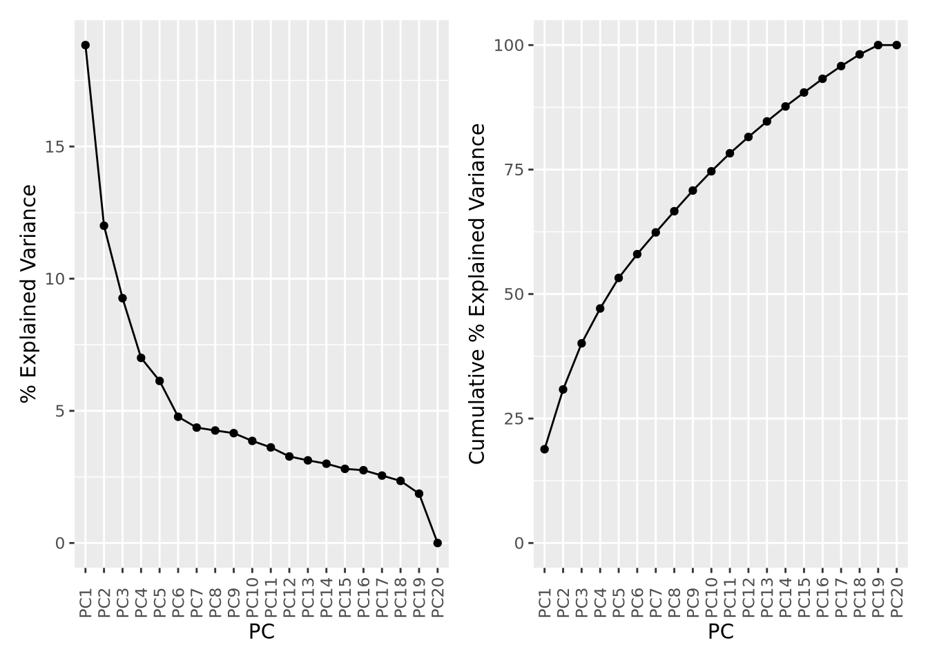
The first component explains nearly 20% of all variance in the dataset, followed by the second component with about 12%, the third component 9%, and so on. The cumulative variance plot on the right shows that the top 15 components are required to capture 90% of the variance in the dataset. This suggests that each sample contributes a significant amount of variance to the overall dataset, but that there are still some features that covary among them.
An important use of PCA results is the identification of outlier samples. This is accomplished by plotting the projections of each sample and examining the result by eye to identify samples that are “far away” from the other samples. This is usually done by inspection and outlier samples chosen subjectively; there are no general rules to decide when a sample is an outlier by this method. Below the projections for components 1 and 2 are plotted against each other as a scatter plot:
as_tibble(pca$x) %>%
  ggplot(aes(x=PC1,y=PC2)) +
  geom_point()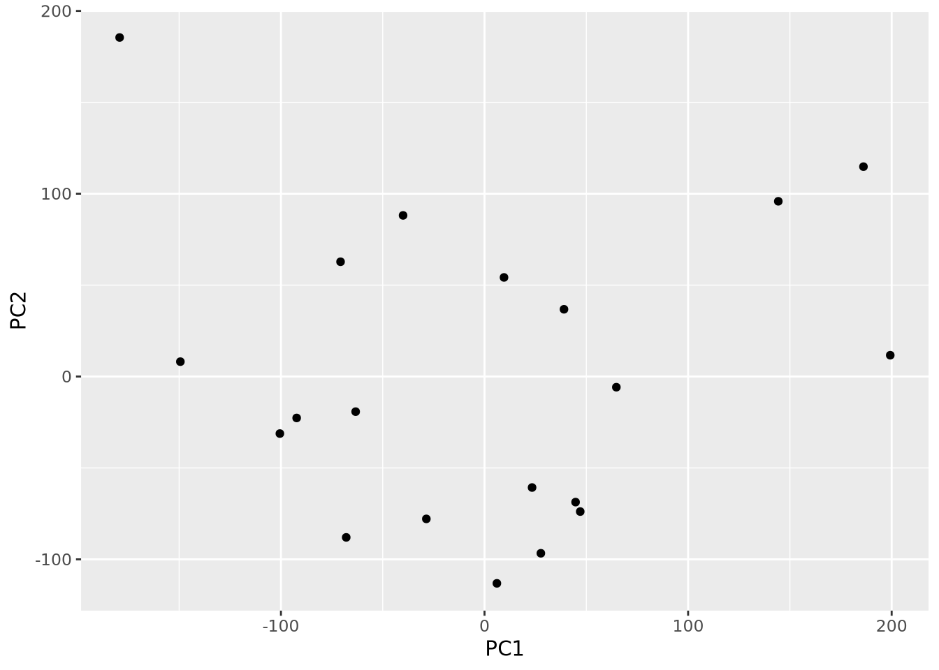
By eye, no samples appear to be obvious outliers. However, this plot is just one
of many pairs of projections. We could plot all pairs of the first six
components using the ggpairs() function in the
GGally package:
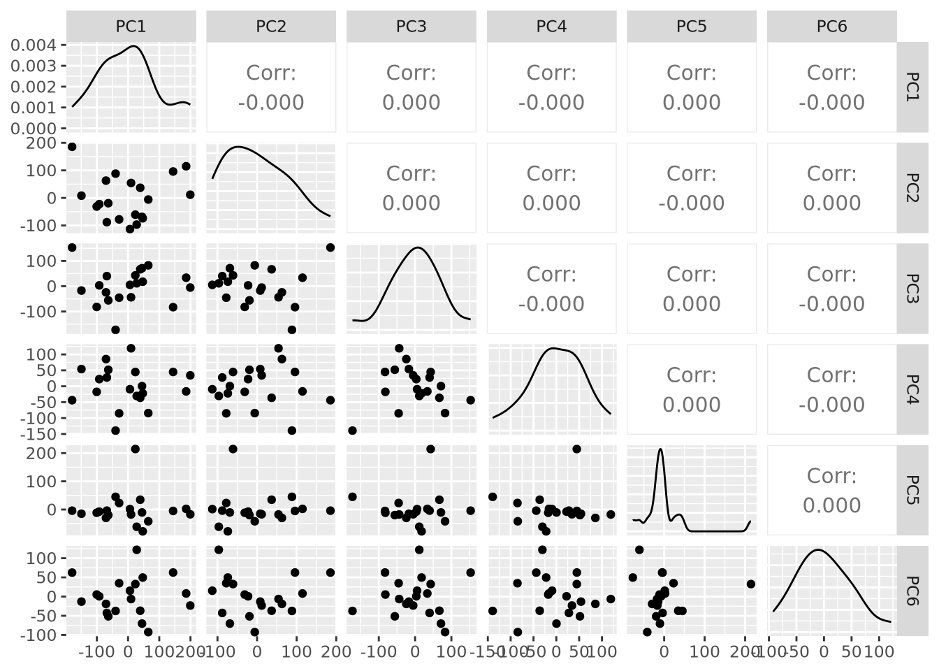
This is already nearly unintelligible and mostly uninformative. While it is very common for projections for pairs of components to be plotted, an alternative way to visualize projections across all samples is by plotting the distribution of projections for each component using a beeswarm plot:
as_tibble(pca$x) %>%
  pivot_longer(everything(),names_to="PC",values_to="projection") %>%
  mutate(PC=fct_relevel(PC,str_c("PC",1:20))) %>%
  ggplot(aes(x=PC,y=projection)) +
  geom_beeswarm() + labs(title="PCA Projection Plot") +
  theme(axis.text.x=element_text(angle=90,hjust=0,vjust=0.5))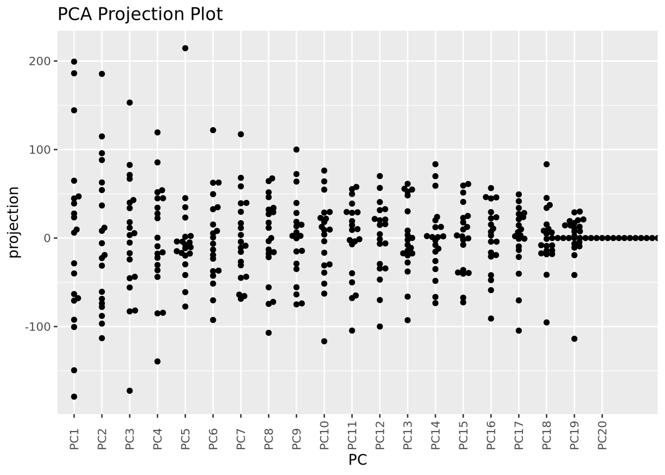
Now we can see all the projections for all components in the same plot, although we cannot see how they relate to one another.
These projection plots may become more useful if we layer on additional
information about our samples. There are two types of samples in our dataset (
labelled A and C. We can color our pairwise scatter plot by type like so:
as_tibble(pca$x) %>%
  mutate(type=stringr::str_sub(rownames(pca$x),1,1)) %>%
  ggplot(aes(x=PC1,y=PC2,color=type)) +
  geom_point()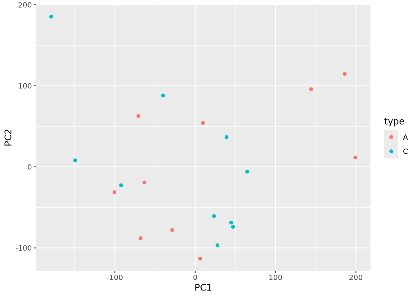
Little pattern is obvious from the plot, but we can plot pairs of components as before but now with type information:
library(GGally)
as_tibble(pca$x) %>%
  mutate(type=stringr::str_sub(rownames(pca$x),1,1)) %>%
  dplyr::select(c(type,PC1:PC6)) %>%
  ggpairs(columns=1:6,mapping=aes(fill=type))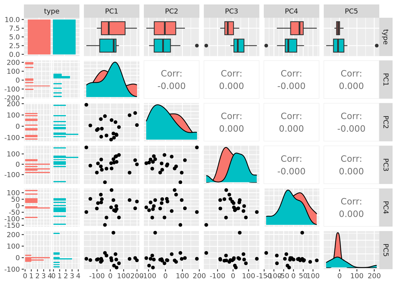
Examining PC3 and PC4, we now observe that there may indeed be some genes that distinguish between types based on the separation of projection scores for the two types. Finally, we can also color our beeswarm plot by type:
as_tibble(pca$x) %>%
  mutate(
    sample=rownames(pca$x),
    type=stringr::str_sub(sample,1,1)
  ) %>%
  pivot_longer(PC1:PC20,names_to="PC",values_to="projection") %>%
  mutate(PC=fct_relevel(PC,str_c("PC",1:20))) %>%
  ggplot(aes(x=PC,y=projection,color=type)) +
  geom_beeswarm() + labs(title="PCA Projection Plot") +
  theme(axis.text.x=element_text(angle=90,hjust=0,vjust=0.5))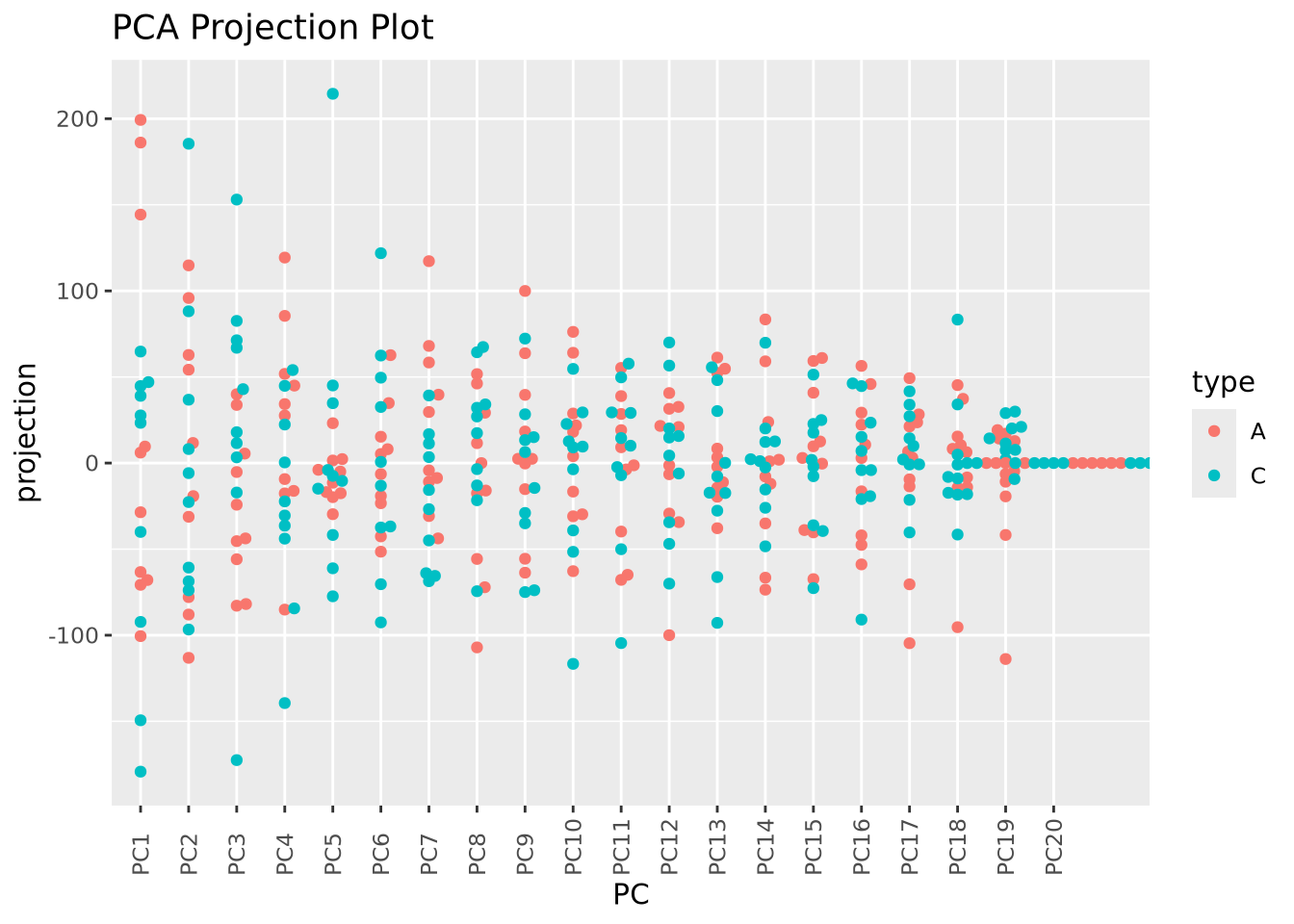
These approaches to plotting the results of a PCA are complementary, and all may be useful in understanding the structure of a dataset.
7.4.2 Cluster Analysis
Cluster analysis or simple clustering is the task of grouping objects together such that objects within the same group, or cluster, are more similar to each other than to objects in other clusters. It is a type of exploratory data analysis that seeks to identify structure or organization in a dataset without making strong assumptions about the data or testing a specific hypothesis. Many different clustering algorithms have been developed that employ different computational strategies and are designed for data with different types and properties. The choice of algorithm is often dependent upon not only the type of data being clustered but also the comparative performance of different clustering algorithms applied to the same data. Different algorithms may identify different types of patterns, and so no one clustering method is better than any other in general.
The goal of clustering may be easily illustrated with the following plot:
unclustered <- ggplot(well_clustered_data, aes(x=f1,y=f2)) +
  geom_point() +
  labs(title="Unclustered")
clustered <- ggplot(well_clustered_data, aes(x=f1,y=f2,color=cluster,shape=cluster)) +
  geom_point() +
  labs(title="Clustered")

unclustered | clustered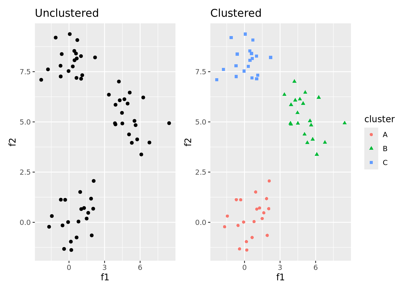
That is, the goal of clustering is to take unlabeled data that has some structure like on the left and label data points that are similar to one another to be in the same cluster. A full treatment of cluster analysis is beyond the scope of this book, but below we discuss a few of the most common and general clustering algorithms used in biology and bioinformatics.
7.4.2.1 Hierarchical Clustering
Hierarchical clustering is a form of clustering that clusters data points together in nested, or hierarchical, groups based on their dissimilarity from one another. There are two broad strategies to accomplish this:
- Agglomerative: all data points start in their own groups, and groups are iteratively merged hierarchically into larger groups based on their similarity until all data points have been added to a group
- Divisive: all data points start in the same group, and are recursively split into smaller groups based on their dissimilarity
Whichever approach is used, the critical step in clustering is choosing the distance function that quantifies how dissimilar two data points are. Distance functions, or metrics are non-negative real numbers whose magnitude is proportional to some notion of distance between a pair of points. There are many different distance functions to choose from, and the choice is made based on the type of data being clustered. For numeric data, euclidean distance, which corresponds to the length of a line segment drawn between two points in any \(n\)-dimensional Euclidean space is often a reasonable choice.
Because the divisive strategy is conceptually the inverse of agglomerative clustering, we will limit our description to agglomerative clustering. Once the distance function has been chosen, distances between all pairs of points are computed and the two nearest points are merged into a group. The new group of points is used for computing distances to all other points as a set using a linkage function which defines how the group is summarized into a single point for the purposes of distance calculation. The linkage function is what distinguishes different clustering algorithms, which include:
- Single-linkage - distance between two groups is computed as the distance between the two nearest members of the groups
- Complete-linkage - distance between two groups is computed as the distance between the two farthest members of the groups
- Unweighted Pair Group Method with Arithmetic mean (UPGMA) - distance between two groups is the average distance of all pairs of points between groups
- Weighted Pair Group Method with Arithmetic mean (WPGMA) - similar to UPGMA, but weights distances from pairs of groups evenly when merging
The choice of linkage function (and therefore clustering algorithm) should be determined based on knowledge of the dataset and assessment of clustering performance. In general, there is no one linkage function that will always perform well.
The following figure illustrates a simple example of clustering a 1 dimensional set of points using WPGMA:
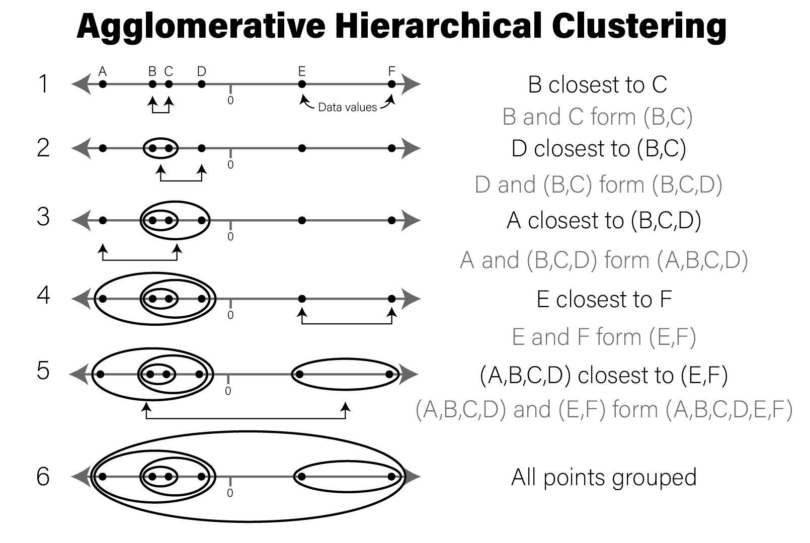
Below we will cluster the synthetic dataset introduced above in R:
ggplot(well_clustered_data, aes(x=f1,y=f2)) +
  geom_point() +
  labs(title="Unclustered")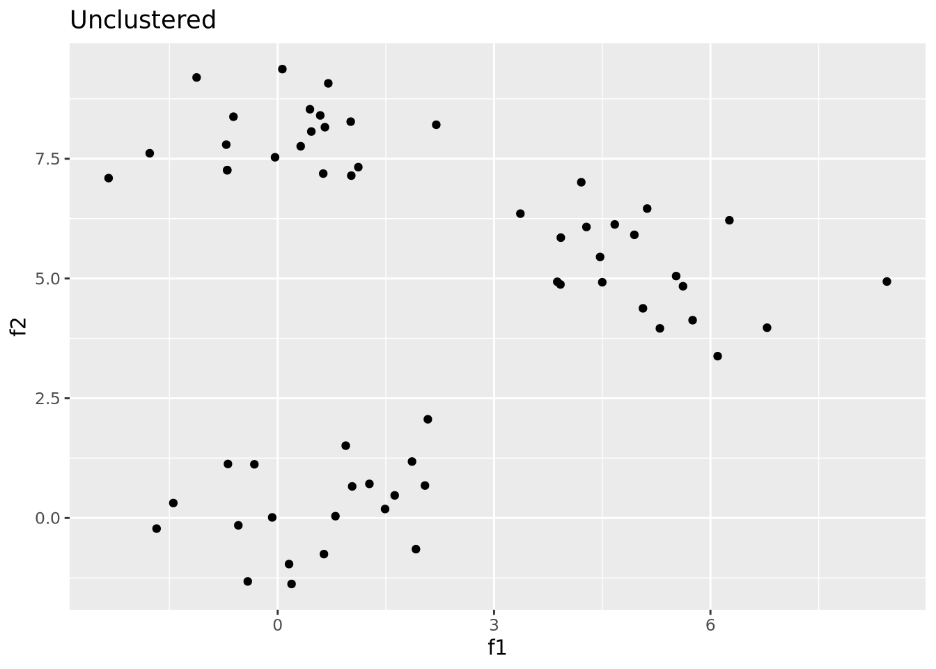
This synthetic dataset has two distinct groups of samples drawn from
multivariate normal samples. To hierarchically cluster these samples, we use the
dist()
and hclust()
functions:
# compute all pairwise distances using euclidean distance as the distance metric
euc_dist <- dist(dplyr::select(well_clustered_data,-ID))

# produce a clustering of the data using the hclust for hierarchical clustering
hc <- hclust(euc_dist, method="ave")

# add ID as labels to the clustering object
hc$labels <- well_clustered_data$ID


str(hc)
## List of 7
## $ merge : int [1:59, 1:2] -50 -33 -48 -46 -44 -21 -11 -4 -36 -3 ...
## $ height : num [1:59] 0.00429 0.08695 0.23536 0.24789 0.25588 ...
## $ order : int [1:60] 8 9 7 6 19 18 11 16 4 14 ...
## $ labels : chr [1:60] "A1" "A2" "A3" "A4" ...
## $ method : chr "average"
## $ call : language hclust(d = euc_dist, method = "ave")
## $ dist.method: chr "euclidean"
## - attr(*, "class")= chr "hclust"The hclust() return object describes the clustering as a tree that can be
visualized using a dendrogram:
library(ggdendro)
ggdendrogram(hc)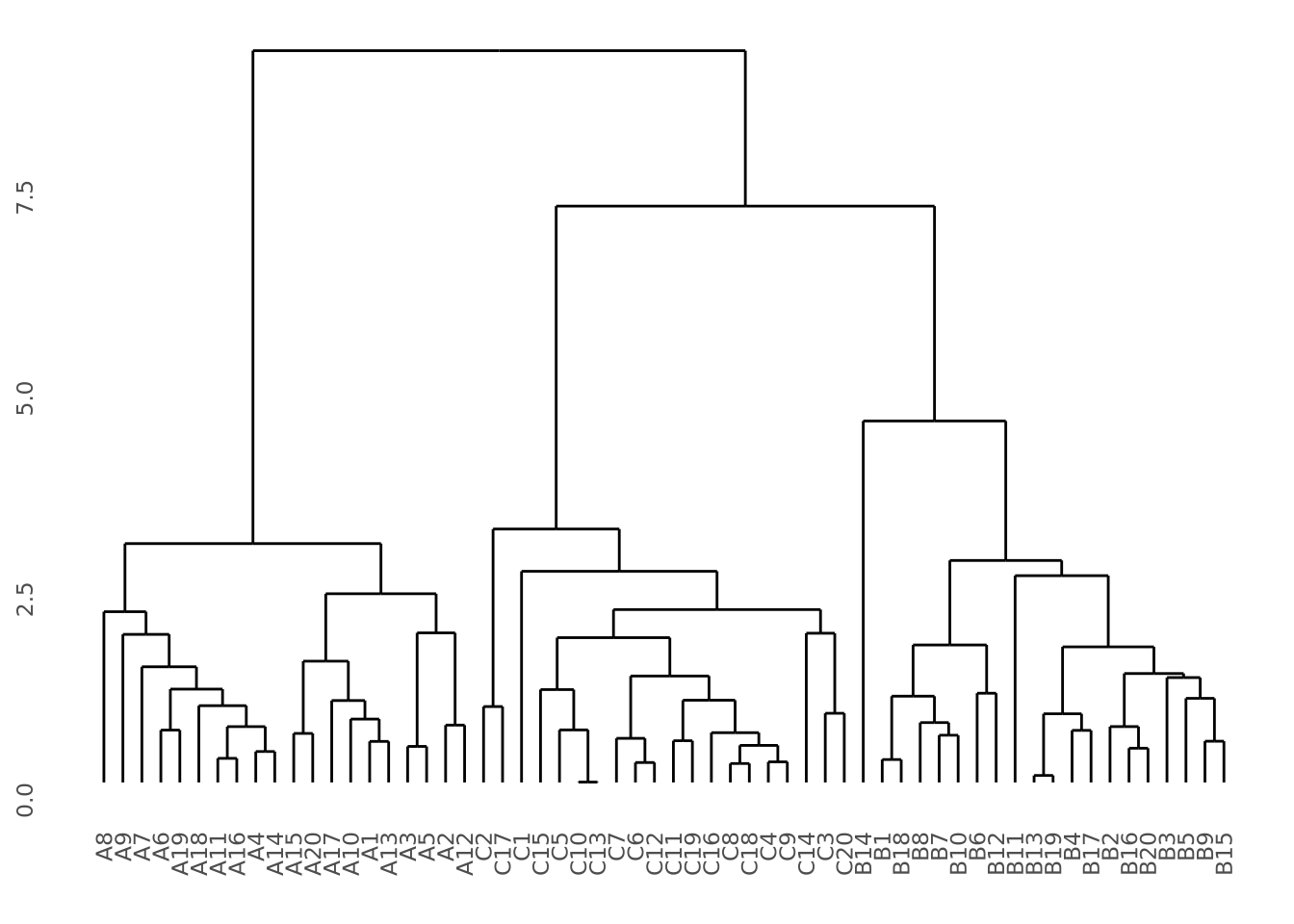 Our data do indeed cluster well, where all samples from the same group cluster
together perfectly. See the dendrogram section in the data
vizualization chapter for more detail on how to plot clustering
results.
Our data do indeed cluster well, where all samples from the same group cluster
together perfectly. See the dendrogram section in the data
vizualization chapter for more detail on how to plot clustering
results.
It is sometimes desirable to use split hierarchical clustering into groups based
on their pattern. In the above clustering, three discrete clusters corresponding
sample groups are clearly visible. If we wished to separate these three groups,
we can use the
cutree
to divide the tree into three groups using k=3:
labels <- cutree(hc,k=3)
labels
## A1 A2 A3 A4 A5 A6 A7 A8 A9 A10 A11 A12 A13 A14 A15 A16 A17 A18 A19 A20
## 1 1 1 1 1 1 1 1 1 1 1 1 1 1 1 1 1 1 1 1
## B1 B2 B3 B4 B5 B6 B7 B8 B9 B10 B11 B12 B13 B14 B15 B16 B17 B18 B19 B20
## 2 2 2 2 2 2 2 2 2 2 2 2 2 2 2 2 2 2 2 2
## C1 C2 C3 C4 C5 C6 C7 C8 C9 C10 C11 C12 C13 C14 C15 C16 C17 C18 C19 C20
## 3 3 3 3 3 3 3 3 3 3 3 3 3 3 3 3 3 3 3 3We can then use these samples and labels to color our original plot as desired:
# we turn our labels into a tibble so we can join them with the original tibble
well_clustered_data %>%
  left_join(
    tibble(
      ID=names(labels),
      label=as.factor(labels)
    )
  ) %>%
  ggplot(aes(x=f1,y=f2,color=label)) +
  geom_point() +
  labs(title="Clustered")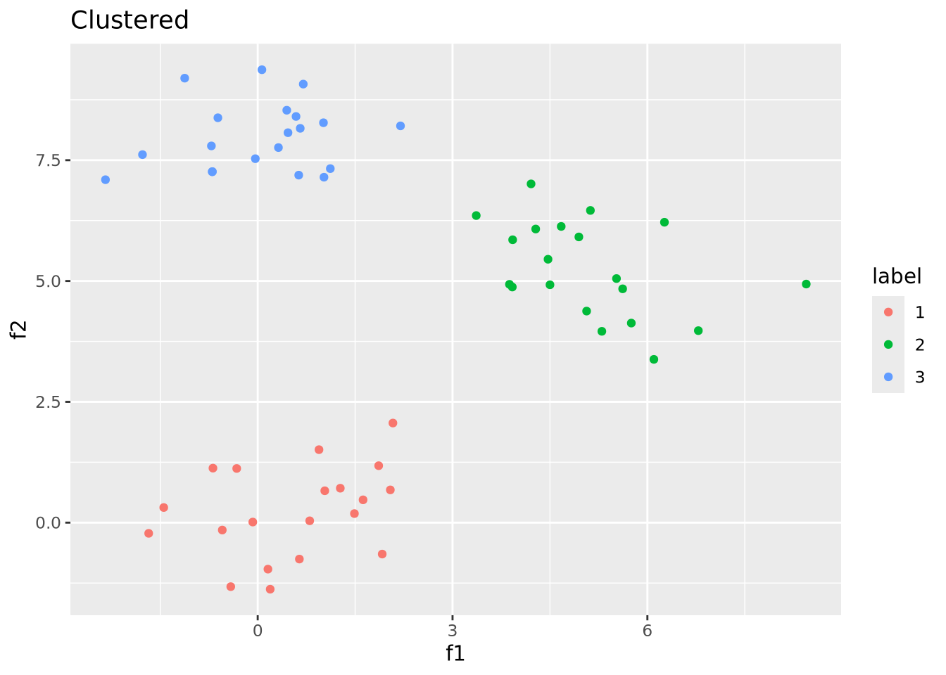
We were able to recover the correct clustering because this dataset was easy to cluster by construction. Real data are seldom so well behaved.
7.5 Network Analysis
The basic components of a network are vertex (or node), which is the features or subjects we are interested in. The edges are connections between the vertices. In a general context, one example is the relationship network. The vertices are people. If two people are friends, we draw an edge to connect them. In a biology context, the vertices may be genes, and edges represent whether there are any correlations between two genes.
Vertices and edges can have attributes. For example, in a social interaction network, we may assign different colors to the vertices according to a student’s major. When connect two students when they know each other, we can also assign weights to the edges to represent how often they interact with each other.
The igraph package provides functions to represent and
analyze networks in several language, including R. In
the examples below, we will use the igraph package to demonstrate the concepts
described in this section.
The sample_gnm(n,m) function
generates a random network with \(n\) nodes and \(m\) edges between them. We will
use this function below to generate random networks of different types.
A cyclic network has at least one directed path that starts and ends in the same node.
set.seed(2)
samp_g <- igraph::sample_gnm(n = 4, m = 4)
vertex_attr(samp_g) <- list(color = rep("slategray1", gorder(samp_g)))
plot(samp_g)
An acyclic network , on the other hand, does not have any cycle path.
set.seed(1)
samp_g <- igraph::sample_gnm(n = 5, m = 4)
vertex_attr(samp_g) <- list(color = rep("slategray1", gorder(samp_g)))
plot(samp_g)
The edges in a directed network point to one specific direction (but, edges can point in both directions, which are equivalent to undirected edges). One common example is a network representing cell metabolic process, where certain proteins biochemically modify, e.g. phosphorylate, other proteins.
set.seed(2)
samp_g <- sample_gnm(n = 5, m = 7, directed = TRUE)
vertex_attr(samp_g) <- list(color = rep("slategray1", gorder(samp_g)))
plot(samp_g)
The edges in a indirect network do not have direction. Common examples include social interaction network and gene correlation network.
set.seed(3)
samp_g <- sample_gnm(n = 5, m = 7, directed = FALSE)
vertex_attr(samp_g) <- list(color = rep("slategray1", gorder(samp_g)))
plot(samp_g)
7.5.1 Basic network analysis
7.5.1.1 Shortest path
The shortest path between two vertices is… yes, the shortest path you can go from one vertex to the other. There may be more than one shortest paths between two vertices.
In the following network, there are many ways to go from “Moon_Capital” to “Crystal_Corridor”, but there’s only one shortest path, which is “Moon_Capital” -> “Gryphon’s_Nest” -> “Crystal_Corridor”. On the other hand, when you want to go from “Moon_Capital” to “Icy_Turret”, there are two possible ways: one through “Gryphon’s_Nest”, one through “Agate_Trademart”.
In igraph, this can be calculated using shortest_paths().
shortest_paths(samp_g, from = "Moon_Capital", to = "Crystal_Corridor")$vpath## [[1]]
## + 3/5 vertices, named, from fb97f3e:
## [1] Moon_Capital Gryphon's_Nest Crystal_CorridorOne thing to keep in mind is, when weights are assigned to edges and being considered, the shortest path may not be the path that goes through the least number of vertices. In this example, consider the weight assigned to the edge connecting “Moon_Capital” and “Gryphon’s_Nest” is substantially large. The Royal Priest warned you that Gryphons live at the top of the hill, and it’s too hard to climb.
Let’s color the edges according to their weights. Green means 1, blue means 2 while red means 3. Now, the shortest path from “Moon_Capital” to “Crystal_Corridor” becomes “Moon_Capital” -> “Agate_Trademart” -> “Icy_Turret” -> “Crystal_Corridor”.
set.seed(4)
names <- c("Moon_Capital", "Icy_Turret", "Crystal_Corridor", "Gryphon's_Nest", "Agate_Trademart")
samp_g <- sample_gnm(n = 5, m = 7)
vertex_attr(samp_g) <- list(name = names, color = rep("slategray1", gorder(samp_g)))
edge_attr(samp_g) <- list(
  color = c("deepskyblue", "salmon", "deepskyblue", "deepskyblue", "palegreen3", "palegreen3", "salmon"),
  weights = c(2, 3, 2, 2, 1, 1, 3)
)
plot(samp_g,
  vertex.label.cex = 1,
  vertex.label.dist = 3, edge.width = c(3, 1, 1, 1, 3, 3, 1)
)
We can conveniently find the shortest path with weights assigned!
shortest_paths(samp_g,
  from = "Moon_Capital", to = "Crystal_Corridor",
  weights = edge_attr(samp_g, "weights")
)$vpath
## [[1]]
## + 4/5 vertices, named, from 4af1101:
## [1] Moon_Capital Agate_Trademart Icy_Turret Crystal_Corridor7.5.1.2 Vertex centrality
The degree of a vertex is the number of edges connected to it. In igraph, this can be calculated using degree().
g <- graph_from_data_frame(data.frame(
  "from" = c("A", "A", "A", "A", "A", "B", "C", "A", "G", "H", "H", "H", "H", "H", "M", "I", "G", "N", "N"),
  "to" = c("B", "C", "D", "E", "F", "D", "E", "G", "H", "I", "J", "K", "L", "M", "K", "J", "N", "O", "P")
), directed = F)
vertex_attr(g) <- list(name = vertex_attr(g, "name"), color = rep("slategray1", gorder(g)))
plot(g)
degree(g)## A B C G H M I N D E F J K L O P
## 6 2 2 3 6 2 2 3 2 2 1 2 2 1 1 1The centrality of a vertex indicates how important it is in a network. For instance, after seeing a social interaction network, one question we can ask is “which person has the most influential power in this community?”. There are many different types of centrality, here we will only go through the basics.
To some extent, the degree can be used to evaluate the importance of a vertex. When a vertex is connected to a lot of other vertices, it naturally appears to be more important and has more ability to pass down information to other vertices. Assume you just opened a new on-line shop and you want to attract new customers as many as possible, you start by reaching out to the person you know has the largest number of friends.
But, sometimes, people with the largest number of friends may not necessarily be the one who can “spread the word” to the whole community the most efficiently. In the example above, although A and H have a lot of connections, in fact, it seems like if we pass an information to G, the whole community will be influenced the most quickly.
This leads us to closeness centrality, which is the sum of the length of the shortest paths between a node and all the other nodes in the graph. Although A and H have a lot of friends, it takes too long to reach the other side of the graph. When we calculating the closeness centrality using closeness() function to calculate closeness centrality.
closeness(g)## A B C G H M I
## 0.03225806 0.02272727 0.02272727 0.03703704 0.03225806 0.02272727 0.02272727
## N D E F J K L
## 0.02702703 0.02272727 0.02272727 0.02222222 0.02272727 0.02272727 0.02222222
## O P
## 0.01960784 0.01960784Betweenness centrality is the number of shortest paths that pass through the vertex. In this example, G is the also the one with the highest betweenness centrality.
betweenness(g)## A B C G H M I N D E F J K L O P
## 58 0 0 72 58 0 0 27 0 0 0 0 0 0 0 0