- Syllabus
- 1 Introduction
- 2 Data in Biology
- 3 Preliminaries
- 4 R Programming
- 4.1 Before you begin
- 4.2 Introduction
- 4.3 R Syntax Basics
- 4.4 Basic Types of Values
- 4.5 Data Structures
- 4.6 Logical Tests and Comparators
- 4.7 Functions
- 4.8 Iteration
- 4.9 Installing Packages
- 4.10 Saving and Loading R Data
- 4.11 Troubleshooting and Debugging
- 4.12 Coding Style and Conventions
- 4.12.1 Is my code correct?
- 4.12.2 Does my code follow the DRY principle?
- 4.12.3 Did I choose concise but descriptive variable and function names?
- 4.12.4 Did I use indentation and naming conventions consistently throughout my code?
- 4.12.5 Did I write comments, especially when what the code does is not obvious?
- 4.12.6 How easy would it be for someone else to understand my code?
- 4.12.7 Is my code easy to maintain/change?
- 4.12.8 The
stylerpackage
- 5 Data Wrangling
- 6 Data Science
- 7 Data Visualization
- 8 Biology & Bioinformatics
- 8.1 R in Biology
- 8.2 Biological Data Overview
- 8.3 Bioconductor
- 8.4 Microarrays
- 8.5 High Throughput Sequencing
- 8.6 Gene Identifiers
- 8.7 Gene Expression
- 8.7.1 Gene Expression Data in Bioconductor
- 8.7.2 Differential Expression Analysis
- 8.7.3 Microarray Gene Expression Data
- 8.7.4 Differential Expression: Microarrays (limma)
- 8.7.5 RNASeq
- 8.7.6 RNASeq Gene Expression Data
- 8.7.7 Filtering Counts
- 8.7.8 Count Distributions
- 8.7.9 Differential Expression: RNASeq
- 8.8 Gene Set Enrichment Analysis
- 8.9 Biological Networks .
- 9 EngineeRing
- 10 RShiny
- 11 Communicating with R
- 12 Contribution Guide
- Assignments
- Assignment Format
- Starting an Assignment
- Assignment 1
- Assignment 2
- Assignment 3
- Problem Statement
- Learning Objectives
- Skill List
- Background on Microarrays
- Background on Principal Component Analysis
- Marisa et al. Gene Expression Classification of Colon Cancer into Molecular Subtypes: Characterization, Validation, and Prognostic Value. PLoS Medicine, May 2013. PMID: 23700391
- Scaling data using R
scale() - Proportion of variance explained
- Plotting and visualization of PCA
- Hierarchical Clustering and Heatmaps
- References
- Assignment 4
- Assignment 5
- Problem Statement
- Learning Objectives
- Skill List
- DESeq2 Background
- Generating a counts matrix
- Prefiltering Counts matrix
- Median-of-ratios normalization
- DESeq2 preparation
- O’Meara et al. Transcriptional Reversion of Cardiac Myocyte Fate During Mammalian Cardiac Regeneration. Circ Res. Feb 2015. PMID: 25477501l
- 1. Reading and subsetting the data from verse_counts.tsv and sample_metadata.csv
- 2. Running DESeq2
- 3. Annotating results to construct a labeled volcano plot
- 4. Diagnostic plot of the raw p-values for all genes
- 5. Plotting the LogFoldChanges for differentially expressed genes
- The choice of FDR cutoff depends on cost
- 6. Plotting the normalized counts of differentially expressed genes
- 7. Volcano Plot to visualize differential expression results
- 8. Running fgsea vignette
- 9. Plotting the top ten positive NES and top ten negative NES pathways
- References
- Assignment 6
- Assignment 7
- Appendix
- A Class Outlines
7.6 Other Kind of Plots
7.6.1 Dendrograms
Dendrograms are visualizations of tree structures (dendron means tree in Greek). In the graph theory branch of mathematics, a tree is defined as a graph composed of nodes and edges in which any two nodes are connected by exactly one path. Such a graph is also called an acyclic graph, where no paths exist that can be followed from a node back to iself. A full treatment of trees and graph theory is beyond the scope of this book, but we will discuss trees to the extent they are necessary to understand how to read a dendrogram.
The concepts of a dendrogram are illustrated in the following figure:
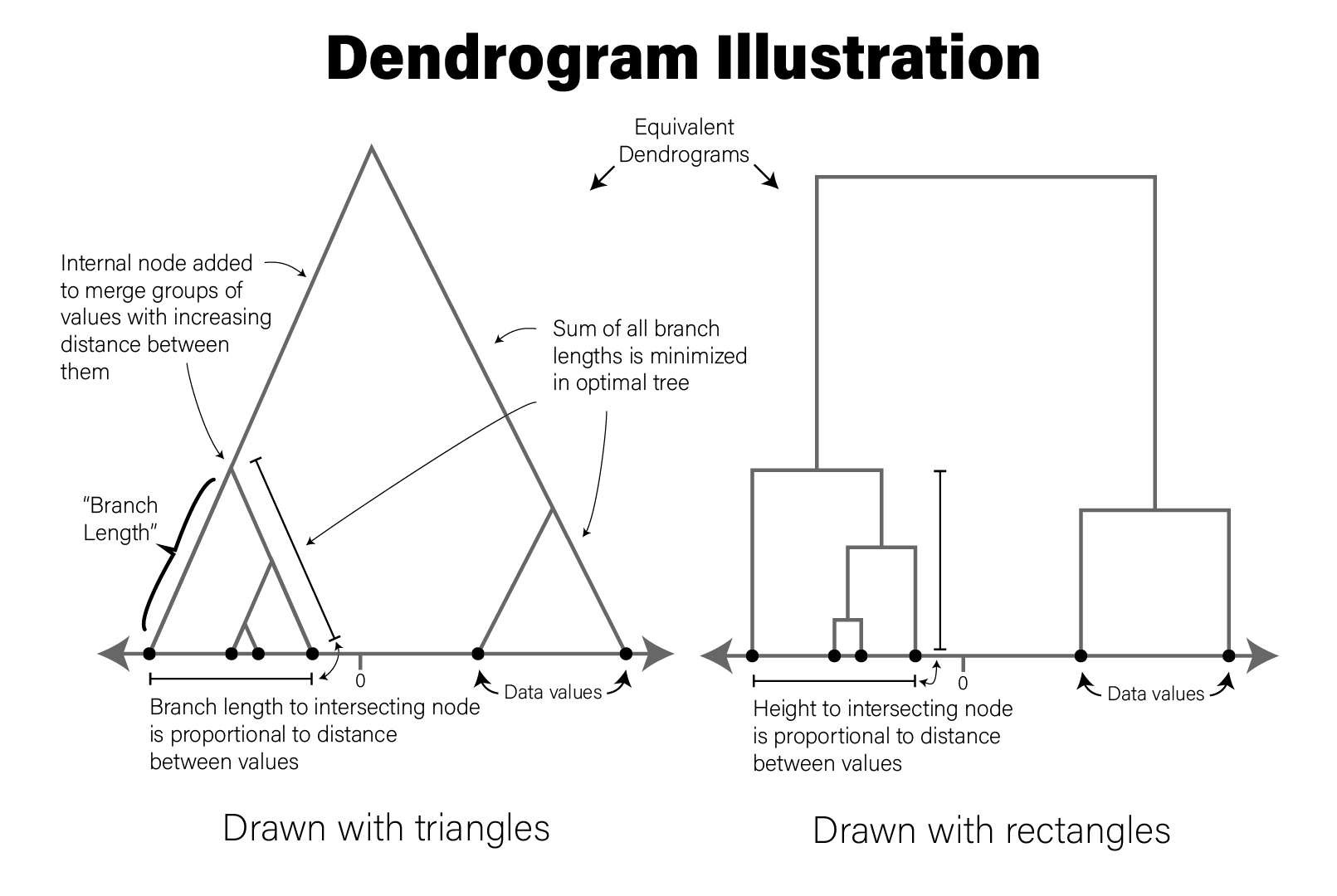
Dendrogram Illustration
The tree drawn in a typical dendrogram is created using the output of a clustering algorithm, e.g. hierarchical clustering that groups data points together based on their dissimilarity. Briefly, in the figure, the data are one dimensional scalars, so the distance between all points is simply the absolute value of the difference between them. The two closest points are then merged into a single group, and the pairwise distances are recomputed for all remaining data points with a summary of this new group (the group summarization method is specified by the user and is called the linkage critera). Then the process repeats, where the two nearest data points or summarized groups are merged into a new group, the new group is summarized, pairwise distances recomputed, etc. until all the data points have been included in a group. In this way, all data points are assigned to a hierarchy of groups. In general, any hierarchical grouping of data can be used to generate a dendrogram.
Given a hierarchical clustering result, a dendrogram can be drawn in several ways in R. Using our AD marker example data, we hierarchically cluster the subjects based on the content of all their markers and visualize the result as follows:
library(ggdendro)

# produce a clustering of the data using the hclust for hierarchical clustering
# and euclidean distance as the distance metric
euc_dist <- dist(dplyr::select(ad_metadata,c(tau,abeta,iba1,gfap)))
hc <- hclust(euc_dist, method="ave")

# add ID as labels to the clustering object
hc$labels <- ad_metadata$ID

ggdendrogram(hc)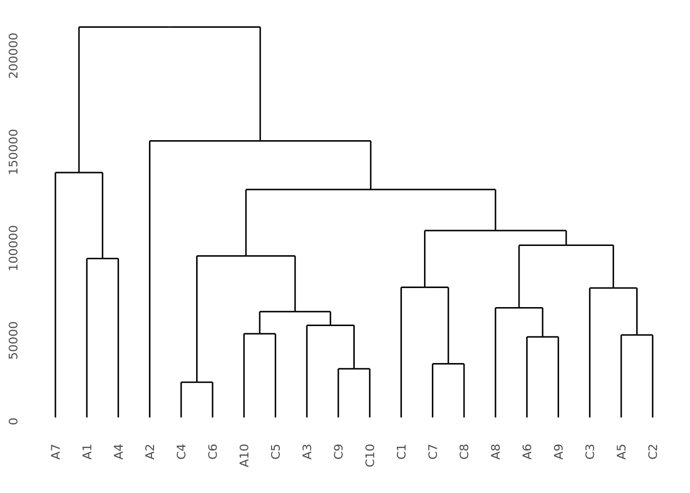
This dendrogram does not produce highly distinct clusters of AD and control samples with all the data.
To illustrate what a dataset with strong clustering looks like, we draw multivariate samples from two normal distributions and cluster the results:
library(patchwork)
library(ggdendro)

well_clustered_data <- tibble(
  ID=c(stringr::str_c("A",1:10),stringr::str_c("B",1:10)),
  f1=c(rnorm(10,0,1),rnorm(10,10,1)),
  f2=c(rnorm(10,0,1),rnorm(10,10,1))
)

scatter_g <- ggplot(well_clustered_data, aes(x=f1,y=f2)) + geom_point()

# produce a clustering of the data using the hclust for hierarchical clustering
# and euclidean distance as the distance metric
euc_dist <- dist(dplyr::select(well_clustered_data,-ID))
hc <- hclust(euc_dist, method="ave")

# add ID as labels to the clustering object
hc$labels <- well_clustered_data$ID

dendro_g <- ggdendrogram(hc)
scatter_g | dendro_g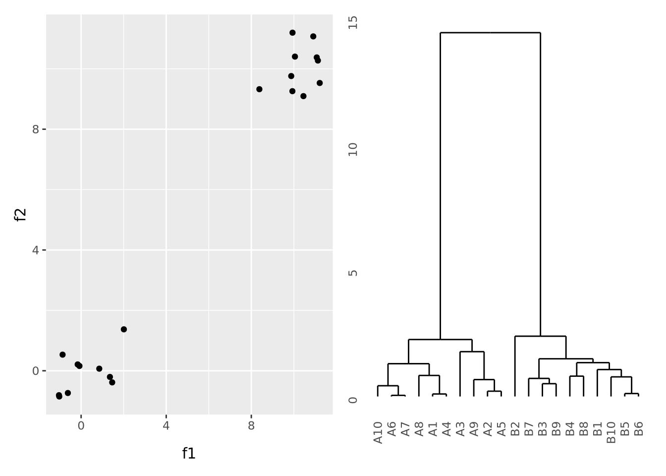
Here, all the A and B samples strongly cluster together, with a large distance between clusters.
- Dendrograms Wikipedia page
ggdendropackage vignette
7.6.2 Chord Diagrams and Circos Plots
Circos is a software package that creates circular
diagrams originally designed to depict genomic features and data. The software
is capable of making beautiful, information dense figures. The Circos software
itself is written in the Perl programming language, but
the circlize package brings
these capabilities to R. The following is a basic circos plot created by the
circlize package:
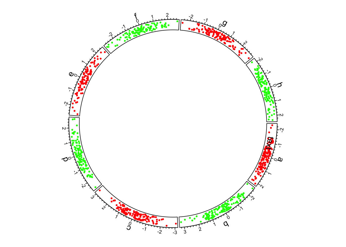
Basic circlize plot
The circle is divided up into 8 sectors here labeled with letters. There is a single track added to the plot, where each sector has a 2-dimensional random dataset plotted within the arc of the sector’s track box. Many tracks may be added to the same plot:
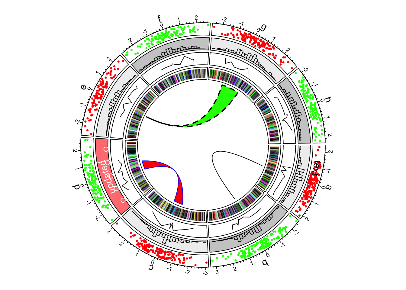
Multiple tracks in a circlize plot
The arches inside the circle are called chords and are drawn to indicate there is a relationship between the coordinates of different sectors. Diagrams with such chords between sectors are called chord diagrams, and some plots are composed only of coords:
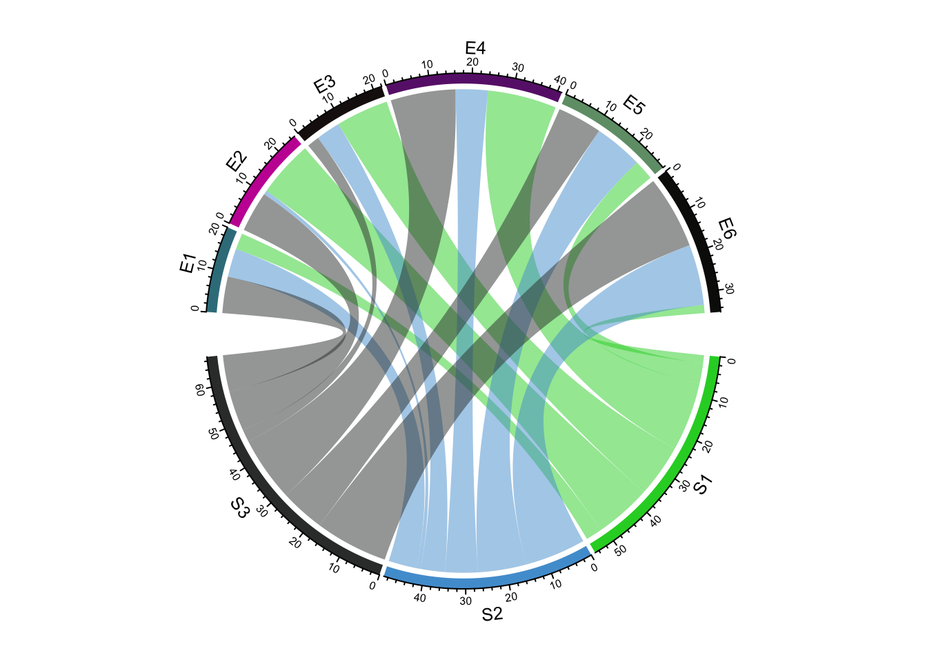
circlize chord diagram
These chord diagrams are often used in genomics studies to illustrate chromosomal rearrangements:
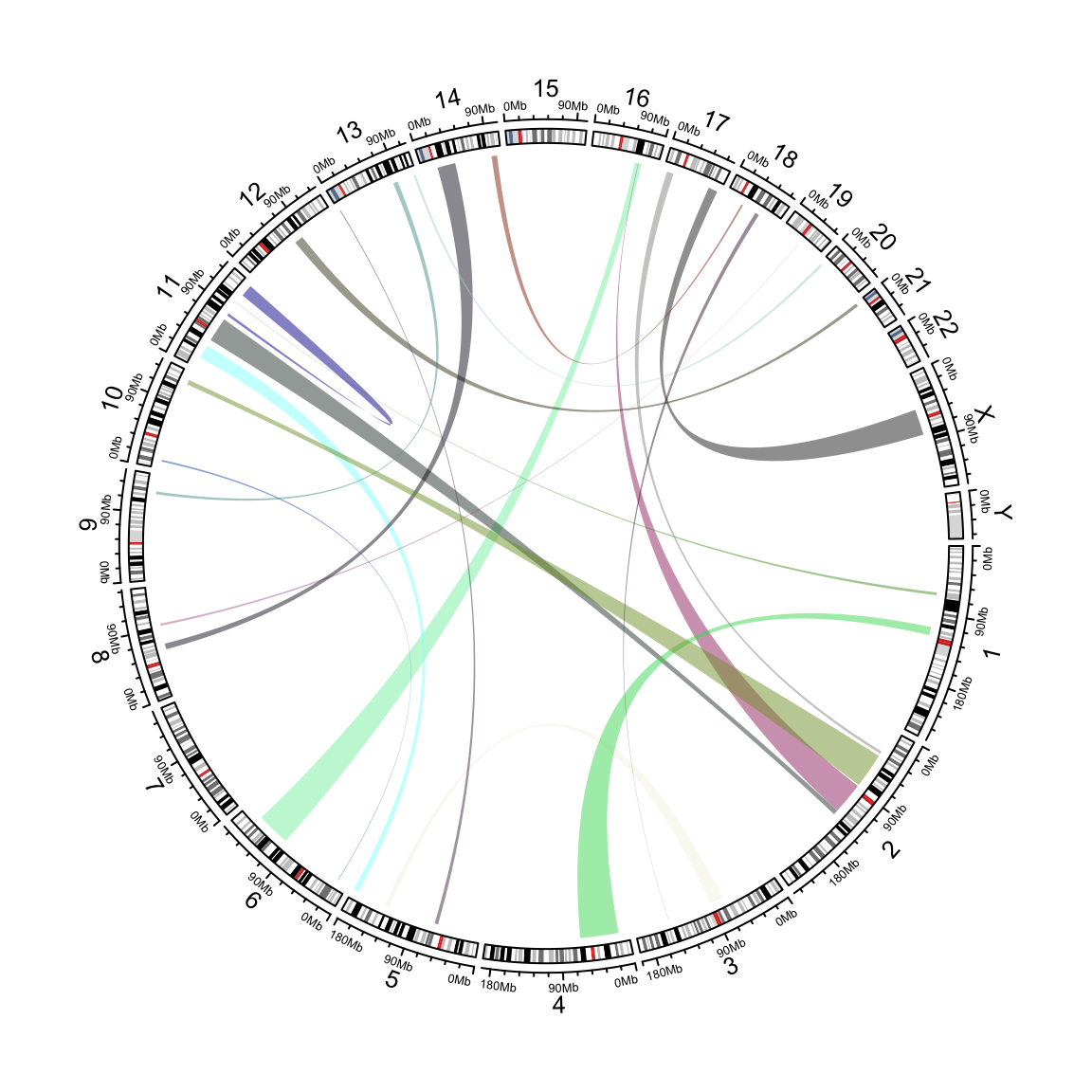
genomic links example
Read the circlize documentation for more information on how to use this very feature rich package.