- Syllabus
- 1 Introduction
- 2 Data in Biology
- 3 Preliminaries
- 4 R Programming
- 4.1 Before you begin
- 4.2 Introduction
- 4.3 R Syntax Basics
- 4.4 Basic Types of Values
- 4.5 Data Structures
- 4.6 Logical Tests and Comparators
- 4.7 Functions
- 4.8 Iteration
- 4.9 Installing Packages
- 4.10 Saving and Loading R Data
- 4.11 Troubleshooting and Debugging
- 4.12 Coding Style and Conventions
- 4.12.1 Is my code correct?
- 4.12.2 Does my code follow the DRY principle?
- 4.12.3 Did I choose concise but descriptive variable and function names?
- 4.12.4 Did I use indentation and naming conventions consistently throughout my code?
- 4.12.5 Did I write comments, especially when what the code does is not obvious?
- 4.12.6 How easy would it be for someone else to understand my code?
- 4.12.7 Is my code easy to maintain/change?
- 4.12.8 The
stylerpackage
- 5 Data Wrangling
- 6 Data Science
- 7 Data Visualization
- 8 Biology & Bioinformatics
- 8.1 R in Biology
- 8.2 Biological Data Overview
- 8.3 Bioconductor
- 8.4 Microarrays
- 8.5 High Throughput Sequencing
- 8.6 Gene Identifiers
- 8.7 Gene Expression
- 8.7.1 Gene Expression Data in Bioconductor
- 8.7.2 Differential Expression Analysis
- 8.7.3 Microarray Gene Expression Data
- 8.7.4 Differential Expression: Microarrays (limma)
- 8.7.5 RNASeq
- 8.7.6 RNASeq Gene Expression Data
- 8.7.7 Filtering Counts
- 8.7.8 Count Distributions
- 8.7.9 Differential Expression: RNASeq
- 8.8 Gene Set Enrichment Analysis
- 8.9 Biological Networks .
- 9 EngineeRing
- 10 RShiny
- 11 Communicating with R
- 12 Contribution Guide
- Assignments
- Assignment Format
- Starting an Assignment
- Assignment 1
- Assignment 2
- Assignment 3
- Problem Statement
- Learning Objectives
- Skill List
- Background on Microarrays
- Background on Principal Component Analysis
- Marisa et al. Gene Expression Classification of Colon Cancer into Molecular Subtypes: Characterization, Validation, and Prognostic Value. PLoS Medicine, May 2013. PMID: 23700391
- Scaling data using R
scale() - Proportion of variance explained
- Plotting and visualization of PCA
- Hierarchical Clustering and Heatmaps
- References
- Assignment 4
- Assignment 5
- Problem Statement
- Learning Objectives
- Skill List
- DESeq2 Background
- Generating a counts matrix
- Prefiltering Counts matrix
- Median-of-ratios normalization
- DESeq2 preparation
- O’Meara et al. Transcriptional Reversion of Cardiac Myocyte Fate During Mammalian Cardiac Regeneration. Circ Res. Feb 2015. PMID: 25477501l
- 1. Reading and subsetting the data from verse_counts.tsv and sample_metadata.csv
- 2. Running DESeq2
- 3. Annotating results to construct a labeled volcano plot
- 4. Diagnostic plot of the raw p-values for all genes
- 5. Plotting the LogFoldChanges for differentially expressed genes
- The choice of FDR cutoff depends on cost
- 6. Plotting the normalized counts of differentially expressed genes
- 7. Volcano Plot to visualize differential expression results
- 8. Running fgsea vignette
- 9. Plotting the top ten positive NES and top ten negative NES pathways
- References
- Assignment 6
- Assignment 7
- Appendix
- A Class Outlines
7.3 Plotting One Dimension
The simplest plots involve plotting a single vector of numbers, or several such
vectors (e.g. for different samples). Each value in the vector typically
corresponds to a category or fixed value, for example the tau column from the
example above has pairs of (ID, tau value). The order of these numbers can be
changed, but the vector remains one dimensional or 1-D.
7.3.1 Bar chart
Bar charts map length (i.e. the height or width of a box) to the scalar value of a number. The difference in visual length can help the viewer notice consistent patterns in groups of bars, depending on how they are arranged:
ggplot(ad_metadata, mapping = aes(x=ID,y=tau)) +
  geom_bar(stat="identity")
Note the stat="identity" argument is required because by default geom_bar
counts the number of values for each value of x, which in our case is only ever
one. This plot is not particularly helpful, so let’s change the fill color of
the bars based on condition:
ggplot(ad_metadata, mapping = aes(x=ID,y=tau,fill=condition)) +
  geom_bar(stat="identity")
Slightly better, but maybe we can see even more clearly if we sort our tibble by tau first. Sorting elements in these 1-D charts is somewhat complicated, and is explained in the [Reordering 1-D Data Elements] section below.
Bar charts can also plot negative numbers. In the following example, we center the tau measurements by subtracting the mean from each value before plotting:
mutate(ad_metadata, tau_centered=(tau - mean(tau))) %>%
  ggplot(mapping = aes(x=ID, y=tau_centered, fill=condition)) +
  geom_bar(stat="identity")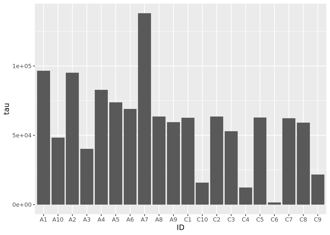
7.3.2 Lollipop plots
Similar to bar charts, so-called “lollipop plots” replace the bar with a line segment and a circle. The length of the line segment is proportional to the magnitude of the number, and the point marks the length of the segment as a height on the y or length on the x axis, depending on orientation.
ggplot(ad_metadata) +
  geom_point(mapping=aes(x=ID, y=tau)) +
  geom_segment(mapping=aes(x=ID, xend=ID, y=0, yend=tau))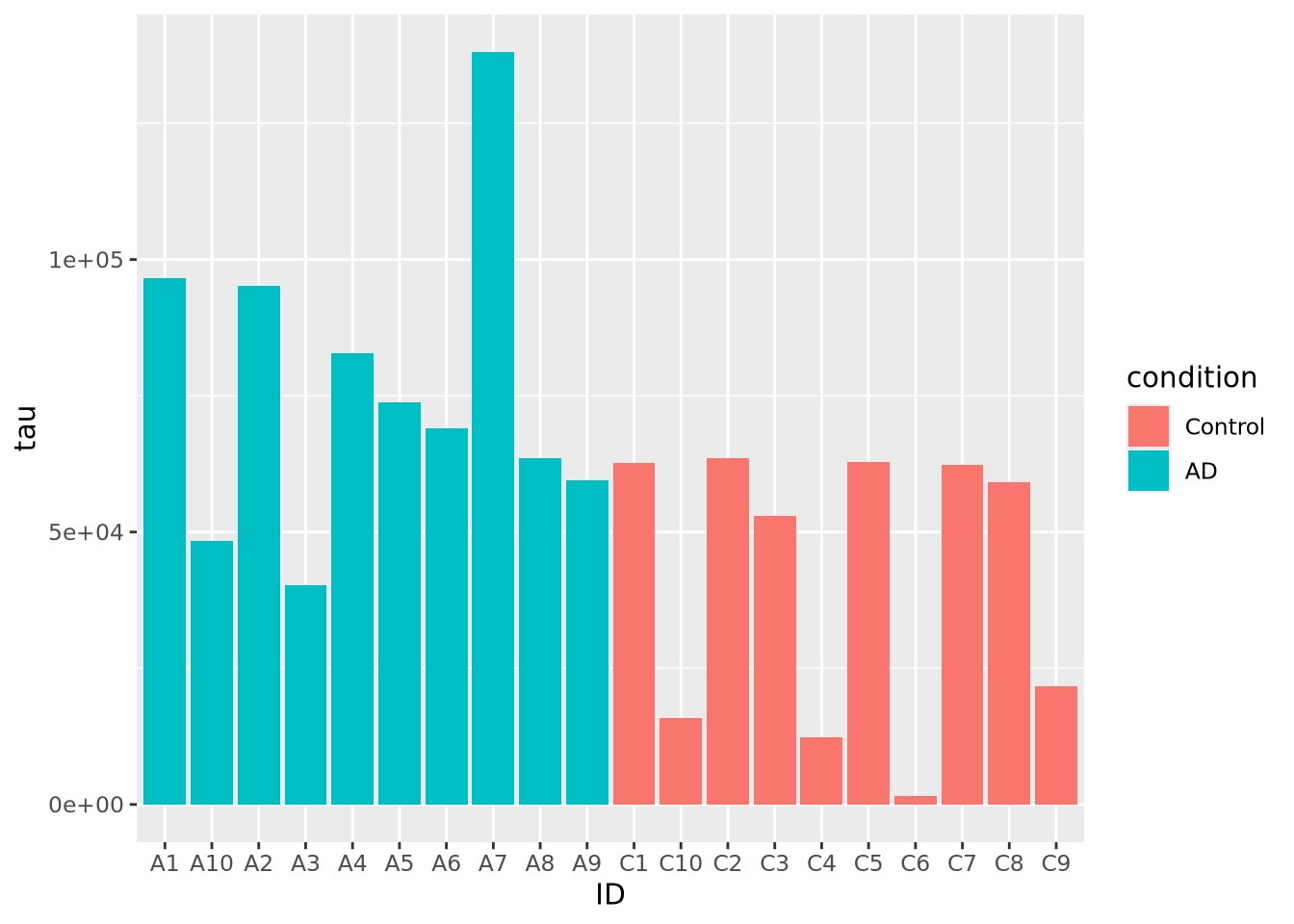
Note that aes() mappings can be made on the ggplot() object or on each
individual geometry function call, to specify different mappings based on
geometry.
7.3.3 Stacked Area charts
Stacked area charts can visualize multiple 1D data that share a common categorical axis. The charts consist of one line per variable with vertices that correspond to x and y values similar to a bar or lollipop plots. Each variable is plotted using the previous one as a baseline, so that the height of the data points for each category is proportional to their sum. The space between the lines for each variable and the previous one are filled with a color. The following plot visualizes the amount of marker stain for each of the four genes for each individaul:
pivot_longer(
  ad_metadata,
  c(tau,abeta,iba1,gfap),
  names_to='Marker',
  values_to='Intensity'
  ) %>%
  ggplot(aes(x=ID,y=Intensity,group=Marker,fill=Marker)) +
    geom_area()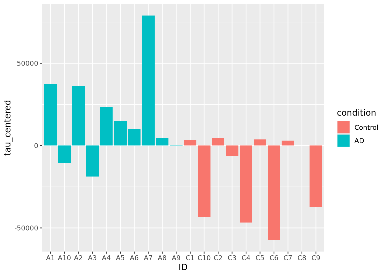
We notice that subject A4 has the highest overall level of marker intensity,
followed by A1, A7, etc. The control samples overall have less intensity across
all markers. Certain samples, A2 and C5, have little to no abeta aggregation,
and C6 has little to no tau.
Stacked area plots require three pieces of data:
- x - a numeric or categorical axis for vertical alignment
- y - a numeric axis to draw vertical proportions
- group - a categorical variable that indicates which (x,y) pairs correspond to the same line
In the example above, we needed to pivot our tibble so that the different
markers and their values were placed into columns Marker and Intensity,
respectively. Data for stacked bar charts will usually need to be in this ‘long’
format, as described in Rearranging Data.
Sometimes it is more helpful to view the relative proportion of values in each category rather than the actual values. The result is called a proportional stacked area plots. While not a distinct plot type, we can create one by preprocessing our data by dividing each value by the column sum:
pivot_longer(
ad_metadata,
c(tau,abeta,iba1,gfap),
names_to='Marker',
values_to='Intensity'
) %>%
group_by(ID) %>% # we want to divide each subjects intensity values by the sum of all four markers
mutate(
`Relative Intensity`=Intensity/sum(Intensity)
) %>%
ungroup() %>% # ungroup restores the tibble to its original number of rows after the transformation
ggplot(aes(x=ID,y=`Relative Intensity`,group=Marker,fill=Marker)) +
geom_area()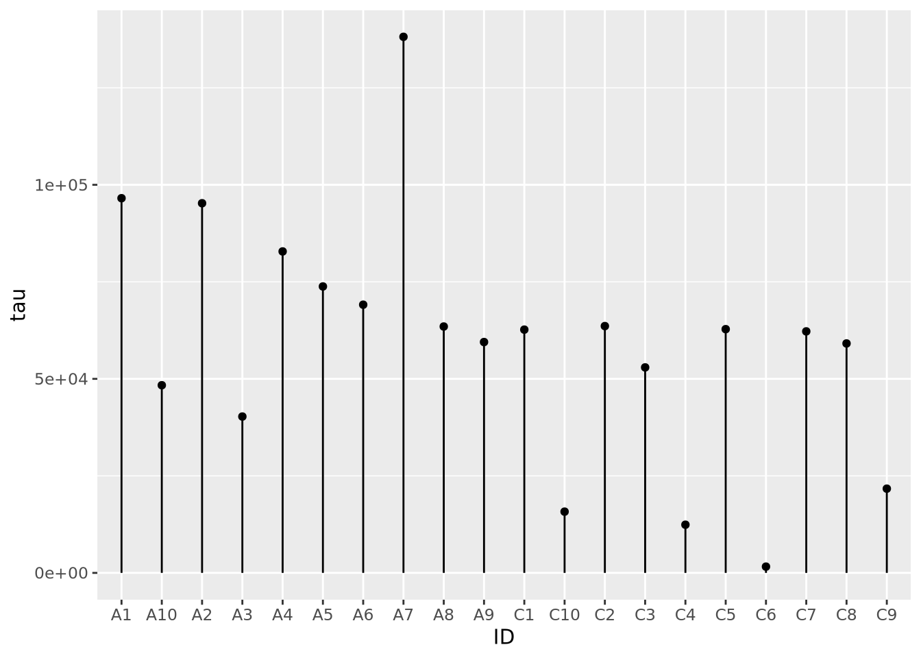 Now the values for each subject have been normalized to each sum to 1. In this
way, we might note that the relative proportion of
Now the values for each subject have been normalized to each sum to 1. In this
way, we might note that the relative proportion of abeta seems to be greater
in AD samples than Controls, but that may not be true of tau. These
observations may inspire us to ask these questions more rigorously than we have
done so far by inspection.