- Syllabus
- 1 Introduction
- 2 Data in Biology
- 3 Preliminaries
- 4 R Programming
- 4.1 Before you begin
- 4.2 Introduction
- 4.3 R Syntax Basics
- 4.4 Basic Types of Values
- 4.5 Data Structures
- 4.6 Logical Tests and Comparators
- 4.7 Functions
- 4.8 Iteration
- 4.9 Installing Packages
- 4.10 Saving and Loading R Data
- 4.11 Troubleshooting and Debugging
- 4.12 Coding Style and Conventions
- 4.12.1 Is my code correct?
- 4.12.2 Does my code follow the DRY principle?
- 4.12.3 Did I choose concise but descriptive variable and function names?
- 4.12.4 Did I use indentation and naming conventions consistently throughout my code?
- 4.12.5 Did I write comments, especially when what the code does is not obvious?
- 4.12.6 How easy would it be for someone else to understand my code?
- 4.12.7 Is my code easy to maintain/change?
- 4.12.8 The
stylerpackage
- 5 Data Wrangling
- 6 Data Science
- 7 Data Visualization
- 8 Biology & Bioinformatics
- 8.1 R in Biology
- 8.2 Biological Data Overview
- 8.3 Bioconductor
- 8.4 Microarrays
- 8.5 High Throughput Sequencing
- 8.6 Gene Identifiers
- 8.7 Gene Expression
- 8.7.1 Gene Expression Data in Bioconductor
- 8.7.2 Differential Expression Analysis
- 8.7.3 Microarray Gene Expression Data
- 8.7.4 Differential Expression: Microarrays (limma)
- 8.7.5 RNASeq
- 8.7.6 RNASeq Gene Expression Data
- 8.7.7 Filtering Counts
- 8.7.8 Count Distributions
- 8.7.9 Differential Expression: RNASeq
- 8.8 Gene Set Enrichment Analysis
- 8.9 Biological Networks .
- 9 EngineeRing
- 10 RShiny
- 11 Communicating with R
- 12 Contribution Guide
- Assignments
- Assignment Format
- Starting an Assignment
- Assignment 1
- Assignment 2
- Assignment 3
- Problem Statement
- Learning Objectives
- Skill List
- Background on Microarrays
- Background on Principal Component Analysis
- Marisa et al. Gene Expression Classification of Colon Cancer into Molecular Subtypes: Characterization, Validation, and Prognostic Value. PLoS Medicine, May 2013. PMID: 23700391
- Scaling data using R
scale() - Proportion of variance explained
- Plotting and visualization of PCA
- Hierarchical Clustering and Heatmaps
- References
- Assignment 4
- Assignment 5
- Problem Statement
- Learning Objectives
- Skill List
- DESeq2 Background
- Generating a counts matrix
- Prefiltering Counts matrix
- Median-of-ratios normalization
- DESeq2 preparation
- O’Meara et al. Transcriptional Reversion of Cardiac Myocyte Fate During Mammalian Cardiac Regeneration. Circ Res. Feb 2015. PMID: 25477501l
- 1. Reading and subsetting the data from verse_counts.tsv and sample_metadata.csv
- 2. Running DESeq2
- 3. Annotating results to construct a labeled volcano plot
- 4. Diagnostic plot of the raw p-values for all genes
- 5. Plotting the LogFoldChanges for differentially expressed genes
- The choice of FDR cutoff depends on cost
- 6. Plotting the normalized counts of differentially expressed genes
- 7. Volcano Plot to visualize differential expression results
- 8. Running fgsea vignette
- 9. Plotting the top ten positive NES and top ten negative NES pathways
- References
- Assignment 6
- Assignment 7
- Appendix
- A Class Outlines
7.2 Grammar of Graphics
The grammar of graphics is a system of rules that describes how data and graphical aesthetics (e.g. color, size, shape, etc) are combined to form graphics and plots. First popularized in the book The Grammar of Graphics by Leland Wilkinson and co-authors in 1999, this grammar is a major contribution to the structural theory of statistical graphics. In 2005, Hadley Wickam wrote an implementation of the grammar of graphics in R called ggplot2 (gg stands for grammar of graphics).
Under the grammar of graphics, every plot is the combination of three types of information: data, geometry, and aesthetics. Data is the data we wish to plot. Geometry is the type of geometry we wish to use to depict the data (e.g. circles, squares, lines, etc). Aesthetics connect the data to the geometry and defines how the data controls the way the selected geometry looks.
A simple example will help to explain. Consider the following made up sample metadata tibble for a study of subjects who died with Alzheimer’s Disease (AD) and neuropathologically normal controls:
ad_metadata## # A tibble: 20 x 8
## ID age_at_death condition tau abeta iba1 gfap braak_stage
## <chr> <dbl> <fct> <dbl> <dbl> <dbl> <dbl> <fct>
## 1 A1 81 AD 141017 230227 32959 26196 6
## 2 A2 78 AD 141082 214944 204381 26739 6
## 3 A3 80 AD 40788 46663 0 29308 2
## 4 A4 85 AD 78770 136101 98074 41177 3
## 5 A5 81 AD 110573 42893 140591 75334 5
## 6 A6 79 AD 125934 199602 133705 91069 5
## 7 A7 70 AD 32826 31016 34544 27905 1
## 8 A8 76 AD 95281 92308 116275 143759 4
## 9 A9 80 AD 55035 154453 62074 126360 2
## 10 A10 94 AD 53040 9099 39297 137833 2
## 11 C1 78 Control 35684 0 38523 59819 1
## 12 C2 77 Control 62182 29663 73422 52276 3
## 13 C3 73 Control 49062 106332 0 73822 2
## 14 C4 70 Control 10123 0 13962 96704 0
## 15 C5 74 Control 1530 2169 2002 83280 0
## 16 C6 73 Control 25514 49980 25771 53798 1
## 17 C7 81 Control 24367 48786 23961 17561 1
## 18 C8 69 Control 43628 36442 19467 41970 2
## 19 C9 78 Control 48923 64880 16367 110464 2
## 20 C10 77 Control 9688 3818 12424 59021 0For context, tau protein and amyloid beta peptides from the amyloid precursor protein aggregate into neurofibrillary tangles and A-beta plaques, respectively, the brains of people with AD. Generally, the amount of both of these pathologies is associated with more severe disease. Braak stage is a neuropathological assessment of the amount of pathology in a brain that is associated with the severity of disease, where 0 indicates absence of pathology and 6 with widespread involvement in multiple brain regions. Aggregation of tau is also a consequence of normal aging, so must accompany neurological symptoms such as dementia to indicate an AD diagnosis post mortem. Note we have control samples as well as AD.

Tauopathy: tau protein accumulates in the cell bodies of affected neurons - Wikipedia
The histology measures tau, abeta, iba1, and gfap have been quantified
using digital microscopy, where brain sections are stained with
immunohistochemistry to identify the location and degree of pathology; the
measures in the table are the number of pixels of a 400 x 400 pixel image of a
piece of brain tissue that fluoresce when stained with the corresponding
antibody. Tau and A-beta antibodies are specialized to the types of aggregated
proteins mentioned above and provide a quantification of the level of overall
AD pathology. Ionized calcium binding adaptor molecule 1 (IBA1) is a marker of
activated microglia, the resident
macrophages of the brain, which is an
indication of neuroinflammation. Glial fibrillary acidic protein (GFAP) is a
marker for activated astrocytes,
specialized cells that derive from the neuron lineage, are critical for
maintaining the blood brain
barrier, and are also
involved in the neuroinflammatory response.
Let’s say we wished to visualize the relationship between age at death and the
amount of tau pathology. A scatter plot where each marker is a subject with \(x\)
and \(y\) position corresponding to age_at_death and tau respectively. The
following R code creates such a plot with ggplot2:
ggplot(data=ad_metadata, mapping = aes(x = age_at_death, y=tau)) +
  geom_point()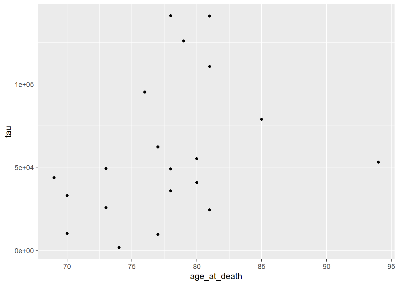
All ggplot2 plots begin with the ggplot() function call, which is passed a
tibble with the data to be plotted. We then define the aesthetics are
defined by mapping the x coordinate to the age_at_death column and the y
coordinate to the tau column with aes(x = age_at_death, y=tau). Finally, the
geometry as ‘point’ with geom_point(), meaning marks will be made at pairs
of x,y coordinates. The plot shows what we expect given our knowledge of the
relationship between age and amount of tau; the two look to be positively
correlated.
However, we are not capturing the whole story: we know that there are both AD
and Control subjects in this dataset. How does condition relate to this
relationship we see? We can layer on an additional aesthetic of color to add
this information to the plot:
ggplot(data=ad_metadata, mapping = aes(x = age_at_death, y=tau, color=condition)) +
  geom_point()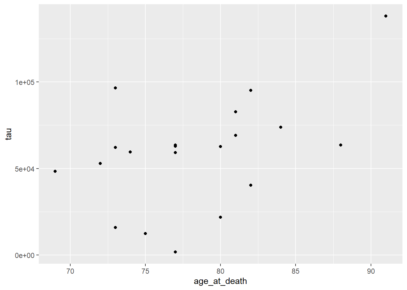
This looks a little clearer, showing that Control subjects generally have both an earlier age at death and a lower amount of tau pathology. This might be a problem, however, since if the age distributions of AD and Control groups are different that might pose a problem with confounding. We should investigate this.
Instead of plotting age at death and tau against each other, we will examine the
distributions of each of these variables for AD and Control samples separately.
We will use the violin
geometry with
geom_violin() to look at the distributions of age_at_death:
ggplot(data=ad_metadata, mapping = aes(x=condition, y=age_at_death)) +
  geom_violin()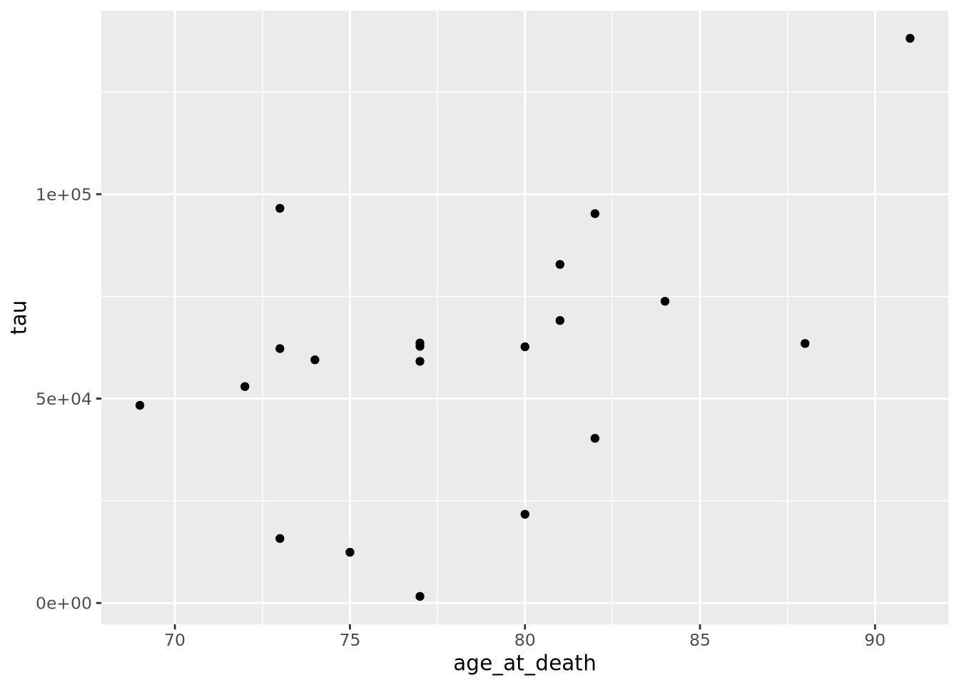
We can see immediately that there are big differences between the age distributions of the two groups. This is not ideal, but perhaps we can adjust for these effects in downstream analyses. We’d like to look at the tau distributions as well, but it would be nice to have these two plots side by side in the same plot. To do that, we will use another library called patchwork, which allows independent ggplot2 plots to be arranged together with a simple expressive syntax:
library(patchwork)
age_boxplot <- ggplot(data=ad_metadata, mapping = aes(x=condition, y=age_at_death)) +
  geom_boxplot()
tau_boxplot <- ggplot(data=ad_metadata, mapping=aes(x=condition, y=tau)) +
  geom_boxplot()

age_boxplot | tau_boxplot # this puts the plots side by side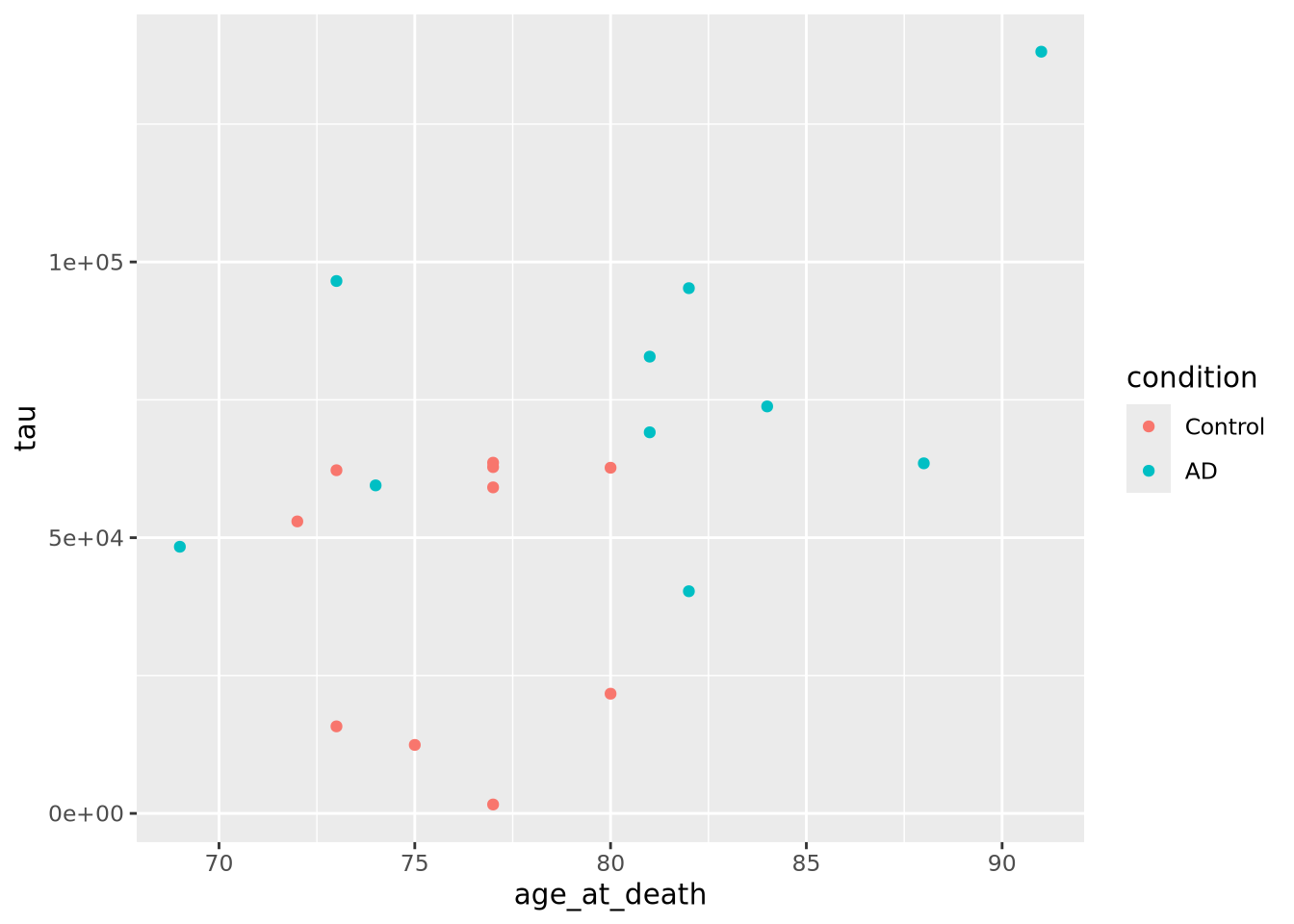
This confirms our suspicion, and also reveals a serious problem with our samples: we have strong confounding of tau and age at death between AD and Control samples. This means that if we look for differences between AD and Control, we won’t know if the difference is due to the amount of tau pathology or due to age of the subjects. With this sample set, we simply cannot confidently answer that question. Just a few simple plots alerted us to this problem; hopefully more expensive datasets have not already been generated for these samples, so that hopefully different subjects are available that could avoid this confounding.
This has been a biological data analysis oriented tutorial on plotting meant to illustrate the principles of the grammar of graphics. Namely, every plot has data, geometry, and aesthetics that can be independently controlled to produce many types of plots. Many of these plots have names, like scatter plots and boxplots, but as you compose different types of geometries and aesthetics together you may find yourself generating plots that aren’t so easily named.
The next sections of this chapter are a kind of “cook book” of different kinds plots you can generate with data of different shapes. It is not intended to be comprehensive, but a helpful guide when you are trying to decide how to visualize your own datasets.
If you want to go directly to the comprehensive documentation of the many types of ggplot2 plots, peruse the R Graph Gallery site.
7.2.1 ggplot mechanics
ggplot has two key concepts that give it great flexibility: layers and
**scales*.
Every plot has one or more layers that contain a type of geometry that
represents a data encoding. In general, each layer will only have one geometry
type, e.g. points or lines, but the geometry might be complex, e.g. density
plots. The layers added to a plot form a stack, where the layers added first are
beneath those added later. The geometry in each layer may draw from the same
data, or each may have its own. Each layer may also share the aesthetic mapping
from the ggplot() call, or may have its own. This is why both the ggplot()
function and each individual geom_X() function can accept data and aesthetic
mappings. The package comes with a large number of geometries described in its
reference documentation.
The geometry in each layer maps the data values to visual properties using
scales. A scale may map a data range to a pixel range, or to a color on a color
gradient, or one of a set of discrete colors or shapes. ggplot provides
reasonable default scales for each geometry type. You can override these
defaults by using the scale_X
functions.
The ggplot2 book is an excellent resource for all things ggplot2.