Gene Expression
Gene Expression
- Gene expression: the process by which information from a gene is used in the synthesis of functional gene products that affect a phenotype.
- Gene expression studies are often focused on protein coding genes
- Many functional expressed molecules
- protein coding genes
- lncRNAs
- transfer RNAs
- microRNAs
Gene Expression Process
- Specific parts of the genome code for genes
- Gene sequences transcribed into RNA molecules called transcripts
- In lower organisms (e.g. bacteria), RNA molecules passed directly to ribosomes
- In most higher organisms (i.e. eukaryotes):
- Initial transcripts, called pre-messenger RNA (pre-mRNA) transcripts are processed via splicing
- Splicing removes certain parts of pre-mRNA (introns) and concatenates adjacent sequences (exons) together into mature RNA (mRNA)
- mRNA exported from nucleus to be translated at ribosomes
Gene Expression Process

Gene Expression Measurements
- Measurements proportional to abundance (or copy number) of RNA transcripts
- Measurements are always non-negative
- Usually relative to some normalizing quantity
- i.e. a value of zero does not mean gene is not expressed!
- Some methods (e.g. digital droplet PCR) can estimate absolute abundance (i.e. exact number of copies)
Gene Expression Assays
Many ways to measure the abundance of RNA transcripts
- Light absorbance
- Northern blot
- quantitative polymerase chain reaction (qPCR)
- Oligonucleotide and microarrays
- High throughput RNA sequencing (RNASeq)
Gene Expression Data in Bioconductor
Gene Expression Data in Bioconductor
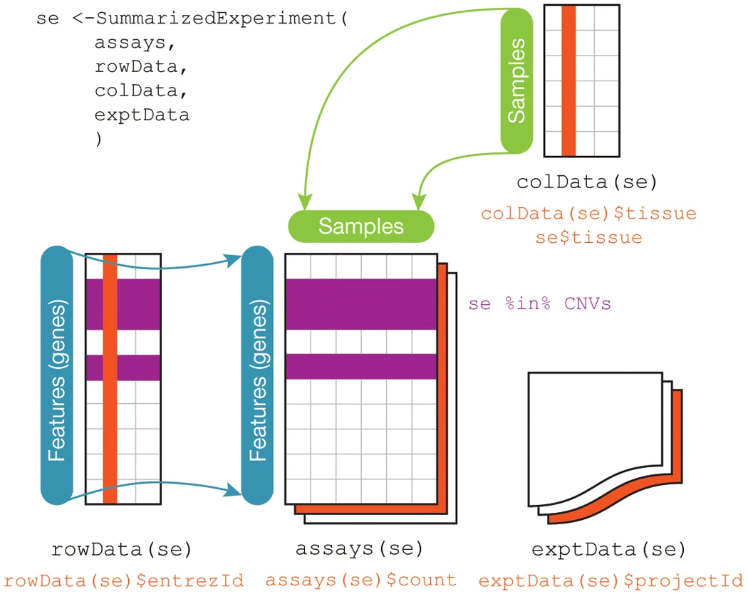
SummarizedExperiment container standard way to load and work with gene expression data in Bioconductor
Stores the following information:
assays- one or more measurement assays (e.g. gene expression) in the form of a feature by sample matrixcolData- metadata associated with the samples (i.e. columns) of the assaysrowData- metadata associated with the features (i.e. rows) of the assaysexptData- additional metadata about the experiment itself, like protocol, project name, etc
SummarizedExperiment Schematic
Creating SummarizedExperiments
- Many Bioconductor packages for specific types of data, e.g. limma create SummarizedExperiment objects for you
- You may also create your own…
Creating SummarizedExperiments
# microarray expression dataset intensities
intensities <- readr::read_delim(
  "example_intensity_data.csv",delim=" "
)

# the first column of intensities tibble is the probesetId,
# extract to pass as rowData
rowData <- intensities["probeset_id"]

# remove probeset IDs from tibble and turn into a R dataframe
# so that we can assign rownames since tibbles don't support
# row names
intensities <- as.data.frame(
  select(intensities, -probeset_id)
)
rownames(intensities) <- rowData$probeset_id
SummarizedExperiment cont’d
# these column data are made up, but you would have a
# sample metadata file to use
colData <- tibble(
  sample_name=colnames(intensities),
  condition=sample(c("case","control"),ncol(intensities),replace=TRUE)
)

se <- SummarizedExperiment(
   assays=list(intensities=intensities),
   colData=colData,
   rowData=rowData
)
SummarizedExperiment cont’d
se
## class: SummarizedExperiment
## dim: 54675 35
## metadata(0):
## assays(1): intensities
## rownames(54675): 1007_s_at 1053_at ... AFFX-TrpnX-5_at AFFX-TrpnX-M_at
## rowData names(1): probeset_id
## colnames(35): GSM972389 GSM972390 ... GSM972512 GSM972521
## colData names(2): sample_name condition
Microarrays
Microarrays

- Microarrays: devices that measure relative abundance of DNA molecules
- Measure 1000s of DNA molecules simultaneously
- Molecules are selected a priori and “hard coded” onto the device
Types of Microarrays
- Microarrays measure DNA
- Usually one microarray is generated for an individual sample
- Sample preparation method depends on target molecules
- DNA: e.g. genetic variants, the DNA itself is biochemically extracted
- RNA abundance: RNA extracted then reverse transcribed to complementary DNA (cDNA)
Microarray Terminology
- probe - short (~25nt) cDNA molecule complementary to portion of target transcript
- probe set - a set of probes that all target the same gene
- flowcell - the glass slide portion of device that has probes deposited on it
Microarray Design

Microarray Data Generation Process

Microarray Gene Expression Data
Microarray Gene Expression Data
Four steps involved in analyzing gene expression microarray data:
- Summarization of probes to probesets
- Normalization
- Quality control
- Analysis
Microarray Data
- Raw probe intensity data stored in CEL data files
affyBioconductor package- Loads CEL files into Bioconductor objects
- Performs key preprocessing operations
- Typically have many CEL files, one per each sample
Reading CEL Files
- Load CEL files with
affy::ReadAffyfunction
# read all CEL files in a single directory
affy_batch <- affy::ReadAffy(celfile.path="directory/of/CELfiles")

# or individual files in different directories
cel_filenames <- c(
  list.files( path="CELfile_dir1", full.names=TRUE, pattern=".CEL$" ),
  list.files( path="CELfile_dir2", full.names=TRUE, pattern=".CEL$" )
)
affy_batch <- affy::ReadAffy(filenames=cel_filenames)
Probe summarization and normalization
affypackage provides functions to perform probe summarization and normalization- Robust Multi-array Average (RMA) state of the art method for normalization
affy::rmafunction implements RMA, performs summarization and normalization of multiple arrays simultaneously
Aside: R package data
- Some packages include data with the R functionality
- Load package data into your workspace with
data()function
library(affydata)
data(Dilution)
RMA normalization
library(affy)
library(affydata)
data(Dilution)

# normalize the Dilution microarray expression values
# note Dilution is an AffyBatch object
eset_rma <- affy::rma(Dilution,verbose=FALSE)
ExpressionSet vs SummarizedExperiment
ExpressionSetis a container that contains high throughput assay data- Similar to and superseded by
SummarizedExperiment - Some older packages (notably
affy) returnExpressionSetobjects, notSummarizedExperiments - Similar interface, but some key differences
| Operation | ExpressionSet | SummarizedExperiment |
|---|---|---|
| Get expression values | exprs(eset) |
assays(se) |
| Get column data | phenoData(eset) |
colData(se) |
| Get row data | annotation(eset) |
rowData(se) |
RMA normalization

Grammar of Graphics
Grammar of Graphics

- “Grammar of graphics”: a system of rules that describes how data and graphical aesthetics are combined to form graphics and plots
- Aesthetics == color, size, shape, et c
- First popularized in the book The Grammar of Graphics by Leland Wilkinson and co-authors in 1999
ggplot2

- ggplot2 R package that implements grammar of graphics
- Written by Hadley Wickham in 2005
ggplot2 Fundamentals
- Every plot is the combination of three types of information:
- data (i.e. values)
- geometry (i.e. shapes)
- aesthetics (i.e. connects values and shapes)
ggplot2 Example
A simple example dataset:
## # A tibble: 20 × 8
##    ID    age_at_death condition    tau  abeta   iba1   gfap braak_stage
##    <chr>        <dbl> <fct>      <dbl>  <dbl>  <dbl>  <dbl> <fct>
##  1 A1              73 AD         96548 176324 157501  78139 4
##  2 A2              82 AD         95251      0 147637  79348 4
##                              ...
## 10 A10             69 AD         48357  27260  47024  78507 2
## 11 C1              80 Control    62684  93739 131595 124075 3
## 12 C2              77 Control    63598  69838   7189  35597 3
##                              ...
## 20 C10             73 Control    15781  16592  10271 100858 1
Sidebar: Tau pathology

ggplot2 Example
- Goal: visualize the relationship between age at death and the amount of tau pathology
- Try a scatter plot where each marker is a subject with
- \(x\) is
age_at_death - \(y\) is
tau
ggplot( data=ad_metadata, mapping = aes( x = age_at_death, y = tau ) ) + geom_point() - \(x\) is
Simple Scatter Plot
ggplot(data=ad_metadata, mapping=aes(x=age_at_death, y=tau)) +
  geom_point()

ggplot2 Plot Components
ggplot(data=ad_metadata, mapping=aes(x=age_at_death, y=tau)) +
  geom_point()
ggplot()- function creates a plotdata=- pass a tibble with the datamapping=aes(...)- Define an aesthetics mapping connecting data to plot propertiesgeom_point(...)- Specify geometry as points where marks will be made at pairs of x,y coordinates
Adding More Aesthetics
Is this the whole story?
Adding More Aesthetics
There are both AD and Control subjects in this dataset!
How does
conditionrelate to this relationship we see?Layer on an additional aesthetic of color:
ggplot(
    data=ad_metadata,
    mapping = aes(
      x = age_at_death,
      y = tau,
      color=condition # color each point
    )
  ) +
  geom_point()
Adding More Aesthetics
ggplot(data=ad_metadata, mapping=aes(
      x=age_at_death, y=tau, color=condition
    )) + geom_point()

Other Plot Geometries
Differences in distributions of variables can be important
Examine the distribution of
age_at_deathfor AD and Control samples with violin geometry withgeom_violin():ggplot(data=ad_metadata, mapping = aes(x=condition, y=age_at_death)) + geom_violin()
Violin Plot
ggplot(data=ad_metadata, mapping = aes(x=condition, y=age_at_death)) +
  geom_violin()

Multiple Plots
- Can put multiple plots in one figure with
patchworklibrary:
library(patchwork)
age_boxplot <- ggplot(
    data=ad_metadata,
    mapping = aes(x=condition, y=age_at_death)
  ) +
  geom_boxplot()
tau_boxplot <- ggplot(
    data=ad_metadata,
    mapping=aes(x=condition, y=tau)
  ) +
  geom_boxplot()

age_boxplot | tau_boxplot # this puts the plots side by side
Side by Side Plots
age_boxplot | tau_boxplot # this puts the plots side by side

R Graph Gallery
- Useful collection of plot types and examples:
- R Graph Gallery
ggplot Mechanics
ggplot Mechanics
ggplothas two key concepts that give it great flexibility: layers and scales- A layer is one set of data drawn with a geometry and an aesthetic
- A scale is the mapping from the data values to visual properties
- A plot may have one or more layers
- Different layers may share scales or have their own
ggplot Layers
Each layer is a set of data connected to a geometry and an aesthetic
Each
geom_X()function adds a layer to a plotThe plot has three layers:
ggplot(data=ad_metadata, mapping=aes(x=age_at_death)) +
  geom_point(mapping=aes(y=tau, color='blue')) +
  geom_point(mapping=aes(y=abeta, color='red')) +
  geom_point(mapping=aes(y=iba1, color='cyan'))
ggplot Layers

ggplot Scales
- A scale maps data onto a range, e.g.:
- pixel range
- color on a gradient/set of colors
- shape type, circle or square
- shape dimension, like circle radius
- Multiple layers on the same plot
- Must share at least one scale to be plotted together
- May differ in one or more scales to be distinguished from each other
ggplot Scales
How many layers? How many scales?
ggplot Incompatible Scales
ggplot(data=ad_metadata, mapping=aes(x=braak_stage)) +
  geom_point(mapping=aes(y=tau, color='blue')) +
  geom_point(mapping=aes(y=age_at_death, color='red'))
ggplot Incompatible Scales

Plotting One Dimension
Bar Charts
Bar chart
- Map length (i.e. height or width of rectangle) proportional to scalar value
ggplot(ad_metadata,
  mapping = aes(
    x=ID,
    y=tau)
  ) +
  geom_bar(stat="identity")
Bar chart
ggplot(ad_metadata, mapping = aes(x=ID,y=tau)) +
  geom_bar(stat="identity")

More insightful bar chart
- Change the fill color of the bars based on condition:
ggplot(ad_metadata,
  mapping = aes(
    x=ID,
    y=tau,
    fill=condition)
  ) +
  geom_bar(stat="identity")
More insightful bar chart
ggplot(ad_metadata, mapping = aes(x=ID,y=tau,fill=condition)) +
  geom_bar(stat="identity")

Diverging bar chart
- Bar charts can also plot negative numbers
mutate(ad_metadata, tau_centered=(tau - mean(tau))) %>%
  ggplot(mapping = aes(
    x=ID,
    y=tau_centered,
    fill=condition)
  ) +
  geom_bar(stat="identity")
Diverging bar chart
mutate(ad_metadata, tau_centered=(tau - mean(tau))) %>%
  ggplot(mapping = aes(x=ID, y=tau_centered, fill=condition)) +
  geom_bar(stat="identity")

Lollipop plots
Lollipop plots
- Similar to bar charts, “lollipop plots” replace bar with a line segment and a circle
- No dedicated geometry - use
geom_pointandgeom_segmentlayers:
ggplot(ad_metadata) +
  geom_point(mapping=aes(x=ID, y=tau)) +
  geom_segment(mapping=aes(x=ID, xend=ID, y=0, yend=tau))
Lollipop plots
ggplot(ad_metadata) +
  geom_point(mapping=aes(x=ID, y=tau)) +
  geom_segment(mapping=aes(x=ID, xend=ID, y=0, yend=tau))

Stacked Area charts
Stacked Area charts
- Visualize multiple 1D data that share a common categorical axis
pivot_longer(
    ad_metadata,
    c(tau,abeta,iba1,gfap),
    names_to='Marker',
    values_to='Intensity'
  ) %>%
  ggplot(aes(x=ID,y=Intensity,group=Marker,fill=Marker)) +
    geom_area()
Stacked Area charts

Stacked Area Charts Components
Stacked area plots require three pieces of data:
- x - a numeric or categorical axis for vertical alignment
- y - a numeric axis to draw vertical proportions
- group - a categorical variable that indicates which (x,y) pairs correspond to the same line
Proportional Stacked Area Charts
- Can view the relative proportion of values in each category rather than the actual values
pivot_longer(
    ad_metadata,
    c(tau,abeta,iba1,gfap),
    names_to='Marker',
    values_to='Intensity'
  ) %>%
  group_by(ID) %>% # divide each intensity values by sum markers
  mutate(
    `Relative Intensity`=Intensity/sum(Intensity)
  ) %>%
  ungroup() %>% # ungroup restores the tibble to original number of rows
  ggplot(aes(x=ID,y=`Relative Intensity`,group=Marker,fill=Marker)) +
    geom_area()
Proportional Stacked Area Charts

Visualizing Distributions
Visualizing Distributions
- A distribution describes the general “shape” of a set of numbers
- i.e. what is the relative frequency of the values, or ranges of values
- Must understand distribution of data to choose statistical methods appropriately
Histogram
Histogram
- First described by Karl Pearson
- Type of bar chart
- Divides up the range of a dataset from minimum to maximum into bins usually of the same size
- Each bin represented by a bar with height or width proportional to number of values that fall within that bin
ggplot(ad_metadata) +
  geom_histogram(mapping=aes(x=age_at_death))
Histogram
## `stat_bin()` using `bins = 30`. Pick better value with `binwidth`.

Changing histogram bins
ggplot(ad_metadata) +
  geom_histogram(mapping=aes(x=age_at_death),bins=10)

Histograms sensitive to number of data points
- Histogram of synthetic dataset of 1000 normally distributed values:
tibble(x=rnorm(1000)) %>%
  ggplot() +
  geom_histogram(aes(x=x))
Histograms sensitive to number of data points
## `stat_bin()` using `bins = 30`. Pick better value with `binwidth`.

Histograms with multiple distributions
- Can add multiple histograms to same plot
tibble(
  x=c(rnorm(1000),rnorm(1000,mean=4)),
  type=c(rep('A',1000),rep('B',1000))
) %>%
  ggplot(aes(x=x,fill=type)) +
  geom_histogram(bins=30, alpha=0.6, position="identity")
Histograms with multiple distributions

Density plots
Density plot
Similar to histogram, except instead of binning the values draws a smoothly interpolated line that approximates the distribution
Density plot is always normalized so the integral under the curve is approximately 1
ggplot(ad_metadata) +
  geom_density(mapping=aes(x=age_at_death),fill="#c9a13daa")
Density plot

Density plot vs histogram
library(patchwork)
hist_g <- ggplot(ad_metadata) +
  geom_histogram(mapping=aes(x=age_at_death),bins=30)
density_g <- ggplot(ad_metadata) +
  geom_density(mapping=aes(x=age_at_death),fill="#c9a13daa")

hist_g | density_g
Density plot vs histogram

Density plot vs histogram
library(patchwork)
normal_samples <- tibble(
  x=c(rnorm(1000),rnorm(1000,mean=4)),
  type=c(rep('A',1000),rep('B',1000))
)
hist_g <- ggplot(normal_samples) +
  geom_histogram(
    mapping=aes(x=x,fill=type),
    alpha=0.6, position="identity", bins=30
)
density_g <- ggplot(normal_samples) +
  geom_density(
    mapping=aes(x=x,fill=type),
    alpha=0.6, position="identity"
  )

hist_g | density_g
Density plot vs histogram

Boxplots
Boxplot
- The histogram depicts distribution as a “box and whiskers”
- Assume data are unimodal (i.e. roughly bell-shaped)
- Explicitly draws:
- Median
- 25th and 75th percentile (a.k.a. 1st and 3rd quartile)
- “whiskers” that show further extents
- Some have markers for outlier samples
ggplot(ad_metadata) +
  geom_boxplot(mapping=aes(x=condition,y=age_at_death))
Boxplot
ggplot(ad_metadata) +
  geom_boxplot(mapping=aes(x=condition,y=age_at_death))

Boxplot Anatomy

Boxplot shortcomings
normal_samples <- tibble(
  x=c(rnorm(1000),rnorm(1000,4),rnorm(1000,2,3)),
  type=c(rep('A',2000),rep('B',1000))
)
ggplot(normal_samples, aes(x=x,fill=type,alpha=0.6)) +
  geom_density()

Boxplot shortcomings
ggplot(normal_samples, aes(x=type,y=x,fill=type)) +
  geom_boxplot()

Boxplot shortcomings
library(patchwork)
g <- ggplot(normal_samples, aes(x=type,y=x,fill=type))
boxplot_g <- g + geom_boxplot()
violin_g <- g + geom_violin()

boxplot_g | violin_g
Boxplot shortcomings
- Boxplots can be misleading

Violin Plots
Violin plot
- violin plot produces a shape where the width is proportional to the density of values value along the x or y axis *Similar in principle to a histogram or a density plot
ggplot(ad_metadata) +
  geom_violin(aes(x=condition,y=tau,fill=condition))
Violin plot

Beeswarm Plots
Beeswarm plot
- beeswarm plot similar to a violin plot
- Plots the data itself as points like in a scatter plot
- Points are ‘jittered’ so they don’t overlap
library(ggbeeswarm)
ggplot(ad_metadata) +
  geom_beeswarm(
    aes(x=condition,y=age_at_death,color=condition),
    cex=2,
    size=2
  )
Beeswarm plot

Beeswarm plot limitations
- Typically only useful when the number of values is not too many or too few:
normal_samples <- tibble(
  x=c(rnorm(1000),rnorm(1000,4),rnorm(1000,2,3)),
  type=c(rep('A',2000),rep('B',1000))
)
ggplot(normal_samples, aes(x=type,y=x,color=type)) +
  geom_beeswarm()
Beeswarm plot limitations
ggplot(normal_samples, aes(x=type,y=x,color=type)) +
  geom_beeswarm()

Seeing patterns in bees
- Can color bees by another value
normal_samples <- tibble(
  x=c(rnorm(100),rnorm(100,4),rnorm(100,2,3)),
  type=c(rep('A',200),rep('B',100)),
  category=sample(c('healthy','disease'),300,replace=TRUE)
)
ggplot(normal_samples, aes(x=type,y=x,color=category)) +
  geom_beeswarm()
Seeing patterns in bees

Ridgeline Plots
Ridgeline
- ridgeline charts plot many non-trivial distributions
- Simply multiple density plots drawn for different variables within the same plot
library(ggridges)

tibble(
  x=c(rnorm(100),rnorm(100,4),rnorm(100,2,3)),
  type=c(rep('A',200),rep('B',100)),
) %>%
  ggplot(aes(y=type,x=x,fill=type)) +
  geom_density_ridges()
Ridgeline
## Picking joint bandwidth of 0.892

Many ridgelines
tibble(
  x=rnorm(10000,mean=runif(10,1,10),sd=runif(2,1,4)),
  type=rep(c("A","B","C","D","E","F","G","H","I","J"),1000)
) %>%
  ggplot(aes(y=type,x=x,fill=type)) +
  geom_density_ridges(alpha=0.6,position="identity")
Many ridgelines
## Picking joint bandwidth of 0.499
